7 Best Cartographic Typography Choices That Enhance Readability
The big picture: Typography can make or break your map design â choosing the wrong font transforms even the most accurate cartographic data into an unreadable mess.
Why it matters: Professional cartographers spend years mastering the subtle art of typeface selection because readable maps save lives during emergencies and guide millions of daily navigation decisions.
What’s ahead: We’ve analyzed the most effective cartographic fonts used by leading mapping organizations to identify seven typography choices that’ll elevate your maps from amateur to professional-grade design.
Disclosure: As an Amazon Associate, this site earns from qualifying purchases. Thank you!
P.S. check out Udemy’s GIS, Mapping & Remote Sensing courses on sale here…
Sans-Serif Fonts for Clear Readability
Sans-serif fonts provide optimal legibility at various map scales, making them essential for professional cartographic work. Their clean letterforms eliminate visual clutter that can compromise map readability during critical navigation situations.
Helvetica for Universal Appeal
Helvetica remains the gold standard for cartographic typography across international mapping organizations. You’ll find this Swiss-designed typeface used by major publishers like National Geographic and Rand McNally for its exceptional clarity at small point sizes. Its uniform stroke width and balanced character spacing ensure consistent readability whether you’re designing wall maps or mobile applications. The font’s neutral appearance works seamlessly with diverse color schemes and maintains legibility when overlaid on complex topographic backgrounds.
Arial for Digital Map Applications
Arial excels in digital mapping environments where screen resolution and rendering quality vary significantly. You’ll achieve better results using Arial for web-based mapping applications and GIS software interfaces due to its optimized hinting for digital displays. This Microsoft-developed typeface handles anti-aliasing better than many alternatives, preventing character degradation at zoom levels below 100%. Its widespread availability across operating systems eliminates font substitution issues that can disrupt your map’s visual consistency during file sharing and publication workflows.
Futura for Modern Geometric Precision
Futura brings geometric clarity to contemporary map designs requiring clean, architectural aesthetics. You’ll appreciate its perfect circular letterforms and consistent proportions when labeling urban planning maps, transit systems, and modern infographic-style cartography. The font’s distinctive character shapes create strong visual hierarchy while maintaining excellent readability at sizes down to 6 points. Its Art Deco origins complement minimalist design approaches and work particularly well for maps targeting younger demographics or technology-focused applications.
Serif Fonts for Traditional Elegance
Serif fonts bring classic sophistication to your cartographic designs through their decorative flourishes and historical associations. These typefaces excel in traditional mapping contexts where you need to convey authority and timeless appeal.
Times New Roman for Historical Maps
Explore history's most significant maps with *Great Maps*. This book delves into cartographic masterpieces and their historical context.
Times New Roman delivers exceptional legibility for your historical cartographic projects while maintaining professional credibility across all scales. You’ll find this serif font particularly effective for period maps, genealogical charts, and educational materials where traditional typography reinforces historical authenticity. Its widespread availability ensures consistent reproduction across different platforms and printing methods, making it reliable for archival mapping projects that require long-term accessibility.
Minion Pro for Academic Publications
Minion Pro offers superior readability in dense cartographic text while providing elegant proportions that enhance your scholarly mapping presentations. You can rely on this Adobe font for research publications, academic atlases, and technical documentation where extended reading comfort matters most. Its multiple weights and extensive character set support complex cartographic labeling requirements, including diacritical marks and specialized symbols essential for international mapping projects.
Trajan for Classical Stone-Carved Aesthetics
Trajan captures the monumental quality of Roman inscriptions, making it perfect for your commemorative maps and heritage tourism projects. You’ll achieve striking visual impact when using this all-capitals font for titles, monuments, and historical site markers where gravitas and permanence are essential. Its bold, architectural letterforms work exceptionally well at large sizes for map headers and destination names that need to convey historical significance and cultural importance.
Humanist Fonts for Balanced Legibility
Humanist fonts bridge the gap between geometric precision and organic readability, making them invaluable for cartographic applications where you need clear communication across diverse audiences.
Frutiger for Airport and Transit Maps
Frutiger dominates wayfinding systems because its humanist characteristics ensure readability under stress and motion. You’ll find this typeface powering major transit networks from Charles de Gaulle Airport to metropolitan subway systems. Its letterforms maintain clarity at both large directional signs and small station labels, with generous x-height and open counters that prevent confusion between similar characters like “6” and “9” in route numbers.
Optima for Natural Landscape Features
Optima’s stone-carved elegance makes it perfect for labeling topographic features and natural landmarks on your maps. This humanist sans-serif combines classical proportions with modern clarity, creating labels that feel organic against terrain representations. You’ll achieve professional results when marking mountain ranges, river systems, and park boundaries, as Optima’s varying stroke weights echo the natural variations found in landscape features themselves.
Gill Sans for British Ordnance Survey Style
Gill Sans delivers the authoritative clarity that defines British cartographic tradition, making it essential for survey-style mapping projects. You can replicate the professional appearance of Ordnance Survey maps by using this humanist typeface for place names and administrative boundaries. Its distinctive letterforms provide excellent legibility at multiple scales while maintaining the formal yet approachable character that British mapping standards demand for official documentation.
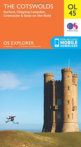
Explore the Cotswolds with this detailed 1:25K scale Ordnance Survey map. Covering Burford, Chipping Campden, and Cirencester, it's perfect for hiking and navigating the region.
Condensed Fonts for Space-Efficient Labeling
Condensed typefaces maximize labeling density while maintaining legibility in space-constrained cartographic environments. These narrow letterforms allow you to fit more text into limited areas without sacrificing readability.
Trade Gothic Condensed for Dense Urban Areas
Trade Gothic Condensed excels in metropolitan mapping where space constraints demand efficient typography solutions. You’ll achieve optimal readability for neighborhood names, district labels, and commercial area identifications using its bold letterforms. The font’s vertical emphasis prevents text overlap while maintaining professional clarity at scales from 1:10,000 to 1:50,000. Major city planning departments rely on Trade Gothic Condensed for zoning maps and development proposals.
Franklin Gothic Condensed for Street Names
Franklin Gothic Condensed delivers superior performance for street labeling systems across residential and commercial districts. You’ll find its letterforms remain crisp when printed at small sizes while providing excellent contrast against varied background colors. The typeface handles curved street alignments effectively, maintaining consistent spacing and angle relationships. Transportation authorities prefer Franklin Gothic Condensed for official street atlases and emergency response mapping applications.
Univers Condensed for Multilingual Applications
Univers Condensed supports extensive character sets essential for international mapping projects requiring multiple language displays. You’ll benefit from its consistent weight distribution across Latin, Cyrillic, and extended Unicode character ranges. The font maintains visual harmony when combining different scripts on tourist maps, cultural heritage documentation, and cross-border regional planning materials. International organizations choose Univers Condensed for standardized cartographic publications spanning diverse linguistic territories.
Script and Decorative Fonts for Water Features
Water features demand specialized typography that flows naturally with aquatic landscapes while maintaining cartographic clarity. Script and decorative fonts enhance the organic character of rivers, lakes, and coastal areas when applied strategically.
Snell Roundhand for River and Stream Names
Snell Roundhand creates flowing elegance that mirrors natural waterway movements across your cartographic designs. This calligraphic typeface excels at labeling meandering rivers and tributaries where traditional fonts appear rigid. You’ll find its graceful curves particularly effective for historical maps and nature-focused publications. The font’s refined stroke variations provide excellent readability at medium scales while maintaining the organic feel essential for water feature labeling.
Brush Script for Informal Coastal Labels
Brush Script delivers casual authenticity for recreational and tourism-focused coastal mapping projects. This dynamic typeface captures the relaxed atmosphere of beach destinations and informal waterfront areas. You can leverage its hand-painted appearance for surf spots, fishing areas, and casual recreation zones. The font’s bold stroke weight ensures visibility against complex coastal backgrounds while conveying the approachable character needed for leisure-oriented cartographic applications.
Italic Variations for Dynamic Water Bodies
Italic typography emphasizes movement and flow in active water features like rapids, waterfalls, and tidal zones. These slanted letterforms visually suggest motion while maintaining professional cartographic standards. You should apply italic treatments to distinguish flowing water from static bodies like ponds or reservoirs. This typographic technique works particularly well with condensed fonts, creating efficient labeling that reinforces the dynamic nature of moving water systems.
Display Fonts for Prominent Geographic Features
Display fonts command attention and establish visual hierarchy for your map’s most significant geographic elements. These bold typefaces ensure critical features remain visible and memorable across various viewing distances and reproduction scales.
Trajan Pro for Mountain Range Titles
Trajan Pro delivers monumental authority when labeling major mountain systems and ranges. Its carved-stone letterforms evoke the permanence and grandeur of alpine landscapes, making it perfect for titles like “Rocky Mountains” or “Cascade Range.” You’ll find this typeface maintains excellent legibility even when applied along curved baselines that follow ridge contours. Professional cartographers favor Trajan Pro for topographic maps where mountain features require distinguished treatment that reflects their geological significance.
Learn essential map reading and navigation skills with this U.S. Army guide. Designed for practical use, it provides clear instructions for navigating any terrain.
Copperplate Gothic for National Park Headers
Learn Copperplate calligraphy with this easy-to-follow manual. Master elegant letterforms and improve your lettering skills step-by-step.
Copperplate Gothic provides institutional gravitas essential for marking protected lands and federal designations. Its condensed letterforms maximize space efficiency while maintaining the authoritative presence needed for park boundaries and reserve labels. You’ll achieve optimal results using Copperplate Gothic for headers like “Yellowstone National Park” or “Grand Canyon National Monument.” The typeface’s sturdy construction ensures clarity across multiple reproduction methods, from digital displays to printed trail maps used in outdoor recreation.
Impact for Bold Regional Designations
Impact creates unmistakable emphasis for large-scale regional labels that anchor your map’s geographic context. Its ultra-bold weight cuts through complex cartographic elements while remaining highly legible at distance viewing. You’ll find Impact particularly effective for continental divisions, major geographic provinces, and broad territorial designations like “Great Plains” or “Pacific Northwest.” Professional mapping standards recommend Impact when regional labels must compete with dense topographic detail or satellite imagery backgrounds.
Custom and Specialized Cartographic Typefaces
Professional mapping organizations have developed specialized typeface systems that address unique cartographic challenges. These custom solutions optimize readability, cultural sensitivity, and brand consistency across complex geographic datasets.
National Geographic Custom Font Family
National Geographic’s proprietary typeface system balances editorial sophistication with cartographic functionality across their award-winning atlas series. Their custom serif family features extended character sets supporting 47 languages while maintaining consistent stroke weights at reduction scales from 1:50,000 to 1:50,000,000. You’ll find their distinctive letterforms engineered with increased x-heights and modified ascenders that prevent visual collision with topographic contour lines, ensuring premium readability in their signature yellow-bordered publications.
USGS Standard Typography Guidelines
USGS typography standards establish the benchmark for American topographic mapping through their comprehensive font specification system. Their guidelines mandate specific typefaces for different map elements: Arial for modern digital applications, Universe for metric quadrangle series, and Souvenir for historical recreation maps. You’ll achieve professional results by following their precise point size requirements, with 8-point minimums for contour labels and 12-point standards for major geographic features, ensuring consistent legibility across their 57,000+ published topographic sheets.
OpenStreetMap Recommended Font Stack
OpenStreetMap’s collaborative font stack prioritizes open-source accessibility while maintaining professional cartographic standards across global mapping projects. Their recommended hierarchy includes Noto Sans for comprehensive Unicode support, DejaVu Sans for Latin script applications, and specialized regional fonts like Noto CJK for Asian character systems. You’ll benefit from their fallback system that automatically selects appropriate typefaces based on language detection, ensuring optimal rendering across 200+ supported languages in their crowd-sourced global database.
Conclusion
Your map’s success depends heavily on the typography choices you make. The seven font categories explored here provide you with a comprehensive toolkit for any cartographic project you’ll encounter.
Remember that context drives your font selection. Urban environments demand condensed typefaces while natural landscapes benefit from flowing scripts and humanist forms.
Professional mapping organizations have proven these typography principles through decades of field testing. You can now apply their expertise to elevate your own cartographic work from amateur to professional standards.
Start with these established foundations and you’ll create maps that communicate clearly and effectively with your intended audience.
Achieve a flawless, even complexion with e.l.f. Flawless Satin Foundation. This lightweight, vegan formula provides medium coverage and a semi-matte finish for all-day wear, while hydrating your skin with glycerin.
Frequently Asked Questions
What makes typography important in map design?
Typography is crucial for map readability and effective communication of cartographic data. The right font choice can significantly impact emergency responses and daily navigation by ensuring clear, readable labels at various scales. Professional cartographers understand that typography eliminates visual clutter and enhances the overall functionality of maps.
Why are sans-serif fonts preferred for cartographic design?
Sans-serif fonts provide exceptional clarity and readability at various scales, making them ideal for map design. They eliminate visual clutter that can hinder navigation and maintain legibility whether viewed on screen or in print. Fonts like Helvetica and Arial are industry standards for their versatility and clear letterforms.
When should serif fonts be used in map design?
Serif fonts are best used when creating maps that require classic sophistication and authority, particularly for historical or academic publications. Times New Roman works well for historical maps, while Minion Pro is excellent for scholarly cartographic work due to its elegant proportions and superior readability.
What are humanist fonts and why are they valuable for maps?
Humanist fonts balance geometric precision with organic readability, making them versatile for diverse cartographic applications. Examples like Frutiger excel in transit maps, Optima works well for natural landscape features, and Gill Sans provides authoritative clarity for survey-style mapping projects.
How do condensed fonts benefit map design?
Condensed fonts maximize labeling density while maintaining legibility in space-constrained environments. They’re particularly useful for dense urban mapping where multiple labels must fit in limited space. Trade Gothic Condensed and Franklin Gothic Condensed are excellent choices for metropolitan and street labeling systems.
What role do script fonts play in cartographic design?
Script fonts enhance the organic character of water features like rivers, lakes, and coastal areas while maintaining clarity. Snell Roundhand provides flowing elegance for waterways, while Brush Script captures the relaxed atmosphere of coastal destinations. They add natural movement to water feature labels.
Why do mapping organizations develop custom typefaces?
Professional mapping organizations create custom typefaces to address unique cartographic challenges and maintain consistency across their publications. These specialized fonts support multiple languages, ensure optimal readability, and meet specific technical requirements that standard fonts might not address effectively.


