7 Best Climate Data Visualization Techniques
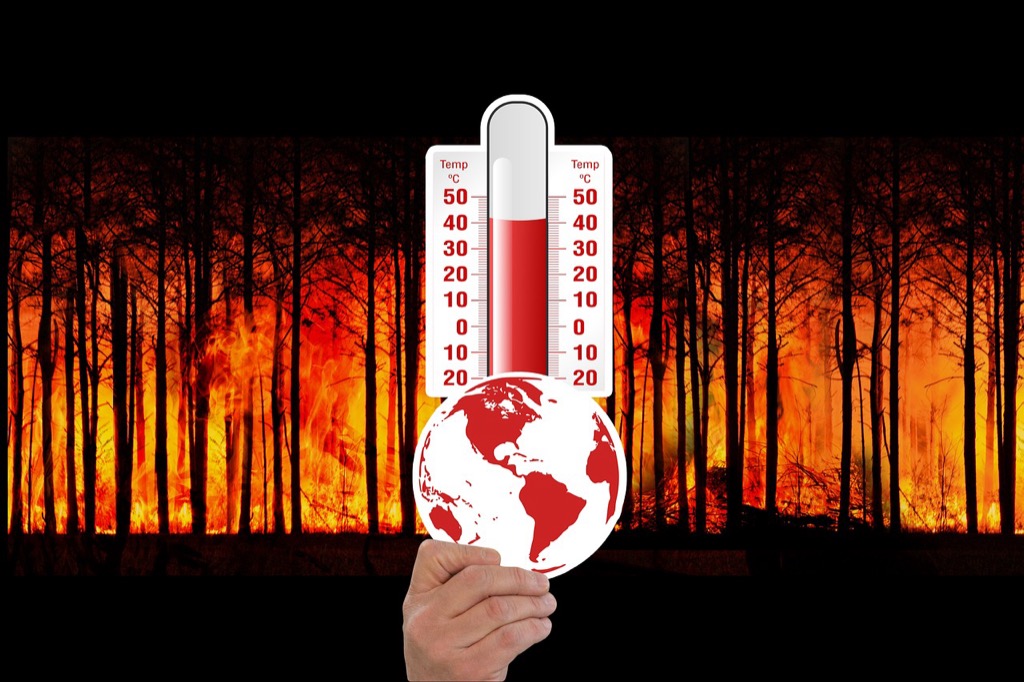
Climate data can be overwhelming – especially when you’re trying to make sense of decades of temperature records sea level measurements and carbon emissions statistics. The big picture: Raw numbers and dense scientific reports often fail to resonate with audiences who need to understand the urgency and scale of climate change.
Why it matters: Visual storytelling transforms complex environmental data into compelling narratives that drive action and inform decision-making across industries and communities.
Disclosure: As an Amazon Associate, this site earns from qualifying purchases. Thank you!
Use Interactive Heat Maps to Show Temperature Changes Over Time
Interactive heat maps transform temperature data into compelling visual narratives that reveal climate patterns across space and time. You’ll create more impactful climate communications by leveraging color-coded displays that make complex thermal data immediately understandable.
P.S. check out Udemy’s GIS, Mapping & Remote Sensing courses on sale here…
Global Temperature Anomaly Visualizations
Temperature anomaly heat maps display deviations from historical averages using color gradients that range from deep blues for cooling to intense reds for warming. You can use NASA’s GISTEMP data with tools like D3.js or Plotly to create interactive global maps showing temperature departures since 1880. These visualizations help audiences understand that recent warming trends exceed natural variability by displaying consistent red patterns across most landmasses during recent decades.
Regional Climate Pattern Comparisons
Regional heat maps reveal localized climate impacts by comparing temperature changes across different geographic areas simultaneously. You’ll want to use NOAA’s climate division data to create side-by-side comparisons showing how the Arctic warms faster than tropical regions. Interactive features like hover tooltips display specific temperature values while zoom functionality allows users to examine state-level or watershed-level patterns. This approach helps stakeholders understand climate vulnerability varies significantly by location.
Seasonal Variation Displays
Seasonal heat maps demonstrate how temperature changes affect different times of year through animated monthly progressions or seasonal averages. You can create compelling visualizations by showing winter warming trends in northern latitudes using ERA5 reanalysis data from Copernicus Climate Change Service. Interactive controls let users toggle between seasons or play animated sequences that reveal shifting patterns like earlier spring melts or extended summer heat periods across decades of climate records.
Create Animated Time-Lapse Videos of Environmental Changes
Time-lapse animations transform static climate data into compelling visual narratives that reveal environmental changes over extended periods. You’ll create powerful storytelling tools that make long-term climate trends immediately apparent to viewers.
Glacier Retreat Documentation
Glacier retreat visualizations showcase decades of ice loss through sequential satellite imagery compiled into smooth animations. You’ll use USGS Landsat archives spanning 1972-present to document retreating glaciers like Alaska’s Muir Glacier or Greenland’s ice sheet margins. Tools like Google Earth Engine process multispectral imagery to highlight ice boundaries over time. These animations reveal retreat rates of 50-100 meters annually for many glaciers, making abstract climate data tangible through dramatic visual evidence.
Sea Level Rise Progression
Sea level rise animations illustrate coastal flooding scenarios using NOAA tide gauge data and satellite altimetry measurements. You’ll create projections showing 0.43-2.84 meter rises by 2100 across vulnerable coastlines like Miami Beach or the Maldives. QGIS plugins generate inundation models from digital elevation data, while Python scripts animate water level changes over time. These visualizations help communities understand flooding risks and adaptation needs through clear before-and-after comparisons.
Deforestation Timeline Visualizations
Deforestation timelines reveal forest loss patterns using Global Forest Watch data and Landsat imagery spanning multiple decades. You’ll document Amazon rainforest clearing rates of 10,000+ square kilometers annually through color-coded animations showing forest cover changes. Hansen Global Forest Change datasets provide year-by-year deforestation data, while Google Earth Timelapse offers ready-made animations. These visualizations expose deforestation hotspots and help quantify biodiversity habitat loss over time.
Design Infographics That Simplify Carbon Footprint Data
Carbon footprint data overwhelms most audiences with its abstract nature and complex calculations. Effective infographics transform these numbers into visual stories that drive behavioral change and policy decisions.
Personal Carbon Calculator Graphics
Create interactive calculators that show emissions from daily activities through visual comparisons. Design pie charts breaking down household emissions by category – transportation typically accounts for 29% while home energy use represents 25% of personal carbon footprints. Build comparison graphics showing how lifestyle choices stack up against national averages, using recognizable icons like cars or light bulbs to represent emission quantities. Include progress tracking visuals that gamify carbon reduction goals with before-and-after scenarios.
Industry Emission Comparisons
Develop sector-based comparison charts highlighting emissions across major industries using standardized CO2 equivalent measurements. Show how electricity generation produces 1.82 billion metric tons annually while agriculture contributes 629 million metric tons in the US. Create proportional graphics using area-based visualizations where larger shapes represent higher-emitting sectors like manufacturing and transportation. Design benchmark comparisons showing emission intensity per dollar of economic output to reveal efficiency differences between industries.
Carbon Offset Visualization Tools
Build interactive maps showing verified offset projects with impact metrics displayed through color-coded markers and progress bars. Visualize forest conservation projects protecting 50000 acres or renewable energy installations generating 2.5 million kWh annually. Create impact calculators that translate offset purchases into tangible equivalents like trees planted or cars removed from roads. Design portfolio dashboards showing offset project diversity across reforestation solar installations and methane capture with real-time impact tracking and certification status updates.
Implement Data Storytelling Through Before-and-After Photo Series
Before-and-after photo series create powerful visual narratives that make climate change impacts immediately understandable to any audience. You’ll transform abstract data into compelling visual evidence that drives understanding and action.
Satellite Imagery Comparisons
You can leverage NASA Landsat and ESA Sentinel satellite archives to create striking before-and-after comparisons spanning decades. Document Arctic sea ice extent changes using MODIS imagery from 2000 to present, revealing 13% per decade ice loss rates. Pair satellite images from the same season and geographic coordinates to ensure accurate comparisons. Use tools like Google Earth Engine to process large datasets and create consistent temporal comparisons that highlight long-term environmental shifts across polar regions and coastlines.
Ground-Level Environmental Documentation
You should establish consistent photo points using GPS coordinates and standardized camera angles to document local environmental changes over time. Capture seasonal variations in vegetation, water levels, and wildlife patterns using identical framing techniques. Document coastal erosion, drought impacts, and ecosystem shifts through monthly or annual photography series. Partner with citizen scientists and community groups to expand your documentation network. Use metadata tags to record weather conditions, timestamps, and equipment specifications for scientific validity.
Urban Development Impact Visuals
You can document heat island effects and urban sprawl impacts through systematic aerial and ground-level photography campaigns. Compare city skylines, green space coverage, and infrastructure development using drone imagery from consistent altitude and angles. Track urban tree canopy changes using high-resolution imagery paired with LIDAR data to quantify vegetation loss percentages. Focus on documenting flood-prone areas, transportation corridors, and residential density changes that affect local climate patterns and community resilience to extreme weather events.
Develop Interactive Dashboards for Real-Time Climate Monitoring
Interactive dashboards transform static climate data into dynamic monitoring systems that update continuously. You’ll create comprehensive visualization platforms that track multiple environmental indicators simultaneously.
Air Quality Index Displays
Build real-time AQI dashboards that visualize particulate matter concentrations across monitoring stations. You can integrate EPA’s AirNow API to display PM2.5 and ozone levels using color-coded maps that update hourly. Include historical trend charts showing 7-day and 30-day averages alongside current readings. Design comparative views that highlight pollution hotspots and seasonal patterns, helping communities understand air quality risks and track improvement efforts over time.
Weather Pattern Tracking Systems
Create dynamic weather visualization systems that combine meteorological data from NOAA and Weather Underground APIs. You’ll display real-time temperature anomalies, precipitation patterns, and extreme weather events using interactive maps with temporal controls. Include storm tracking features that show hurricane paths and intensity changes, plus drought monitoring tools that visualize soil moisture levels. Design alert systems that highlight unusual weather patterns and their potential climate implications.
Renewable Energy Production Metrics
Develop energy dashboard interfaces that track solar, wind, and hydroelectric generation across regional grids. You can integrate utility APIs and EIA data to show real-time production capacity and efficiency metrics. Display comparative charts showing renewable versus fossil fuel contributions to the energy mix, including cost-per-megawatt visualizations. Create forecasting tools that predict renewable energy output based on weather conditions, helping stakeholders understand clean energy potential and grid reliability.
Utilize 3D Modeling to Demonstrate Sea Level Rise Scenarios
Three-dimensional visualizations transform abstract sea level rise projections into tangible experiences that communities can understand and plan for. These immersive models help stakeholders visualize complex coastal flooding scenarios with unprecedented clarity.
Coastal Flooding Simulations
Coastal flooding simulations use digital elevation models and tide gauge data to create realistic 3D representations of inundation scenarios. You’ll combine NOAA’s Sea Level Rise Viewer data with local topographic information to model flooding depths across different neighborhoods. Tools like ArcGIS Pro and QGIS enable you to generate detailed flood extent maps that show water levels reaching 1-6 feet above current high tide marks. These simulations reveal how storm surge amplifies regular flooding events, creating compound impacts that affect transportation corridors, residential areas, and commercial districts.
Infrastructure Impact Projections
Infrastructure impact projections visualize how rising seas threaten critical systems including roads, airports, and power grids. You’ll model vulnerability assessments using LiDAR elevation data combined with infrastructure databases to show which facilities face exposure at different sea level rise scenarios. These 3D visualizations demonstrate how a 2-foot rise affects subway tunnels in cities like New York, while 4-foot scenarios impact entire port facilities and coastal highways. Interactive models allow planners to explore adaptation strategies including seawalls, elevated roadways, and relocated infrastructure components.
Population Displacement Visualizations
Population displacement visualizations combine census data with flood modeling to show how many residents face relocation under different sea level scenarios. You’ll integrate demographic information with inundation zones to create compelling 3D representations of affected communities. These models reveal that 13.1 million Americans live in areas vulnerable to 6 feet of sea level rise, with disproportionate impacts on low-income neighborhoods. Interactive visualizations help policymakers understand migration patterns and plan for climate refugee resettlement while highlighting environmental justice concerns in coastal adaptation planning.
Create Comparative Charts That Put Climate Data in Context
Comparative charts reveal climate change’s true magnitude by positioning current conditions against historical baselines and related impacts. You’ll transform isolated data points into compelling visual narratives that demonstrate correlations between environmental changes and societal consequences.
Historical Climate Trend Analysis
Compare current climate metrics against 100-year baselines to showcase unprecedented changes. You’ll create dual-axis charts displaying temperature anomalies alongside historical averages from NOAA’s climate database. Plot recent decades’ data using bold colors while showing century-long patterns in muted tones. Include drought frequency comparisons, precipitation pattern shifts, and extreme weather event frequencies. These visualizations reveal how today’s “normal” weather represents significant departures from historical norms, making climate acceleration immediately apparent to viewers.
Economic Impact Correlations
Link climate data directly to economic consequences through side-by-side comparison charts. You’ll juxtapose temperature increases with agricultural yield changes, using USDA crop reports and weather station data. Display insurance claim spikes alongside hurricane intensity measurements, or correlate heat dome events with energy consumption costs. Create scatter plots showing relationships between carbon emissions and GDP growth across different sectors. Include tourism revenue impacts from seasonal temperature shifts and snow pack reductions in ski regions.
Get real-time weather data with the Ambient Weather WS-2902. This WiFi-enabled station measures wind, temperature, humidity, rainfall, UV, and solar radiation, plus it connects to smart home devices and the Ambient Weather Network.

Health Outcome Relationships
Connect environmental changes to public health metrics using comparative trend analysis. You’ll overlay heat-related emergency room visits with local temperature records from CDC surveillance data. Compare air quality index readings with respiratory illness rates, or correlate pollen count increases with allergy medication sales. Display vector-borne disease transmission rates alongside temperature and precipitation changes that affect mosquito breeding cycles. Include mental health indicators during extreme weather events, showing correlations between climate disasters and community wellness outcomes.
Conclusion
You now have a comprehensive toolkit for transforming overwhelming climate data into compelling visual stories that drive real change. These seven visualization techniques bridge the gap between scientific complexity and public understanding making your climate communication efforts more impactful.
Your choice of visualization method should align with your audience’s needs and the specific message you want to convey. Whether you’re addressing policymakers urban planners or community members the right visual approach can turn abstract numbers into urgent calls for action.
Remember that effective climate visualization isn’t just about creating beautiful graphicsâit’s about empowering people with the knowledge they need to make informed decisions about our planet’s future.
Frequently Asked Questions
Why is visual storytelling important for climate data communication?
Visual storytelling transforms complex climate data into engaging narratives that make environmental changes easily understandable. Raw scientific data often fails to communicate the urgency of climate change to the public. Interactive visualizations, infographics, and multimedia presentations help convert intricate statistics into compelling stories that inspire action and guide decision-making across communities and sectors.
How do interactive heat maps help explain temperature changes?
Interactive heat maps convert temperature data into color-coded displays that show warming trends over time. They use data like NASA’s GISTEMP to visualize global temperature anomalies, revealing deviations from historical averages. Regional heat maps compare temperature changes across different geographic areas, while seasonal displays show how climate change affects different times of the year.
What makes animated time-lapse videos effective for documenting environmental changes?
Animated time-lapse videos compress decades of environmental change into viewable sequences, making long-term trends immediately apparent. They showcase dramatic changes like glacier retreat rates of 50-100 meters annually, sea level rise projections, and deforestation patterns. These visualizations help communities understand climate risks and adaptation needs by documenting changes over extended periods.
How can infographics simplify carbon footprint data?
Infographics transform abstract carbon footprint numbers into visual stories that drive behavioral change. They include interactive personal carbon calculators comparing daily activities, sector-based charts highlighting emissions across industries, and carbon offset visualization tools showing verified projects. These designs make complex calculations relatable and actionable for individuals and organizations.
What role do before-and-after photo series play in climate communication?
Before-and-after photo series create powerful visual narratives that make climate impacts immediately understandable. Using satellite archives from NASA and ESA, these comparisons show dramatic changes like Arctic sea ice loss and deforestation. Ground-level documentation captures local environmental shifts, while aerial photography documents urban development impacts and heat island effects.
How do interactive dashboards enhance real-time climate monitoring?
Interactive dashboards transform static climate data into dynamic systems with continuous updates. They feature real-time Air Quality Index displays, weather pattern tracking systems, and renewable energy production metrics. These tools integrate APIs from sources like EPA’s AirNow to provide stakeholders with actionable insights into air quality, weather patterns, and renewable energy potential.
What makes 3D modeling effective for demonstrating sea level rise scenarios?
3D modeling transforms abstract sea level rise projections into tangible experiences for communities. Coastal flooding simulations use digital elevation models to create realistic inundation scenarios, while infrastructure impact projections show threats to critical systems. Population displacement visualizations help policymakers understand migration patterns and plan for climate refugee resettlement.
How do comparative charts help contextualize climate data?
Comparative charts place current climate conditions against historical baselines and related impacts. Dual-axis charts display temperature anomalies alongside historical averages, while side-by-side comparisons link climate data to economic consequences like agricultural yields. These visualizations connect environmental changes to public health metrics, making climate data more relatable and comprehensive.