7 Best Mapping Tools for Social Change
You’ve probably seen maps used to track everything from election results to COVID-19 outbreaks but their power extends far beyond displaying data points. Mapping technology has become a game-changing tool for social activists and organizations who need to visualize complex issues and mobilize communities around shared challenges.
From tracking environmental justice violations to mapping food deserts in underserved communities these digital tools transform abstract social problems into concrete visual narratives that spark action. The seven examples we’ll explore show how activists are leveraging everything from simple Google Maps to sophisticated GIS platforms to drive meaningful change in their communities.
Disclosure: As an Amazon Associate, this site earns from qualifying purchases. Thank you!
Disaster Response and Emergency Management Mapping
Emergency situations demand immediate, accurate geographic information to save lives and allocate resources effectively. Digital mapping transforms chaotic disaster scenarios into coordinated response efforts through real-time data visualization and community-driven intelligence gathering.
P.S. check out Udemy’s GIS, Mapping & Remote Sensing courses on sale here…
Real-Time Crisis Mapping During Natural Disasters
Real-time crisis mapping utilizes crowdsourced data and satellite imagery to track developing emergencies as they unfold. OpenStreetMap’s Humanitarian OpenStreetMap Team (HOT) mobilizes volunteers worldwide to digitize affected areas within hours of disasters striking. You’ll find platforms like Ushahidi collecting citizen reports through SMS and social media, creating live incident maps that emergency responders use for immediate decision-making. These systems proved essential during Haiti’s 2010 earthquake, mapping damaged infrastructure and identifying rescue priorities when traditional communication networks failed.
Community-Based Risk Assessment and Preparedness
Community-based risk mapping empowers local residents to identify vulnerabilities and develop targeted preparedness strategies before disasters strike. You can implement participatory mapping workshops where community members mark flood-prone areas, evacuation routes, and critical infrastructure on neighborhood maps. Tools like KoBoToolbox enable communities to conduct systematic risk surveys, collecting data on household preparedness levels and structural vulnerabilities. This grassroots approach ensures mapping reflects local knowledge while building community ownership of disaster preparedness initiatives.
Coordinating Relief Efforts Through Geographic Data
Geographic coordination platforms streamline relief distribution by visualizing supply needs, transportation routes, and resource availability across affected regions. You’ll use systems like UN OCHA’s Humanitarian Data Exchange to share standardized geographic datasets among multiple relief organizations. Logistics mapping tools track supply convoys, identify distribution bottlenecks, and optimize delivery routes to reach isolated communities efficiently. These platforms prevent resource duplication while ensuring comprehensive coverage, as demonstrated during COVID-19 vaccine distribution campaigns that mapped vaccination sites against population density data.
Environmental Justice and Climate Action Mapping
Environmental justice advocates leverage mapping to expose systemic inequalities and build compelling cases for policy reform. You’ll find these mapping initiatives reveal patterns of environmental racism while empowering communities to demand change.
Documenting Pollution Hotspots in Marginalized Communities
You can use EPA’s EJSCREEN tool and AirVisual mapping platforms to document industrial pollution concentrations in low-income neighborhoods. Activists create story maps combining air quality data with demographic information to show how toxic facilities cluster near communities of color. Community Air Monitoring Networks utilize handheld sensors and mobile mapping apps to track real-time pollution levels, generating evidence for environmental lawsuits and regulatory enforcement actions.
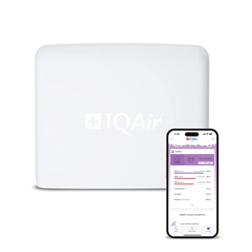
Monitor your outdoor air quality in real-time with professional-grade sensors that track pollutants, temperature, and more. Connect via Wi-Fi or Ethernet and easily install this weatherproof device on a wall, roof, or pole to contribute data to the global IQAir network.
Tracking Climate Change Impacts on Vulnerable Populations
You’ll discover how organizations like Climate Central use sea-level rise projections and heat mapping to visualize climate threats facing frontline communities. Indigenous groups employ traditional ecological knowledge mapping combined with satellite imagery to document changes in wildlife patterns and seasonal cycles. Community health mapping initiatives correlate temperature data with hospitalization rates, revealing how extreme heat disproportionately affects elderly residents and outdoor workers in urban heat islands.
Mapping Green Space Inequities in Urban Areas
You can analyze park accessibility using tools like ParkServe and Google Earth Engine to calculate green space per capita across different neighborhoods. Environmental justice groups create interactive maps showing tree canopy coverage disparities between affluent and low-income areas. Community advocates use participatory mapping workshops to identify vacant lots suitable for community gardens, building compelling cases for equitable green infrastructure investments and urban forest expansion programs.
Human Rights Documentation and Advocacy Mapping
Human rights advocates increasingly rely on sophisticated mapping techniques to document violations and build compelling cases for accountability. You’ll discover how geographic visualization transforms abstract human rights data into powerful evidence that courts and international bodies can’t ignore.
Mapping Conflict Zones and Human Rights Violations
Conflict zone mapping utilizes satellite imagery and ground-truthed data to create verifiable documentation of human rights abuses. Organizations like Human Rights Watch combine GPS coordinates from witnesses with high-resolution satellite data to map mass graves, destroyed villages, and detention facilities. You can access tools like Google Earth Pro and Planet Labs imagery to cross-reference testimonial evidence with visual proof. Crisis Mappers Network coordinates real-time documentation during active conflicts, enabling investigators to preserve evidence before sites get altered or destroyed.
Documenting Displacement and Refugee Movements
Displacement mapping tracks population movements and documents the scale of forced migration crises through mobile data analysis and camp surveys. UNHCR uses GPS-enabled surveys to map refugee settlements and monitor population flows across borders. You’ll find platforms like Flowminder analyzing anonymized mobile phone data to understand migration patterns during humanitarian crises. The Internal Displacement Monitoring Centre creates interactive maps showing displacement trends over time, combining government data with field reports to reveal patterns that inform policy responses and resource allocation decisions.
Exposing Government Surveillance and Oppression
Surveillance mapping reveals patterns of government oppression by plotting locations of arrests, disappearances, and monitoring infrastructure. Organizations like Forensic Architecture use open-source intelligence to map surveillance cameras, phone towers, and detention facilities in authoritarian regimes. You can utilize OSINT techniques combining social media posts, government databases, and crowdsourced reports to document systematic oppression. Privacy International maps global surveillance technologies, while local activists use encrypted platforms like Ushahidi to safely report incidents and create evidence trails that protect sources while building comprehensive documentation.
Public Health and Disease Prevention Mapping
Public health professionals leverage mapping technology to identify disease patterns and optimize resource allocation across communities. These geographic insights transform how health organizations respond to outbreaks and address systemic healthcare inequalities.
Community Health Assessments and Resource Mapping
Community health mapping reveals critical gaps in healthcare infrastructure by visualizing the geographic distribution of medical facilities against population density. Organizations like the CDC use GIS platforms to map primary care shortage areas, identifying communities with limited access to essential services. Community health workers employ mobile data collection tools such as KoBo Toolbox to conduct door-to-door surveys, creating comprehensive maps that highlight specific health needs like diabetes prevalence or vaccination rates in underserved neighborhoods.
Disease Outbreak Tracking and Prevention
Disease surveillance mapping enables rapid response to health emergencies by tracking infection patterns across geographic areas. During COVID-19, platforms like HealthMap and Disease Outbreak News visualized case clusters in real-time, helping public health officials implement targeted interventions. Epidemiologists use ArcGIS Online to create heat maps showing disease transmission corridors, while contact tracing applications generate geographic networks that reveal how infections spread through communities, informing quarantine strategies and resource deployment decisions.
Mapping Healthcare Access Disparities
Healthcare equity mapping exposes systemic barriers that prevent communities from accessing quality medical care. Tools like the Health Resources and Services Administration’s Find Shortage Areas platform map medically underserved areas, revealing transportation challenges and provider shortages that disproportionately affect rural and low-income populations. Social determinants mapping combines healthcare facility locations with demographic data, income levels, and transportation networks to identify communities where residents face multiple barriers to accessing preventive care and specialized treatments.
Housing Justice and Anti-Displacement Mapping
Housing advocates harness mapping tools to expose displacement patterns and fight for equitable housing policies. These visualization strategies transform complex housing data into compelling evidence for policy reform.
Documenting Gentrification and Community Changes
Gentrification mapping reveals demographic shifts and rising property values that threaten longtime residents. Organizations like the Anti-Eviction Mapping Project combine census data with real estate records to visualize neighborhood transformation patterns. These maps overlay income changes, racial demographics, and property values to document displacement pressures. Community-generated story maps feature resident testimonials alongside data points, creating powerful narratives about gentrification’s human impact. Interactive timelines show how neighborhoods change over decades, helping advocates demonstrate systematic displacement patterns to policymakers and media outlets.
Understand the structure of a one-hour TV drama pilot. This book provides a guide to story mapping for television.

Mapping Affordable Housing Availability
Affordable housing maps expose the stark shortage of accessible units across metropolitan areas. Housing advocates use platforms like PolicyMap to visualize subsidized housing locations against public transit networks and job centers. These spatial analyses reveal how affordable units cluster in areas with limited opportunities and poor transportation access. Advocates map housing waitlist data to show demand hotspots where families face years-long delays. Interactive tools allow users to search by income level and family size, demonstrating how few truly affordable options exist for different demographic groups.
Tracking Evictions and Housing Violations
Eviction mapping transforms court records into geographic patterns that expose landlord practices and vulnerable neighborhoods. The Eviction Lab’s mapping platform reveals how eviction rates correlate with racial demographics and poverty levels across cities. Housing advocates map code violations alongside eviction filings to identify problem landlords who use poor conditions to push out tenants. These visualizations combine multiple datasets—court records, inspection reports, and ownership data—to build comprehensive profiles of housing exploitation. Real-time eviction tracking helps legal aid organizations deploy resources to neighborhoods facing displacement crises.
Food Security and Agricultural Justice Mapping
Food security advocates use mapping to expose disparities in food access and document agricultural worker exploitation. These maps transform statistical data into compelling visual narratives that drive policy change and community action.
Identifying Food Deserts in Underserved Communities
Food desert mapping reveals geographic gaps in grocery store access by overlaying demographic data with business locations. You’ll find tools like USDA’s Food Access Research Atlas identifying census tracts where residents travel over one mile to reach fresh produce. Community organizations use these maps to advocate for mobile markets and zoning changes that attract grocery retailers to underserved neighborhoods.
Mapping Urban Agriculture and Community Gardens
Urban agriculture mapping documents food production spaces in cities using GPS coordinates and aerial imagery analysis. Organizations like Growing Power create interactive maps showing community gardens, rooftop farms, and food forests to promote local food systems. You can use platforms like LocalHarvest to map food hubs and farmers markets, revealing how urban agriculture fills nutritional gaps in food desert areas.
Documenting Agricultural Worker Rights Violations
Agricultural worker mapping combines workplace injury reports with geographic data to expose systematic labor violations. Groups like the Coalition of Immokalee Workers use GPS tracking to document wage theft locations and unsafe working conditions across farmlands. These maps reveal patterns of exploitation by connecting health department records with immigration enforcement data, creating powerful evidence for policy reform and worker protection campaigns.
Track vehicles and assets with the LandAirSea 54 GPS Tracker. Get real-time location alerts and historical playback using the SilverCloud app, with a long-lasting battery and discreet magnetic mount.

Digital Divide and Technology Access Mapping
Technology advocates use mapping to expose inequities in digital access and build cases for infrastructure investment. These digital divide maps reveal patterns of connectivity gaps that often mirror existing socioeconomic disparities.
Mapping Internet Connectivity Gaps
Broadband availability mapping reveals stark disparities between urban and rural internet access across communities. You’ll find tools like the FCC’s National Broadband Map displaying connection speeds and provider coverage, while advocacy groups create overlay maps combining broadband data with income demographics. Organizations like Connected Nation document areas where families lack reliable internet access, creating compelling visual evidence for infrastructure funding requests and policy reform initiatives.
Documenting Digital Literacy Resources
Digital literacy resource mapping identifies where communities can access technology training and support services. You can map locations of computer labs, digital literacy programs, and device lending programs to reveal service gaps in underserved neighborhoods. Libraries, community centers, and nonprofit organizations use these maps to coordinate programming and identify areas needing additional support. Tools like ArcGIS Online help visualize the relationship between digital skill resources and demographic data.
Tracking Technology Access in Educational Settings
Educational technology mapping exposes disparities in device access and internet connectivity within school districts. You’ll see advocates mapping student device ratios, Wi-Fi availability, and remote learning capabilities to identify schools requiring additional technology resources. During COVID-19, organizations created maps showing which students lacked home internet access for virtual learning. These visualizations help districts prioritize technology investments and advocate for digital equity funding in educational settings.
Conclusion
These seven mapping applications demonstrate how geographic visualization has become an essential tool for modern activism. When you combine location data with social issues you create compelling narratives that drive policy change and community mobilization.
The power of mapping lies in its ability to transform abstract problems into concrete visual evidence. Whether you’re documenting environmental injustices or tracking displacement patterns these tools help advocates build stronger cases for reform.
As mapping technology continues to evolve you’ll find even more opportunities to leverage geographic data for social impact. The key is choosing the right platform and approach that aligns with your specific advocacy goals and community needs.
Frequently Asked Questions
What is social activism mapping and how does it work?
Social activism mapping uses geographic visualization tools to transform complex social issues into compelling visual evidence. Activists utilize platforms ranging from Google Maps to advanced GIS systems to display patterns of inequality, environmental hazards, and community challenges. These maps help mobilize communities by making abstract problems tangible and actionable.
How do activists use mapping for disaster response and emergency management?
Activists employ real-time crisis mapping using crowdsourced data and satellite imagery during natural disasters. Platforms like OpenStreetMap’s HOT and Ushahidi create live incident maps for emergency responders. Community-based risk assessment workshops help residents identify vulnerabilities, while geographic coordination platforms optimize relief efforts and resource distribution.
What role does mapping play in environmental justice advocacy?
Environmental justice advocates use mapping to expose pollution hotspots and systemic inequalities in marginalized communities. Tools like EPA’s EJSCREEN and AirVisual help document toxic facility clustering near communities of color. Organizations create story maps combining air quality data with demographic information to illustrate climate impacts on vulnerable populations.
How do human rights organizations use mapping for documentation?
Human rights advocates employ satellite imagery and GPS coordinates to document violations in conflict zones, including mass graves and detention facilities. They track displacement patterns during migration crises and map surveillance infrastructure to reveal government oppression patterns. These maps transform abstract data into powerful evidence for accountability.
What is healthcare equity mapping and why is it important?
Healthcare equity mapping visualizes the distribution of medical facilities against population density to reveal gaps in healthcare infrastructure. It tracks disease outbreaks in real-time, exposes barriers to quality medical care access, and highlights transportation challenges affecting rural and low-income populations, helping optimize resource allocation.
How does housing justice mapping combat gentrification and displacement?
Housing advocates use mapping to expose displacement patterns and demographic shifts threatening longtime residents. Tools like the Anti-Eviction Mapping Project visualize neighborhood transformations, affordable housing shortages, and eviction patterns. These maps help legal aid organizations respond to displacement crises and advocate for equitable housing policies.
What is food security mapping and how does it address food deserts?
Food security mapping reveals geographic gaps in grocery store access and documents food production spaces in cities. It exposes disparities in food access while combining workplace injury reports with geographic data to document agricultural worker exploitation, creating evidence for policy reform and worker protection campaigns.
How does digital divide mapping expose technology inequities?
Digital divide mapping reveals disparities between urban and rural internet access using tools like the FCC’s National Broadband Map. It identifies gaps in technology training, exposes educational device access disparities within school districts, and helps prioritize infrastructure investments while advocating for digital equity in educational settings.