7 Best Map Design Tips for Readability
Why it matters: Your map design can make or break user experience — whether you’re building a navigation app or displaying data visualizations.
The big picture: User-centered design puts your audience’s needs first transforming complex geographic information into intuitive visual experiences that actually work.
What’s ahead: We’ll explore seven proven strategies that’ll help you create maps users love — from simplifying visual clutter to optimizing for mobile interactions.
Disclosure: As an Amazon Associate, this site earns from qualifying purchases. Thank you!
P.S. check out Udemy’s GIS, Mapping & Remote Sensing courses on sale here…
Prioritize Clear Visual Hierarchy and Information Architecture
Your map’s success depends on how effectively you organize information layers to guide users through complex geographic data. A well-structured visual hierarchy transforms overwhelming datasets into intuitive navigation tools.
Establish Primary, Secondary, and Tertiary Information Levels
You’ll create effective maps by assigning importance levels to each data layer based on user objectives. Primary elements like major roads or destination markers should dominate the visual field through larger symbols and high contrast colors. Secondary features such as minor streets or landmarks need moderate prominence using mid-tone colors and smaller symbols. Tertiary information including grid lines or administrative boundaries should remain subtle with light gray tones and thin line weights.
Use Typography and Color to Guide User Attention
Your typography choices directly impact how users process map information in scanning patterns. Primary labels require bold, high-contrast fonts at 12-14pt sizes for immediate recognition of key locations. Secondary text should use medium-weight fonts at 10-12pt with darker colors to maintain readability without competing with primary elements. Color temperature creates natural attention flow – warm colors like red and orange draw focus to critical features while cool blues and greens recede into supporting roles.
Organize Map Elements Based on User Tasks
You’ll optimize user experience by grouping related map elements according to specific workflow requirements. Navigation-focused designs should cluster transportation networks, waypoints, and distance indicators in logical proximity. Data analysis maps need statistical overlays positioned near their corresponding geographic features with consistent symbol placement. Interactive elements like zoom controls and layer toggles must occupy predictable screen positions that don’t interfere with primary map content or user touch targets.
Implement Intuitive Navigation and Wayfinding Systems
Effective navigation systems transform complex geographic information into user-friendly pathways. You’ll need to balance visual clarity with functional guidance to help users move confidently through your mapped environment.
Navigate with ease using this 7-inch GPS navigator, featuring real-time voice guidance and pre-loaded 2025 maps. Customize routes based on your vehicle type to avoid restrictions and receive speed & red light warnings.

Design Recognizable Icons and Symbols
Universal symbols reduce cognitive load by leveraging familiar visual language. Standard icons like arrows for directions, magnifying glasses for search, and house symbols for home locations immediately communicate their purpose across cultures and languages.
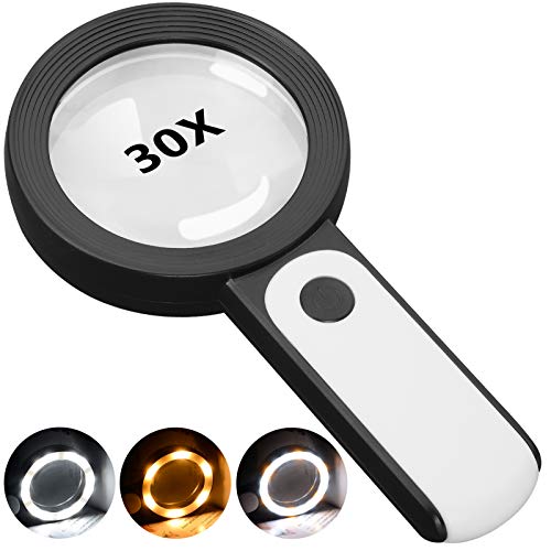
This 30X magnifying glass helps users with low vision easily read small text. Featuring a large 3.15" lens and 18 LEDs with adjustable cool, warm, and mixed light modes, it reduces eye strain and improves reading in any lighting.
Consistent sizing ensures your navigation icons remain legible at various zoom levels. Design icons at 24×24 pixels minimum for mobile interfaces, with scalable vector formats that maintain clarity when enlarged. Test icon recognition with users who aren’t familiar with your specific mapping application.
Provide Clear Directional Indicators
Compass roses and north arrows establish spatial orientation, particularly crucial for users navigating unfamiliar territories. Position these elements in consistent locations—typically upper-right corners—where users expect to find orientation tools.
Breadcrumb trails show users their navigation path and current location within the map hierarchy. Display up to three levels of location context, such as “Country > State > City,” allowing users to understand their position and easily backtrack to broader geographic areas.
Include Consistent Navigation Patterns
Predictable control placement builds user confidence through muscle memory. Position zoom controls, layer toggles, and search functions in identical locations across all map views. Users shouldn’t need to hunt for basic navigation tools when switching between different map sections.
Standardized gestures align with platform conventions—pinch-to-zoom, drag-to-pan, and double-tap-to-zoom work intuitively because users already know these interactions. Avoid creating custom gestures that conflict with established mobile mapping behaviors your audience expects.
Optimize for Multiple Device Types and Screen Sizes
Your map’s effectiveness depends heavily on how well it adapts across different devices and screen configurations. Responsive design ensures your cartographic work delivers consistent user experiences whether viewed on smartphones, tablets, or desktop displays.
Experience vivid content on the Galaxy A16 5G's 6.7" display and capture stunning photos with its triple-lens camera. Enjoy peace of mind with a durable design, six years of updates, and Super Fast Charging.

Create Responsive Map Layouts
Design flexible grid systems that automatically adjust map elements based on available screen space. Use percentage-based widths for legend boxes and control panels rather than fixed pixel dimensions. Implement breakpoints at 768px and 1024px to trigger layout changes for tablet and desktop views. Stack vertical elements on smaller screens while maintaining horizontal arrangements on larger displays for optimal information density.
Adapt Touch Targets for Mobile Interaction
Size interactive elements to minimum 44px by 44px following Apple’s Human Interface Guidelines and Google’s Material Design standards. Space clickable buttons at least 8px apart to prevent accidental touches during map navigation. Design zoom controls with finger-friendly proportions and position pan controls away from common thumb reach zones. Test touch responsiveness across different device orientations to ensure consistent interaction patterns.
Ensure Readability Across Different Screen Resolutions
Scale text labels dynamically using relative units like em or rem instead of fixed pixel sizes. Maintain minimum 12px font sizes on mobile devices and 14px on desktop displays for optimal legibility. Adjust line weights and symbol sizes proportionally across resolution densities – what appears clear on retina displays may become illegible on standard screens. Use vector-based icons and symbols that remain crisp at all zoom levels and pixel densities.
Incorporate Accessibility Features for All Users
Accessibility transforms maps from exclusive tools into inclusive resources that serve diverse user needs. Modern cartographic standards require designs that accommodate users with varying visual, motor, and cognitive abilities.
Design for Color-Blind and Visually Impaired Users
Implement colorblind-safe palettes using tools like ColorBrewer or Viz Palette to ensure data remains distinguishable across color vision types. Use pattern overlays and texture fills alongside color coding for categorical data. Test color combinations with simulators like Coblis or Stark to verify accessibility across deuteranopia, protanopia, and tritanopia conditions. Maintain contrast ratios of at least 4.5:1 between text and background elements to meet WCAG standards.
Implement Screen Reader Compatibility
Structure map data with semantic HTML elements and ARIA labels that describe geographic features meaningfully. Use role attributes like “application” for interactive maps and “img” for static visualizations. Provide logical reading order by organizing map layers hierarchically so screen readers can navigate from major landmarks to specific details. Ensure all interactive elements have descriptive focus states and keyboard navigation support for users relying on assistive technologies.
Protect your eyes with RaoOG blue light blocking reading glasses. Featuring flexible spring hinges for a comfortable fit and accurate magnification for clear, distortion-free vision.

Provide Alternative Text for Map Elements
Write descriptive alt text that conveys the map’s purpose, geographic scope, and key data patterns rather than simply listing features. For choropleth maps, describe the data distribution and notable trends. Create detailed captions for complex visualizations that explain symbology, data sources, and interpretation guidance. Use structured descriptions that progress from general context to specific details, helping non-visual users understand spatial relationships and data significance effectively.
Customize Content Based on User Context and Needs
Your map’s effectiveness depends on delivering relevant information that matches your users’ specific circumstances and objectives. Context-aware design transforms generic mapping interfaces into personalized navigation tools.
Display Location-Specific Information
Present relevant data based on your user’s geographic position and immediate surroundings. Show nearby amenities like restaurants, gas stations, or transit stops within walking distance. Display local weather conditions, traffic patterns, or regional hazards that affect navigation decisions. Include culturally relevant landmarks and points of interest that resonate with local users. Implement geofencing to trigger location-specific alerts or recommendations automatically. This approach reduces information overload while increasing the map’s practical value for immediate decision-making.
Filter Content by User Preferences
Enable users to customize their map view according to their specific interests and needs. Offer toggle options for different data layers like bike paths, public transportation, or accessibility features. Allow users to save preference profiles for different activities such as hiking, driving, or walking. Implement smart filtering that learns from user behavior and emphasizes frequently accessed features. Provide industry-specific overlays for professionals like delivery drivers or field researchers. These customization options ensure your map displays only the most relevant information for each user’s current purpose.
Adapt Map Detail Based on Zoom Level
Adjust information density and feature prominence as users change their viewing scale. Display broad regional features at low zoom levels while revealing street-level details as users zoom in. Use progressive disclosure to show basic landmarks first, then add specific addresses and building details at higher magnifications. Implement scale-appropriate labeling that prevents text overcrowding at any zoom level. Apply generalization techniques that maintain geographic accuracy while optimizing visual clarity across all scales. This hierarchical approach ensures your map remains readable and useful at every viewing distance.
Provide Interactive Feedback and Real-Time Updates
Interactive feedback transforms static maps into dynamic tools that respond to user actions and changing conditions. Real-time updates ensure your map data remains current and actionable for navigation and decision-making purposes.
Show User Location and Movement
Location accuracy depends on GPS precision and your chosen positioning system. Display user position with a distinct marker that contrasts against map backgrounds while maintaining 20-pixel minimum touch targets for mobile devices. Movement indicators like directional arrows or trailing paths help users understand their orientation and travel history. Consider implementing location smoothing algorithms to reduce GPS jitter and provide stable position updates every 2-3 seconds for optimal user experience.
Display Loading States and Progress Indicators
Loading states prevent user confusion during data retrieval and tile rendering processes. Implement skeleton screens or progressive loading patterns that show map structure before detailed content loads. Progress indicators should reflect actual loading time with percentage completion for large datasets or multi-layer maps. Use animated spinners for quick operations under 3 seconds and progress bars for longer processes like route calculations or complex spatial analysis operations.
Offer Contextual Help and Tooltips
Contextual assistance reduces cognitive load by providing relevant information at decision points. Display tooltips on hover for desktop users and implement long-press gestures for mobile interaction with map features. Help content should explain specific map symbols navigation controls and data interpretation without cluttering the interface. Position tooltips using smart placement algorithms that avoid screen edges and ensure readability across different zoom levels and device orientations.
Test and Iterate Through User Research and Analytics
User-centered map design isn’t complete without continuous validation and refinement. Your map’s success depends on understanding how real users interact with your design and making data-driven improvements.
Conduct Usability Testing Sessions
Schedule regular testing sessions with 5-8 participants from your target user group. Set up controlled environments where users complete specific navigation tasks while you observe their interactions. Record screen activity and verbal feedback as participants work through common scenarios like finding locations or interpreting data layers. Focus on identifying pain points where users hesitate, make errors, or express confusion. Test both desktop and mobile versions separately to capture device-specific usability issues.
Analyze User Behavior Patterns
Monitor analytics data to identify where users struggle most with your map interface. Track metrics like time-to-completion for common tasks, abandonment rates at specific interaction points, and heat maps showing click patterns. Pay attention to zoom level preferences and feature usage frequency to understand which elements provide the most value. Use tools like Google Analytics or specialized mapping analytics platforms to capture user flow patterns and identify areas where users consistently get stuck or leave the application.
Gather Feedback Through Surveys and Interviews
Deploy targeted surveys immediately after users complete mapping tasks to capture fresh impressions and specific pain points. Create brief questionnaires focusing on task difficulty, feature discoverability, and overall satisfaction with the map experience. Conduct follow-up interviews with 10-15% of survey respondents to dive deeper into their feedback and uncover underlying usability issues. Ask open-ended questions about their mental models and expectations to understand gaps between your design intent and user perception.
Conclusion
Creating user-centered maps isn’t just about making them look good—it’s about making them work for your users. When you prioritize clear visual hierarchy optimize for different devices and ensure accessibility you’re building tools that people can actually use effectively.
Remember that great map design is an ongoing process. Your users’ needs will evolve and technology will continue to advance. By staying committed to user research and continuous testing you’ll keep your maps relevant and valuable.
The seven strategies we’ve covered give you a solid foundation but the real magic happens when you adapt them to your specific audience and goals. Start implementing these principles today and watch how they transform your users’ mapping experience.
Achieve a flawless, even complexion with e.l.f. Flawless Satin Foundation. This lightweight, vegan formula provides medium coverage and a semi-matte finish for all-day wear, while hydrating your skin with glycerin.

Frequently Asked Questions
What is user-centered design in map creation?
User-centered design in map creation prioritizes the audience’s needs by transforming complex geographic information into intuitive visuals. This approach focuses on understanding user goals, tasks, and contexts to create maps that are easy to navigate and understand, reducing cognitive load while enhancing overall user experience.
How do I create an effective visual hierarchy in maps?
Create visual hierarchy by establishing primary, secondary, and tertiary information levels. Use bold fonts and high-contrast colors for major elements, while keeping less critical features more subtle. Organize information layers logically and use color temperature to create natural flow, guiding users’ attention to the most important map elements first.
What makes navigation icons effective on maps?
Effective navigation icons are recognizable, consistently sized, and universally understood. Use standard icons that communicate their purpose clearly, maintain consistent sizing for legibility across zoom levels, and conduct user testing for icon recognition. This reduces cognitive load and helps users navigate confidently through your mapped environment.
Why is responsive design important for maps?
Responsive design ensures maps work consistently across smartphones, tablets, and desktops. It involves creating flexible grid systems that adjust based on screen space, implementing appropriate breakpoints, and using scalable text with vector-based icons. This approach maintains usability and readability regardless of the device or screen size used.
How can I make my maps accessible to all users?
Make maps accessible by implementing colorblind-safe palettes, using pattern overlays for data distinction, and ensuring screen reader compatibility with semantic HTML and ARIA labels. Provide meaningful alternative text for map elements and descriptions that convey the map’s purpose and key data patterns for non-visual users.
What is contextual customization in mapping?
Contextual customization involves tailoring map content to users’ specific circumstances and objectives. This includes displaying location-specific information like nearby amenities, allowing content filtering by user preferences, and adapting detail levels based on zoom. This approach ensures maps deliver relevant information when and where users need it most.
How do real-time updates improve map usability?
Real-time updates transform static maps into dynamic tools that respond to user actions and changing conditions. Features like accurate location display, loading states, progress indicators, and contextual tooltips create a more engaging experience while preventing user confusion during data retrieval and navigation processes.
Why is continuous user testing important for map design?
Continuous user testing through usability sessions, analytics analysis, and user feedback helps identify pain points and usage patterns. This iterative, data-driven approach ensures map designs align with real user needs, leading to improved effectiveness and user satisfaction while reducing navigation difficulties and confusion.