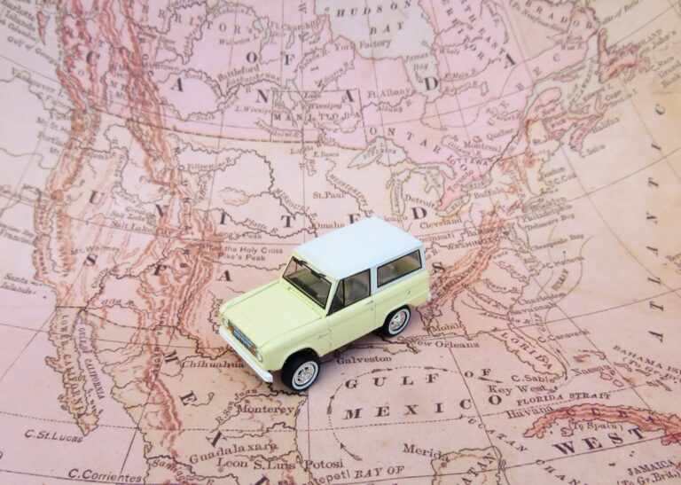
7 Best Map Design Ideas for Apps
You’re looking at maps differently now that digital experiences dominate how users navigate and explore information. Modern applications demand map designs that break away from traditional GPS aesthetics and embrace creative visual storytelling that engages users while delivering functional navigation. The most innovative apps today use eclectic map styles that transform mundane location data into compelling visual experiences that users actually want to interact with.
Disclosure: As an Amazon Associate, this site earns from qualifying purchases. Thank you!
Minimalist Vector Maps With Bold Color Palettes
Minimalist vector maps with bold color palettes represent a sophisticated approach to digital cartography that prioritizes visual impact while maintaining functional clarity. This design philosophy strips away unnecessary visual elements while amplifying essential geographic information through strategic color choices.
Clean Line Work and Geometric Shapes
Clean line work creates the foundation for effective minimalist map design by reducing visual noise while preserving spatial relationships. You’ll achieve optimal results by using consistent stroke weights between 1-3 pixels for roads and 0.5-1 pixel for administrative boundaries. Geometric shapes like circles for points of interest and simplified polygons for land features enhance readability across all zoom levels. Tools like Mapbox Studio and Adobe Illustrator provide precise vector control for creating these refined geometric elements.
P.S. check out Udemy’s GIS, Mapping & Remote Sensing courses on sale here…
Achieve a flawless, even complexion with e.l.f. Flawless Satin Foundation. This lightweight, vegan formula provides medium coverage and a semi-matte finish for all-day wear, while hydrating your skin with glycerin.

Strategic Use of Contrast Colors
Strategic color contrast transforms minimalist maps into powerful visual communication tools by guiding user attention to critical information. You should implement high contrast ratios of at least 4.5:1 between background and foreground elements to ensure accessibility compliance. Bold accent colors like electric blue (#0066FF) or vibrant orange (#FF6600) work effectively against neutral backgrounds such as charcoal (#2C2C2C) or warm gray (#F5F5F5). Color temperature differences between warm and cool tones create natural hierarchy without overwhelming the user experience.
Typography Integration for Modern Appeal
Typography integration elevates minimalist vector maps by establishing clear information hierarchy through thoughtful font selection and placement. You’ll maximize readability by choosing sans-serif typefaces like Helvetica Neue or Open Sans at sizes ranging from 10-16px depending on map scale. Strategic label positioning using offset techniques and leader lines prevents text overlap while maintaining spatial accuracy. Modern typography systems support multiple languages and character sets, ensuring your minimalist design philosophy translates effectively across global applications.
Hand-Drawn Illustrated Maps With Artistic Flair
Hand-drawn maps bring warmth and personality to modern applications while maintaining clear spatial relationships. These artistic approaches transform functional mapping into engaging visual narratives that users remember and share.
Watercolor and Sketch Techniques
Create vibrant watercolor art with this portable set. It includes 40 colors (metallic & fluorescent), a brush pen, watercolor paper, and more, all in a stylish tin box.

Watercolor techniques create organic boundaries and depth through layered transparency effects. Digital tools like Procreate and Adobe Fresco simulate natural pigment bleeding for authentic texture. Sketch-style linework adds character through varying stroke weights and intentional imperfections. Combine pencil textures with soft color washes to establish clear geographic features while maintaining artistic appeal. Export high-resolution assets at 300 DPI to preserve fine details across different screen densities.
Custom Icons and Landmarks
Custom illustrated icons replace standard mapping symbols with brand-specific artwork that reflects local culture. Design landmark illustrations using simplified shapes and consistent color palettes to maintain readability at small scales. Create scalable vector graphics for restaurants, attractions, and transportation hubs using tools like Adobe Illustrator or Figma. Test icon recognition at mobile sizes before implementation. Maintain 2:1 contrast ratios between icon colors and background elements for accessibility compliance.
Learn Adobe Illustrator with the 2025 release of this comprehensive guide. Master essential skills through hands-on lessons.

Personal Touch for Brand Storytelling
Brand storytelling through maps connects geographic data with company values and user experiences. Incorporate brand colors into terrain features and use custom typography that matches your visual identity. Develop illustrated elements that reflect your brand’s personality while serving functional navigation purposes. Create consistent visual themes across different map zoom levels. Document your artistic style guidelines to ensure cohesive implementation across multiple team members and future map updates.
Dark Mode Maps With Neon Accents
Dark mode mapping transforms traditional cartographic conventions by leveraging high-contrast aesthetics and luminous design elements. You’ll create visually striking interfaces that reduce eye strain while maintaining precise spatial navigation capabilities.
High Contrast Design Elements
High contrast ratios between dark backgrounds and bright accent colors ensure optimal readability across different screen technologies. You should maintain at least 4.5:1 contrast ratios for WCAG compliance while using deep charcoal or true black base layers.
Select bright cyan, electric blue, or vibrant green for primary navigation elements like route lines and poi markers. Test your color combinations against both AMOLED and LCD displays to verify consistent visibility. Consider using gradient transitions between contrast levels to create smooth visual hierarchies without sacrificing accessibility standards.
Glowing Effects and Highlights
Glowing effects simulate light emission through CSS box-shadow properties or SVG filter techniques in web-based mapping platforms. You can apply subtle outer glows to road networks using rgba color values with low opacity settings.
Implement pulsing animations for active location markers using keyframe sequences that cycle opacity between 0.6 and 1.0. Layer multiple glow intensities to create depth perception – apply tight inner glows for definition and broader outer glows for atmospheric effects. Balance glow radius with zoom levels to maintain visual clarity at different map scales.
Modern Gaming and Tech Aesthetics
Gaming-inspired aesthetics incorporate HUD-style interface elements and sci-fi visual language into practical navigation design. You’ll integrate angular typography, geometric patterns, and holographic-style transparency effects that reference cyberpunk and futuristic gaming interfaces.
Use hexagonal grid overlays for area boundaries and implement circuit board-inspired line patterns for secondary road networks. Apply subtle scan line effects or digital noise textures to background layers while maintaining primary route visibility. Consider integrating animated elements like radar sweeps or data stream visualizations that activate during route calculation or location updates.
Interactive 3D Isometric Map Designs
3D isometric map designs create spatial depth that transforms flat geographic data into engaging dimensional experiences. These elevated perspectives combine technical precision with visual appeal to enhance modern application interfaces.
Layered Depth and Dimension
Building successful isometric maps requires strategic layering techniques that establish clear visual hierarchy through height variations. You’ll create depth by elevating buildings 15-30 pixels above ground level and positioning transportation networks at intermediate heights. Tools like Blender and Cinema 4D provide precise control over layer positioning and perspective angles. Shadow casting between layers adds realistic depth perception while maintaining clean geometric forms essential for user navigation clarity.
Hover Effects and Animation
Implementing hover interactions transforms static isometric elements into responsive navigation tools that guide user exploration. You’ll design smooth elevation transitions where buildings rise 5-10 pixels on cursor contact using CSS3 transforms or JavaScript libraries like Three.js. Subtle pulsing effects on points of interest create visual hierarchy without overwhelming the interface. Color temperature shifts from cool to warm tones during hover states provide immediate feedback while maintaining accessibility standards.
Enhanced User Engagement Features
Interactive tooltips and expandable information panels maximize the storytelling potential of isometric map designs through contextual data display. You’ll integrate click-to-zoom functionality that maintains perspective consistency while revealing detailed building interiors or street-level information. Real-time data integration displays live traffic patterns or occupancy levels through animated color changes. Progressive disclosure techniques reveal additional map layers based on user zoom levels, preventing visual clutter while providing comprehensive geographic information.
Vintage-Inspired Maps With Contemporary Twists
Vintage-inspired maps bridge nostalgic aesthetics with modern functionality, creating designs that feel both timeless and cutting-edge. These maps leverage historical cartographic elements while incorporating contemporary digital capabilities and user interface standards.
Retro Color Schemes and Textures
Retro color schemes utilize muted earth tones, sepia gradients, and aged paper textures to evoke classic cartographic traditions. You’ll achieve authentic vintage appeal by implementing color palettes from the 1940s-1960s, including burnt oranges, deep teals, and cream backgrounds. Digital aging techniques like subtle grain overlays and weathered edges enhance the nostalgic atmosphere while maintaining crisp vector clarity for modern screens.
Modern Typography and Layout
Modern typography transforms vintage maps by pairing classic serif fonts with contemporary sans-serif elements for optimal readability. You can combine traditional cartographic letterforms like Trajan Pro with clean interface fonts such as Roboto or Open Sans. Strategic typography hierarchy ensures navigation elements remain accessible while preserving the authentic feel of historical map labeling conventions and traditional compass rose designs.
Nostalgic Appeal for Modern Audiences
Nostalgic appeal connects with modern audiences through familiar visual references from historical atlases and vintage travel posters. You’ll engage users by incorporating hand-lettered style headers, decorative border elements, and illustrated compass roses that trigger positive associations with exploration and discovery. This approach transforms routine navigation into an engaging experience that feels both sophisticated and approachable for contemporary digital applications.
Abstract Geometric Map Interpretations
Abstract geometric interpretations transform traditional cartographic elements into contemporary visual statements that prioritize form and aesthetic impact over literal geographic representation.
Simplified Shapes and Patterns
Geometric abstraction reduces complex geographic features into essential forms like circles, triangles, and hexagons. You’ll create striking visual patterns by converting coastlines into angular segments and representing urban areas through tessellated shapes. Tools like Figma and Sketch excel at generating these precise geometric interpretations. Consider using modular grid systems to maintain consistency across different zoom levels while ensuring your simplified patterns remain recognizable as geographic features.
Creative Data Visualization
Data-driven geometry transforms statistical information into compelling visual narratives through abstract mapping techniques. You can represent population density using varying polygon sizes or traffic patterns through animated geometric flows. Platforms like D3.js and Observable enable dynamic geometric visualizations that respond to real-time data feeds. Incorporate color gradients within geometric shapes to show data intensity while maintaining the abstract aesthetic that distinguishes your design from conventional mapping approaches.
Artistic Approach to Geographic Information
Conceptual mapping treats geographic data as raw material for artistic expression rather than literal representation. You’ll develop unique visual languages by combining geometric abstraction with data accuracy requirements. Experiment with overlapping transparent shapes to create depth and layered meaning in your geographic interpretations. Balance artistic vision with functional navigation by ensuring essential wayfinding elements remain clear within your abstract framework, creating maps that serve as both practical tools and visual art pieces.
Mixed Media Collage Style Maps
Mixed media collage style maps blend traditional and digital techniques to create layered visual narratives that transform geographic data into artistic experiences. These innovative designs combine photography, illustration, textures, and typography to produce maps that function as both navigation tools and visual storytelling platforms.
Combining Photography and Illustration
Blend aerial photography with hand-drawn elements to create maps that showcase both realistic terrain and artistic interpretation. You’ll achieve compelling visual depth by layering satellite imagery beneath illustrated landmarks and custom iconography. Tools like Photoshop and Procreate allow you to seamlessly integrate high-resolution geographic photography with vector illustrations, creating hybrid designs that maintain spatial accuracy while adding artistic personality. This technique works particularly well for tourism applications and cultural mapping projects where authenticity meets creativity.
Textured Overlays and Layers
Layer paper textures, fabric patterns, and digital brush strokes to add tactile quality to your digital maps. You can incorporate scanned vintage maps, watercolor washes, and geometric patterns as overlay elements that enhance visual interest without compromising readability. Adobe After Effects and Figma provide precise opacity controls and blending modes that help you balance textural elements with essential geographic information. These layered approaches create maps that feel handcrafted while maintaining the precision and scalability required for modern applications.
Unique Visual Storytelling Elements
Integrate typography, historical artifacts, and cultural symbols to transform maps into narrative experiences that connect users with place-based stories. You’ll enhance engagement by incorporating vintage postcards, architectural sketches, and local artwork as decorative elements that provide cultural context. Canva and InDesign offer extensive libraries of visual elements that you can combine with geographic data to create maps that tell comprehensive stories about locations, communities, and historical events through carefully curated visual collages.
Conclusion
These seven eclectic map design approaches offer you powerful tools to transform standard geographic interfaces into memorable user experiences. You’ll find that each style serves different purposes – from minimalist vectors that prioritize clarity to mixed media collages that tell rich stories.
Your choice depends on your application’s goals and target audience. Dark mode maps with neon accents work brilliantly for tech-forward apps while vintage-inspired designs connect with users seeking familiarity and warmth.
The key is balancing visual innovation with practical functionality. You can create maps that users actually want to explore rather than simply endure. Start experimenting with these techniques and watch your engagement metrics improve as users spend more time discovering what your application has to offer.
Frequently Asked Questions
What makes modern map design different from traditional GPS aesthetics?
Modern map design focuses on creative visual storytelling and user engagement rather than just functional navigation. It transforms ordinary location data into captivating visual experiences using innovative styles, bold color palettes, custom illustrations, and interactive elements that encourage user interaction and brand connection.
What are the key elements of minimalist vector map design?
Minimalist vector maps feature clean line work, geometric shapes, bold color palettes, and strategic contrast colors. They prioritize visual impact while maintaining functional clarity and readability. Essential tools include Mapbox Studio and Adobe Illustrator for precise design control and accessibility compliance.
How do hand-drawn illustrated maps enhance user experience?
Hand-drawn maps add warmth and personality to applications while preserving spatial relationships. They use watercolor techniques, sketch-style linework, and custom icons to create engaging visual narratives. Digital tools like Procreate and Adobe Fresco help achieve authentic textures and brand-specific artwork.
What are the benefits of dark mode maps with neon accents?
Dark mode maps with neon accents create high-contrast aesthetics that enhance readability and visual appeal. They utilize bright colors for navigation elements, glowing effects for depth, and gaming-inspired HUD elements. This design maintains optimal contrast ratios while creating visually striking user experiences.
How do interactive 3D isometric maps improve navigation?
3D isometric maps transform flat geographic data into engaging dimensional experiences using strategic layering and visual hierarchy. They feature hover effects, animations, interactive tooltips, and click-to-zoom functionality. Tools like Blender and Cinema 4D enable precise control for immersive mapping experiences.
Why are vintage-inspired maps popular in modern applications?
Vintage-inspired maps blend nostalgic aesthetics with modern functionality, using retro color schemes, aged paper textures, and classic typography. They connect with users through familiar visual references while maintaining clarity for digital screens, transforming routine navigation into engaging experiences.
What is abstract geometric map interpretation?
Abstract geometric maps prioritize aesthetic impact over literal geographic representation using simplified shapes and patterns. They transform complex geographic features into striking visual statements and creative data visualizations. Tools like Figma, Sketch, D3.js, and Observable enable these artistic approaches to geographic information.
How do mixed media collage style maps work?
Mixed media collage maps blend traditional and digital techniques, combining photography and illustration to create layered visual narratives. They use textured overlays, cultural symbols, and unique typography to transform geographic data into artistic experiences that enhance user engagement and storytelling depth.