7 Best Spatial Data Art Ideas
You’re surrounded by spatial data every day—from GPS coordinates to population density maps—but traditional charts and graphs often fail to capture the full story. Artists and data scientists are breaking boundaries by transforming complex geographic information into stunning visual experiences that make patterns pop and insights stick.
The intersection of art and spatial analysis opens doors to creative storytelling that reaches audiences far beyond the typical data science community. Whether you’re mapping migration patterns through interactive sculptures or visualizing climate change through immersive installations, artistic approaches help people connect emotionally with data-driven insights.
Disclosure: As an Amazon Associate, this site earns from qualifying purchases. Thank you!
Transform Geographic Data Into Abstract Paintings
Geographic data becomes powerful visual art when you translate numerical values into artistic elements. Abstract painting techniques let you create compelling interpretations of spatial information that engage viewers on an emotional level.
P.S. check out Udemy’s GIS, Mapping & Remote Sensing courses on sale here…
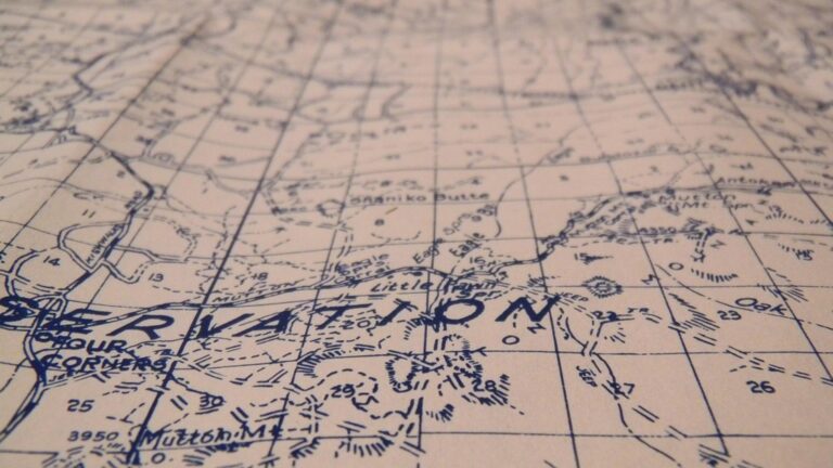
Color-Coded Elevation Maps
Transform topographic data into stunning abstract compositions using elevation-based color palettes. Assign warm colors like reds and oranges to high elevations and cool blues and purples to low-lying areas. You’ll create natural gradients that mirror mountain ranges and valleys while maintaining scientific accuracy. Digital painting software like Adobe Photoshop or Procreate lets you import DEM files and apply custom color ramps for artistic interpretation.
Population Density Heat Waves
Convert demographic data into flowing, wave-like patterns that represent human settlement intensity. Use thick, bold brushstrokes for densely populated urban centers and thin, delicate lines for rural areas. Layer different opacity levels to show population clusters as overlapping energy fields. This technique transforms census data into organic forms that suggest movement and growth patterns across your geographic region.
Climate Pattern Brushstrokes
Visualize weather and climate data through directional brushwork that follows wind patterns and temperature gradients. Paint precipitation data using vertical strokes of varying intensity and temperature changes with horizontal color transitions. Seasonal data becomes cyclical patterns while storm systems translate into dynamic, swirling compositions. Use texture brushes to represent different climate phenomena like drought conditions or humidity levels.
Create Interactive 3D Sculptures From Topographic Information
Transform your elevation data into tangible artworks that invite viewers to explore landscapes through touch and interaction.
Laser-Cut Terrain Models
Convert your DEM files into layered acrylic sculptures using laser cutting technology. Import elevation data into CAD software like AutoCAD or Fusion 360 to generate contour lines at 10-meter intervals. Stack laser-cut layers to create stepped terrain models that reveal mountain ridges, valleys, and watershed boundaries. Add LED backlighting between layers to highlight different elevation zones with color-coded illumination. These models work particularly well for displaying national park topography or urban development patterns.
Create professional designs with BeckerCAD 15 3D PRO, compatible with AutoCAD. Import/export DWG/DXF files and visualize your projects in realistic 3D.

3D Printed Landscape Formations
Upload your GIS raster data to 3D printing software like Blender or MeshLab to generate printable terrain meshes. Scale your vertical exaggeration to 2-3x normal proportions to emphasize subtle elevation changes in flat regions. Print models in multiple materials—use flexible filament for glacial areas and rigid PLA for rocky terrain. Create modular sections that connect together for large-scale installations. Consider printing at 1:50,000 scale for desktop displays or 1:10,000 for gallery installations.
Create 3D art with the SCRIB3D P1 3D Pen! This easy-to-use pen features adjustable speed control and includes PLA filament, a stencil book, and project guide to get you started.

Wire Frame Geographic Structures
Construct skeletal representations of terrain using aluminum or steel wire bent according to elevation profiles. Extract cross-sectional data from your DTM at regular intervals and transfer coordinates to a wire-bending jig. Weld intersection points to create three-dimensional grid structures that capture the essence of topographic form. These frameworks cast dramatic shadows that change throughout the day, creating dynamic visual experiences. Install motion sensors to trigger color-changing LED strips that follow the wire paths when viewers approach.
Protect your property with this wireless driveway alarm system. It features a long 1/2-mile range and a motion sensor that detects movement up to 50 feet away, reducing false alarms.

Design Data-Driven Murals Using Urban Planning Statistics
Transform city planning data into large-scale artistic installations that make municipal information accessible to everyone. These data-driven murals bridge the gap between complex urban analytics and public understanding.
Traffic Flow Artistic Representations
Create flowing visual narratives that transform vehicle count data into dynamic brushstrokes across building facades. Use varying line thickness to represent traffic volume – thick lines for highways carrying 50,000+ vehicles daily and thin streams for residential streets with under 5,000 cars. Apply color gradients from red (heavy congestion) to green (smooth flow) based on average speed data. Position these flow patterns at eye level where pedestrians naturally engage with the artwork while walking through urban corridors.
Building Height Gradient Walls
Design vertical color transitions that mirror your city’s skyline density patterns directly onto architectural surfaces. Map building heights from zoning data into color spectrums – deep blues for single-story structures transitioning through purples and oranges to bright yellows for skyscrapers over 20 stories. Scale the mural proportionally so viewers can identify their neighborhood’s development intensity. Include metallic accents or textural elements that catch sunlight differently throughout the day, creating dynamic shadows that emphasize height variations.
Green Space Distribution Patterns
Translate park coverage statistics into organic, nature-inspired designs that celebrate urban biodiversity. Use actual tree canopy data to create leaf-like patterns – dense clustering represents areas with 60%+ green coverage while sparse designs show neighborhoods under 10% tree coverage. Incorporate local plant species silhouettes from botanical surveys and vary green tones based on park accessibility scores. Position these murals near transit stops or community centers where they spark conversations about environmental equity in urban planning.
Develop Augmented Reality Installations for Location-Based Datasets
Transform your spatial data into immersive AR experiences that blend physical locations with digital visualizations. These installations create powerful connections between geographic information and real-world spaces.
GPS Coordinate Light Projections
Project your coordinate data directly onto surfaces using location-aware light systems. You’ll create dynamic displays that respond to visitors’ positions with corresponding data visualizations. Install GPS-triggered projectors that illuminate building facades with population density maps when pedestrians approach specific coordinates. Configure motion sensors to activate elevation contours on sidewalks showing underground utility networks. Use laser projectors to display property boundaries and zoning information directly onto parcels during community planning meetings.
Mobile App Art Overlays
Develop smartphone applications that overlay artistic interpretations of spatial data onto camera feeds. You’ll transform mundane locations into information-rich environments through augmented reality interfaces. Design apps that reveal historical census data as floating geometric patterns above neighborhoods when viewed through phone cameras. Create AR filters that display air quality measurements as color-coded particle animations surrounding buildings. Build location-based experiences where users discover hidden demographic patterns through interactive 3D models anchored to specific geographic coordinates.
Experience vivid content on the Galaxy A16 5G's 6.7" display and capture stunning photos with its triple-lens camera. Enjoy peace of mind with a durable design, six years of updates, and Super Fast Charging.

Real-Time Spatial Data Visualizations
Stream live geographic data into AR installations that update continuously with current conditions. You’ll create responsive artworks that reflect changing spatial patterns throughout the day. Install weather station networks that feed temperature and humidity data into floating heat map visualizations above city blocks. Connect traffic sensors to AR displays showing vehicle flow patterns as animated light streams along roadways. Design installations that visualize social media check-ins as pulsing data clouds anchored to popular gathering spots.
Get real-time weather data with the Ambient Weather WS-2902. This WiFi-enabled station measures wind, temperature, humidity, rainfall, UV, and solar radiation, plus it connects to smart home devices and the Ambient Weather Network.

Construct Textile Art From Demographic Mapping Information
Transform population statistics and demographic data into tactile textile artworks that make census information accessible through touch and visual texture. These fabric-based installations create intimate connections between community members and their neighborhood data.
Embroidered Census Data
Stitch population density patterns directly onto fabric using embroidery techniques that translate numeric values into thread density. You’ll create age demographic visualizations by selecting different thread colors for each generation, with golden threads representing senior populations and vibrant blues depicting younger residents. Convert household income data into varying stitch lengths, where longer stitches indicate higher median incomes across census blocks. Use cross-stitch patterns to represent educational attainment levels, creating geometric designs that reveal neighborhood academic achievement patterns.
Woven Migration Patterns
Weave movement data into textile patterns using directional threads that follow actual migration routes between geographic regions. You’ll incorporate different fiber types to represent various migration waves, with silk threads depicting international movement and cotton representing domestic relocation patterns. Create color gradients that show migration intensity over time periods, using darker hues for peak movement years and lighter tones for quieter periods. Develop rhythmic weaving patterns that mirror seasonal migration cycles, incorporating texture changes that reflect the demographic characteristics of moving populations.
Create elegant projects with Superior Threads Tire Silk #50. This 109-yard spool of 3-ply silk thread offers a smooth finish and subtle sheen, perfect for quilting and sewing where a blended look is desired.

Quilted Boundary Representations
Piece together fabric squares that represent different census tracts or voting districts using traditional quilting methods. You’ll assign specific fabric patterns to demographic characteristics, creating visual narratives about community composition through textile selection. Use contrasting stitching patterns along fabric edges to highlight gerrymandered boundaries or disputed territorial lines. Incorporate metallic thread accents that trace major transportation corridors or natural boundaries, creating hierarchical visual systems that distinguish between administrative and geographic borders.
Build Kinetic Sculptures Responding to Environmental Spatial Data
Transform real-time environmental datasets into dynamic sculptural experiences that physically respond to changing spatial conditions. These installations create visceral connections between viewers and environmental data patterns.
Weather Pattern Movement Pieces
Create wind-activated sculptures that mirror atmospheric pressure changes using rotating elements and flexible materials. Install barometric sensors that trigger mechanical movements corresponding to storm systems approaching your geographic region. Position lightweight aluminum fins that rotate at speeds proportional to wind velocity data, while suspended fabric panels undulate based on humidity measurements. Mount LED strips that pulse with lightning strike frequency from weather stations within a 50-mile radius, creating an immersive representation of meteorological activity.
Tidal Data Mechanical Installations
Design hydraulic sculptures that rise and fall with actual tide cycles using water pumps connected to oceanographic databases. Program mechanical pistons to mirror tidal heights at specific coastal monitoring stations, creating vertical movements that match real-time sea level fluctuations. Install rotating discs that spin at rates corresponding to tidal flow velocities, while color-changing elements shift from blue to green based on water temperature readings. Connect multiple sculptural elements to represent different coastal locations simultaneously, showing regional tidal variations across your mapped area.
Air Quality Responsive Sculptures
Construct particulate-sensitive installations that change opacity and color based on real-time pollution monitoring data. Program motorized filters that become denser as PM2.5 readings increase, creating visual representations of air clarity in your urban environment. Install color-changing LED arrays that transition from green to red as ozone levels rise above EPA thresholds. Mount rotating ventilation elements that spin faster during high pollution events, while misting systems activate when air quality indices exceed healthy ranges, creating tangible experiences of invisible environmental conditions.
Produce Digital Art Animations From Satellite Imagery
You can transform vast archives of satellite data into compelling visual narratives that reveal Earth’s dynamic changes over time. This technique leverages temporal satellite datasets to create artistic animations that make complex geographic transformations accessible to broader audiences.
Time-Lapse Geographic Changes
You’ll create dramatic visual stories by sequencing satellite images across decades to reveal environmental transformations. Process Landsat archive data spanning 30+ years to document deforestation patterns in the Amazon, using false-color composites that emphasize vegetation loss through stark color transitions. Transform glacier retreat documentation into flowing animations that show ice margin changes, incorporating elevation data to create depth perception. Export sequences as high-resolution video files that compress decades of change into compelling 60-second narratives.
Seasonal Transformation Loops
You can generate mesmerizing cyclical animations by processing MODIS imagery at weekly intervals throughout complete calendar years. Create seamless loops showing agricultural cycles, where dormant winter fields transform into vibrant green croplands through spring planting and summer growth phases. Develop snow cover animations using NOAA satellite data, emphasizing elevation-dependent melting patterns through color-graded visualizations. Process phenology datasets to create artistic interpretations of leaf emergence and senescence, using enhanced color palettes that amplify seasonal vegetation changes into abstract compositions.
Urban Growth Progression Videos
You’ll document metropolitan expansion by combining nighttime light data with high-resolution imagery to create compelling urbanization narratives. Process Google Earth Engine’s Landsat collection to track city boundary evolution, using classification algorithms that distinguish built environments from natural landscapes through spectral analysis. Generate population density animations by integrating census data with satellite observations, creating heat-map visualizations that pulse with growth intensity. Export development corridor animations that trace highway construction and suburban sprawl, incorporating infrastructure datasets to highlight transportation-driven expansion patterns.
Conclusion
These artistic approaches to spatial data visualization open up entirely new possibilities for how you can connect with geographic information. By moving beyond traditional charts and graphs you’re able to create experiences that speak to both analytical minds and creative spirits.
The fusion of art and data science isn’t just about making prettier visualizations—it’s about democratizing access to complex information. When you transform census data into textile art or satellite imagery into kinetic sculptures you’re inviting broader communities to engage with topics that might otherwise seem inaccessible.
Your next spatial data project doesn’t have to live confined to spreadsheets and static maps. Whether you’re working with environmental data urban planning statistics or demographic information these artistic techniques can help you tell more compelling stories that resonate with diverse audiences and create lasting impact.
Frequently Asked Questions
What is the main purpose of integrating art with spatial data analysis?
The integration of art and spatial data analysis aims to make complex geographic information more accessible and emotionally engaging. Traditional charts and graphs often fail to convey the full story of spatial data, while artistic methods like interactive sculptures and immersive installations help viewers connect with the information on a deeper level, reaching audiences beyond the typical data science community.
How can geographic data be transformed into visual art?
Geographic data can be transformed into visual art through various techniques including abstract painting with color-coded elevation maps, converting population density data into flowing wave-like patterns, and visualizing climate data through directional brushwork. These methods use warm colors for high elevations, cool colors for low areas, and dynamic compositions to capture weather patterns while maintaining scientific accuracy.
What are interactive 3D sculptures in spatial data visualization?
Interactive 3D sculptures transform topographic information into tangible artworks. These include laser-cut terrain models with LED backlighting, 3D printed landscape formations that emphasize elevation changes, and wireframe geographic structures. These sculptures create dynamic visual experiences through shadows and motion-activated lighting, allowing viewers to physically engage with geographic information in new ways.
How do data-driven murals make urban planning accessible?
Data-driven murals translate urban planning statistics into public art installations. Traffic flow is represented through dynamic brushstrokes with varying thickness and color gradients, building heights are shown through vertical murals with color transitions, and green space distribution becomes organic designs using tree canopy data. These large-scale installations bridge complex urban analytics with public understanding.
What role does augmented reality play in spatial data art?
Augmented reality (AR) installations create immersive experiences that blend physical locations with digital visualizations. They use GPS coordinate light projections, mobile app overlays that transform mundane locations into information-rich environments, and real-time spatial data visualizations that reflect changing patterns like weather and traffic throughout the day, enhancing audience interaction with geographic data.
How is textile art used to represent demographic data?
Textile art transforms demographic mapping into tactile artworks through embroidered census data using different thread colors for age demographics, woven migration patterns with directional threads showing actual routes, and quilted boundary representations where fabric squares represent census tracts. These intimate artworks create personal connections between community members and their neighborhood data.
What are kinetic sculptures in environmental data visualization?
Kinetic sculptures respond to real-time environmental spatial data through mechanical movement. They include wind-activated sculptures mimicking atmospheric pressure changes, hydraulic installations rising and falling with tidal cycles, and air quality responsive sculptures changing opacity and color based on pollution data. These installations use sensors to create visceral representations of environmental patterns.
How can satellite imagery be transformed into digital art?
Satellite imagery can be transformed into digital art animations that reveal Earth’s dynamic changes over time. Techniques include creating time-lapse animations documenting environmental transformations like deforestation, seasonal transformation loops showing agricultural cycles, and urban growth progression videos combining nighttime light data with high-resolution imagery to document metropolitan expansion and environmental changes.