5 Best Color Management Techniques for Maps
Why it matters: Color management makes or breaks your map’s ability to communicate effectively with users. Poor color choices can confuse readers while strategic color application guides them intuitively through complex geographic data.
The big picture: Professional cartographers rely on proven color management techniques that balance aesthetic appeal with functional clarity. These methods ensure your maps remain accessible readable and visually compelling across different platforms and audiences.
What’s ahead: We’ll explore five essential color management strategies that transform ordinary maps into powerful visual communication tools that serve both novice and expert users.
Disclosure: As an Amazon Associate, this site earns from qualifying purchases. Thank you!
P.S. check out Udemy’s GIS, Mapping & Remote Sensing courses on sale here…
Understanding Color Spaces and Profiles for Cartographic Design
Color spaces and profiles form the technical foundation that ensures your cartographic colors reproduce consistently across different devices and printing methods.
Achieve a flawless, even complexion with e.l.f. Flawless Satin Foundation. This lightweight, vegan formula provides medium coverage and a semi-matte finish for all-day wear, while hydrating your skin with glycerin.

RGB vs CMYK Color Models in Map Production
RGB works best for digital map displays where you’ll view maps on screens, tablets, or interactive web platforms. This additive color model uses red, green, and blue light combinations to create vibrant colors that match what users see on monitors and mobile devices.
CMYK becomes essential for printed maps since printing presses use cyan, magenta, yellow, and black inks in subtractive color mixing. You’ll notice color shifts when converting RGB designs to CMYK, particularly with bright blues and greens that can’t reproduce accurately in print.
ICC Color Profiles for Consistent Map Output
ICC profiles standardize color interpretation across your entire mapping workflow from data visualization software to final output devices. You should embed sRGB profiles for web maps and Adobe RGB or ProPhoto RGB for high-quality print work.
Profile mismatches cause color shifts that can make elevation data appear inconsistent or land use categories blend together. Always assign the correct working profile in your GIS software and maintain profile consistency through export processes to preserve your intended color relationships.
Working Color Space Selection for Geographic Data
sRGB provides the safest choice for general-purpose mapping since it matches most computer monitors and web browsers. You’ll achieve predictable results when sharing maps digitally or publishing online interactive versions.
Experience smooth, tear-free gaming and video with the Acer KB272 G0bi 27" Full HD monitor, featuring Adaptive-Sync (FreeSync Compatible) and a rapid 1ms response time. Enjoy vibrant colors with 99% sRGB coverage and versatile connectivity through HDMI and VGA ports.

Adobe RGB expands your color gamut for specialized cartographic work requiring precise color differentiation, such as detailed topographic maps or scientific visualizations. This wider color space lets you distinguish subtle variations in elevation tints or vegetation classifications that sRGB can’t display accurately.
Learn essential map reading and navigation skills with this U.S. Army guide. Designed for practical use, it provides clear instructions for navigating any terrain.

Establishing Consistent Color Workflows Throughout Map Creation
Building on proper color space selection, you must implement standardized workflows that maintain color consistency from initial design through final output.
Color Management System Setup in GIS Software
Configure your GIS software’s color management settings before starting any mapping project to ensure predictable color reproduction. Set QGIS or ArcGIS Pro to use the same ICC profiles across all workstations, establishing sRGB as your default RGB working space for digital maps. Enable color management in export settings and verify that your software displays colors accurately by calibrating monitor profiles. Test color consistency by opening the same project file on different computers within your organization.
Stay organized with this 48-inch workbench featuring drawers, shelves, and a pegboard. The enamel-coated work surface supports up to 220 pounds and includes built-in power outlets and a fluorescent light.
Standardizing Color Palettes Across Map Series
Create standardized color palettes using hex codes or Pantone references to maintain visual consistency across multiple maps in a series. Develop a master palette document that specifies exact colors for common map elements like water bodies (#0077BE), vegetation (#228B22), and urban areas (#D3D3D3). Save these palettes as .ase files in Adobe software or .qml style files in QGIS for easy sharing among team members. Apply the same classification breaks and color ramps consistently across similar datasets.
Documentation and Version Control for Color Schemes
Document your color decisions in a comprehensive style guide that includes color codes, usage guidelines, and visual examples for each map element. Maintain version control using Git or similar systems to track changes in color schemes and style files over time. Create naming conventions for color schemes that indicate project, date, and version number (e.g., “Urban_Planning_2024_v1.2”). Store all color profiles, palette files, and documentation in a centralized location accessible to your entire mapping team.
Master the art of concise writing with The Elements of Style. This classic guide offers clear rules and principles for effective communication.

Calibrating Display Monitors and Output Devices for Accurate Colors
Your monitor and output devices must display colors accurately to ensure consistent color reproduction throughout your mapping workflow. Without proper calibration, the colors you see on screen won’t match your printed maps or other devices.
Monitor Calibration Tools and Techniques for Cartographers
Hardware colorimeters like the X-Rite i1Display Pro or Datacolor SpyderX provide the most reliable monitor calibration for cartographic work. You’ll need to calibrate your display monthly using these devices to maintain color accuracy. Software-only calibration methods aren’t sufficient for professional mapping because they rely on visual estimation rather than precise measurement. Set your monitor to 6500K color temperature and 2.2 gamma for optimal cartographic color reproduction.
Get accurate color on today's brightest displays with the Calibrite Display Plus HL. It calibrates LCD, OLED, and mini-LED screens, and includes Calibrite PROFILER software for customized settings and validation.

Printer Calibration for Physical Map Production
Printer profiling requires creating custom ICC profiles for each paper-ink combination you use in map production. You can generate these profiles using tools like X-Rite i1Profiler or ColorMunki software paired with spectrophotometers. Print standardized color targets on your specific paper stock then measure the results to build accurate profiles. Update your printer profiles every six months or when changing ink cartridges to maintain consistent output quality for your physical maps.
Color Temperature and Gamma Settings Optimization
6500K color temperature matches standard daylight viewing conditions and aligns with most professional printing workflows used in cartography. You should set your monitor’s gamma to 2.2 for Windows systems or 1.8 for Mac computers to ensure proper color space interpretation. Adjust your room lighting to 500-1000 lux and position light sources behind your monitor to minimize color perception variations. These settings create optimal conditions for evaluating map colors before final production.
Implementing Proof Colors and Soft Proofing Methods
Accurate color preview before production prevents costly reprints and ensures your maps meet client expectations. Professional proofing techniques bridge the gap between digital design and physical output.
Soft Proofing Techniques in Design Software
Configure soft proofing in Adobe Illustrator or QGIS to simulate your target printing conditions on-screen. Enable “Proof Colors” view and select your printer’s ICC profile to preview color gamut limitations before production. Use split-screen comparison modes to evaluate original versus proofed colors simultaneously. Toggle between different rendering intents—perceptual works best for photographic map elements while relative colorimetric preserves spot colors. Monitor your soft proof under consistent lighting conditions and calibrate your display monthly for reliable preview accuracy.
Hard Copy Proofing for Print Verification
Create physical test prints using your exact paper stock and printer settings before full production runs. Print color bars and target patches alongside map samples to verify color accuracy across different areas. Use standardized test targets like IT8.7/4 charts to measure color deviation from expected values. Compare hard proofs under your intended viewing conditions—daylight for outdoor maps or office lighting for indoor use. Document any color adjustments needed and update your ICC profiles based on measured differences between expected and actual output values.
Color Accuracy Testing and Quality Control Measures
Implement Delta E measurements to quantify color differences between your design intent and actual output. Acceptable tolerances typically range from Delta E <2 for critical colors to <5 for general mapping applications. Use spectrophotometers like X-Rite eXact to measure printed samples against digital color values. Establish quality control checkpoints at key workflow stages—after color palette creation, following soft proof approval, and during final print production. Maintain color measurement logs to track consistency over time and identify when equipment recalibration becomes necessary for maintaining professional color standards.
Optimizing Color Choices for Different Map Types and Audiences
Your color decisions must align with specific map purposes and target audiences to maximize communication effectiveness. Different cartographic applications require distinct color strategies that consider both technical requirements and user needs.
Accessibility Considerations in Cartographic Color Design
Colorblind-friendly palettes ensure your maps reach the widest possible audience. You’ll want to avoid red-green combinations that affect approximately 8% of men and 0.5% of women. Use tools like ColorBrewer 2.0 or Viz Palette to test your color schemes for various types of color vision deficiency. Implement sufficient contrast ratios of at least 4.5:1 between foreground and background elements to meet WCAG accessibility standards.
Color Psychology and Cultural Considerations in Mapping
Cultural color associations significantly impact how your audience interprets geographic data. Blue universally represents water bodies, while green indicates vegetation across most cultures. However, you’ll need to research specific cultural contexts when creating maps for international audiences. For example, red symbolizes danger in Western cultures but prosperity in Chinese culture, affecting how you display risk or economic data on your maps.
Industry-Specific Color Standards and Best Practices
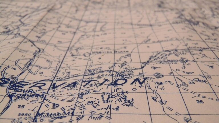
Professional mapping sectors maintain established color conventions that you should follow for consistency. Topographic maps use standardized USGS color schemes with brown contour lines and blue hydrography. Aviation charts follow ICAO standards with specific colors for airspace classifications and navigation aids. Weather maps consistently use the rainbow spectrum for precipitation intensity, while geological surveys employ distinct color codes for rock formations and mineral deposits across different time periods.
Conclusion
Mastering these five color management techniques will transform your maps from simple visualizations into powerful communication tools. You’ll achieve consistent results across all platforms and devices while ensuring your maps remain accessible to diverse audiences.
The investment in proper color calibration equipment and standardized workflows pays dividends through reduced production costs and enhanced professional credibility. Your clients will notice the difference when your maps display accurately across every medium.
Remember that effective color management isn’t just about technical precision—it’s about creating maps that serve their intended purpose. Whether you’re designing for digital display or print production your attention to these foundational techniques will set your cartographic work apart in today’s competitive landscape.
Frequently Asked Questions
What are the key differences between RGB and CMYK color models in cartography?
RGB is an additive color model ideal for digital displays, using red, green, and blue light to create colors. CMYK is a subtractive model used in printing, combining cyan, magenta, yellow, and black inks. For digital maps, use RGB; for printed maps, CMYK ensures accurate color reproduction on physical media.
How often should I calibrate my monitor for accurate color management?
Calibrate your monitor monthly using hardware colorimeters like X-Rite i1Display Pro or Datacolor SpyderX. Regular calibration maintains color accuracy and ensures consistent color reproduction throughout your mapping workflow. Environmental factors and monitor aging can affect color accuracy over time.
What is soft proofing and why is it important for map production?
Soft proofing simulates how your map colors will appear when printed, using your monitor to preview the final output. This technique helps identify potential color issues before printing, preventing costly reprints and ensuring your maps meet client expectations and quality standards.
Which color space should I use for professional mapping projects?
Use sRGB for general digital mapping and web-based applications. For specialized work requiring precise color differentiation, Adobe RGB offers a wider color gamut. Always maintain consistency by using the same color space throughout your entire mapping workflow and team collaboration.
How can I ensure my maps are accessible to colorblind users?
Choose colorblind-friendly palettes that rely on brightness and saturation differences rather than hue alone. Test your color schemes using colorblind simulation tools, ensure sufficient contrast ratios meet WCAG standards, and consider adding patterns or symbols to distinguish map elements beyond color alone.
What are ICC color profiles and why do I need them?
ICC color profiles standardize color interpretation across different devices and software in your mapping workflow. They ensure consistent color reproduction from your monitor to printer, preventing unwanted color shifts. Assign correct profiles to maintain color accuracy throughout the entire production process.
How do I create a standardized color palette for map series?
Document color choices using hex codes or Pantone references in a comprehensive style guide. Maintain version control to track color scheme changes, create shareable palette files, and ensure all team members have access to the same color standards for consistent visual communication.
What is Delta E measurement in color accuracy testing?
Delta E quantifies the visual difference between two colors, with lower values indicating closer color matches. Professional mapping typically aims for Delta E values below 2-3 for critical color accuracy. Use spectrophotometers to measure Delta E and establish quality control checkpoints throughout production.
Should I use different color strategies for different map types?
Yes, different cartographic applications require distinct color approaches. Topographic maps follow established conventions, while thematic maps may use more creative palettes. Consider your target audience, cultural context, and industry standards when selecting colors for specific map types and applications.
How do I optimize my printer settings for accurate map colors?
Create custom ICC profiles for each paper-ink combination you use. Update printer profiles regularly and use standardized test targets to measure color accuracy. Perform hard copy proofing with physical test prints to verify colors before final production runs.