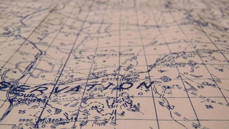
5 Ways Map Projections Distort Reality (Lost to Modern Maps)
You’ve probably stared at a world map countless times but never realized you’re looking at a massive distortion of reality. Every flat map transforms our spherical planet in ways that skew your perception of countries’ sizes relationships and distances. These cartographic compromises affect everything from your understanding of global inequality to political perspectives about which regions matter most.
Disclosure: As an Amazon Associate, this site earns from qualifying purchases. Thank you!
The Mercator Projection Makes Greenland Look Massive
You’ve probably noticed that Greenland appears enormous on most world maps, but this visual impression stems from one of cartography’s most persistent distortions. The Mercator projection stretches landmasses dramatically as they approach the poles, creating size relationships that don’t match reality.
Why Greenland Appears Larger Than Africa
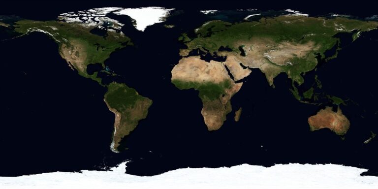
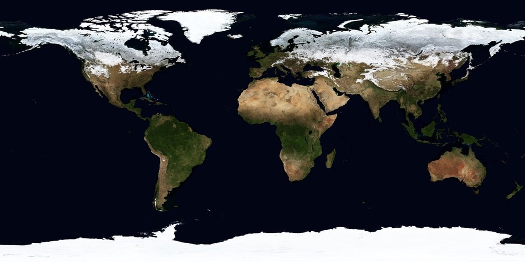
Greenland measures 836,330 square miles while Africa spans 11.7 million square miles – making Africa 14 times larger in reality. The Mercator projection’s mathematical formula progressively enlarges areas moving toward the poles, inflating Greenland’s visual size by approximately 550%. You’re seeing a landmass that appears continental when it’s actually closer to Alaska’s size. This distortion occurs because the projection must stretch horizontal lines of longitude to maintain straight-line navigation properties, inevitably warping polar regions beyond recognition.
P.S. check out Udemy’s GIS, Mapping & Remote Sensing courses on sale here…
The Navigation Benefits That Made This Distortion Acceptable
Sailors chose the Mercator projection because it preserves compass bearings as straight lines, making ocean navigation remarkably simple. You could plot a course from any point to another using a ruler and maintain constant heading throughout your journey. This property, called conformality, revolutionized 16th-century maritime exploration when Gerardus Mercator introduced it. Despite its size distortions, the projection’s navigation advantages made it the standard for sea charts and eventually wall maps, cementing Greenland’s oversized appearance in our collective geographic consciousness.
Equal-Area Projections Sacrifice Shape for Accurate Size
Equal-area projections solve the size distortion problem by preserving the relative areas of landmasses. However, they achieve this accuracy by dramatically altering the shapes of countries and continents.
How the Gall-Peters Projection Stretches Countries Vertically
You’ll notice the Gall-Peters projection makes tropical countries appear unnaturally tall and thin. Africa stretches vertically while appearing compressed horizontally, creating an elongated appearance that distorts familiar continental shapes. Countries near the equator become stretched vertically by up to 140%, while polar regions appear flattened. This vertical distortion makes recognizable landmasses like Brazil and Indonesia look dramatically different from their true proportions, though their actual surface areas remain mathematically correct.
The Political Implications of Size Distortions
You’re seeing how map projections can influence political perspectives about global importance and resource distribution. The Gall-Peters projection emphasizes the true size of developing nations in Africa, Asia, and South America, challenging Western-centric worldviews perpetuated by Mercator-based maps. Educational institutions increasingly adopt equal-area projections to provide students with more accurate representations of global land distribution. This shift affects how you perceive international relationships, trade partnerships, and the relative significance of different regions in global affairs.
Curved Earth Becomes Flat: The Impossible Mathematical Challenge
Transforming Earth’s curved surface into a flat map creates mathematical impossibilities that no projection can fully solve. You’re essentially trying to peel an orange and lay the skin perfectly flat – it simply can’t be done without tears, stretches, or overlaps.
Why No Flat Map Can Perfectly Represent a Sphere
Mathematical impossibility defines the core challenge of cartographic projection. Earth’s spherical surface has positive curvature everywhere, while flat maps have zero curvature. This fundamental geometric difference means you’ll always lose some accuracy when flattening the globe.
The Theorema Egregium, proven by mathematician Carl Friedrich Gauss in 1827, demonstrates that curved surfaces cannot be mapped to flat surfaces without distortion. You can preserve angles, areas, or distances – but never all three simultaneously in a single projection.
The Trade-offs Cartographers Must Make
Every projection sacrifices something to gain something else. When you choose the Mercator projection, you’re trading accurate size relationships for precise angular measurements and straight rhumb lines that sailors need for navigation.
Alternatively, equal-area projections like Mollweide preserve size relationships but severely distort shapes near the edges. Distance-preserving projections maintain accurate measurements along specific lines but distort everything else. Your choice depends entirely on your map’s intended purpose and which distortions you can accept.
Distance Measurements Become Unreliable Across Projections
Distance calculations on flat maps rarely match real-world measurements due to the inherent distortions in translating Earth’s curved surface onto paper. Your GPS device calculates actual distances differently than what you’d measure with a ruler on a traditional map.
Navigate with ease using this 7-inch GPS navigator, featuring real-time voice guidance and pre-loaded 2025 maps. Customize routes based on your vehicle type to avoid restrictions and receive speed & red light warnings.

How Straight Lines on Maps Don’t Equal Shortest Routes
Straight lines on most map projections don’t represent the shortest distance between two points on Earth’s surface. The Mercator projection shows New York to London as a straight horizontal line, but pilots actually fly a curved path that appears to bend northward on the map. This curved route saves approximately 200 miles compared to following the map’s straight line. Great circle routes follow Earth’s curvature, making them shorter despite appearing longer on flat projections.
The Great Circle Navigation Problem
Great circle navigation reveals how map projections mislead distance calculations between distant locations. A flight from Los Angeles to Tokyo covers 5,500 miles following the shortest great circle route, but measuring this distance with a ruler on a Mercator map gives you roughly 7,000 miles. The projection’s distortion increases dramatically at higher latitudes, making polar routes appear impossibly long. Airlines use specialized navigation charts that account for these distortions, calculating fuel requirements based on actual spherical distances rather than projected measurements.
Cultural and Political Bias Shapes Our Geographic Perspective
Your understanding of world geography reflects centuries of cartographic choices rooted in cultural dominance and political power. These mapping decisions continue shaping how you perceive global relationships and regional importance.
Why Most World Maps Center Europe and North America
Get durable, tear-resistant posters made in the USA. Each 18" x 29" poster features high-quality 3 MIL lamination for lasting protection.

European cartographers positioned their homelands at map centers during the Age of Exploration, establishing a visual hierarchy that persists today. You’ll find this Eurocentric approach in 95% of classroom wall maps, where the Prime Meridian divides the world with Europe prominently displayed in the upper center. This placement makes Western nations appear central to global affairs while pushing Asia to the margins, despite Asia containing 60% of the world’s population. Publishers maintain this centering because it aligns with their primary markets in North America and Europe, where most educational materials are sold.
How Map Orientation Influences Global Perception
North-up orientation isn’t geographically necessary—it’s a cultural convention that reinforces Northern Hemisphere dominance in your worldview. Medieval Islamic maps placed south at the top, while ancient Chinese cartographers oriented maps toward the emperor’s palace. You can see this bias in action when viewing south-up maps, which make Australia and South America appear to “rise above” North America and Europe, challenging your preconceptions about global power structures. This standard orientation contributes to phrases like “Down Under” for Australia, subtly reinforcing the idea that northern regions hold higher status in global hierarchies.
Conclusion
Every map you’ve ever seen tells a story shaped by mathematical compromises and cultural choices. From the Mercator projection’s inflated polar regions to the Gall-Peters projection’s stretched tropical countries these distortions fundamentally alter how you perceive our world.
The next time you look at a world map remember that what you’re seeing isn’t objective reality. It’s a filtered version influenced by centuries of cartographic decisions that continue to shape your understanding of global relationships distances and the relative importance of different regions.
Understanding these limitations doesn’t make maps less valuable—it makes you a more informed map reader. Whether you’re planning a flight route or studying global politics recognizing these distortions helps you see beyond the flat surface to the complex spherical world beneath.
Frequently Asked Questions
Why does Greenland look so much larger than Africa on most world maps?
This is due to the Mercator projection, which dramatically distorts landmasses near the poles. While Greenland appears huge on standard maps, Africa is actually 14 times larger in reality. The Mercator projection inflates Greenland’s size by approximately 550% to maintain straight-line navigation, making it a useful tool for sailors despite the visual distortion.
What are equal-area projections and how do they differ from the Mercator projection?
Equal-area projections preserve the relative sizes of landmasses but distort their shapes instead. The Gall-Peters projection is a common example that stretches tropical countries vertically while compressing polar regions. Unlike the Mercator projection, which prioritizes navigation accuracy, equal-area projections show true size relationships between continents and countries.
Can any flat map accurately represent Earth’s curved surface?
No, it’s mathematically impossible. The Theorema Egregium proves that curved surfaces cannot be perfectly represented on flat surfaces without distortion. Every map projection must sacrifice accuracy in either angles, areas, or distances. Cartographers choose projections based on their intended purpose and acceptable trade-offs.
Why don’t straight lines on maps represent the shortest flight paths?
Straight lines on most map projections don’t account for Earth’s spherical nature. The shortest route between two points on a sphere is called a great circle route, which appears curved on flat maps. For example, flights from New York to London follow a curved path that saves about 200 miles compared to the straight line shown on Mercator maps.
How do map projections influence our political and cultural perspectives?
Map distortions can shape our understanding of global relationships and regional importance. The Mercator projection’s emphasis on northern regions reinforces Western-centric worldviews, while equal-area projections highlight the true size of developing nations. Educational institutions increasingly use equal-area maps to provide more balanced geographic perspectives and challenge traditional biases.
What is the most accurate way to measure distances on Earth?
The most accurate method uses great circle navigation, which calculates distances along Earth’s curved surface. Airlines and navigation systems use specialized charts that account for spherical geometry rather than flat map measurements. For instance, the actual distance from Los Angeles to Tokyo is 5,500 miles, but measuring on a Mercator map shows approximately 7,000 miles.