5 Best Environmental Data Integrations for Digital Maps
Why it matters: You’re creating maps in an era where environmental awareness drives decision-making and traditional cartography alone won’t cut it anymore.
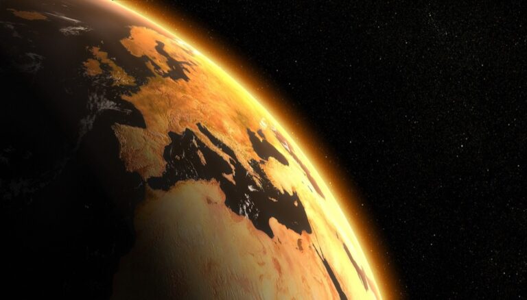
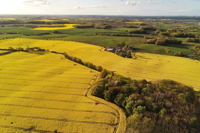
The big picture: Integrating environmental data transforms static maps into powerful tools that reveal climate patterns, pollution levels, and ecosystem health in ways that influence everything from urban planning to conservation efforts.
What’s next: Modern mapping technologies now make it easier than ever to layer environmental datasets onto your cartographic work, creating visualizations that tell compelling stories about our planet’s changing conditions.
Disclosure: As an Amazon Associate, this site earns from qualifying purchases. Thank you!
P.S. check out Udemy’s GIS, Mapping & Remote Sensing courses on sale here…
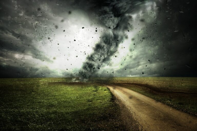
Incorporate Real-Time Climate Data Through Interactive Web Mapping Platforms
Interactive web mapping platforms transform static environmental maps into dynamic visualization tools that respond to changing atmospheric conditions. You’ll create more impactful cartographic products by leveraging real-time data streams that update automatically.
Utilize Weather APIs and Satellite Feeds
Connect your mapping applications to established weather APIs like NOAA’s National Weather Service API or OpenWeatherMap to pull current atmospheric data. Services such as NASA’s Earth Observing System Data provide satellite imagery updates every 15-30 minutes. You’ll access temperature readings, humidity levels, wind patterns, and precipitation data through standardized JSON formats. Configure automated data retrieval scripts to refresh your map layers without manual intervention, ensuring your visualizations reflect the most current environmental conditions available.
Implement Dynamic Color Coding for Temperature and Precipitation
Design color schemes that automatically adjust based on incoming climate data values to create intuitive temperature and precipitation visualizations. Use warm reds and oranges for temperatures above 80°F, cool blues for freezing conditions, and graduated green-to-yellow scales for precipitation intensity. Libraries like D3.js and Leaflet support dynamic styling functions that recalculate colors as new data arrives. You’ll maintain visual consistency by establishing fixed color breakpoints that accommodate seasonal temperature ranges and typical precipitation patterns for your mapping region.
Create Time-Slider Functionality for Historical Climate Patterns
Build interactive timeline controls that allow users to scrub through historical climate data spanning multiple years or decades. JavaScript frameworks like Timeline.js or custom HTML5 range inputs enable smooth temporal navigation through archived weather datasets. You’ll connect slider positions to specific date ranges, triggering map layer updates that show temperature anomalies, drought patterns, or seasonal precipitation changes. Store historical data in efficient formats like GeoTIFF or NetCDF to ensure responsive playback performance when users explore long-term climate trends.
Layer Environmental Sensors and IoT Data onto Traditional Maps
Measure temperature, humidity, pressure, and VOC gases with the BME680 environmental sensor. It supports I2C and SPI communication and is compatible with 3.3V/5V systems, including Raspberry Pi, Arduino, and ESP32.

Modern IoT networks generate continuous environmental measurements that transform static cartographic displays into responsive monitoring systems. You’ll discover how sensor integration creates maps that pulse with real-time environmental conditions.
Integrate Air Quality Monitoring Station Data
Connect your maps to EPA’s AirNow API to display PM2.5, ozone, and nitrogen dioxide readings from monitoring stations across your study area. You can visualize this data through graduated symbols or heat maps that update hourly. Most GIS platforms support direct API integration, allowing you to pull data from Purple Air sensors and government monitoring networks. Configure color-coded point symbols where green represents good air quality and red indicates hazardous conditions for immediate visual interpretation.
Accurately monitor your indoor air quality with this portable device. It measures temperature, humidity, formaldehyde, TVOC, and particulate matter (PM2.5/PM1.0/PM10) in real-time using advanced sensors and a built-in fan.

Display Water Quality Measurements from Smart Sensors
Get wide TPMS coverage with this universal sensor. Programmable to fit 95% of vehicles, it simplifies service and reduces inventory needs. Pack of 10.

Stream real-time pH, dissolved oxygen, and turbidity data from USGS water quality sensors directly onto your base maps. You’ll find these measurements particularly valuable when mapping watershed conditions or tracking pollution events. Set up automated data feeds that refresh every 15 minutes from sources like the Water Quality Portal. Use proportional symbols scaled to pollutant concentration levels, with larger symbols indicating higher contamination readings that require immediate attention from environmental managers.
Overlay Soil Condition and Agricultural Data Points
Incorporate soil moisture, temperature, and nutrient data from agricultural IoT networks to create precision farming maps. You can access this information through platforms like CropX or Field Climate that provide API connections to sensor arrays. Display soil conditions using interpolated surfaces that show moisture gradients across farm fields. Add point symbols for individual sensor locations with popup displays showing current readings, helping farmers optimize irrigation schedules and fertilizer applications based on real-time soil conditions.
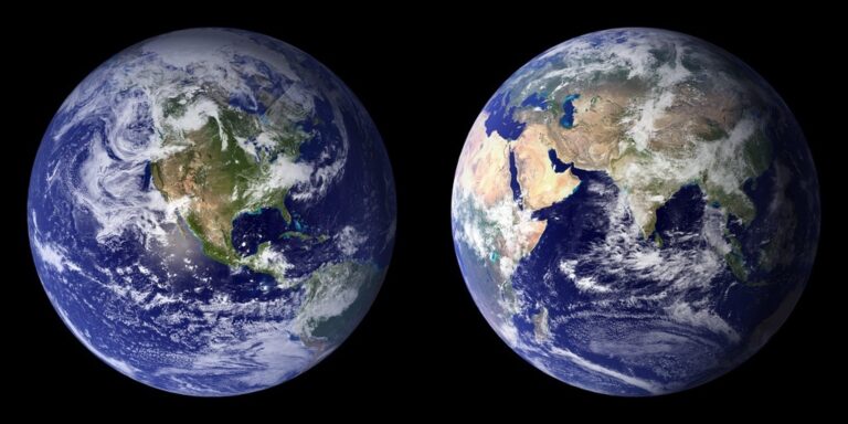
Visualize Ecosystem Boundaries Using Satellite Imagery and GIS Data
Satellite imagery provides the spatial context needed to map precise ecosystem boundaries that traditional field surveys often miss. You’ll create more accurate environmental maps by combining multispectral data with advanced GIS analysis techniques.
Map Vegetation Zones Through NDVI Analysis
Calculate NDVI values from Landsat or Sentinel-2 imagery to identify distinct vegetation communities across your study area. Use QGIS or ArcGIS to process red and near-infrared bands, generating vegetation indices that range from -1 to +1. Apply supervised classification algorithms to group similar NDVI values into forest, grassland, and agricultural zones. Set threshold values between 0.2-0.4 for sparse vegetation and 0.6-0.8 for dense forests to create accurate vegetation boundary maps.
Define Watershed and Habitat Boundaries
Extract watershed boundaries using digital elevation models (DEMs) from USGS or NASA SRTM datasets in your GIS software. Run flow direction and flow accumulation analyses to automatically delineate drainage basins and stream networks. Combine topographic boundaries with species occurrence data from GBIF or state wildlife databases to map critical habitat zones. Use buffer zones of 100-500 meters around water features to establish riparian habitat corridors that support ecosystem connectivity.
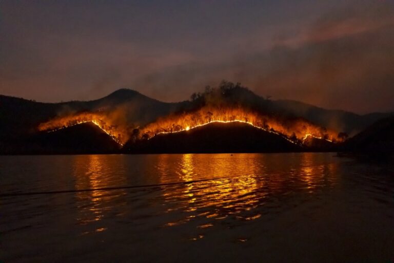
Track Deforestation and Land Use Changes Over Time
Compare multi-temporal satellite images from different years using change detection algorithms in Google Earth Engine or ENVI software. Download Landsat imagery spanning 10-20 years to identify forest loss patterns and urban expansion trends. Apply normalized difference vegetation index (NDVI) differencing to quantify vegetation changes over time. Create time-series animations showing land cover transitions, using consistent color schemes where green represents forest gain and red indicates deforestation or development.
Combine Demographic Data with Environmental Risk Assessments
Demographic environmental integration reveals critical patterns where vulnerable populations face disproportionate environmental hazards. You’ll create powerful advocacy tools by overlaying census data with environmental risk zones.
Overlay Population Density with Flood Zone Maps
Population density overlays with FEMA flood zones identify at-risk communities requiring targeted emergency planning. You’ll use Census Bureau’s American Community Survey data alongside FEMA’s National Flood Hazard Layer to calculate exposed populations per square mile. Import both datasets into QGIS and apply graduated symbology showing population counts within 100-year floodplains. This visualization helps emergency managers prioritize evacuation routes and shelter locations.
Map Environmental Justice Indicators by Community
Environmental justice mapping combines EPA’s EJSCREEN database with local demographic boundaries to highlight disparate environmental burdens. You’ll overlay minority population percentages with proximity to hazardous waste sites, creating choropleth maps showing cumulative environmental stressors. Use ArcGIS’s spatial analysis tools to calculate buffer zones around pollution sources, then intersect with census tracts. Color-code communities by environmental justice index scores to reveal patterns of environmental inequality.
Correlate Health Data with Pollution Exposure Levels
Health outcome correlations with air quality data expose pollution’s impact on community wellness. You’ll combine CDC’s Environmental Public Health Tracking Network data with EPA’s Air Quality System measurements to map respiratory illness rates against PM2.5 concentrations. Create dual-axis visualizations showing asthma hospitalization rates alongside annual pollution averages. Use statistical analysis tools in R or Python to calculate correlation coefficients and generate regression maps.
Develop Multi-Scale Environmental Story Maps for Public Engagement
Understand the structure of a one-hour TV drama pilot. This book provides a guide to story mapping for television.

Multi-scale environmental story maps transform complex environmental data into compelling narratives that resonate with diverse audiences. These dynamic tools bridge the gap between technical environmental analysis and public understanding by combining cartographic visualization with structured storytelling frameworks.
Create Narrative-Driven Climate Change Visualizations
Craft temporal climate narratives using sequential map panels that illustrate temperature and precipitation changes across decades. You’ll combine NOAA’s Climate Data Online with ArcGIS StoryMaps to create scrolling visualizations showing regional climate shifts from 1950 to present. Structure your narrative arc around local climate impacts, using before-and-after satellite imagery to demonstrate glacial retreat, drought progression, or sea-level rise effects that directly affect your target audience’s communities.
Design Interactive Infographics for Conservation Awareness
Build conservation dashboards that connect wildlife habitat data with user interaction through clickable species distribution maps and population trend charts. You’ll integrate eBird occurrence data with protected area boundaries from the World Database on Protected Areas to show conservation success stories. Incorporate gamification elements like species identification quizzes or habitat restoration progress bars that encourage deeper exploration while maintaining scientific accuracy through peer-reviewed conservation status assessments from the IUCN Red List.
Build Educational Tools for Environmental Policy Communication
Develop policy impact simulators using scenario-based mapping that demonstrates how different environmental regulations affect local communities and ecosystems. You’ll combine zoning data with environmental impact models to show potential outcomes of proposed policies through split-screen comparisons. Create stakeholder engagement platforms that allow users to explore trade-offs between economic development and environmental protection using slider controls that adjust development scenarios while displaying corresponding changes in air quality, habitat connectivity, and community health indicators.
Conclusion
You’re now equipped with five powerful approaches to transform your cartographic work through environmental data integration. These methods will help you create maps that don’t just show locations but tell compelling stories about our planet’s changing conditions.
The future of cartography lies in your ability to merge traditional mapping skills with environmental intelligence. By implementing these techniques you’ll produce visualizations that inform decision-makers and inspire communities to take action.
Start with one approach that aligns with your current projects and gradually expand your toolkit. Your maps will become invaluable resources for addressing today’s most pressing environmental challenges while engaging audiences in meaningful ways.
Frequently Asked Questions
What is environmental data integration in mapping?
Environmental data integration in mapping refers to combining environmental datasets like climate patterns, pollution levels, and ecosystem health with traditional geographic maps. This transforms static maps into dynamic tools that provide real-time insights into environmental conditions, helping urban planners, conservationists, and policymakers make informed decisions based on current environmental data.
How do interactive web mapping platforms enhance environmental visualization?
Interactive web mapping platforms enhance environmental visualization by connecting to real-time data sources like weather APIs and satellite feeds. They use dynamic color coding for temperature and precipitation, create intuitive visualizations that update automatically, and include time-slider functionality for exploring historical climate patterns, making environmental data more accessible and engaging.
What role do IoT sensors play in environmental mapping?
Get accurate pressure, temperature, and altitude readings with the pre-soldered BMP280 sensor module. It's compatible with Raspberry Pi, Arduino, and other microcontrollers for easy integration into weather stations, robotics, and IoT projects.

IoT sensors transform traditional maps into responsive monitoring systems by providing real-time environmental data. They connect to APIs like EPA’s AirNow for air quality monitoring, USGS sensors for water quality measurements, and agricultural networks for soil conditions. This creates live maps that display current pollution levels, watershed conditions, and farming optimization data.
How can satellite imagery help visualize ecosystem boundaries?
Satellite imagery helps visualize ecosystem boundaries through NDVI analysis using Landsat or Sentinel-2 data to identify vegetation communities. It defines watershed and habitat boundaries using digital elevation models and species data, tracks deforestation over time, and employs change detection algorithms to quantify vegetation changes and create time-series animations.
What is environmental justice mapping?
Environmental justice mapping combines demographic data with environmental risk assessments to identify where vulnerable populations face disproportionate environmental hazards. It overlays population density with flood zones, integrates EPA’s EJSCREEN database with demographic boundaries, and correlates health data with pollution exposure to highlight environmental inequalities and support advocacy efforts.
How do multi-scale environmental story maps work?
Multi-scale environmental story maps transform complex environmental data into compelling narratives using sequential map panels to show changes over time. They create interactive infographics for conservation awareness, develop educational tools for policy communication, and include scenario-based mapping that demonstrates how different regulations affect local communities and ecosystems.
What APIs are commonly used for environmental mapping?
Common APIs for environmental mapping include NOAA’s National Weather Service API for weather data, NASA’s Earth Observing System Data for satellite information, EPA’s AirNow API for air quality data, and USGS sensors for water quality measurements. These APIs provide real-time access to environmental datasets for dynamic mapping applications.
How can environmental mapping support urban planning?
Environmental mapping supports urban planning by providing real-time data on climate patterns, pollution levels, and ecosystem health. It helps identify flood-prone areas, air quality hotspots, and vulnerable populations. This information enables planners to make data-driven decisions about development, infrastructure placement, and emergency preparedness while considering environmental impacts.