7 Best Environmental Activism Maps
Maps aren’t just navigation tools—they’re powerful weapons in the fight for environmental justice. You can transform complex environmental data into compelling visual stories that spark action and drive policy change in your community.
Smart activists leverage mapping technology to expose pollution patterns, track deforestation, and mobilize grassroots movements with unprecedented precision. Whether you’re fighting industrial pollution in your neighborhood or advocating for protected wilderness areas, the right mapping strategy can amplify your message and create undeniable evidence for your cause.
The digital revolution has democratized environmental mapping, putting professional-grade tools in your hands without requiring a PhD in geography or a massive budget.
Disclosure: As an Amazon Associate, this site earns from qualifying purchases. Thank you!
P.S. check out Udemy’s GIS, Mapping & Remote Sensing courses on sale here…
Create Community Pollution Maps to Document Environmental Hazards
Community pollution mapping transforms environmental data into powerful advocacy tools that reveal hidden contamination patterns in your area. You’ll document hazards that affect public health and create visual evidence for regulatory agencies and community organizations.
Track Air Quality Issues in Your Neighborhood
Deploy low-cost air quality sensors like PurpleAir or AirVisual monitors throughout your community to create real-time pollution maps. Position sensors near schools, hospitals, and residential areas to capture exposure patterns that affect vulnerable populations. Use platforms like Sensor.Community or AirNow to visualize particulate matter, ozone levels, and other pollutants across different neighborhoods. Document seasonal variations and daily patterns to identify pollution sources like traffic congestion, industrial emissions, or construction activities.
Understand your indoor air quality with the Amazon Smart Air Quality Monitor. It tracks five key factors and provides an easy-to-understand air quality score in the Alexa app, plus notifications when air is poor.

Map Water Contamination Sources and Affected Areas
Identify contamination sources by mapping industrial facilities, landfills, and agricultural runoff areas alongside local water bodies and wells. Collect water quality data from EPA databases, local health departments, and citizen science programs to create comprehensive contamination maps. Use GIS tools like QGIS or ArcGIS Online to overlay contamination data with demographic information, revealing environmental justice patterns. Track contamination plumes and affected water supplies to show how pollution spreads through groundwater and surface water systems.
Document Noise Pollution from Industrial Activities
Measure noise levels using smartphone apps like SoundLevel or professional decibel meters to create community noise maps. Record measurements at consistent times and locations near industrial facilities, airports, highways, and construction sites to establish baseline data. Map noise complaints and health impacts alongside decibel readings to demonstrate the relationship between industrial activities and community well-being. Create time-series maps showing how noise pollution varies throughout the day and correlates with industrial operations or traffic patterns.
Experience vivid content on the Galaxy A16 5G's 6.7" display and capture stunning photos with its triple-lens camera. Enjoy peace of mind with a durable design, six years of updates, and Super Fast Charging.

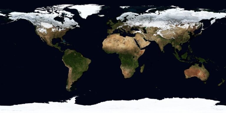
Develop Interactive Maps to Showcase Climate Change Impacts
Interactive climate mapping transforms abstract data into compelling visual stories that drive environmental action. These dynamic visualizations help you communicate the urgency of climate issues to diverse audiences.
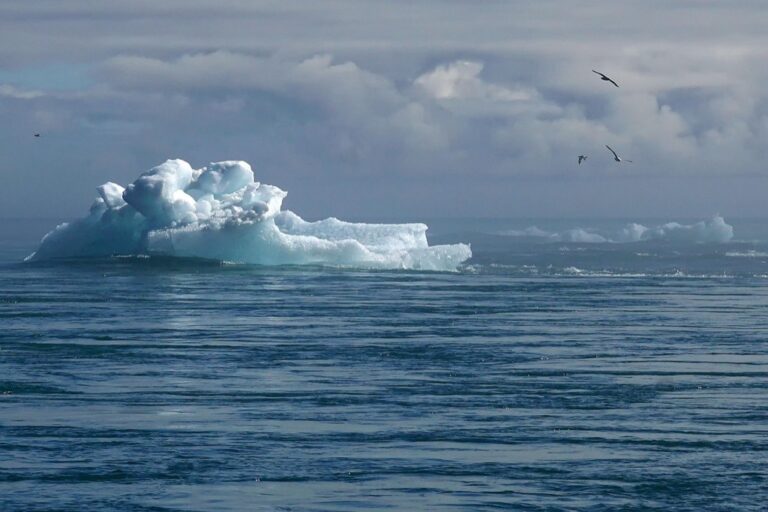
Visualize Rising Sea Levels and Coastal Erosion
Sea level rise visualization requires precise elevation data combined with predictive modeling capabilities. You’ll need digital elevation models (DEMs) with sub-meter accuracy and NOAA’s sea level rise projections to create effective coastal vulnerability maps.
Layer historical shoreline data from USGS with current satellite imagery to show erosion patterns over decades. Tools like ArcGIS Pro and QGIS can process bathymetric data alongside coastal topography to model flood scenarios at different sea level thresholds.
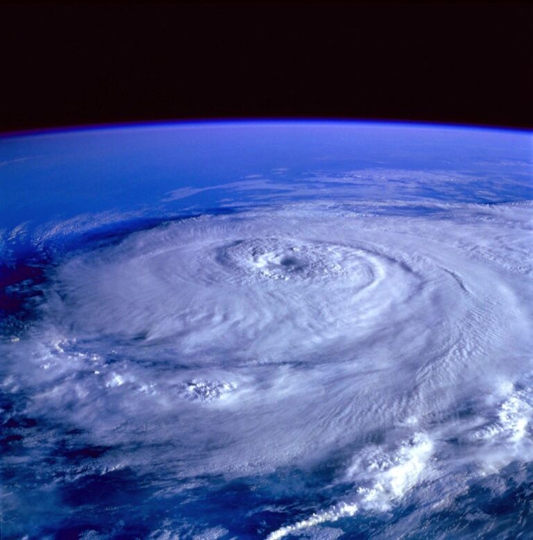
Track Temperature Changes Over Time
Temperature mapping demands high-quality meteorological datasets spanning multiple decades for statistical significance. NOAA’s Climate Data Online archive provides station-based records you can interpolate using kriging or inverse distance weighting methods.
Create animated time series maps showing seasonal and annual temperature anomalies using color ramps that highlight warming trends. Incorporate urban heat island analysis by overlaying land cover classifications with temperature data to reveal localized climate impacts affecting community health.
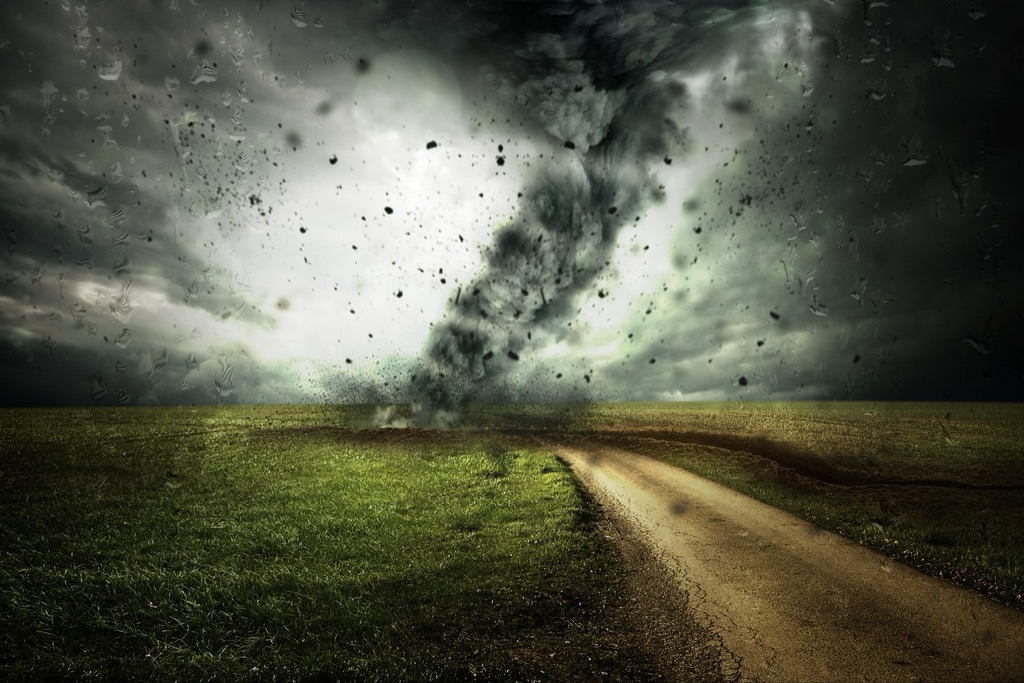
Map Extreme Weather Events and Their Frequency
Extreme weather mapping requires combining historical event databases with spatial analysis to identify patterns and hotspots. NOAA’s Storm Events Database provides geocoded records of tornadoes, hurricanes, floods, and heat waves dating back decades.
Use kernel density analysis to identify areas with increasing storm frequency and overlay these with population density data. Temporal analysis tools in GIS software can reveal seasonal shifts in extreme weather patterns, helping communities prepare for changing climate risks.
Use Maps to Organize Environmental Cleanup Campaigns
Maps transform cleanup campaigns from scattered efforts into coordinated environmental actions. You’ll maximize your impact by visualizing contamination hotspots and deploying volunteers strategically across target areas.
Identify High-Priority Areas for Community Clean-Up
Create contamination density maps using GPS coordinates to mark pollution hotspots like illegal dumping sites, plastic accumulation zones, and chemical spill locations. Layer environmental health data with demographic information to prioritize areas affecting vulnerable populations including schools, elderly communities, and low-income neighborhoods. Use satellite imagery to identify hard-to-reach contaminated sites like abandoned industrial areas, overgrown vacant lots, and remote waterway segments that require specialized cleanup equipment.
Coordinate Volunteer Efforts Across Multiple Locations
Deploy interactive digital maps through platforms like Google My Maps or ArcGIS Online to assign volunteer teams to specific cleanup zones based on skill level and available equipment. Create real-time coordination systems using apps like Zello or WhatsApp to share location updates, safety alerts, and resource needs across multiple cleanup sites. Establish central command locations using GPS tracking to monitor team progress, coordinate supply deliveries, and redirect volunteers to areas needing additional support.
Track vehicles and assets with the LandAirSea 54 GPS Tracker. Get real-time location alerts and historical playback using the SilverCloud app, with a long-lasting battery and discreet magnetic mount.

Track Progress and Document Before-and-After Results
Generate visual progress reports using drone photography or smartphone apps to capture georeferenced before-and-after images at each cleanup location. Create time-lapse maps showing contamination reduction over multiple cleanup events, measuring removed debris by weight and volume at specific coordinates. Develop impact dashboards displaying total area cleaned, volunteer hours contributed, and environmental improvements achieved, using these maps to secure funding and recruit participants for future campaigns.
Create Biodiversity Maps to Protect Local Wildlife
You’ll discover that biodiversity mapping serves as your most powerful tool for wildlife conservation advocacy. These detailed habitat visualizations transform abstract conservation concepts into compelling evidence that resonates with policymakers and community members alike.
Document Endangered Species Habitats
Document endangered species locations using GPS coordinates and field observations to create precise habitat maps. You’ll layer population density data with environmental variables like vegetation cover and water sources. Combine citizen science platforms like eBird with professional wildlife surveys to build comprehensive species distribution models. Share these habitat maps with conservation organizations to support critical habitat designations and funding applications for protection programs.
Map Migration Patterns and Wildlife Corridors
Map seasonal migration routes by tracking tagged animals and analyzing movement data from wildlife telemetry studies. You’ll identify crucial corridors that connect fragmented habitats across landscapes. Use temporal mapping to show how migration timing shifts with climate change impacts. Overlay transportation infrastructure and development zones to highlight potential barrier locations. These corridor maps become essential tools for advocating wildlife-friendly road designs and land-use planning decisions.
Identify Areas at Risk from Development
Identify vulnerable ecosystems by overlaying proposed development projects with biodiversity hotspot data and habitat quality assessments. You’ll analyze zoning maps and construction permits to predict future habitat fragmentation patterns. Create impact scenario maps showing before-and-after development effects on wildlife populations. Use buffer zones around critical habitats to demonstrate minimum protection requirements. These risk assessment maps provide concrete evidence for environmental impact reviews and community opposition campaigns.
Design Maps for Environmental Justice Advocacy
Environmental justice mapping requires precision in revealing systemic inequities through spatial analysis. You’ll need to layer demographic data with environmental hazard information to create compelling visual narratives that support advocacy efforts.
Highlight Environmental Inequities in Different Communities
Overlay demographic data with environmental hazard locations to reveal patterns of environmental racism. Use census tract boundaries to compare pollution exposure levels between different racial and ethnic communities. Map industrial facilities, waste sites, and toxic release inventory locations alongside community demographics. Create choropleth maps showing environmental burden scores by neighborhood, using tools like ArcGIS or QGIS to calculate cumulative impact indices that combine multiple pollution sources.
Map the Correlation Between Poverty and Pollution
Analyze income data against environmental health indicators to demonstrate how low-income areas bear disproportionate pollution burdens. Layer median household income with air quality measurements, water contamination levels, and proximity to industrial facilities. Use bivariate mapping techniques to show correlation strength between economic status and environmental exposure. Calculate environmental justice screening scores using EPA’s EJSCREEN tool, then create scatter plots and regression maps showing the relationship between poverty rates and cumulative environmental impacts.
Showcase Disproportionate Health Impacts
Visualize health outcome disparities using disease mapping techniques to connect environmental hazards with community health data. Map asthma rates, cancer clusters, and birth defect incidences alongside pollution sources using public health databases. Create heat maps showing elevated disease rates in environmentally burdened communities compared to cleaner areas. Use epidemiological mapping methods to display relative risk ratios and confidence intervals, ensuring statistical significance when highlighting health disparities linked to environmental factors.
Build Educational Maps to Raise Environmental Awareness
Educational mapping transforms complex environmental data into compelling visual stories that inspire action. You’ll create powerful learning tools that make environmental issues accessible to diverse audiences.
Create School Programs Using Interactive Mapping Tools
Engage students with hands-on environmental mapping projects using platforms like ArcGIS Online or Google Earth Engine. You’ll design curriculum modules where students map local air quality data, track watershed boundaries, and analyze land use changes over time. Interactive web applications let students toggle between pollution layers, demographic data, and health statistics to understand environmental connections. Consider partnering with science teachers to integrate mapping exercises into existing environmental science coursework, allowing students to document neighborhood pollution sources and create action plans for their communities.
Develop Public Awareness Campaigns with Visual Data
Launch compelling campaigns by transforming environmental statistics into intuitive visual narratives using tools like Tableau Public or CARTO. You’ll create story maps that guide viewers through environmental challenges, combining satellite imagery with pollution data and community photos. Design infographic-style maps that highlight key statistics, such as air quality trends or deforestation rates, using contrasting colors and clear legends. Focus on creating shareable content that communicates complex environmental issues in under 30 seconds, ensuring your message reaches busy community members who need quick, impactful information.
Understand the structure of a one-hour TV drama pilot. This book provides a guide to story mapping for television.

Share Maps on Social Media to Reach Wider Audiences
Maximize your reach by adapting environmental maps for social media platforms using mobile-friendly formats and attention-grabbing visuals. You’ll create animated GIFs showing time-lapse environmental changes, design Instagram-ready square maps with bold typography, and develop Twitter-sized graphics highlighting key environmental statistics. Use consistent branding across platforms and include clear calls-to-action that direct viewers to full interactive maps. Consider creating map series that tell ongoing environmental stories, encouraging followers to share your content and participate in local environmental monitoring efforts.
Utilize Maps for Policy Advocacy and Government Engagement
Maps serve as powerful diplomatic tools that translate complex environmental data into compelling evidence for policy makers. You’ll find that visual presentations of spatial data carry more weight in government settings than traditional reports or statistics alone.
Present Data-Driven Evidence to Local Officials
Transform your environmental research into persuasive cartographic presentations that city council members and county commissioners can quickly understand. Create professional-grade maps using GIS software like ArcGIS Pro or QGIS that overlay pollution data with demographic information to show direct community impacts. Present these maps during public comment periods at municipal meetings, focusing on specific addresses and neighborhoods that officials recognize. Include clear legends, scale bars, and data source citations to establish credibility with government staff who’ll review your materials after meetings.
Support Environmental Legislation with Visual Proof
Develop compelling map series that demonstrate the need for specific environmental regulations by showing before-and-after scenarios or projected impacts. Use temporal mapping techniques to illustrate how environmental conditions have changed over time in your jurisdiction, creating animated visualizations that show pollution spread or habitat loss progression. Submit these maps as official testimony to state legislators, ensuring you include metadata documentation and peer-reviewed data sources. Focus on creating maps that highlight economic impacts alongside environmental concerns, showing how proposed legislation could protect property values and public health investments.
Collaborate with Government Agencies on Environmental Monitoring
Partner with local environmental agencies by offering your mapping expertise to enhance their data collection and reporting capabilities. Propose citizen science mapping projects that complement official monitoring programs, using standardized data collection protocols that agencies can incorporate into their databases. Share your maps through official government portals and help agencies develop public-facing dashboards that make environmental data more accessible to constituents. Establish formal data-sharing agreements that allow you to access government datasets while contributing your community-collected information to official environmental assessments.
Conclusion
Maps aren’t just navigation tools—they’re powerful weapons in your environmental activism arsenal. By transforming complex data into compelling visuals you can drive real change in your community and beyond.
Whether you’re documenting pollution hotspots organizing cleanup efforts or advocating for policy changes these mapping strategies give you the evidence you need to make your voice heard. The technology is accessible the impact is measurable and the potential for change is limitless.
Your next step? Choose one mapping technique that resonates with your environmental goals and start creating the visual stories that will inspire action in your community.
Frequently Asked Questions
What is environmental justice mapping and why is it important?
Environmental justice mapping uses geographic information systems (GIS) to reveal how environmental hazards disproportionately affect marginalized communities. It overlays demographic data with pollution sources, health outcomes, and environmental burdens to expose systemic inequities. This visual approach helps activists, researchers, and policymakers identify environmental racism and advocate for fair treatment of all communities regardless of income, race, or social status.
How can communities use maps to document pollution in their neighborhoods?
Communities can deploy low-cost air quality sensors near schools, hospitals, and residential areas to create real-time pollution maps. They can also map water contamination by overlaying industrial facilities and agricultural runoff data with local water bodies. Using smartphones and GPS devices, residents can document pollution sources, create photographic evidence maps, and share findings with environmental agencies and local officials.
What tools are available for creating environmental maps without technical expertise?
Modern mapping tools like Google Earth, QGIS (free), and ArcGIS Online offer user-friendly interfaces for beginners. Mobile apps allow GPS data collection, while web-based platforms enable map creation without coding. Many tools provide templates and tutorials specifically designed for environmental activism. Cloud-based solutions make collaboration easy, allowing community groups to work together on mapping projects from different locations.
How do maps help with wildlife conservation efforts?
Maps document endangered species habitats using GPS coordinates and field observations, creating precise habitat boundaries that inform conservation strategies. They track migration patterns and wildlife corridors by analyzing tagged animal movement data, helping design wildlife-friendly infrastructure. Conservation maps also identify areas at risk from development by overlaying proposed projects with biodiversity hotspot data, demonstrating potential impacts on wildlife populations.
Can maps be used to track climate change impacts locally?
Yes, maps effectively visualize local climate change impacts through time-series data showing temperature changes, sea level rise, and coastal erosion. They can display extreme weather event patterns, helping communities prepare for climate risks. Interactive climate maps combine historical data with future projections, making complex climate science accessible to local audiences and supporting community adaptation planning efforts.
How do maps support environmental cleanup campaigns?
Maps transform scattered cleanup efforts into coordinated actions by identifying pollution hotspots and prioritizing vulnerable areas. Interactive digital maps coordinate volunteer efforts, showing cleanup locations, progress tracking, and real-time communication. Contamination density maps help allocate resources efficiently, while before-and-after visualization demonstrates campaign impact, encouraging continued community participation and securing funding for future initiatives.
What role do maps play in environmental education and public awareness?
Maps convert complex environmental data into intuitive visual narratives that engage diverse audiences. Schools use interactive mapping tools for hands-on environmental projects, while public awareness campaigns share maps on social media to reach wider audiences. Mobile-friendly maps make environmental information accessible anywhere, helping communities understand local environmental issues and inspiring grassroots action through compelling visual storytelling.
How can environmental activists use maps for policy advocacy?
Maps provide compelling visual evidence for policy meetings, transforming research data into persuasive cartographic presentations. They illustrate environmental changes over time, supporting legislation with clear visual proof. Activists can collaborate with government agencies through citizen science mapping projects, providing valuable data for environmental monitoring. Maps make complex issues understandable to policymakers, increasing the likelihood of meaningful environmental policy changes.