7 Best Interactive Presentation Strategies
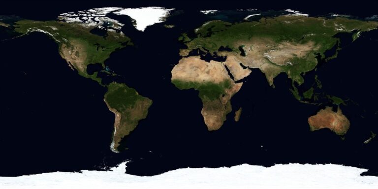
Maps transform boring presentations into engaging visual experiences that capture your audience’s attention instantly. When you incorporate interactive mapping strategies into your presentations you’re not just showing data – you’re telling compelling stories that stick with viewers long after they leave the room. These seven proven techniques will help you leverage maps to boost audience engagement and make your next presentation unforgettable.
Disclosure: As an Amazon Associate, this site earns from qualifying purchases. Thank you!
Start With Clear Geographic Context
Your map’s geographic foundation determines whether your audience connects with your data or gets lost in visual confusion.
Achieve a flawless, even complexion with e.l.f. Flawless Satin Foundation. This lightweight, vegan formula provides medium coverage and a semi-matte finish for all-day wear, while hydrating your skin with glycerin.

Define Your Map’s Purpose and Scope
Identify your presentation’s core geographic question before selecting any mapping elements. You’ll need to determine whether you’re showing regional patterns, comparing specific locations, or tracking movement across territories. Define your geographic boundaries early—continent-level data requires different approaches than city-block analysis. Consider your audience’s geographic familiarity with the area you’re mapping to establish appropriate detail levels.
P.S. check out Udemy’s GIS, Mapping & Remote Sensing courses on sale here…
Choose the Right Map Type for Your Data
Match your data characteristics to proven cartographic formats for maximum impact. Point data works best with symbol maps or heat maps, while regional statistics shine through choropleth maps. Flow data demands network maps or arrow symbols, and temporal changes require animated sequences or small multiples. Test different projection types—Mercator for global navigation, Albers for regional analysis, or custom projections for specialized geographic focus areas.
Establish Visual Hierarchy With Color and Scale
Control your audience’s attention through strategic color choices and scaling decisions that highlight your key findings. Use sequential color schemes for ranked data, diverging palettes for positive/negative comparisons, and categorical colors for distinct groups. Apply the 5±2 rule—limit your color categories to seven maximum for cognitive clarity. Scale your symbols proportionally to data values, ensuring your largest elements don’t overwhelm smaller but equally important geographic features.
Incorporate Real-Time Data Integration
Real-time data integration transforms static maps into dynamic visual narratives that respond to changing conditions during your presentation.
Connect Live APIs for Dynamic Updates
You’ll maximize presentation impact by connecting your maps directly to live data APIs from government agencies, weather services, or business databases. Services like USGS earthquake feeds, Census Bureau APIs, and transportation department traffic systems provide continuous data streams that update your visualizations automatically. Popular mapping platforms including ArcGIS Online, Mapbox, and Google Maps Platform offer built-in API integration tools that require minimal coding knowledge to implement effectively.
Display Current Statistics and Metrics
You can showcase real-time statistics through dynamic map overlays that display live population counts, economic indicators, or environmental measurements as they change. Configure your mapping software to pull current data from sources like Federal Reserve economic databases, EPA air quality monitors, or social media trending APIs. Position these metrics prominently using callout bubbles, dashboard panels, or animated counters that draw attention to significant changes during your presentation.
Understand your indoor air quality with the Amazon Smart Air Quality Monitor. It tracks five key factors and provides an easy-to-understand air quality score in the Alexa app, plus notifications when air is poor.

Enable Automatic Data Refresh During Presentations
You’ll maintain audience engagement by setting automatic refresh intervals that update your map data every few minutes without interrupting your presentation flow. Configure your mapping platform’s refresh settings to poll data sources at optimal intervals – typically 5-15 minutes for most applications. Test your internet connection beforehand and prepare static backup slides featuring recent data snapshots in case connectivity issues arise during critical presentation moments.
Enable Click-Through Navigation Features
Transform your map from a static display into an interactive exploration tool that lets your audience dive deeper into the data on their own terms.
Create Hotspots for Detailed Information
Establish clickable zones on key geographic features that reveal additional context when selected. Position hotspots strategically on major cities, significant landmarks, or data concentration points to maximize engagement potential. Configure popup windows or slide-out panels that display relevant statistics, images, or explanatory text without overwhelming the main presentation flow. Test hotspot sensitivity across different devices to ensure consistent functionality for both mouse clicks and touch interactions.
Link Map Elements to Supporting Content
Connect geographic features directly to related slides, documents, or multimedia content through embedded hyperlinks. Create seamless transitions between your map overview and detailed breakdowns by linking regions to specific data visualizations or case studies. Implement breadcrumb navigation that allows users to return to the main map after exploring linked content. Design clear visual indicators like cursor changes or highlighting effects that signal interactive elements to your audience.
Design Intuitive User Interface Controls
Place navigation controls in consistent locations that follow standard web interface conventions for maximum usability. Include zoom buttons, pan controls, and layer toggles positioned where users naturally expect to find them. Implement keyboard shortcuts for power users while maintaining touch-friendly button sizes for tablet presentations. Add subtle animations and hover effects that provide immediate feedback when users interact with different map elements or navigation tools.
Utilize Zoom and Pan Capabilities
Zoom and pan functionality transforms your maps from static visuals into powerful storytelling instruments that guide audience attention precisely where you need it.
Guide Audience Focus With Strategic Zooming
Start at regional scale then progressively zoom to specific locations to build context before revealing details. You’ll maintain audience orientation while creating dramatic reveals of your key data points.
Configure your mapping software with predefined zoom levels that correspond to your presentation flow. Set bookmarks at 1:100,000 for regional context, 1:25,000 for local patterns, and 1:5,000 for site-specific details to ensure consistent scaling throughout your presentation.
Create Smooth Transitions Between Locations
Enable animated panning between geographic locations to maintain spatial relationships and prevent audience disorientation. Your transitions should take 2-3 seconds to allow viewers to track the movement across the map surface.
Use curved flight paths instead of direct linear panning when covering large distances. This technique mimics natural eye movement patterns and helps audiences understand the geographic relationship between distant locations more effectively.
Optimize Map Resolution for Different Zoom Levels
Configure multiple tile sets or vector scales to ensure crisp detail at every zoom level without overwhelming your presentation software. You’ll need base map resolutions of at least 300 DPI for close-up views and 150 DPI for regional overviews.
Test your map performance across all planned zoom levels before presenting. Cache high-resolution tiles locally when possible to prevent loading delays during live demonstrations, and always have static backup images ready for critical zoom sequences.
Add Multimedia Layers and Annotations
Multimedia elements transform static map presentations into rich, immersive experiences that capture audience attention. Strategic placement of videos, audio, and interactive annotations creates multiple layers of information that support your geographic narrative.
Embed Videos and Audio Content
Video integration brings your map locations to life through compelling visual storytelling. Embed short video clips directly into specific geographic points using software like ArcGIS StoryMaps or Mapbox GL JS. Position drone footage, time-lapse sequences, or interview segments at relevant coordinates to provide context that static images can’t deliver. Configure autoplay settings and volume controls to maintain presentation flow while ensuring videos load quickly during live demonstrations.
Include Pop-Up Information Windows
Information windows provide detailed context without cluttering your main map display. Design pop-up panels that appear when users click specific locations, containing charts, statistics, images, and formatted text. Use HTML-based templates in platforms like Leaflet or Google Maps API to create consistent styling across all pop-ups. Limit content to 3-4 key data points per window to prevent information overload and ensure quick loading times.
Overlay Text Labels and Visual Indicators
Strategic text placement and visual symbols guide audience attention to critical map features. Apply dynamic labeling systems that adjust font size and position based on zoom levels, preventing overcrowding at different scales. Use consistent color coding for categories and implement arrow indicators, callout boxes, and highlight polygons to emphasize important areas. Test label visibility across various screen sizes and projector displays to ensure readability during live presentations.
Design for Multi-Device Compatibility
Your interactive maps must adapt seamlessly across different screen sizes and devices to maintain presentation impact. Multi-device compatibility ensures your mapping presentation delivers consistent engagement whether viewed on tablets, smartphones, or large displays.
Experience vivid content on the Galaxy A16 5G's 6.7" display and capture stunning photos with its triple-lens camera. Enjoy peace of mind with a durable design, six years of updates, and Super Fast Charging.

Ensure Responsive Map Display
Configure your mapping framework to automatically adjust layout elements based on screen dimensions. Modern web mapping libraries like Leaflet and Mapbox GL JS include built-in responsive design features that resize map containers dynamically. Set percentage-based widths rather than fixed pixel values for map containers, and establish breakpoints at 768px, 1024px, and 1440px screen widths. Test your map’s legend placement and control positioning across different orientations, ensuring critical navigation elements remain accessible on smaller screens without overlapping essential geographic data.
Optimize Touch Controls for Mobile Devices
Design touch-friendly interface elements with minimum 44px tap targets for mobile interaction. Enable pinch-to-zoom gestures and implement momentum-based panning for smooth navigation on touchscreens. Configure your mapping software to recognize multi-touch gestures while preventing accidental zooming during single-finger scrolling. Replace hover-based tooltips with tap-activated pop-ups, and increase the size of clickable hotspots to accommodate finger navigation. Disable context menus that interfere with touch interactions, and ensure your map responds immediately to touch input without lag.
Test Functionality Across Different Platforms
Validate your interactive maps on iOS Safari, Android Chrome, and desktop browsers before presentation day. Create a testing checklist that includes zoom performance, data loading speeds, and touch responsiveness across different operating systems. Use browser developer tools to simulate various device screen sizes and network conditions, particularly testing on slower 3G connections. Verify that your map tiles load correctly on different platforms and that JavaScript functions execute properly across browser versions. Document any platform-specific issues and prepare alternative display methods for problematic devices.
Implement Audience Participation Elements
Transform your interactive map presentations from passive viewing experiences into dynamic collaborative sessions that keep your audience actively engaged throughout your presentation.
Create Polling and Survey Integration
Embed live polling tools directly into your map interface to gather instant audience feedback about geographic preferences and data interpretations. Connect polling platforms like Mentimeter or Poll Everywhere to your mapping software through API integrations, allowing viewers to vote on location-specific questions while viewing the results displayed as map overlays. Configure your polling system to trigger automatically when you reach predetermined geographic waypoints, creating natural interaction moments that maintain presentation flow without disrupting your narrative structure.
Enable Real-Time Feedback Collection
Configure annotation tools that allow audience members to add comments and suggestions directly onto your map display during live presentations. Implement collaborative platforms like Padlet or custom web-based solutions that sync with your mapping interface, enabling participants to drop pins with feedback or highlight areas of interest. Set up moderation controls to review submissions before they appear on the main display, ensuring content quality while encouraging active participation through immediate visual feedback integration.
Design Collaborative Mapping Activities
Structure group exercises where participants contribute data points or vote on geographic priorities using their mobile devices to build collective map narratives. Design activities using platforms like ArcGIS Survey123 or custom web forms that feed directly into your presentation map, allowing real-time visualization of crowd-sourced information. Create clear participation guidelines and provide simple data entry templates, ensuring smooth workflow while participants see their contributions immediately reflected in the evolving map display throughout your collaborative session.
Conclusion
These interactive mapping strategies transform your presentations from passive viewing experiences into dynamic collaborative sessions. When you implement these techniques thoughtfully you’ll create presentations that don’t just inform but truly engage your audience.
Remember that successful interactive map presentations require preparation and testing. Your mapping software should be configured properly your data connections verified and your navigation elements optimized for the devices your audience will use.
The key lies in balancing interactivity with clarity. You want to provide enough interactive elements to keep your audience engaged without overwhelming them with options. Start with one or two strategies that align best with your presentation goals then gradually incorporate additional techniques as you become more comfortable with the technology.
Your maps should serve your story not overshadow it. Focus on creating seamless experiences that guide your audience through your data while encouraging active participation and meaningful engagement.
Frequently Asked Questions
What makes maps effective tools for presentations?
Maps transform static data into engaging visual stories that resonate with audiences. They provide geographic context, enable interactive exploration, and help presenters create memorable experiences. By combining spatial data with multimedia elements, maps turn presentations into dynamic visual narratives that hold audience attention better than traditional slide formats.
How do I choose the right type of map for my data?
Select map types based on your data characteristics and presentation goals. Use symbol maps for point data, choropleth maps for regional statistics, and heat maps for density visualization. Consider your audience’s familiarity with the geographic area and ensure the map type clearly communicates your key message without overwhelming viewers.
What is real-time data integration in map presentations?
Real-time data integration connects your maps to live data sources through APIs, creating dynamic visualizations that update during presentations. This transforms static maps into responsive visual narratives showing current conditions, live statistics, and changing data patterns. Configure automatic refresh intervals and prepare backup slides for connectivity issues.
How can I make my maps more interactive for audiences?
Create clickable hotspots on key geographic features, add zoom and pan capabilities, and implement click-through navigation. Design intuitive user interface controls with consistent navigation elements. Enable audience participation through live polling, annotation tools, and collaborative mapping activities where participants can contribute data points or vote on priorities.
Why is multi-device compatibility important for interactive maps?
Multi-device compatibility ensures consistent engagement across smartphones, tablets, and laptops. Configure responsive design frameworks that automatically adjust layouts based on screen dimensions. Optimize touch controls for mobile devices and test functionality across different platforms to guarantee seamless presentation experiences regardless of device type.
What multimedia elements can enhance map presentations?
Embed videos, audio content, and pop-up information windows to bring map locations to life. Use strategic text labels, visual indicators, and dynamic overlays to guide audience attention. Implement HTML-based templates for consistency and create smooth animated transitions between different geographic locations to maintain engagement.
How do I optimize map performance during live presentations?
Test map functionality across devices before presenting, configure predefined zoom levels, and optimize resolution for different scales. Ensure smooth transitions between locations, prepare backup slides for technical issues, and document platform-specific problems. Set appropriate refresh intervals for real-time data and verify internet connectivity requirements.