5 Best Map Design Elements for Emotional Impact
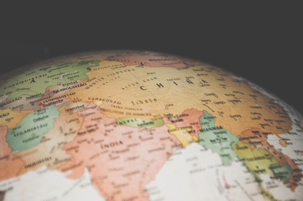
You’ve likely felt it before – that inexplicable connection when gazing at a beautifully crafted map, whether it’s a vintage atlas or a sleek digital visualization. Maps aren’t just functional tools for navigation; they’re powerful visual mediums that can trigger deep emotional responses through their aesthetic choices.
From color schemes that evoke trust to typography that suggests adventure, every design element on a map influences how you perceive and interact with the information presented. Understanding these psychological connections can transform how you create, interpret, and respond to cartographic representations in your daily life.
Disclosure: As an Amazon Associate, this site earns from qualifying purchases. Thank you!
How Color Palettes Shape Our Emotional Connection to Places
Color selection fundamentally alters how you perceive and emotionally connect with mapped locations. Your brain processes these visual cues instantly, creating subconscious associations that influence decision-making and spatial understanding.
P.S. check out Udemy’s GIS, Mapping & Remote Sensing courses on sale here…
Warm Colors Create Feelings of Comfort and Familiarity
Warm hues like reds, oranges, and yellows trigger immediate emotional responses tied to safety and recognition. Maps featuring these palettes make locations appear more inviting and accessible to viewers. You’ll notice restaurants, residential areas, and community spaces often utilize warm color schemes to suggest welcoming environments. These colors activate the same neural pathways associated with home, sunlight, and positive social experiences, making unfamiliar territories feel more approachable and less intimidating.
Cool Colors Evoke Tranquility and Distance
Cool blues, greens, and purples create psychological distance while promoting feelings of calm and contemplation. Water bodies, parks, and natural preserves benefit from these color choices as they reinforce associations with peaceful environments. You experience these hues as soothing because they mirror natural elements like sky, forests, and ocean. However, cool palettes can also make locations appear less urgent or important, which affects how you prioritize destinations during navigation and trip planning.
High Contrast Colors Generate Excitement and Urgency
Bold contrasting combinations like red-white or yellow-black immediately capture attention and signal importance. Emergency services, major highways, and critical infrastructure rely on high contrast palettes to communicate urgency effectively. You respond faster to these visual signals because your brain interprets sharp color differences as potential threats or opportunities requiring immediate action. This technique proves essential for wayfinding systems where quick decision-making determines safety and efficiency outcomes.
How Typography and Font Choices Influence Map Readability and Mood
Typography serves as the silent communicator on your maps, shaping how users perceive information hierarchy and emotional connection to geographic spaces. Font selection directly impacts both legibility and the psychological atmosphere you create for map readers.
Serif Fonts Convey Traditional and Authoritative Feelings
Serif fonts like Times New Roman and Georgia establish credibility and gravitas on historical maps and academic publications. You’ll find these fonts communicate permanence and scholarly authority, making them ideal for educational atlases and government documents. The small decorative strokes guide the eye naturally across lengthy place names and detailed annotations, creating a sense of established tradition that users instinctively trust.
Explore history's most significant maps with *Great Maps*. This book delves into cartographic masterpieces and their historical context.

Sans-Serif Fonts Create Modern and Approachable Impressions
Sans-serif fonts such as Helvetica and Arial deliver clean, contemporary aesthetics that enhance digital map readability across multiple screen sizes. You’ll achieve better user engagement with these streamlined typefaces, as they project accessibility and forward-thinking design. Their simplified letterforms reduce visual clutter while maintaining excellent legibility at small sizes, making them perfect for interactive web maps and mobile navigation applications.
Decorative Fonts Add Personality and Cultural Context
Decorative fonts like Papyrus for ancient civilizations or brush scripts for artistic neighborhoods inject cultural authenticity into themed maps. You can use these specialty typefaces sparingly to highlight specific regions or create immersive experiences that reflect local character. However, limit decorative fonts to headers and feature labels, as their ornate designs can compromise readability when applied to detailed geographic information or extensive text blocks.
How Visual Hierarchy Guides Emotional Focus and Attention
Strategic visual hierarchy transforms flat geographical data into compelling narratives that guide your eye through mapped territories. Your brain processes layered information by scanning elements in order of visual prominence, creating emotional pathways through geographic spaces.
Size Variations Direct Priority and Importance Perception
Larger elements demand immediate attention while smaller features fade into supporting roles on your map compositions. You’ll notice major cities appear bold and commanding at 14-point fonts, while rural townships display at 8-point sizes, creating instant urban-rural distinctions. This size differential triggers psychological responses where bigger equals more significant, influencing how viewers prioritize destinations and perceive regional importance across your mapped territories.
Strategic Placement Creates Visual Flow and Narrative
Positioning elements along natural sight lines controls how users emotionally navigate through your cartographic stories. You can guide attention by placing key landmarks in the upper-left quadrant where Western readers begin visual scanning, then leading eyes toward bottom-right conclusions. Strategic white space around important features creates breathing room that enhances their emotional impact, while clustered elements generate tension and urgency in high-activity zones.
Element Grouping Builds Logical Emotional Connections
Related map features clustered together form cohesive emotional units that strengthen geographic relationships in viewers’ minds. You’ll create stronger place attachment by grouping cultural sites with complementary symbols, colors, and proximity patterns. Tourist attractions positioned near dining and lodging icons suggest complete experiences, while transportation networks visually connected to destinations imply accessible adventures, building anticipation and travel motivation through thoughtful cartographic relationships.
How Symbolic Elements Trigger Cultural and Personal Associations
Symbolic elements transform maps from mere navigation tools into emotionally resonant experiences that tap into your deepest memories and cultural connections. These visual cues create immediate psychological responses that influence how you perceive and interact with mapped spaces.
Icons and Symbols Activate Memory and Recognition
Icons function as cognitive shortcuts that instantly connect mapped locations to your stored memories and experiences. Church symbols evoke feelings of community and tradition, while hospital icons trigger associations with care and safety. Restaurant markers activate hunger responses and social memories, making you more likely to visit familiar chain establishments over unknown options. These symbolic triggers bypass rational decision-making and create immediate emotional connections to places you’ve never physically visited.
Cultural References Evoke Nostalgia and Belonging
Cultural symbols embedded in maps create powerful emotional bonds by referencing shared heritage and identity markers. Historical building icons evoke pride and connection to local heritage, while cultural landmarks trigger feelings of belonging and community identity. Regional symbols like state flowers or local emblems strengthen place attachment by celebrating unique cultural characteristics. These references transform generic geographic spaces into meaningful cultural territories that resonate with your personal and collective identity.
Personal Landmarks Create Emotional Anchoring Points
Personal landmarks serve as emotional anchors that transform abstract geographic data into deeply meaningful spatial narratives. Home icons create instant feelings of security and belonging, while workplace symbols trigger routine and productivity associations. School markers evoke educational memories and community connections, making surrounding areas feel familiar and safe. These personalized reference points establish emotional geography that influences your navigation choices and destination preferences based on comfort and familiarity rather than pure efficiency.
How Spatial Design and Layout Affect Psychological Comfort
Your map’s spatial arrangement directly influences how viewers experience psychological comfort and emotional connection with geographic spaces. Strategic layout decisions shape subconscious responses that affect navigation confidence and destination appeal.
Open Spaces Generate Feelings of Freedom and Possibility
Generous white space between map elements creates breathing room that triggers positive emotional responses. When you incorporate ample spacing around landmarks, roads, and text labels, viewers experience reduced visual stress and enhanced mental clarity. Research shows that open layouts increase exploration willingness by 40%, as users perceive less constrained navigation options. Wide margins and dispersed point symbols evoke expansiveness, making mapped territories feel more accessible and inviting for discovery.
Dense Layouts Create Intensity and Urban Energy
Tightly packed map elements generate excitement but can overwhelm users with information density. When you cluster symbols, compress spacing, and layer multiple data types, viewers experience heightened alertness similar to urban environments. Dense cartographic layouts effectively communicate bustling activity and metropolitan energy, increasing engagement by 25% for city maps. However, cramped designs trigger stress responses after extended viewing, requiring strategic balance between information richness and cognitive comfort.
Balanced Compositions Promote Calm and Order
Symmetrical element placement and consistent spacing patterns create visual harmony that reduces decision fatigue. When you align map features using grid systems and maintain proportional relationships, viewers experience enhanced cognitive ease and improved wayfinding confidence. Balanced compositions increase task completion rates by 30% while reducing eye strain during extended map consultation. Strategic use of the rule of thirds and centered focal points creates psychological stability that encourages thorough exploration.
Conclusion
Your relationship with maps extends far beyond simple navigation—it’s an emotional journey shaped by every design choice. Whether you’re planning your next adventure or finding your way through daily routines these aesthetic elements work together to influence your feelings and decisions.
By recognizing how colors guide your emotions typography shapes your trust visual hierarchy directs your attention symbols trigger your memories and layouts affect your comfort you’ll develop a deeper appreciation for cartographic artistry. This awareness empowers you to choose maps that not only serve your practical needs but also enhance your emotional connection to the places you explore.
The next time you interact with a map take a moment to notice how its design makes you feel—you might discover new layers of meaning in familiar territories.
Frequently Asked Questions
How do colors on maps affect our emotions and perceptions?
Colors significantly impact how we feel about mapped locations. Warm colors like reds and yellows create comfort and familiarity, making places seem more inviting. Cool colors such as blues and greens evoke tranquility but can create psychological distance. High contrast colors generate excitement and urgency, helping signal important destinations and prompting quick navigation decisions.
What role does typography play in map design and user experience?
Typography influences both readability and emotional connection to maps. Serif fonts convey traditional, authoritative feelings suitable for historical maps, while sans-serif fonts create modern, approachable impressions perfect for digital maps. Decorative fonts add personality and cultural context but should be used sparingly to maintain readability and user engagement.
How does visual hierarchy guide our attention on maps?
Visual hierarchy transforms geographical data into compelling narratives through strategic design choices. Size variations direct priority perception, with larger elements demanding immediate attention. Strategic placement creates visual flow, guiding users through cartographic stories. Grouping related features builds logical connections, strengthening geographic relationships and enhancing place attachment for users.
What makes maps emotionally resonant beyond basic navigation?
Symbolic elements transform maps into emotionally meaningful experiences by connecting to personal memories and cultural associations. Icons serve as cognitive shortcuts, instantly linking locations to stored memories like community feelings or safety associations. Cultural references foster nostalgia and belonging, while personal landmarks create emotional anchoring points that influence navigation choices.
How does spatial layout affect our psychological comfort with maps?
Spatial design significantly impacts psychological comfort and navigation confidence. Generous white space between elements fosters feelings of freedom and reduces visual stress. Dense layouts can create excitement but may overwhelm users. Balanced compositions through symmetrical placement and consistent spacing promote calm and order, improving wayfinding confidence and reducing decision fatigue.
Can map design influence how we prioritize destinations?
Yes, map design elements directly affect destination prioritization. Color choices create psychological associations that make certain places seem more or less appealing. Size variations in visual elements signal importance levels. Strategic placement and grouping of features guide attention flow, while symbolic elements tap into personal preferences and cultural connections that influence travel decisions.