6 Best Data Visualization Techniques for Impact
The big picture: You’re standing at the intersection of data visualization and creative expression where maps transform from simple navigation tools into powerful storytelling mediums.
Why it matters: Modern mapping combines analytical precision with artistic flair to communicate complex information in ways that both inform and inspire your audience.
What’s next: These six innovative approaches will help you merge statistical rigor with creative design to produce maps that don’t just show data—they make people feel it.
Disclosure: As an Amazon Associate, this site earns from qualifying purchases. Thank you!
P.S. check out Udemy’s GIS, Mapping & Remote Sensing courses on sale here…
Combine Data Visualization With Hand-Drawn Illustrations
Hand-drawn illustrations breathe life into sterile datasets while maintaining analytical precision. This hybrid approach transforms complex statistical information into visually compelling narratives that capture both quantitative accuracy and emotional resonance.
Integrate Statistical Charts Into Watercolor Landscapes
Create vibrant watercolor art with this portable set. It includes 40 colors (metallic & fluorescent), a brush pen, watercolor paper, and more, all in a stylish tin box.
Layer bar charts and line graphs directly onto painted terrain features to create compelling visual narratives. Position precipitation data bars within watercolor mountain ranges or embed population growth curves along hand-painted coastlines. Use transparent overlays in GIS software like QGIS or ArcGIS Pro to blend statistical elements with scanned artwork. Your charts maintain data integrity while the watercolor base provides geographic context and aesthetic appeal that engages viewers beyond raw numbers.
Layer Digital Heat Maps Over Sketched Urban Scenes
Overlay digital density maps onto pencil-drawn cityscapes to highlight data patterns within familiar urban contexts. Create heat map visualizations in R or Python, then composite them over hand-sketched street layouts using Adobe Photoshop or GIMP. Adjust opacity levels between 60-80% to preserve both the analytical heat patterns and underlying architectural details. This technique works particularly well for crime statistics, foot traffic data, or demographic information where the human-scale sketch provides relatable context for abstract numerical patterns.
Merge Geographic Information Systems With Creative Design Elements
Transform your technical GIS outputs into compelling visual narratives by thoughtfully integrating artistic design principles with spatial analysis workflows.
Apply Artistic Color Palettes to Traditional GIS Outputs
Replace default GIS color schemes with curated palettes that enhance data interpretation while maintaining cartographic standards. Consider using complementary colors from nature photography or fine art to create choropleth maps that draw viewers into your spatial story. Tools like ColorBrewer and Adobe Color help you select scientifically-backed palettes that ensure accessibility while adding visual sophistication. Test your chosen colors across different display formats to verify readability and maintain professional cartographic integrity throughout your mapping project.
Incorporate Typography Art Into Spatial Analysis Results
Elevate your GIS labels and annotations by treating typography as a design element rather than mere functional text. Select fonts that complement your map’s theme—serif fonts for historical analyses or clean sans-serif options for modern urban studies. Create hierarchical text systems using varying weights and sizes to guide readers through complex spatial relationships. Consider hand-lettered labels for feature callouts or use decorative fonts sparingly for map titles that capture attention without compromising legibility.
Transform Statistical Heat Maps Into Abstract Art Compositions
Statistical heat maps offer untapped potential for artistic transformation. You can convert rigid data visualizations into flowing compositions that maintain analytical integrity while engaging viewers emotionally.
Convert Population Density Data Into Flowing Organic Shapes
Replace traditional grid-based heat maps with fluid, organic boundaries that follow natural population clusters. Use Bezier curves in Adobe Illustrator or QGIS’s smoothing algorithms to transform angular census blocks into flowing shapes resembling water currents or cloud formations. Apply graduated color transitions between density zones using natural palettes—forest greens for sparse areas transitioning to warm coral tones for dense urban cores. This approach preserves statistical accuracy while creating visually compelling narratives about human settlement patterns.
Learn Adobe Illustrator with the 2025 release of this comprehensive guide. Master essential skills through hands-on lessons.
Redesign Temperature Maps Using Impressionist Techniques
Apply impressionist painting principles to meteorological data visualization by breaking temperature zones into textured brushstroke patterns. Use QGIS’s displacement renderer or custom Python scripts to create stippled effects that mirror Pointillist techniques. Replace solid color blocks with varied dot densities—sparse dots for cooler regions, dense clusters for warmer areas. Incorporate color theory from Monet’s palette: cool blues and purples for low temperatures, warm yellows and oranges for high readings. This technique transforms sterile weather data into emotionally resonant climate portraits.
Blend Infographic Design With Traditional Cartographic Methods
Infographic design principles transform conventional maps into compelling visual narratives. You’ll create more engaging cartographic products by merging data storytelling techniques with geodetic precision.
Create Story-Driven Maps Using Narrative Visual Elements
Storytelling transforms static maps into dynamic communication tools. You’ll achieve this by incorporating sequential visual elements like numbered waypoints, directional arrows, and timeline indicators that guide readers through geographic narratives. Combine traditional cartographic symbols with infographic elements such as progress bars showing elevation changes or population growth over time. Tools like Adobe Illustrator allow you to layer these narrative components over precise coordinate systems while maintaining spatial accuracy.
Combine Icons and Symbols With Precise Geographic Coordinates
Icon integration enhances map readability without sacrificing positional accuracy. You’ll replace traditional point symbols with intuitive icons that immediately convey meaning – hospital crosses for medical facilities, graduation caps for educational institutions, or factory symbols for industrial zones. Ensure icons maintain consistent scale relationships and don’t obscure underlying geographic features. Use software like ArcGIS Pro or QGIS to anchor custom icon libraries to exact coordinate positions while applying appropriate cartographic generalization principles.
Integrate Interactive Digital Tools With Analog Art Techniques
Modern mapping technology doesn’t have to replace traditional artistic methods—it can enhance them. You’ll discover powerful combinations that preserve the tactile quality of hand-crafted work while leveraging digital precision.
Develop Touch-Screen Maps With Hand-Painted Textures
Touch-screen maps gain visual depth when you overlay hand-painted textures onto digital base layers. Scan watercolor washes or acrylic textures at 300 DPI, then import them into ArcGIS Pro or QGIS as semi-transparent overlays. You’ll maintain precise coordinate accuracy while adding organic visual appeal. Tools like Procreate or Adobe Fresco let you paint directly on tablets, creating custom terrain textures that respond to touch interactions through web mapping APIs.
Improve reading focus and comfort with these colored overlays. This pack includes 20 sheets in 7 colors to reduce visual stress and aid readers of all ages.
Build Augmented Reality Experiences Over Physical Art Installations
Augmented reality transforms static art installations into dynamic mapping experiences. Position painted canvases or sculptural elements as anchor points for AR overlays using ARCore or ARKit frameworks. You can layer real-time data visualizations, historical timelines, or interactive legends directly onto physical artwork. Unity 3D combined with Mapbox SDK enables precise GPS positioning of digital elements over hand-crafted installations, creating immersive experiences that blend physical craftsmanship with dynamic data storytelling.
Fuse Scientific Data Representation With Fine Art Aesthetics
Scientific data transforms into compelling visual narratives when you merge analytical precision with artistic interpretation. This approach elevates raw datasets beyond traditional charts and graphs into meaningful aesthetic experiences.
Present Climate Change Data Through Sculptural Map Forms
Transform temperature datasets into three-dimensional topographic sculptures using materials like clay, foam, or 3D-printed elements. You’ll create tactile elevation models where rising temperatures translate to physical height, making abstract warming trends tangible through artistic form.
Layer precipitation data onto hand-carved relief maps using colored resins or paints that flow naturally across carved watersheds. This technique allows viewers to trace climate patterns through their fingertips while experiencing the data as both scientific measurement and artistic expression through sculptural mapping techniques.
Explore the United States with this 3D raised relief map. Feel the terrain and understand topography through its tactile, vacuum-formed design.
Display Economic Trends Using Mixed Media Artistic Approaches
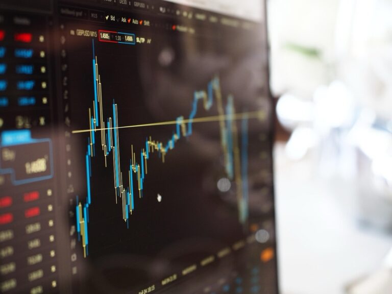
Integrate stock market fluctuations into abstract paintings by translating price movements into brushstroke patterns across canvas surfaces. You’ll use acrylic paints with varying opacity levels to represent trading volumes while maintaining mathematical accuracy in your artistic data representation.
Create vibrant art with this acrylic paint set! It features 24 richly pigmented, non-toxic colors that blend easily and dry quickly on various surfaces. The tightly sealed bottles prevent leaks and drying.
Combine demographic income data with textile art by weaving economic indicators into fabric patterns using thread colors that correspond to wage levels. This mixed-media approach transforms statistical analysis into wearable art pieces that communicate socioeconomic patterns through tactile artistic mapping experiences.
Conclusion
The fusion of artistic creativity with analytical precision opens endless possibilities for transforming how you present spatial information. These six innovative approaches demonstrate that data visualization doesn’t have to sacrifice beauty for accuracy.
By experimenting with mixed media techniques sculptural elements and interactive digital tools you’ll create maps that speak to both the mind and heart. Your audience will connect more deeply with information when it’s presented through compelling visual narratives.
The most successful mapping projects balance scientific rigor with creative expression. Whether you’re working with GIS data climate statistics or demographic trends these techniques will help you craft memorable experiences that make complex information accessible and engaging.
Start small by incorporating one or two artistic elements into your next mapping project. You’ll quickly discover how these creative approaches can elevate your analytical work from simple data presentation to powerful storytelling that resonates with viewers long after they’ve seen your visualization.
Frequently Asked Questions
What is the main purpose of combining data visualization with creative expression?
The main purpose is to transform basic navigation tools and sterile datasets into powerful storytelling mediums that evoke emotional responses. By merging analytical precision with artistic elements, creators can effectively communicate complex information that resonates with audiences while maintaining statistical accuracy and making data more relatable and engaging.
How can hand-drawn illustrations enhance data visualization?
Hand-drawn illustrations infuse life into sterile datasets while preserving analytical accuracy. This technique combines the precision of data visualization with the warmth and humanity of artistic expression, creating maps and charts that are both informative and emotionally engaging, making complex information more accessible to diverse audiences.
What are some techniques for integrating statistical charts into artistic landscapes?
Key techniques include layering statistical data directly onto watercolor painted terrains, overlaying digital heat maps on sketched urban scenes, and transforming grid-based heat maps into fluid, organic shapes. These methods create visually compelling narratives by placing abstract numerical patterns within familiar, artistic contexts that viewers can easily relate to.
How can GIS outputs be transformed into creative visual narratives?
GIS outputs can be enhanced by incorporating artistic color palettes using tools like ColorBrewer and Adobe Color, applying thematic typography with hierarchical text systems, and replacing technical elements with creative design components. This transformation maintains geodetic precision while making the information more visually sophisticated and accessible to broader audiences.
What role does typography play in spatial analysis visualization?
Typography guides readers through complex spatial relationships by using thematic fonts and hierarchical text systems that maintain legibility while enhancing visual appeal. Proper typography helps organize information, creates visual hierarchy, and ensures that spatial data is communicated clearly while supporting the overall artistic narrative of the visualization.
Master the art of typography with this comprehensive guide. Learn to set perfect type with clear explanations and practical examples.
How can heat maps be transformed into abstract art?
Heat maps can be redesigned using impressionist techniques to create emotionally resonant portraits, replacing traditional grids with organic shapes that reflect natural patterns, and incorporating artistic color schemes. These transformations maintain analytical integrity while showcasing the artistic potential of statistical data, making complex information more visually appealing and emotionally engaging.
What are interactive digital tools combined with analog art techniques?
These include developing touch-screen maps with hand-painted textures, building augmented reality experiences over physical art installations, and overlaying organic visual elements onto digital base layers. These hybrid approaches create immersive experiences that blend traditional craftsmanship with modern technology, enhancing both accessibility and emotional impact.
How can scientific data be represented through fine art aesthetics?
Scientific data can be transformed through sculptural mapping techniques like creating 3D topographic sculptures from climate data, layering precipitation data onto hand-carved relief maps, integrating stock market data into abstract paintings, and weaving demographic information into textile art. These methods make complex data more tangible and relatable.
What makes narrative-driven maps more effective than traditional maps?
Narrative-driven maps incorporate sequential visual elements, intuitive icons, and storytelling techniques that enhance readability while maintaining positional accuracy. They combine data storytelling with geodetic precision, creating more engaging experiences that guide viewers through information in a logical, emotionally resonant way that traditional maps often lack.
What tools are recommended for creating artistic color palettes in data visualization?
ColorBrewer and Adobe Color are the primary recommended tools for creating artistic color palettes that ensure both accessibility and visual sophistication. These tools help maintain analytical accuracy while enhancing the aesthetic appeal of data visualizations, ensuring that color choices support both the artistic vision and the data’s integrity.
