7 Color Contrast Techniques That Transform Digital Maps
Why it matters: Map readability can make or break your navigation experience whether you’re using GPS apps or designing interactive maps for websites.
The big picture: Poor color contrast creates accessibility barriers and forces users to squint strain and potentially miss critical navigation details that could impact their journey.
What’s next: Strategic color contrast techniques transform confusing maps into clear intuitive tools that guide users effortlessly from point A to point B.
Disclosure: As an Amazon Associate, this site earns from qualifying purchases. Thank you!
P.S. check out Udemy’s GIS, Mapping & Remote Sensing courses on sale here…
Understanding Color Contrast Fundamentals in Map Design
Building on the importance of map readability, mastering color contrast fundamentals transforms your mapping projects from visually confusing displays into clear navigation tools.
Color Theory Basics for Cartographic Applications
Complementary colors create the strongest visual separation in map design. You’ll achieve maximum contrast by pairing colors opposite on the color wheel—like blue roads against orange terrain or red markers on green backgrounds. Analogous color schemes work best for showing data hierarchies, using colors that sit adjacent on the wheel like blue-green-teal for water features. Monochromatic approaches help you create subtle distinctions within single feature types, varying lightness and saturation while maintaining color family consistency.
Accessibility Standards and Visual Perception
WCAG 2.1 guidelines require a minimum 3:1 contrast ratio for large text and 4.5:1 for small text in digital maps. You’ll need higher ratios—up to 7:1—for critical navigation elements like route indicators or warning symbols. Color blindness affects 8% of men and 0.5% of women, making red-green combinations particularly problematic. Testing tools like Color Oracle or Stark help you simulate how users with different vision types perceive your map colors, ensuring universal accessibility.
The Role of Contrast Ratios in Navigation
High contrast ratios between 7:1 and 21:1 work best for primary navigation elements like main roads, destination markers, and current location indicators. You’ll want medium contrast ratios of 4.5:1 to 7:1 for secondary features like street names, points of interest, and route alternatives. Low contrast ratios below 3:1 should only be used for background elements like terrain shading or administrative boundaries that support but don’t compete with primary navigation information.
Implementing High Contrast Color Schemes
You’ll achieve the most dramatic navigation improvements by establishing clear visual hierarchies through strategic high contrast color implementation.
Light Versus Dark Background Strategies
Dark backgrounds excel at highlighting bright navigation elements like route paths and point markers. You’ll find that cyan routes (#00FFFF) and yellow waypoints (#FFFF00) achieve maximum visibility against dark slate backgrounds (#2F2F2F). Light backgrounds work better for detailed topographic information where users need to read elevation contours and terrain features clearly.
Primary Color Selection for Maximum Visibility
Primary color selection should prioritize complementary pairs that create natural visual separation. You’ll want to use red (#FF0000) for critical alerts, blue (#0066CC) for water features, and green (#228B22) for recreational areas. Orange (#FF6600) works exceptionally well for construction zones and temporary route changes since it naturally draws attention.
Testing Contrast Levels Across Different Devices
Device testing requires checking your color schemes across multiple screen types and lighting conditions. You’ll need to verify contrast ratios using tools like WebAIM’s Color Contrast Checker on both mobile OLED displays and desktop LCD monitors. Outdoor visibility testing becomes crucial since sunlight can reduce perceived contrast by up to 60%, requiring you to boost primary navigation colors accordingly.
This 43" Samsung 4K UHD commercial display delivers crisp visuals with a non-glare screen and built-in media player. Designed for 16/7 operation, it offers versatile connectivity and a three-year warranty for reliable performance.

Utilizing Color Temperature Differences
Color temperature creates natural visual separations that guide users through complex map information. Understanding warm and cool relationships helps establish intuitive navigation patterns.
Warm and Cool Color Combinations
Warm colors (reds, oranges, yellows) naturally advance toward viewers, making them ideal for highlighting active routes and points of interest. Cool colors (blues, purples, greens) recede visually, working best for background elements like water bodies and terrain features. You’ll create stronger contrast by pairing warm navigation paths with cool base layers, such as orange route lines over blue water features or red waypoints against green recreational areas.
Creating Visual Hierarchy Through Temperature
Temperature-based hierarchies organize map information by importance through natural visual weight. Position warm colors for primary navigation elements like current location markers and active routes, while cool colors support secondary features such as alternate paths and reference points. You can establish three hierarchy levels: hot temperatures (red-orange) for critical alerts, moderate temperatures (yellow-green) for standard navigation, and cool temperatures (blue-purple) for contextual information.
Seasonal and Environmental Considerations
Environmental context influences temperature perception and navigation effectiveness throughout different seasons and lighting conditions. Summer maps benefit from cooler temperature palettes that reduce eye strain in bright sunlight, while winter navigation requires warmer accent colors that remain visible against snow and ice. You should test temperature combinations under various lighting scenarios, ensuring that warm emergency markers stay prominent in both daylight glare and low-light conditions.
Applying Complementary Color Pairings
Complementary color relationships create the strongest visual separation possible in map design. These opposing color combinations maximize contrast while maintaining aesthetic harmony across your navigation interface.
Opposite Colors on the Color Wheel
Red and green pairings provide maximum contrast for route differentiation, making them ideal for highlighting active navigation paths against terrain backgrounds. Blue and orange combinations excel at separating water features from urban infrastructure, while purple and yellow schemes create striking visibility for points of interest against neutral map backgrounds. These opposing relationships ensure users can instantly distinguish between different navigation elements without visual confusion.
Enhancing Route Visibility With Complementary Schemes
Primary route highlighting benefits from red paths against green terrain backgrounds, creating immediate visual priority for active navigation instructions. Alternative route display works effectively with orange paths on blue water or transportation backgrounds, maintaining clarity without competing with primary directions. Traffic condition overlays leverage complementary relationships by using red congestion indicators against green free-flow areas, providing instant traffic status recognition for navigation decisions.
Balancing Saturation Levels for Optimal Readability
High saturation complementary pairs work best for primary navigation elements like active routes and critical waypoints that require immediate user attention. Medium saturation combinations provide effective contrast for secondary features like alternate routes and traffic updates without overwhelming the primary navigation display. Low saturation pairings maintain complementary relationships while reducing visual fatigue during extended navigation sessions, particularly important for long-distance route guidance and detailed map exploration.
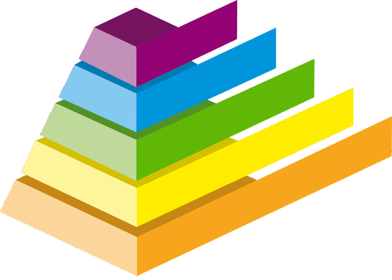
Establishing Clear Visual Hierarchy Through Color Gradients
Color gradients create intuitive navigation paths that guide users through complex map information systematically. You’ll establish clear priorities by transitioning from high-intensity colors for critical elements to subtle tones for background features.
Progressive Color Scaling for Different Map Elements
Progressive scaling assigns darker, more saturated colors to primary navigation routes while lighter variants handle secondary pathways. Your main highways should use full-strength colors like deep blue (#003366), arterial roads get medium tones (#4D79A4), and residential streets receive pale versions (#B3CCE6). This creates natural visual stepping that prevents information overload during navigation tasks.
Priority-Based Color Assignment Systems
Priority-based systems rank map features by navigation importance then assign color intensity accordingly. You’ll designate high-priority elements like active routes and destinations with maximum saturation values above 80%, medium-priority features like landmarks receive 50-70% saturation, and background elements stay below 40%. This systematic approach ensures critical navigation information dominates the visual field.
Layered Information Display Techniques
Layered techniques stack information using graduated color opacity to reveal detail progressively. Your base layer uses 100% opacity for terrain features, transportation networks apply 85% opacity for clear visibility, and supplementary data like property boundaries use 50% opacity. Users can process essential navigation elements first while accessing additional context through visual layering without overwhelming the primary wayfinding experience.
Integrating Monochromatic Contrast Variations
Monochromatic contrast techniques offer sophisticated solutions for maintaining visual clarity while working within restricted color palettes. You’ll find these approaches particularly valuable when developing brand-compliant mapping systems or creating cohesive navigation interfaces.
Single-Hue Value Adjustments
Manipulate lightness and darkness within individual color channels to create distinct navigation layers. Assign your darkest blue values (20-30% lightness) to primary highways, medium blues (50-60%) to secondary roads, and light blues (80-90%) to residential streets. This systematic value progression maintains color harmony while establishing clear route hierarchies that users can instantly recognize and follow through complex urban environments.
Grayscale Integration for Text Elements
Implement strategic grayscale contrast ratios for all text overlays and labels on colored map backgrounds. Use pure black (#000000) for critical navigation instructions, dark gray (70% black) for street names, and medium gray (50% black) for supplementary information like distance markers. This grayscale hierarchy ensures text readability across various map zoom levels while preventing color interference with your primary navigation elements.
Maintaining Brand Consistency With Limited Palettes
Develop systematic tint and shade variations from your brand’s core colors to expand navigation options without compromising visual identity. Create five distinct values from each brand color: two darker shades for emphasis, the original brand color for primary elements, and two lighter tints for background features. This approach maintains brand recognition while providing sufficient contrast variation for complex mapping scenarios.
Optimizing Color Choices for Universal Accessibility
Creating accessible maps requires thoughtful color selection that accommodates diverse visual abilities while maintaining navigation effectiveness.
Color Blind-Friendly Design Solutions
Implement redundant visual encoding beyond color alone to ensure map functionality for users with color vision deficiencies. Use distinct patterns, textures, or symbols alongside color coding for route differentiation. Test your color combinations using simulators like Coblis or Stark to verify visibility across protanopia, deuteranopia, and tritanopia conditions. Replace problematic red-green combinations with blue-orange or purple-yellow pairings that maintain strong contrast for all users.
Multi-Modal Visual Cues and Patterns
Combine color with additional visual elements to create robust navigation systems that function across different accessibility needs. Incorporate varied line weights, dash patterns, and directional arrows to supplement color coding. Add textural backgrounds or hatching patterns to distinguish between terrain types or zones. This approach ensures your maps remain functional even when viewed on monochrome displays or by users relying on screen readers with spatial audio feedback.
Read comfortably with this lightweight, full-page 5X magnifying glass. Its large viewing area and ergonomic handle make it ideal for seniors and those with low vision to easily read small print.

Cross-Platform Compatibility Considerations
Design color schemes that perform consistently across different devices, operating systems, and display technologies. Test your maps on various screen types including OLED, LCD, and e-ink displays to verify contrast ratios remain effective. Account for automatic dark mode switches and color temperature adjustments that may alter your intended color relationships. Establish fallback color profiles that maintain accessibility standards when system-level color modifications are applied.
Conclusion
Mastering these seven color contrast techniques will transform your maps from confusing displays into powerful navigation tools. You’ll create clearer visual pathways that guide users effortlessly while meeting accessibility standards for diverse audiences.
Remember that effective map design isn’t just about making things look good—it’s about creating functional tools that work for everyone. Test your color choices across different devices and lighting conditions to ensure consistent performance.
Start implementing these techniques gradually and measure user engagement to see the immediate impact. Your improved maps will reduce navigation errors and create more satisfying user experiences that keep people coming back to your platform.
Frequently Asked Questions
What is the importance of color contrast in map design?
Color contrast in map design is crucial for creating clear, readable navigation experiences. Poor contrast can cause user strain, make it difficult to distinguish between map elements, and create accessibility issues. Strategic color contrast improves map clarity, making navigation more intuitive and effective while ensuring all users can access critical navigation information regardless of their visual abilities.
What are the recommended contrast ratios for different map elements?
For primary navigation elements like routes and alerts, use high contrast ratios of at least 4.5:1 for normal text and 3:1 for large text, following WCAG 2.1 guidelines. Secondary features should have medium contrast ratios, while background elements should use lower ratios to maintain visual hierarchy without overwhelming users with too much information.
How do warm and cool colors affect map navigation?
Warm colors (reds, oranges, yellows) are ideal for highlighting active routes, alerts, and points of interest as they naturally draw attention. Cool colors (blues, purples, greens) work best for background elements like water features and terrain. This temperature-based approach creates natural visual separation and helps users quickly identify the most important navigation information.
What are complementary color pairings and why are they effective?
Complementary colors are opposite on the color wheel and create the strongest visual separation in map design. Examples include red and green for route differentiation, blue and orange for water features, and purple and yellow for points of interest. These pairings enhance visibility, reduce visual confusion, and help users quickly distinguish between different map elements.
How can maps be made accessible for color blind users?
Design color blind-friendly maps by using redundant visual encoding beyond color alone. Incorporate distinct patterns, textures, varied line weights, and directional arrows to convey information. Test designs with color blindness simulators and ensure sufficient contrast ratios. This multi-modal approach ensures map functionality for users with color vision deficiencies while maintaining clarity for all users.
What is visual hierarchy in map design?
Visual hierarchy uses color gradients and progressive scaling to guide users through map information systematically. Primary elements use high-intensity colors, secondary features use medium saturation, and background elements use subtle tones. This layered approach prevents information overload by allowing users to focus on essential navigation elements while accessing additional context when needed.
How should color schemes be tested for different environments?
Test color schemes across various devices, lighting conditions, and display technologies to ensure consistent visibility. Use tools like WebAIM’s Color Contrast Checker for digital testing, and conduct outdoor visibility tests under different lighting scenarios. This comprehensive testing approach ensures optimal navigation performance in real-world conditions and maintains accessibility standards across all platforms.