7 Best Mapping Techniques for Climate Data
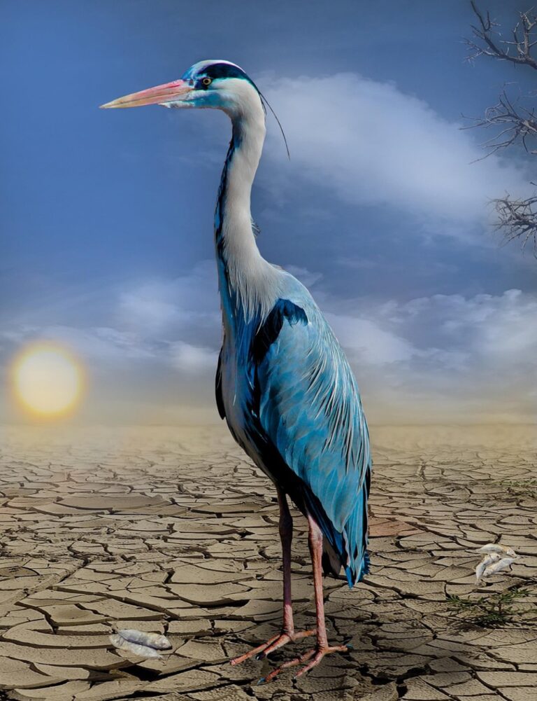
Climate change data can feel overwhelming and abstract — but maps transform complex environmental information into visual stories you can actually understand. From temperature anomaly visualizations to sea-level rise projections, cartographic approaches help you grasp the scale and urgency of our changing planet in ways that raw numbers simply can’t match. These seven mapping techniques reveal climate patterns that’ll reshape how you think about environmental challenges facing your community and the world.
Disclosure: As an Amazon Associate, this site earns from qualifying purchases. Thank you!
Temperature Mapping Reveals Global Warming Patterns
Temperature mapping provides the most direct cartographic evidence of global warming trends. These visualizations transform complex climate datasets into compelling visual narratives that reveal warming patterns across different scales and timeframes.
Heat Map Visualizations of Rising Temperatures
Heat map visualizations transform temperature data into color-coded displays that reveal warming patterns across geographic regions. You’ll find these maps use color gradients from blue (cooler) to red (warmer) to show temperature anomalies compared to historical baselines. NASA’s global temperature anomaly maps demonstrate how you can visualize decade-by-decade warming trends using standardized color schemes. Tools like ArcGIS Pro and QGIS enable you to create heat maps using gridded temperature datasets from NOAA or ERA5 reanalysis data.
P.S. check out Udemy’s GIS, Mapping & Remote Sensing courses on sale here…
Isothermal Line Analysis for Climate Zones
Isothermal lines connect points of equal temperature to delineate climate zone boundaries and track their migration over time. You can map these contour lines to show how temperature thresholds have shifted poleward as global temperatures rise. The Köppen climate classification system relies on isothermal analysis to define climate boundaries. Your isothermal maps should use 1°C or 2°C intervals depending on regional temperature ranges. Processing CHELSA or WorldClim datasets through GIS software allows you to generate accurate isothermal contours for any time period.
Seasonal Temperature Variation Charts
Seasonal temperature variation charts display monthly temperature patterns to reveal changes in seasonal cycles and extreme weather events. You’ll create these visualizations using time-series data that shows how winter warming rates exceed summer warming in many Arctic regions. Climate stripes and warming spiral graphics effectively communicate seasonal temperature trends to broader audiences. Your seasonal charts should incorporate both mean temperatures and extreme value indicators. Meteorological station data from Global Historical Climatology Network provides reliable inputs for creating these temporal visualizations.
Sea Level Rise Cartography Shows Coastal Vulnerabilities
Coastal cartography transforms sea level data into critical planning tools that reveal which communities face the greatest flood risks. These specialized maps combine elevation data with projected water levels to create powerful visual narratives about our changing coastlines.
Topographic Mapping of At-Risk Coastal Areas
Plan your next adventure with the 2025 National Geographic Road Atlas, covering the United States, Canada, and Mexico. Its durable, folded format (11 x 15 in) makes it ideal for hiking and camping trips.

Topographic mapping identifies vulnerable coastal zones by combining Digital Elevation Models (DEMs) with current sea level data. You’ll find LIDAR-derived elevation datasets provide the most accurate foundation for these assessments, typically measuring vertical accuracy within 15 centimeters. Modern GIS software like ArcGIS Pro processes these datasets to generate flood inundation zones that highlight areas below specific elevation thresholds. Coastal planners use these maps to identify infrastructure at risk including roads, buildings, and utilities located in low-lying areas.
Bathymetric Charts for Ocean Level Changes
Bathymetric mapping reveals underwater topography that influences how rising seas will impact different coastal segments. You can access NOAA’s Electronic Navigational Charts (ENCs) and multibeam sonar data to understand seafloor gradients and coastal shelf configurations. Shallow continental shelves amplify storm surge effects while steep underwater slopes concentrate wave energy differently. These charts help predict where rising waters will advance inland most rapidly and identify natural barriers like underwater ridges that might slow coastal flooding.
Future Projection Maps for Coastal Planning
Future projection mapping combines current topographic data with climate models to visualize potential flooding scenarios decades ahead. You’ll want to incorporate IPCC sea level rise projections ranging from 0.43 to 2.84 meters by 2100 depending on emission scenarios. Tools like NOAA’s Sea Level Rise Viewer allow you to model different time horizons and create probability-based flood maps. These projections help planners evaluate retreat strategies, infrastructure hardening needs, and zoning modifications for coastal development.
Precipitation Pattern Maps Track Changing Weather Systems
Precipitation cartography reveals how climate change disrupts established weather patterns through sophisticated data visualization techniques. These maps transform complex meteorological datasets into actionable intelligence for water resource management and climate adaptation planning.
Rainfall Distribution Mapping Techniques
Isohyetal mapping creates contour lines connecting points of equal precipitation across geographic regions. You’ll generate these maps using interpolation algorithms like kriging or inverse distance weighting applied to weather station data. PRISM climate mapping integrates topographic effects with precipitation measurements to produce high-resolution rainfall surfaces. Thiessen polygon analysis assigns precipitation values to geographic areas based on proximity to monitoring stations, while radar-derived precipitation maps provide real-time coverage using NEXRAD doppler data for immediate storm tracking applications.
Get real-time weather data with the Ambient Weather WS-2902. This WiFi-enabled station measures wind, temperature, humidity, rainfall, UV, and solar radiation, plus it connects to smart home devices and the Ambient Weather Network.

Drought Index Visualization Methods
Palmer Drought Severity Index (PDSI) mapping displays standardized drought conditions using color-coded classifications from extreme wet to exceptional drought. You’ll create these visualizations by processing temperature and precipitation data through established PDSI algorithms. Standardized Precipitation Index (SPI) cartography focuses exclusively on precipitation deficits over multiple time scales. MODIS satellite-derived vegetation indices like NDVI complement ground-based measurements by showing drought impacts on plant health. Soil moisture mapping using SMAP satellite data provides subsurface drought indicators that traditional precipitation measurements often miss.
Storm Tracking and Frequency Analysis
Hurricane track density maps aggregate historical storm paths to identify corridors of highest activity using kernel density estimation techniques. You’ll process HURDAT2 database records spanning decades to reveal changing storm patterns. Tornado occurrence mapping combines Storm Prediction Center data with population density layers to assess risk exposure. Hail frequency analysis uses NOAA storm reports and radar signatures to map hail probability zones. Lightning strike density visualization employs National Lightning Detection Network data to show thunderstorm frequency patterns and their correlation with changing precipitation regimes.
Ice Cover Mapping Documents Polar Region Changes
Ice cover cartography transforms polar satellite data into compelling visual evidence of climate change impacts. These mapping techniques reveal dramatic changes in Earth’s frozen regions with unprecedented precision.
Satellite Imagery for Glacier Retreat Tracking
Landsat time-series analysis provides the foundation for documenting glacier retreat patterns across decades. You’ll create multi-temporal glacier boundary maps using normalized difference snow index (NDSI) calculations to distinguish ice from rock surfaces. Sentinel-2 imagery offers enhanced 10-meter resolution for detailed terminus position tracking. Advanced cartographers combine optical imagery with synthetic aperture radar (SAR) data from Sentinel-1 to penetrate cloud cover and monitor glacial movement velocities through interferometric analysis.
Achieve a flawless, even complexion with e.l.f. Flawless Satin Foundation. This lightweight, vegan formula provides medium coverage and a semi-matte finish for all-day wear, while hydrating your skin with glycerin.

Arctic Sea Ice Extent Visualization
NSIDC sea ice concentration data enables you to map Arctic ice extent with daily precision using passive microwave satellite measurements. Create comparative visualizations showing September minimum extents using color-coded concentration percentages from 15% to 100% ice coverage. MODIS thermal infrared imagery supplements concentration data by revealing ice surface temperatures and melt pond formation. Interactive time-series maps demonstrate the 13% per decade decline in Arctic sea ice extent since 1979.
Antarctic Ice Sheet Thickness Mapping
ICESat-2 altimetry data provides precise elevation measurements for tracking Antarctic ice sheet thickness changes. You’ll process laser altimetry returns to generate digital elevation models showing annual ice mass variations across drainage basins. GRACE satellite gravimetry complements altimetry by measuring total ice mass changes through gravitational anomaly detection. Combine both datasets to create comprehensive thickness change maps revealing accelerated ice loss in West Antarctica’s Amundsen Sea sector.
Carbon Emission Mapping Identifies Pollution Sources
Carbon emission mapping reveals the geographic distribution of greenhouse gas sources, transforming invisible pollution into visible patterns that inform policy decisions and environmental management strategies.
Industrial Emission Heat Maps
Industrial emission heat maps visualize pollution intensity across manufacturing regions using EPA emissions inventory data and satellite-based monitoring systems. You’ll find these maps display CO2 concentrations through color gradients, with red zones indicating high-emission facilities like power plants and steel mills. NASA’s OCO-2 satellite data combined with ground-based sensors creates comprehensive visualizations that track emission plumes and identify previously unmapped pollution sources in real-time.
Transportation Corridor Carbon Tracking
Transportation corridor carbon tracking maps highway and shipping route emissions using GPS fleet data and fuel consumption algorithms. You can analyze traffic density patterns combined with vehicle emission factors to create detailed carbon footprint corridors along major interstate systems. MOVES (Motor Vehicle Emission Simulator) data integrated with OpenStreetMap road networks produces precise visualizations showing how urban arterials and freight corridors contribute disproportionately to regional carbon budgets.
Regional Carbon Footprint Comparisons
Regional carbon footprint comparisons utilize standardized per-capita emission calculations across administrative boundaries to reveal consumption-based versus production-based carbon patterns. You’ll discover these choropleth maps highlight stark differences between urban and rural emissions, with metropolitan areas showing higher transportation emissions while rural regions display elevated agricultural methane outputs. EDGAR (Emissions Database for Global Atmospheric Research) provides the foundational datasets for creating accurate regional comparisons at county and state levels.
Vegetation Mapping Monitors Ecosystem Shifts
Experience smooth, tear-free gaming and video with the Acer KB272 G0bi 27" Full HD monitor, featuring Adaptive-Sync (FreeSync Compatible) and a rapid 1ms response time. Enjoy vibrant colors with 99% sRGB coverage and versatile connectivity through HDMI and VGA ports.

Vegetation mapping reveals how plant communities respond to changing climate conditions across landscapes. You’ll discover ecosystem boundaries shifting and species distributions evolving through advanced satellite monitoring techniques.
NDVI Analysis for Plant Health Assessment
NDVI calculations transform satellite spectral data into vegetation health indicators that track photosynthetic activity across time. You’ll use Landsat 8 or Sentinel-2 imagery to generate Normalized Difference Vegetation Index values ranging from -1 to +1, where healthy vegetation registers above 0.4. MODIS Terra provides 16-day composite NDVI products at 250-meter resolution for continental-scale monitoring, while higher-resolution sensors capture localized stress patterns in agricultural areas and forest canopies affected by drought or temperature extremes.
Deforestation Tracking Through Satellite Data
Deforestation detection algorithms process multi-temporal satellite imagery to identify forest loss events with sub-annual precision. You’ll combine Landsat time-series analysis with Global Forest Change datasets that provide annual tree cover loss at 30-meter resolution since 2000. PRODES monitoring systems track Amazon deforestation using MODIS and Landsat data, while FORMA alerts detect clearing activities within weeks. Hansen Global Forest Change maps quantify forest loss percentages by administrative boundaries, enabling you to correlate deforestation rates with climate variables.
Species Migration Pattern Visualization
Species distribution models integrate occurrence data with bioclimatic variables to map habitat suitability changes over time. You’ll use MaxEnt modeling software combined with WorldClim datasets to project species range shifts under different warming scenarios. eBird citizen science data provides migration timing observations that you can map using kernel density estimation techniques. Climate envelope modeling reveals corridors where species must migrate to maintain suitable temperature and precipitation conditions, while connectivity analysis identifies landscape barriers that fragment migration pathways.
Extreme Weather Event Mapping Reveals Climate Impacts
Extreme weather event mapping transforms raw meteorological data into visual evidence of climate change’s intensifying effects on global weather systems.
Hurricane Intensity and Path Tracking
Hurricane intensity mapping combines satellite imagery with pressure data to visualize storm strengthening patterns over warming ocean surfaces. You’ll track storm paths using HURDAT2 datasets and NOAA’s Historical Hurricane Database to analyze changing trajectories and rapid intensification events. Modern mapping platforms display wind speed gradients through color coding, revealing how storms maintain strength longer due to increased sea surface temperatures and altered atmospheric conditions.
Wildfire Spread and Risk Assessment Maps
Wildfire mapping integrates MODIS thermal anomaly data with vegetation moisture indices to predict fire behavior and spread patterns. You can utilize NIFC’s Incident Information System data to track active fires while combining fuel load mapping with weather station data for risk assessment visualization. These maps display fire perimeters through temporal analysis, showing how drought conditions and temperature extremes extend fire seasons beyond historical norms.
Flood Zone Mapping and Historical Analysis
Flood zone mapping combines USGS stream gauge data with FEMA’s National Flood Hazard Layer to visualize changing inundation patterns across watersheds. You’ll overlay precipitation intensity maps with topographic data to identify areas experiencing increased flood frequency due to extreme rainfall events. Historical flood analysis reveals shifting 100-year floodplains through comparative mapping of past flood extents against current precipitation models and urbanization patterns.
Easily monitor water depth with the AdirPro 4" Stream Gauge. Its durable fiberglass construction withstands all weather conditions, while bold, non-glare markings ensure clear readings.

Conclusion
These seven cartographic approaches transform abstract climate data into powerful visual narratives that you can understand and act upon. Each mapping technique serves as a unique lens through which you can examine different aspects of our changing planet.
By combining temperature visualizations with sea level projections precipitation patterns ice coverage monitoring carbon emission tracking vegetation analysis and extreme weather mapping you gain a comprehensive view of climate change’s multifaceted impacts.
These tools don’t just display data—they reveal connections between local environmental changes and global climate systems. Whether you’re a researcher policymaker or concerned citizen these mapping approaches provide the visual evidence needed to make informed decisions about our planet’s future.
The power of cartography lies in its ability to make the invisible visible turning complex climate science into accessible knowledge that drives meaningful action.
Frequently Asked Questions
How do maps help people understand climate change data?
Maps transform complex climate datasets into visual stories that are easier to comprehend. They use cartographic techniques like temperature anomaly visualizations and sea-level rise projections to illustrate the scale and urgency of climate change, making abstract data more accessible to the public.
What are temperature anomaly maps and how do they work?
Temperature anomaly maps use color gradients to display temperature variations across regions compared to historical averages. Heat map visualizations show warming trends, while isothermal line analysis tracks climate zone boundaries and their migration over time, revealing global warming patterns.
How do sea level rise maps help coastal communities?
Sea level rise maps combine topographic data with current sea level measurements to identify vulnerable coastal zones. They use LIDAR elevation data and bathymetric charts to show which communities face the greatest flood risks, helping planners develop retreat strategies and infrastructure protection.
What mapping techniques track changing precipitation patterns?
Precipitation mapping uses isohyetal mapping, PRISM climate data, and radar-derived maps to visualize rainfall distribution. Drought index maps show conditions using Palmer Drought Severity Index (PDSI) and Standardized Precipitation Index (SPI), while storm tracking maps reveal changing hurricane and tornado patterns.
How do satellite maps monitor ice cover changes?
Ice cover mapping uses Landsat time-series analysis and Sentinel-2 imagery to track glacier retreat. Arctic sea ice maps utilize NSIDC data showing decline since 1979, while Antarctic ice sheet maps use ICESat-2 altimetry data to reveal accelerated ice loss patterns.
What do carbon emission maps reveal about pollution sources?
Carbon emission maps identify geographic distribution of greenhouse gas sources using EPA inventory data and satellite monitoring. They show industrial emission heat maps, transportation corridor tracking, and regional carbon footprint comparisons, revealing pollution patterns that inform policy decisions.
How does vegetation mapping show ecosystem changes?
Vegetation mapping uses NDVI analysis to assess plant health through satellite spectral data. It tracks deforestation through satellite algorithms, monitors species migration patterns, and maps habitat suitability changes, revealing how plant communities respond to changing climate conditions.
What role do extreme weather event maps play in climate documentation?
Extreme weather maps combine satellite imagery with meteorological data to visualize intensifying climate effects. They show hurricane intensity patterns, wildfire risks using thermal anomaly data, and flood zone changes through stream gauge analysis, providing evidence of climate change impacts.