5 Map Projection Comparison Techniques That Improve Precision
Why it matters: When you’re working with geographic data or creating maps, choosing the right projection can make or break your visualization’s accuracy and effectiveness.
The big picture: Different map projections distort our three-dimensional world in unique ways, and understanding how to compare them systematically will help you make informed decisions for your specific mapping needs.
What’s ahead: We’ll walk you through five proven techniques that cartographers and GIS professionals use to evaluate projections, from measuring distortion patterns to analyzing their suitability for different geographic regions and purposes.
Disclosure: As an Amazon Associate, this site earns from qualifying purchases. Thank you!
P.S. check out Udemy’s GIS, Mapping & Remote Sensing courses on sale here…
Understanding Map Projection Fundamentals Before Comparison
Before you can effectively evaluate different map projections, you’ll need to grasp the core concepts that drive distortion patterns and accuracy variations across projection systems.
What Are Map Projections and Why They Matter
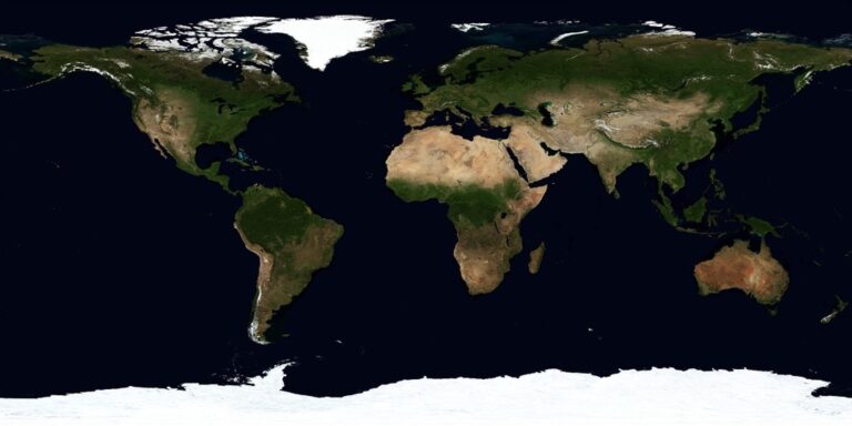
Map projections transform the Earth’s curved surface onto flat representations, creating unavoidable distortions in the process. You’ll encounter these mathematical conversions in every GIS software from ArcGIS to QGIS, where coordinate systems define how geographic data appears on your screen. Since no projection preserves all spatial properties simultaneously, you must choose projections that minimize distortion for your specific mapping purpose—whether that’s measuring distances, preserving shapes, or maintaining accurate areas for statistical analysis.
Common Types of Distortion in Map Projections
Distortion manifests in four primary ways: area distortion changes the relative size of features, angular distortion alters shape relationships, distance distortion affects measurements between points, and directional distortion modifies bearing accuracy. You’ll notice area distortion most dramatically in Mercator projections where Greenland appears larger than Africa, while angular distortion becomes apparent when circles appear as ellipses. Understanding these distortion types helps you select appropriate projections for navigation, statistical mapping, or topographic survey work.
Key Parameters That Affect Projection Accuracy
Central meridian, standard parallels, and false origin coordinates significantly influence projection accuracy within your area of interest. You’ll achieve optimal results by centering these parameters on your study region—for example, using UTM zones that place your data near the central meridian reduces distance distortion. Datum selection also affects accuracy, with modern systems like WGS84 providing better global consistency than older regional datums. These parameter choices directly impact measurement precision in surveying applications and spatial analysis workflows.
Visual Side-by-Side Comparison Method
Visual side-by-side comparison provides the most intuitive approach for evaluating map projection differences. You’ll place identical geographic datasets using different projections next to each other, allowing immediate recognition of distortion patterns and accuracy variations across your mapping area.
Setting Up Grid Overlays for Direct Comparison
Create reference grids using 10-degree latitude and longitude lines in your GIS software like ArcGIS Pro or QGIS. Apply these identical grids to each projection you’re testing, ensuring consistent styling and symbology. The grid lines reveal how each projection warps coordinate systems differently. Focus on areas where grid squares appear most distorted – these indicate zones of maximum projection error. You’ll notice rectangular grids become curved or stretched depending on the projection type, with equatorial regions typically showing less distortion than polar areas.
Analyzing Shape Distortion Patterns
Examine geometric shapes by placing circles or squares at regular intervals across your test area in each projection. Perfect circles become ellipses in projections with angular distortion, while squares transform into rectangles or parallelograms. Document these shape changes using screenshots or exported images for later reference. Pay attention to directional patterns – some projections maintain shape accuracy along specific meridians or parallels while distorting perpendicular areas. The Tissot indicatrix method provides mathematical precision, but visual shape comparison offers immediate understanding of distortion severity.
Measuring Area Distortion Variations
Calculate area measurements for identical polygons across different projections using your GIS measurement tools. Create test polygons at various latitudes – equatorial, mid-latitude, and polar regions – then record area values for each projection. Export these measurements to spreadsheets for percentage difference calculations. Area distortion becomes most apparent when comparing equal-area projections like Albers Equal Area against conformal projections like Web Mercator. Greenland’s area provides an excellent test case, as it appears drastically oversized in Mercator but correctly proportioned in equal-area projections.
Mathematical Distortion Analysis Technique
Mathematical distortion analysis provides the most precise method for evaluating map projection accuracy through quantifiable measurements. You’ll use established mathematical formulas to calculate exact distortion values at any point on your projected surface.
Calculating Tissot’s Indicatrix Values
Tissot’s indicatrix calculates distortion by measuring how a perfect circle on Earth’s surface transforms into an ellipse on your map projection. You’ll compute the semi-major axis (a) and semi-minor axis (b) values using the projection’s scale factors along meridians and parallels. The formula a/b ratio reveals angular distortion, while the area ab indicates areal distortion at each geographic coordinate.
Quantifying Angular and Linear Distortion
Angular distortion measures how projection affects shape accuracy using the maximum angular deformation formula: ω = 2arcsin[(a-b)/(a+b)]. Linear distortion calculates scale variation through meridional scale factor (h) and parallel scale factor (k) equations. You’ll apply these formulas across your projection’s extent to identify zones where distortion exceeds acceptable thresholds for your mapping requirements.
Using Statistical Metrics for Objective Assessment
Statistical metrics provide standardized comparison values across different projections using root mean square (RMS) error calculations. You’ll compute Airy’s criterion for angular distortion and Tobler’s area distortion index to generate numerical rankings. Professional GIS software like ArcGIS Pro and QGIS include distortion analysis tools that automatically calculate these metrics for comprehensive projection evaluation workflows.
Geographic Coverage and Use Case Evaluation
Understanding how different projections perform across various geographic contexts and applications enables you to select the most appropriate projection for your specific mapping requirements.
Assessing Suitability for Different Regions
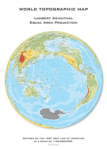
Regional characteristics directly influence projection accuracy and effectiveness. Polar regions require specialized projections like Lambert Azimuthal Equal-Area or Stereographic, while equatorial zones work well with Mercator or Cylindrical Equal-Area projections. Mid-latitude regions benefit from conic projections such as Lambert Conformal Conic or Albers Equal-Area. Consider your study area’s latitudinal extent—projections optimized for 30°-60° latitude ranges won’t perform effectively near the poles or equator.
Explore the world with this unique topographic map centered on 165 West. Featuring a Lambert Azimuthal Equal Area projection and hexagonal tiling for insightful data visualization.
Matching Projections to Specific Applications
Different mapping applications demand specific projection characteristics. Navigation and marine charts require conformal projections like Mercator to preserve angles for bearing calculations. Statistical mapping and demographic analysis need equal-area projections such as Albers or Mollweide to maintain accurate area relationships. Web mapping applications typically use Web Mercator (EPSG:3857) for tile compatibility, while scientific research often employs UTM zones for precise distance measurements and coordinate accuracy.
Learn to navigate confidently with this guide to nautical charts! Understand both electronic and paper charts, including a complete reference to Chart #1 symbols and abbreviations.

Evaluating Performance at Various Scales
Scale considerations fundamentally affect projection selection and accuracy. Large-scale maps (1:24,000 or larger) can use UTM or State Plane coordinate systems with minimal distortion across smaller geographic areas. Medium-scale regional maps (1:250,000 to 1:1,000,000) benefit from conic projections centered on the area of interest. Small-scale continental or global maps require careful projection selection—equal-area projections for thematic mapping or compromise projections like Robinson for general reference maps.
Interactive Digital Comparison Tools
Digital platforms and specialized software now provide cartographers with sophisticated tools to evaluate projection accuracy through dynamic, visual interfaces that eliminate much of the manual calculation work.
Utilizing Online Projection Comparison Platforms
Projection Wizard and MapProjections.net offer browser-based interfaces where you can instantly switch between projections while maintaining identical geographic datasets. These platforms display real-time distortion patterns through color-coded overlays and provide quantitative metrics for angular and area distortion at any point on the map. You’ll find these tools particularly valuable for client presentations where visual impact matters more than detailed mathematical analysis.
Leveraging GIS Software for Advanced Analysis
ArcGIS Pro’s Projection Comparison toolbar and QGIS’s projection transformation tools enable batch processing of multiple projections simultaneously. You can create automated workflows that calculate Tissot’s indicatrix values across entire study areas and generate comprehensive distortion reports. These platforms integrate statistical analysis functions that compute RMS error values and produce publication-ready comparison charts showing projection performance across different geographic regions.
Creating Custom Comparison Dashboards
Tableau and Power BI connect directly to GIS databases to create interactive dashboards displaying projection metrics in real-time. You can build custom interfaces that allow stakeholders to adjust parameters like central meridians or standard parallels while observing immediate changes in distortion patterns. These dashboards excel at presenting complex projection data through intuitive visualizations that highlight trade-offs between different projection choices for specific mapping applications.
Best Practices for Selecting Optimal Projections
Making the right projection choice requires a systematic approach that considers your specific mapping goals alongside technical constraints.
Prioritizing Your Mapping Requirements
Define your primary purpose before evaluating projection options. Navigation applications demand conformal projections like Web Mercator to preserve angular relationships, while statistical analysis requires equal-area projections such as Albers Conic Equal-Area. Identify your target audience and their technical expertise level, as this influences whether you can use specialized projections or need familiar standards like WGS84 Geographic.
Balancing Trade-offs Between Different Distortions
Accept that perfect accuracy is impossible across all distortion types in any single projection. Prioritize the distortion type that matters most for your application—area preservation for demographic mapping or shape accuracy for geological surveys. Test multiple projection candidates using the comparison techniques discussed earlier, then select the option that minimizes your most critical distortion while keeping secondary distortions within acceptable limits.
Documenting Your Comparison Process
Create a standardized evaluation matrix that records distortion metrics, accuracy measurements, and visual assessment scores for each projection candidate. Document your selection criteria, test datasets, and geographic extent to ensure reproducible results. Archive your comparison reports with projection parameters and rationale, as this documentation proves invaluable when updating maps or explaining methodology to stakeholders and peer reviewers.
Conclusion
These five comparison techniques provide you with a comprehensive toolkit for evaluating map projections effectively. By combining visual assessments with mathematical analysis you’ll make more informed decisions about which projection best suits your specific mapping needs.
Remember that no single projection works perfectly for every application. Your choice should balance the trade-offs between different types of distortion while considering your geographic area of interest and intended use case.
The digital tools and interactive platforms available today make this evaluation process more accessible than ever. You can now quickly compare multiple projections and generate detailed distortion reports without extensive manual calculations.
Start with visual comparisons to get an intuitive understanding then apply mathematical techniques for precise measurements. This systematic approach ensures you’ll select projections that enhance rather than compromise your geographic visualizations and spatial analyses.
Frequently Asked Questions
What is map projection and why does it matter?
Map projection transforms the Earth’s curved surface into flat representations for mapping purposes. It matters because all projections create unavoidable distortions in area, angles, distance, or direction. Choosing the right projection significantly impacts the accuracy and effectiveness of your geographic visualizations, making it crucial for informed mapping decisions.
What are the main types of distortion in map projections?
The four main types of distortion are: area distortion (size changes), angular distortion (shape changes), distance distortion (length variations), and directional distortion (bearing changes). Understanding these helps you select projections that minimize distortions most important to your specific mapping purpose and geographic coverage area.
How do I visually compare different map projections?
Use the side-by-side comparison method by displaying identical geographic datasets with different projections next to each other. Add 10-degree grid overlays to reveal coordinate system warping patterns. Examine how geometric shapes like circles transform across projections to identify areas of maximum distortion and evaluate which projection best suits your needs.
What is Tissot’s indicatrix and how does it help evaluate projections?
Tissot’s indicatrix measures how a perfect circle on Earth’s surface transforms into an ellipse on map projections. It provides quantifiable distortion measurements through mathematical analysis. By calculating these values, you can precisely assess angular and linear distortion using established formulas, offering the most accurate method for projection evaluation.
Which projection should I use for different geographic regions?
Polar regions: Use Lambert Azimuthal Equal-Area or Stereographic projections. Equatorial zones: Choose Mercator or Cylindrical Equal-Area projections. Large-scale maps: Utilize UTM or State Plane systems. Small-scale thematic maps: Carefully select based on whether you need equal-area or conformal properties for your specific application.
What tools can help automate projection comparison?
Professional GIS software like ArcGIS Pro and QGIS offer automated distortion calculations. Online platforms include Projection Wizard and MapProjections.net for real-time analysis. Advanced tools enable batch processing and comprehensive distortion reports. Custom dashboards using Tableau or Power BI provide interactive visualizations for dynamic projection metric comparisons.
How do I choose between conformal and equal-area projections?
Choose conformal projections for navigation, engineering, and applications requiring accurate angles and shapes. Select equal-area projections for statistical mapping, demographic analysis, and when accurate area measurements are crucial. Consider your primary mapping purpose: shape preservation versus area accuracy, as you cannot have both simultaneously.
What factors should I consider when evaluating projection accuracy?
Consider your geographic coverage area, mapping scale, primary use case, and acceptable distortion trade-offs. Define whether you need accurate areas, shapes, distances, or directions. Evaluate regional characteristics and match projection properties to your specific application requirements. Document your comparison process using standardized evaluation matrices.