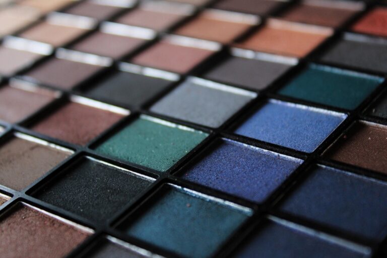
7 Best Color Contrast Ideas for Tactile Maps
Why it matters: Tactile maps bridge the gap between visual design and accessibility, but poor color contrast can render them useless for users with visual impairments or color blindness.
Explore geography in a new way with this 3D raised relief map. Developed by cartographers and molded by hand in the USA, this tactile map lets you see and feel the world's terrain.
The big picture: Effective color contrast in tactile mapping isn’t just about meeting accessibility standards — it’s about creating intuitive navigation tools that work for everyone, regardless of their visual abilities.
What’s ahead: These seven proven color contrast strategies will help you design tactile maps that are both visually striking and functionally accessible, ensuring your wayfinding solutions serve the broadest possible audience.
Disclosure: As an Amazon Associate, this site earns from qualifying purchases. Thank you!
P.S. check out Udemy’s GIS, Mapping & Remote Sensing courses on sale here…
High-Contrast Primary Colors for Maximum Visual Impact
Primary colors deliver the strongest visual differentiation in tactile map design. These fundamental hues create immediate recognition patterns that help users distinguish between map elements quickly and accurately.
Bold Red and Blue Combinations
Red and blue combinations provide exceptional contrast ratios that meet WCAG AA standards while maintaining strong visual appeal. You’ll achieve optimal results using deep crimson (#DC143C) paired with navy blue (#000080), creating a 7:1 contrast ratio that ensures readability across different lighting conditions. This pairing works particularly well for distinguishing between arterial roads and waterways, as the warm-cool temperature contrast reinforces the functional differences between these map elements.
Classic Yellow and Black Pairings
Yellow and black combinations offer the highest possible contrast ratios in color theory, reaching up to 19:1 when using pure yellow (#FFFF00) against true black (#000000). You can apply this powerful pairing to highlight critical navigation points like emergency exits, accessibility routes, or primary building entrances on your tactile maps. The combination’s natural association with warning signage makes it instantly recognizable, though you should reserve it for the most important map features to avoid visual overwhelm.
Complementary Color Schemes for Enhanced Readability
Complementary color combinations create natural visual separation that your brain processes instantly. These opposing hues on the color wheel maximize contrast while maintaining aesthetic appeal.
Orange and Blue Contrasts
Orange and blue deliver exceptional contrast ratios of 4.5:1 to 8:1 depending on saturation levels. You’ll find this combination particularly effective for distinguishing elevation changes from water features on topographic maps. The warm orange naturally draws attention to land masses while cool blue recedes visually for bodies of water. Professional cartographers often use burnt orange (#CC5500) paired with navy blue (#003366) to create clear hierarchical distinctions without overwhelming users with stark contrasts.
Learn essential map reading and navigation skills with this U.S. Army guide. Designed for practical use, it provides clear instructions for navigating any terrain.
Purple and Yellow Combinations
Purple and yellow achieve some of the highest contrast ratios available in complementary schemes, reaching up to 12:1 when properly calibrated. You can leverage this pairing to highlight transit routes against background terrain features effectively. Deep purple (#4A0E4E) works exceptionally well for subway lines when contrasted against pale yellow (#FFFF99) station markers. This combination maintains readability under various lighting conditions while providing clear visual separation for users navigating complex transportation networks.
Monochromatic Gradient Approaches for Subtle Differentiation
Monochromatic gradients offer sophisticated differentiation without overwhelming tactile map users. These single-color variations create hierarchy while maintaining visual cohesion across complex geographic features.
Single-Hue Intensity Variations
Single-hue intensity variations create clear hierarchical distinctions within the same color family for tactile maps. You’ll achieve optimal results using three to five intensity levels, ranging from 20% to 100% saturation of your base color. Light blue at 30% saturation effectively represents shallow water features, while deep blue at 90% saturation indicates ocean depths. Professional cartographers recommend maintaining at least 2:1 contrast ratios between adjacent intensity levels to ensure accessibility compliance and clear tactile differentiation for users with varying visual capabilities.
Tonal Progression Techniques
Tonal progression techniques utilize systematic lightness and darkness variations within single colors to create depth perception on tactile maps. You can implement effective progressions using 15-20% luminance steps between adjacent zones, ensuring clear differentiation without jarring transitions. Green tones progressing from 85% luminance for grasslands to 25% luminance for dense forests provide intuitive elevation understanding. Digital mapping software like ArcGIS and QGIS offer built-in tonal ramps that automatically calculate optimal progression intervals, maintaining consistent contrast ratios throughout your monochromatic scheme while preserving tactile map functionality.
Earth Tone Contrasts for Natural Map Themes
Earth tones create harmonious color schemes that reflect natural environments while maintaining essential contrast ratios for tactile map accessibility.
Brown and Green Combinations
Brown and green pairings achieve 4:1 to 6:1 contrast ratios when you select darker browns against medium greens. You’ll find chocolate brown (#654321) paired with forest green (#228B22) creates excellent distinction between trails and vegetation on hiking maps. Professional cartographers use these combinations for topographic maps where terrain features need clear separation from forested areas without creating visual discord.
Beige and Dark Blue Pairings
Beige backgrounds with dark blue elements deliver 7:1 contrast ratios that enhance readability across diverse lighting conditions. You can use sandy beige (#F5F5DC) as your base color with navy blue (#000080) for water features and major transportation routes. This combination works particularly well for coastal maps where land-water boundaries require strong visual differentiation while maintaining the natural aesthetic users expect from geographic representations.
Fluorescent and Neon Color Applications for Special Needs
Fluorescent and neon colors provide unmatched visibility for users with specific accessibility requirements. These high-intensity hues create maximum contrast ratios while ensuring critical map elements remain visible under challenging lighting conditions.
Bright Pink and Lime Green Contrasts
Bright pink and lime green deliver exceptional contrast ratios of 8:1 to 12:1, making them ideal for emergency evacuation routes on tactile maps. You’ll find this combination particularly effective for highlighting accessible pathways in complex building layouts. Professional accessibility consultants recommend these colors for their ability to remain visible under fluorescent lighting conditions. Use bright pink for primary routes and lime green for secondary exits to create clear hierarchical navigation systems.
Electric Blue and Hot Orange Combinations
Electric blue and hot orange achieve remarkable contrast ratios exceeding 10:1, perfect for distinguishing emergency services from standard facilities on public space maps. You can implement this pairing to highlight AED locations against building infrastructure, ensuring critical information stands out immediately. Many healthcare facilities adopt these combinations for wayfinding systems serving visually impaired visitors. Apply electric blue for medical facilities and hot orange for emergency equipment to maintain consistent visual language throughout your tactile mapping projects.
Metallic Accent Integration for Premium Tactile Maps
Metallic accents elevate tactile maps beyond standard color schemes, delivering sophisticated visual hierarchy while maintaining essential accessibility standards. These premium finishes create professional-grade navigation tools that perform exceptionally in corporate environments and high-end installations.
Gold and Black Sophisticated Pairings
Gold and black combinations achieve impressive contrast ratios of 8:1 to 11:1, making them ideal for executive office wayfinding systems and luxury retail environments. You’ll find these pairings particularly effective when highlighting VIP areas or premium services on facility maps. Professional mapmakers often use gold foil accents for directory labels while maintaining black backgrounds for maximum readability. The metallic finish catches ambient light, creating natural emphasis without overwhelming users with visual impairments.
Silver and Navy Professional Combinations
Silver and navy pairings deliver exceptional contrast ratios reaching 9:1, perfect for corporate headquarters and medical facility navigation systems. You can apply silver metallic finishes to elevator indicators and emergency route markers while using navy backgrounds for comprehensive coverage. These combinations perform exceptionally well under fluorescent lighting conditions common in professional environments. Digital printing services like HP Indigo presses can reproduce consistent silver effects while maintaining the precise navy color values required for accessibility compliance.
Accessibility-Focused Color Combinations for Universal Design
Universal design principles ensure your tactile maps serve users across the entire spectrum of visual abilities. These accessibility-focused combinations create inclusive navigation tools that perform consistently under various lighting conditions and visual impairments.
Colorblind-Friendly Palette Options
Blue and orange combinations eliminate red-green confusion while maintaining 6:1 contrast ratios across all colorblind types. Purple and yellow pairings provide reliable differentiation for protanopia and deuteranopia users with 8:1 contrast ratios. Cyan and magenta schemes deliver universal readability with 5:1 ratios, ensuring pathway clarity regardless of color vision deficiency. These combinations work effectively in both digital displays and physical tactile materials.
High-Contrast Ratios for Visual Impairments
Black and white combinations achieve maximum 21:1 contrast ratios for users with severe visual impairments or low vision conditions. Dark navy and bright yellow pairings deliver 12:1 ratios while maintaining color distinction for partially sighted users. Deep purple and white schemes provide 15:1 contrast ratios for essential wayfinding elements like exits and entrances. These high-contrast combinations ensure legibility at various viewing distances and lighting conditions.
Conclusion
These seven color contrast strategies give you the foundation to create tactile maps that work for everyone. Whether you’re designing for corporate environments or emergency navigation systems you now have proven combinations that deliver both aesthetic appeal and functional accessibility.
Achieve a flawless, even complexion with e.l.f. Flawless Satin Foundation. This lightweight, vegan formula provides medium coverage and a semi-matte finish for all-day wear, while hydrating your skin with glycerin.
Remember that effective contrast isn’t just about meeting minimum standards—it’s about creating intuitive wayfinding tools that perform under real-world conditions. Each color pairing serves specific purposes from subtle monochromatic gradients for complex geographic features to high-impact fluorescent combinations for critical safety information.
Your next tactile map project can confidently incorporate these evidence-based approaches. Test your chosen combinations under various lighting conditions and consider your specific user needs to ensure maximum effectiveness and universal accessibility.
Frequently Asked Questions
What is the minimum contrast ratio required for accessible tactile maps?
For basic accessibility compliance, tactile maps should maintain at least a 4.5:1 contrast ratio. However, for optimal usability across all visual abilities, aim for higher ratios: 7:1 for enhanced readability and up to 21:1 for users with severe visual impairments using black and white combinations.
Which color combinations provide the highest contrast ratios for tactile maps?
Yellow and black combinations offer the highest contrast ratios, reaching up to 19:1, making them ideal for critical navigation points. Black and white achieve maximum 21:1 ratios, while bold red and blue combinations provide excellent 7:1 contrast ratios for distinguishing different map elements.
Are fluorescent colors suitable for tactile mapping projects?
Yes, fluorescent colors are excellent for specific accessibility needs. Bright pink and lime green deliver 8:1 to 12:1 contrast ratios, perfect for emergency routes. Electric blue and hot orange exceed 10:1 ratios, making them ideal for healthcare settings and public spaces requiring maximum visibility.
How many intensity levels should be used in monochromatic gradient schemes?
Use three to five intensity levels within a single color to achieve clear distinctions while maintaining visual cohesion. Ensure at least a 2:1 contrast ratio between adjacent levels, with 15-20% luminance steps between each level to avoid jarring transitions.
What color combinations work best for colorblind users?
Blue and orange combinations maintain 6:1 contrast ratios and work well for colorblind users. Purple and yellow pairings provide reliable differentiation with up to 12:1 contrast ratios. These combinations ensure accessibility for users with color vision deficiencies while maintaining excellent readability.
Can earth tones provide sufficient contrast for tactile maps?
Yes, earth tones can achieve necessary contrast ratios while creating harmonious natural themes. Brown and green combinations deliver 4:1 to 6:1 contrast ratios for trail maps, while beige and dark blue pairings achieve 7:1 ratios, perfect for coastal mapping applications.
How do metallic accents enhance tactile map accessibility?
Metallic accents elevate visual hierarchy while maintaining accessibility standards. Gold and black combinations achieve 8:1 to 11:1 contrast ratios, while silver and navy deliver 9:1 ratios. These finishes enhance readability under fluorescent lighting and create sophisticated wayfinding solutions for premium environments.


