7 Map Aesthetics Ideas That Create Visual Impact
Maps aren’t just navigation tools anymore—they’re becoming stunning works of art that blend functionality with visual storytelling. You’ll discover how cartographers and designers are pushing creative boundaries by experimenting with color palettes, typography, and innovative visualization techniques that transform ordinary geographic data into captivating visual experiences. Whether you’re a designer seeking inspiration or simply fascinated by the intersection of art and geography, exploring map aesthetics opens up a world where data meets beauty in unexpected ways.
Explore and map the wilderness for the Queen in Cartographers! Draw unique terrain shapes and score points based on randomly selected goals each game, but beware of monster ambushes.

Disclosure: As an Amazon Associate, this site earns from qualifying purchases. Thank you!
Discover the Beauty of Hand-Drawn Cartographic Illustrations
Hand-drawn cartographic illustrations transform geographic data into intimate artistic expressions that capture the human connection to place. These personal interpretations of landscape and territory offer unique aesthetic qualities that digital maps often can’t replicate.
Traditional Pen and Ink Techniques
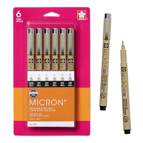
Pen and ink techniques create precise, high-contrast maps with exceptional detail and professional appearance. You’ll achieve the best results using technical pens like Sakura Pigma Micron or Staedtler Pigment Liners with waterproof ink that won’t smudge during the drawing process.
P.S. check out Udemy’s GIS, Mapping & Remote Sensing courses on sale here…
Hatching and cross-hatching provide effective methods for indicating elevation, terrain texture, and land use patterns. You can vary line weight and density to show topographic relief, creating depth through careful application of stippling techniques for water bodies and vegetation areas.
Watercolor Map Painting Methods
Create vibrant watercolor art with this portable set. It includes 40 colors (metallic & fluorescent), a brush pen, watercolor paper, and more, all in a stylish tin box.

Watercolor painting methods bring luminous color and organic texture to your cartographic illustrations through transparent layering techniques. You’ll need quality watercolor paper, professional-grade paints like Winsor & Newton or Daniel Smith, and natural hair brushes for optimal paint flow and control.
Wet-on-wet techniques create soft atmospheric effects perfect for depicting weather patterns, cloud formations, and natural boundaries. You can build color intensity through glazing multiple transparent layers, allowing each layer to dry completely before applying the next wash.
Digital Drawing Tools for Modern Map Art
Digital drawing tools combine traditional illustration aesthetics with modern workflow efficiency and unlimited revision capabilities. You’ll find Procreate, Adobe Fresco, and Clip Studio Paint offer excellent brush engines that simulate natural media while providing vector and raster drawing options.
Create stunning comics, manga, and illustrations with CLIP STUDIO PAINT PRO. Benefit from a natural drawing experience and tools for panel creation, 3D reference, and animation.

Pressure-sensitive styluses like Apple Pencil or Wacom Cintiq Pro enable natural drawing motions with variable line weights and opacity control. You can create custom brushes that mimic traditional cartographic symbols, then organize them into libraries for consistent application across multiple map projects.
This stylus pen offers precise and smooth control for iPad models 2018-2024. Enjoy palm rejection technology and fast charging for up to 10 hours of use.

Explore Vintage Map Collection and Restoration
Vintage maps offer a treasure trove of cartographic artistry that bridges historical documentation with visual aesthetics. Building upon the artistic foundations discussed earlier, these historical artifacts reveal how past cartographers combined technical precision with decorative elements to create maps that function as both navigation tools and works of art.
Antique Map Authentication Processes
You’ll need to examine paper composition, ink chemistry, and printing methods to verify authentic historical maps. Watermark analysis under UV light reveals paper manufacturing dates and origins, while microscopic examination of ink penetration patterns distinguishes hand-drawn elements from printed reproductions. Professional authentication services use spectroscopic analysis to identify period-appropriate pigments and binding agents. Document provenance research through auction records, library catalogs, and historical publishing databases confirms legitimate ownership chains and publication details.
Preservation Techniques for Historical Maps
You should store vintage maps in acid-free folders within climate-controlled environments maintaining 65-70°F temperatures and 45-55% humidity levels. Mylar encapsulation protects fragile documents while allowing viewing access without direct handling. UV-filtering glass prevents light damage during display periods. Professional conservation treatments include surface cleaning with soft brushes, tear repair using Japanese tissue paper, and deacidification processes that neutralize harmful acids. Never attempt repairs using household adhesives or lamination materials that can cause irreversible damage.
Creating Digital Archives of Classic Cartography
You can preserve map collections through high-resolution scanning at 600-1200 DPI using specialized book scanners that accommodate bound atlases. Georeferencing software like QGIS allows you to align historical maps with modern coordinate systems for comparative analysis. Digital restoration techniques in Photoshop remove stains and fill gaps while maintaining historical accuracy. Metadata standards including Dublin Core elements ensure proper cataloging with geographic coordinates, creation dates, and cartographer information for searchable online archives.
Master the Art of Typographic Map Design
Typography transforms functional geographic information into visually compelling cartographic compositions. Your font choices and text placement decisions directly impact how viewers navigate and interpret spatial relationships on your maps.
Font Selection for Geographic Labels
Sans-serif fonts like Helvetica and Futura provide maximum legibility for place names at small scales. You’ll achieve better readability by selecting typefaces with consistent stroke widths and open letterforms. Arial works well for digital displays while Univers excels in print applications. Avoid decorative fonts for primary labels since they compromise clarity when reduced to typical map text sizes. Reserve serif fonts like Times New Roman for historical or formal cartographic contexts where traditional aesthetics enhance the map’s narrative purpose.
Balancing Text Hierarchy on Maps
Create clear information priorities using three distinct text sizes for your geographic labels. Primary cities require the largest font size, typically 12-14 points, while secondary settlements use 10-12 points for middle hierarchy. Physical features and minor locations work best at 8-10 points to maintain readability without overwhelming major elements. You’ll establish visual order by maintaining consistent size relationships across similar feature types. Weight variations through bold and regular fonts help distinguish administrative boundaries from natural features while preserving overall typographic harmony.
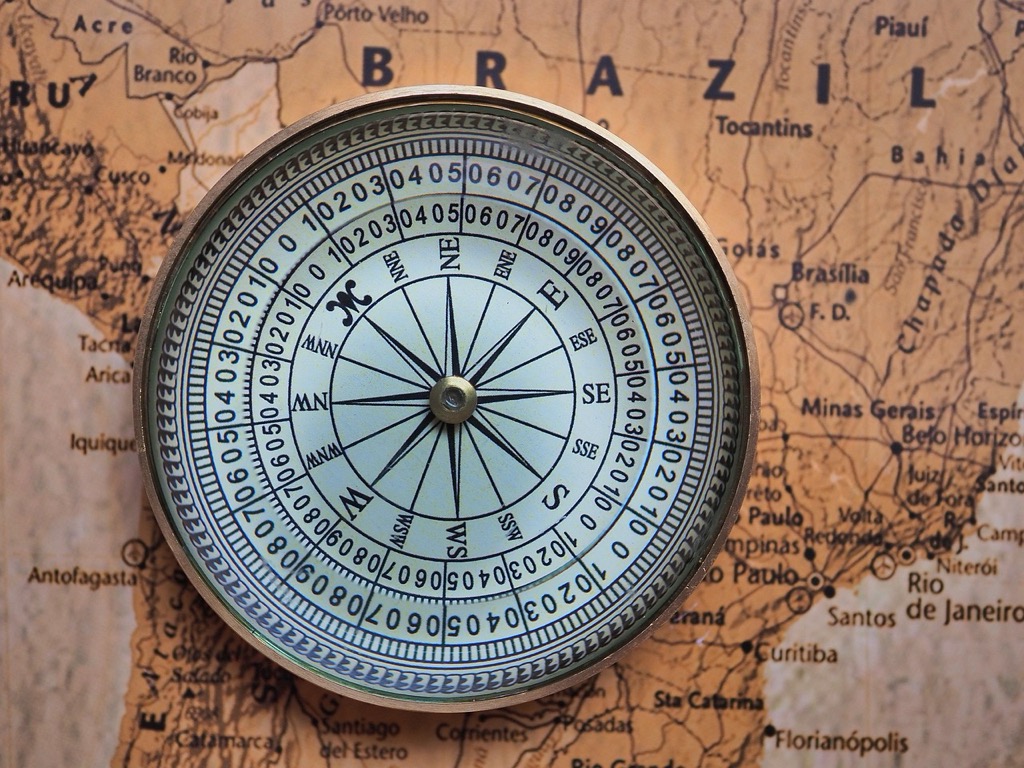
Incorporating Decorative Lettering Elements
Hand-lettered compass roses and ornamental title cartouches add authentic character to traditional map designs. You can integrate decorative capitals for region names while maintaining readable body text for detailed information. Custom lettering works particularly well for historical recreations or themed maps where artistic flair supports the cartographic narrative. Digital calligraphy tools allow you to create unique letterforms that complement your map’s aesthetic without sacrificing legibility. Balance decorative elements carefully to avoid visual competition with essential geographic data.
Experiment with Color Theory in Cartographic Design
Color theory transforms ordinary maps into compelling visual narratives that guide viewers through geographic information with intentional psychological impact.
Understanding Color Psychology in Maps
Warm colors like reds and oranges create urgency and draw attention to critical features such as emergency zones or high-priority areas. Cool blues and greens suggest calm environments like water bodies and natural spaces. Research shows that 65% of people process visual information more effectively when colors align with their psychological associations. You’ll notice that topographic maps use green for lower elevations and brown for higher elevations because these colors naturally correspond to vegetation and earth tones.
Creating Cohesive Color Palettes
Sequential color schemes work best for elevation data and population density where values progress logically from light to dark. Diverging palettes with contrasting hues highlight data that splits around a central value like temperature variations above and below freezing. Tools like ColorBrewer 2.0 provide tested color combinations that remain accessible to colorblind users. Professional cartographers typically limit their palettes to 5-7 distinct colors to maintain visual clarity and prevent cognitive overload.
Using Color to Convey Geographic Information
Categorical data requires distinct hues that don’t suggest hierarchical relationships such as different land use types or political boundaries. Quantitative data benefits from graduated color intensity where darker shades represent higher values. You can use color temperature to differentiate between human-made features (warmer tones) and natural elements (cooler tones). Consider that 8% of men experience color vision deficiency, so always test your maps with colorblind simulation tools before finalizing your design.
Create Fantasy and Fictional World Maps
Get durable, tear-resistant posters made in the USA. Each 18" x 29" poster features high-quality 3 MIL lamination for lasting protection.

Fantasy cartography opens unlimited creative possibilities while maintaining the visual credibility that makes fictional worlds feel authentic. You’ll craft landscapes that support storytelling while applying real-world geographic principles.
Developing Unique Geographic Features
Start with fundamental terrain relationships that mirror natural processes. Mountains create rain shadows, rivers flow downhill toward oceans, and climate zones follow logical patterns based on latitude and elevation. Design mountain ranges with realistic drainage systems where water flows create valleys and river networks.
Consider tectonic influences when placing mountain chains and island archipelagos. Volcanic regions cluster along fault lines, while ancient mountain ranges show weathered, rounded profiles. Create diverse biomes by varying elevation, proximity to water bodies, and prevailing wind patterns across your continent.
Building Consistent Scale and Proportions
Establish your map’s scale early and maintain it throughout the design process. A kingdom spanning 500 miles requires different detail levels than a city district covering 2 square miles. Use real-world reference points – if your capital city equals London’s size, ensure surrounding features match proportionally.
Create distance relationships that support your narrative timeline. If characters travel between cities in three days on horseback, position those settlements approximately 60-90 miles apart. Maintain consistent symbol sizes for similar features across your entire map to preserve visual hierarchy and geographic believability.
Adding Mythical Elements and Storytelling Details
Integrate fantastical features using established geographic logic as your foundation. Floating islands still need weather patterns and ecological systems. Magical forests require realistic boundaries with surrounding terrain types. Ancient ruins appear in locations that made strategic sense – hilltops, river crossings, or natural harbors.
Layer your mythical elements with historical depth through naming conventions and architectural styles. Abandoned dwarf mines follow ore veins through mountain ranges, while elven territories cluster around old-growth forests. Add subtle details like trade routes connecting major settlements and defensive structures positioned at geographic chokepoints.
Design Minimalist and Abstract Map Interpretations
Minimalist cartography strips away visual clutter to reveal the fundamental structure of geographic relationships. This approach transforms dense spatial data into clean, comprehensible visual narratives that emphasize clarity over detail.
Simplifying Complex Geographic Data
Distill your datasets to core geographic elements by removing non-essential features that create visual noise. Remove secondary roads when showing regional connectivity patterns, eliminate minor water bodies to highlight major river systems, and consolidate similar land use categories into broader classifications. Use data filtering techniques in GIS software to establish clear feature hierarchies—display only cities above 50,000 population for regional maps or show elevation contours at 500-foot intervals instead of 100-foot increments. This selective approach ensures your map communicates its primary message without overwhelming viewers with excessive detail.
Using Geometric Shapes and Patterns
Transform organic geographic forms into simplified geometric representations that maintain spatial accuracy while creating visual consistency. Replace complex coastlines with smoothed curves using generalization algorithms, represent urban areas as clean rectangles or circles scaled by population, and convert irregular political boundaries into simplified polygons. Apply consistent pattern libraries—use parallel lines for agricultural zones, dots for population density, and solid fills for water bodies. Vector graphics software like Adobe Illustrator excels at creating these standardized geometric elements, while QGIS offers automated generalization tools for converting complex features into simplified shapes.
Focusing on Essential Spatial Relationships
Prioritize the most critical geographic connections by emphasizing proximity, accessibility, and functional relationships over precise geographic detail. Highlight major transportation corridors that connect economic centers, show watershed boundaries that define natural resource regions, and display time-distance relationships through isochrone mapping. Use visual hierarchy techniques—thicker lines for primary connections, consistent spacing for related elements, and strategic white space to separate distinct geographic zones. This approach mirrors successful transit map designs that sacrifice geographic accuracy to clearly communicate how people actually move through and interact with space.
Incorporate Mixed Media and Textural Elements
Mixed media approaches elevate map aesthetics beyond traditional flat representations by combining multiple materials and techniques. These methods create tactile depth and visual interest that draws viewers into geographic narratives.
Combining Traditional and Digital Techniques
Start your mixed media process by creating hand-drawn foundation elements using traditional media like ink or graphite. Scan these artwork pieces at 600 DPI resolution to preserve fine details and texture variations. Import your scanned elements into digital platforms like Adobe Illustrator or QGIS for precision editing and color enhancement. Layer digital typography and data visualization over your traditional artwork to achieve professional cartographic standards while maintaining artistic authenticity.
Adding Physical Textures to Map Surfaces
Apply specialty papers like handmade cotton or linen stock to create natural texture variations across your map surface. Use embossing techniques to raise mountain ranges and architectural features, creating tactile elevation changes. Incorporate fabric elements such as burlap or canvas for representing agricultural regions or historical contexts. Sand mixed with acrylic medium creates realistic coastal textures, while crumpled tissue paper under paint layers simulates terrain roughness effectively.
Using Collage and Layering Methods
Build visual depth through strategic layering of translucent materials like vellum or acetate sheets over base map elements. Cut vintage paper fragments from old atlases or historical documents to represent specific geographic regions authentically. Apply decoupage techniques using tissue paper or rice paper to create weathered, aged appearances on contemporary maps. Stack multiple transparent map layers with different data themes to create complex visual narratives that reveal information progressively as viewers examine closer.
Conclusion
You’ve now discovered seven powerful approaches to transform your maps from simple navigation tools into captivating visual art. Each technique offers unique opportunities to blend functionality with creative expression whether you’re drawn to hand-drawn illustrations or cutting-edge digital design.
The beauty of map aesthetics lies in experimentation. You can start with one approach that resonates with your style then gradually incorporate elements from other techniques. Remember that the most compelling maps often emerge from combining multiple aesthetic approaches.
Your journey into cartographic artistry doesn’t end here. These foundational concepts provide the framework for developing your own distinctive map-making style. Start creating and let your geographic imagination guide you toward producing maps that are both informative and visually stunning.
Frequently Asked Questions
What makes modern cartography different from traditional map-making?
Modern cartography combines functionality with visual storytelling, using innovative color palettes, typography, and visualization techniques. Today’s cartographers focus on transforming standard geographic data into engaging visual experiences that blend art with geography, creating maps that serve as both navigation tools and aesthetic creations.
How do hand-drawn maps differ from digital ones?
Hand-drawn maps capture the human connection to place through intimate artistic expressions. They use traditional techniques like pen and ink for precise, high-contrast details, or watercolor for luminous color and texture. Digital tools offer unlimited revisions and custom brushes while maintaining traditional aesthetics.
What makes vintage maps valuable as both art and historical documents?
Vintage maps serve as bridges between historical documentation and visual aesthetics, showcasing past cartographers’ combination of technical precision with decorative elements. Their value lies in their historical significance, artistic craftsmanship, and the unique perspective they provide on how geography was understood in different eras.
How important is typography in map design?
Typography is critical in map design as font choices and text placement can transform geographic information into visually compelling compositions. Sans-serif fonts work best for legibility, while serif fonts suit historical contexts. Proper text hierarchy with distinct font sizes for different features maintains clarity and visual appeal.
How does color theory apply to cartographic design?
Color theory transforms ordinary maps into compelling visual narratives with psychological impact. Warm colors create urgency while cool colors suggest calmness. Sequential color schemes work for elevation data, diverging palettes for contrasting data, and proper color application enhances geographic information communication while considering accessibility.
What are the key principles of fantasy cartography?
Fantasy cartography requires maintaining visual credibility while supporting storytelling. Key principles include developing unique geographic features based on real-world logic, maintaining consistent scale and proportions, and integrating mythical elements that are grounded in established geographic principles to enhance narrative depth.
How can maps be simplified without losing essential information?
Minimalist map design focuses on clarity over detail by removing visual clutter and non-essential features. Effective simplification involves data filtering, establishing clear hierarchies, using geometric shapes for consistency, and prioritizing essential spatial relationships like proximity and accessibility to communicate geographic connections effectively.
What are mixed media techniques in modern map-making?
Mixed media cartography combines traditional and digital techniques to create textural, multi-dimensional maps. This includes layering hand-drawn elements with digital typography, using specialty papers and embossing for physical texture, and employing collage methods to build visual depth beyond flat representations.