7 Best Map Projections for Global Datasets
The big picture: When you’re working with global datasets, choosing the right map projection can make or break your data visualization and analysis accuracy.
Why it matters: Each projection method distorts different aspects of Earth’s surface — some preserve area while others maintain shape or distance — and your choice directly impacts how viewers interpret your data.
What’s ahead: We’ll explore seven distinct projection techniques that data scientists and cartographers use to transform three-dimensional global information onto flat surfaces, helping you select the best method for your specific visualization needs.
Disclosure: As an Amazon Associate, this site earns from qualifying purchases. Thank you!
P.S. check out Udemy’s GIS, Mapping & Remote Sensing courses on sale here…
Cylindrical Projections: The Foundation of Global Mapping
Achieve a flawless, even complexion with e.l.f. Flawless Satin Foundation. This lightweight, vegan formula provides medium coverage and a semi-matte finish for all-day wear, while hydrating your skin with glycerin.

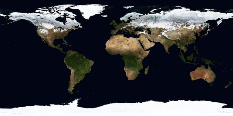
Cylindrical projections wrap the Earth’s surface around an imaginary cylinder, creating the most recognizable world map formats. These projections maintain consistent directional relationships and provide familiar rectangular layouts that work well for global dataset visualization.
Mercator Projection for Navigation and Web Mapping
Mercator projection preserves angles and shapes, making it essential for navigation applications where accurate compass bearings matter most. You’ll find this projection powering Google Maps, OpenStreetMap, and most web mapping platforms because it maintains consistent zoom levels across latitudes. The projection severely distorts areas near the poles, with Greenland appearing nearly as large as Africa, so you should avoid using Mercator for area-dependent statistical analysis or population density visualizations.
Miller Cylindrical for Balanced World Views
Miller cylindrical reduces polar distortion while maintaining the familiar rectangular world map appearance that audiences expect. You’ll get less extreme area distortion than Mercator, making Miller suitable for general reference maps and educational materials. This projection compresses the polar regions by approximately 20% compared to Mercator, creating a more balanced visual representation of continental sizes while still preserving the straight-line latitude and longitude grid that simplifies global data overlay processes.
Equal-Area Cylindrical for Statistical Analysis
Equal-area cylindrical projections maintain accurate area relationships, making them ideal for displaying population density, economic data, or environmental statistics across global datasets. You can choose from several variants including Lambert cylindrical equal-area and Gall-Peters, each offering different standard parallels for optimal regional accuracy. These projections sacrifice shape accuracy for precise area representation, so landmasses appear stretched vertically near the equator and compressed near the poles, but your statistical comparisons remain mathematically valid.
Conic Projections: Optimizing Mid-Latitude Accuracy
Conic projections drape the Earth’s surface onto an imaginary cone, making them exceptionally suited for regions between 30° and 60° latitude. These projections excel at preserving accuracy across continental landmasses while minimizing distortion in populated mid-latitude zones.
Lambert Conformal Conic for Regional Climate Data
Lambert Conformal Conic projections preserve angles and shapes across regional scales, making them ideal for meteorological datasets and climate modeling. You’ll find this projection standard in NOAA weather maps and atmospheric research applications. The projection maintains consistent scale along two standard parallels, ensuring accurate representation of storm systems and temperature gradients. Most GIS software packages include Lambert Conformal Conic as a default option for regional analysis in temperate zones.
Albers Equal-Area Conic for Country-Level Analysis
Albers Equal-Area Conic projections maintain accurate area relationships, making them perfect for demographic and economic datasets across entire countries. You’ll see this projection used extensively in census mapping and agricultural statistics visualization. The projection preserves area proportions between states and provinces while minimizing shape distortion. Statistical agencies like the U.S. Census Bureau rely on Albers projections for choropleth maps displaying population density and economic indicators across continental territories.
Azimuthal Projections: Centering on Specific Points
Azimuthal projections place the Earth’s surface onto a flat plane that touches the globe at a single point, creating maps that radiate outward from a central focus area. These projections excel at displaying regions around polar areas or specific continental landmasses with minimal distortion.
Stereographic Projection for Polar Region Studies
Stereographic projection preserves angles and shapes around polar regions, making it essential for Arctic and Antarctic research datasets. You’ll find this projection particularly valuable when analyzing ice sheet movements, polar climate data, or magnetic field variations. The Universal Polar Stereographic (UPS) coordinate system uses this method for mapping areas beyond 84° latitude, where UTM zones become impractical for accurate measurements.
Lambert Azimuthal Equal-Area for Continental Focus
Explore the world with this unique topographic map centered on 165 West. Featuring a Lambert Azimuthal Equal Area projection and hexagonal tiling for insightful data visualization.
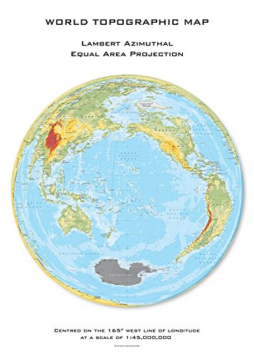
Lambert azimuthal equal-area projection maintains accurate area relationships while centering on specific continents or regions of interest. You can position this projection’s center point anywhere on Earth, making it ideal for demographic studies, environmental monitoring, or economic analysis within particular geographic boundaries. The European Environment Agency uses this projection for statistical mapping across EU member states, ensuring accurate representation of country sizes and population densities.
Pseudocylindrical Projections: Balancing Shape and Area
Pseudocylindrical projections combine the best elements of cylindrical mapping with curved meridians, offering you improved global representation by reducing distortion across multiple geographic properties.
Robinson Projection for General Reference Maps
Explore the world with this 36"x24" physical wall map featuring current geographic details and Earth elevation profiles. Printed on rolled paper in the U.S.A. using the Robinson Projection.

You’ll find the Robinson projection in most world atlases and educational materials because it provides visually appealing global maps without extreme distortion. This projection compromises between area and shape accuracy, making landmasses appear proportional while maintaining recognizable continent shapes. National Geographic used Robinson projection as their standard world map from 1988 to 1998, establishing it as the benchmark for general reference mapping in classrooms and publications worldwide.
Explore the world with the National Geographic Concise Atlas, featuring over 200 maps and illustrations. This authoritative 5th edition provides a complete global overview.

Mollweide Projection for Equal-Area Global Views
You can rely on the Mollweide projection when accurate area representation is critical for your global datasets. This equal-area projection maintains precise area relationships between regions, making it essential for displaying population density, economic data, or environmental statistics across continents. The elliptical boundary creates an aesthetically pleasing world map while preserving area accuracy, though you’ll notice increased shape distortion near the edges that limits its use for navigation purposes.
Interrupted Projections: Minimizing Ocean Distortion
Interrupted projections cut through ocean areas to eliminate distortion over landmasses, creating maps that prioritize terrestrial accuracy over oceanic continuity. You’ll find these projections particularly valuable when your datasets focus primarily on continental analysis rather than maritime studies.
Goode Homolosine for Land-Focused Datasets
Goode homolosine projection combines sinusoidal and Mollweide properties through strategic interruptions that preserve both area accuracy and continental shape integrity. You can optimize your demographic datasets using this projection since it maintains precise area relationships across all continents while minimizing shape distortion. The projection interrupts at 40°44′ north and south latitudes, switching between sinusoidal properties near the equator and Mollweide characteristics toward the poles. Census organizations frequently employ this method for global population mapping because it accurately represents landmass proportions without oceanic interference affecting continental data interpretation.
Interrupted Mollweide for Continental Emphasis
Interrupted Mollweide projection eliminates oceanic distortion by cutting through major water bodies while preserving equal-area properties across continental landmasses. You’ll achieve superior accuracy for land-based environmental datasets since this projection maintains consistent area relationships while reducing shape distortion through strategic ocean interruptions. The projection typically uses four to six lobes that center on major continental groups, creating distinct viewing windows for Africa, Eurasia, the Americas, and Oceania. Environmental agencies utilize this approach for global climate data visualization because it accurately represents terrestrial area proportions essential for carbon storage calculations and biodiversity mapping.
Adaptive Projections: Modern Solutions for Digital Mapping
Modern cartography has evolved beyond traditional fixed projections to embrace adaptive solutions that respond dynamically to user needs and technological capabilities.
Web Mercator for Interactive Online Maps
Web Mercator powers virtually every interactive online mapping platform you encounter today. This spherical Mercator variant sacrifices mathematical precision for computational speed, enabling seamless tile-based rendering across zoom levels. You’ll find it embedded in Google Maps, OpenStreetMap, and most web mapping APIs. Despite its polar distortion limitations, Web Mercator’s universal adoption makes it essential for web-based global datasets requiring pan-and-zoom functionality.
Natural Earth Projection for Aesthetic Global Views
Natural Earth projection delivers visually balanced world maps that compromise mathematically to achieve cartographic beauty. You’ll appreciate how it minimizes distortion across all continents while maintaining recognizable landmass shapes. This hand-tuned projection works exceptionally well for presentation graphics and infographic applications. Environmental organizations and news outlets frequently choose Natural Earth for global datasets because it presents information without the dramatic polar stretching that characterizes other world map projections.
Get durable, tear-resistant posters made in the USA. Each 18" x 29" poster features high-quality 3 MIL lamination for lasting protection.

Specialized Mathematical Projections: Advanced Analytical Applications
Beyond conventional projection categories, specialized mathematical projections address specific analytical challenges in global dataset visualization. These projections optimize mathematical properties for advanced research applications.
Winkel Tripel for Compromise Solutions
You’ll find the Winkel Tripel projection delivers balanced global representation by minimizing three types of distortion simultaneously: area, distance, and angular relationships. This mathematical compromise makes it ideal for global datasets requiring multiple accuracy considerations, such as international development indices or worldwide environmental monitoring programs. The National Geographic Society adopted this projection as their standard for world maps in 1998, recognizing its superior balance across geographic properties. You can effectively use Winkel Tripel for demographic comparisons, climate datasets, and economic indicators where no single property dominates your analytical requirements.
Get the perfect fit for your space with our durable and stylish mat! Available in two sizes: 80x55 cm (Small) and 100x69 cm (Medium).

Eckert IV for Statistical Global Comparisons
You’ll leverage the Eckert IV projection for statistical analyses requiring precise area relationships across global datasets, particularly when comparing continental or national data proportions. This equal-area pseudocylindrical projection maintains accurate area ratios while presenting landmasses in recognizable shapes, making it essential for population density studies, agricultural productivity comparisons, and resource distribution analyses. The projection’s sinusoidal meridians reduce shape distortion compared to cylindrical equal-area alternatives, enhancing data interpretation accuracy. You can confidently apply Eckert IV when creating choropleth maps for international statistics, ensuring that visual area representation matches actual geographic proportions across all continents.
Conclusion
Understanding these seven projection methods empowers you to make informed decisions about your global dataset visualizations. Each technique offers unique advantages that align with specific analytical requirements and geographic focus areas.
Your choice should depend on whether you prioritize area accuracy for statistical analysis or shape preservation for navigation purposes. Consider your audience’s needs and the story your data needs to tell when selecting between traditional methods like Mercator and modern alternatives like Natural Earth.
The key lies in matching your projection method to your visualization goals. Whether you’re creating interactive web maps or presenting demographic research you now have the knowledge to select the most appropriate technique for accurate and effective data representation.
Frequently Asked Questions
What is a map projection and why is it important for data visualization?
A map projection is a method for representing the Earth’s three-dimensional surface on a flat, two-dimensional map. It’s crucial for data visualization because different projections distort various aspects like area, shape, or distance differently. Choosing the right projection ensures accurate interpretation of global datasets and prevents misleading conclusions from distorted geographic representations.
When should I use the Mercator projection for my data?
Use the Mercator projection for navigation-related datasets or when preserving angles and shapes is critical. It’s ideal for maritime navigation, flight paths, and directional analysis. However, avoid it for area-dependent analyses like population density or land area comparisons, as it severely distorts sizes, especially near the polar regions.
What’s the difference between cylindrical and conic projections?
Cylindrical projections wrap the Earth around an imaginary cylinder, creating familiar rectangular world maps with consistent directional relationships. Conic projections drape the Earth onto a cone, optimizing accuracy for mid-latitude regions (30°-60°). Conic projections are better for regional analysis, while cylindrical works well for global datasets.
Which projection should I use for displaying statistical data like population density?
Use equal-area projections such as the Albers Equal-Area Conic, Mollweide, or Lambert Azimuthal Equal-Area projections. These maintain accurate area relationships, ensuring that statistical comparisons remain valid. The U.S. Census Bureau commonly uses Albers Equal-Area Conic for demographic mapping and choropleth maps displaying population and economic indicators.
What are azimuthal projections best suited for?
Azimuthal projections excel at displaying polar regions or specific continental landmasses with minimal distortion. The stereographic projection is perfect for Arctic and Antarctic research, ice sheet analysis, and polar climate data. The Lambert azimuthal equal-area is ideal for demographic studies and environmental monitoring centered on specific continents.
When should I consider using interrupted projections?
Use interrupted projections when your dataset focuses primarily on landmasses rather than oceanic areas. The Goode homolosine and interrupted Mollweide projections cut through oceans to minimize continental distortion. They’re perfect for demographic datasets, land-based environmental analysis, and any study where accurate representation of terrestrial areas is crucial.
What projection is best for web-based interactive maps?
The Web Mercator projection is standard for online mapping platforms like Google Maps and interactive web applications. While it sacrifices mathematical precision, it provides computational speed and seamless tile rendering. For presentation graphics requiring visual balance, consider the Natural Earth projection, which minimizes distortion while maintaining recognizable landmass shapes.