7 Ways to Visualize Global Data with Non-Mercator Projections That Reveal Hidden Patterns
When you’re visualizing global data, the map projection you choose can completely change how your audience interprets the information. The familiar Mercator projection—that rectangular world map you see everywhere—actually distorts landmasses and can mislead viewers about the true scale of global phenomena.
Alternative projections offer more accurate representations of our planet, giving you powerful tools to tell better data stories. These seven innovative approaches will transform how you present everything from climate data to economic trends, ensuring your visualizations communicate with precision and impact.
Disclosure: As an Amazon Associate, this site earns from qualifying purchases. Thank you!
Understanding the Limitations of Traditional Mercator Projections
While the Mercator projection remains ubiquitous in digital mapping platforms, its mathematical properties create significant distortions that can fundamentally mislead your global data visualizations.
P.S. check out Udemy’s GIS, Mapping & Remote Sensing courses on sale here…
Distortion Issues at High Latitudes
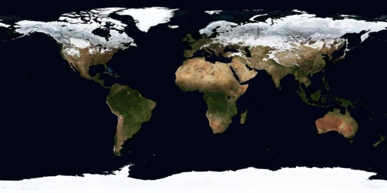
Mercator projections dramatically expand landmasses as they approach the poles, creating severe size distortions in northern regions like Greenland, Alaska, and Siberia. You’ll find that areas above 60° latitude appear up to 400% larger than their actual size, while equatorial regions remain relatively accurate. This mathematical stretching occurs because the projection maintains straight meridians by progressively increasing the spacing between parallels toward the poles.
Misleading Size Comparisons Between Countries
Size relationships between countries become completely unreliable when you use Mercator projections for comparative analysis. Greenland appears larger than Africa on Mercator maps, yet Africa is actually 14 times bigger. Russia looks enormous compared to South America, but they’re nearly equal in size. These distortions can skew your audience’s understanding of demographic data, economic comparisons, or climate patterns across different latitudes.
Impact on Global Data Interpretation
Your global datasets suffer from systematic bias when displayed on Mercator projections, particularly affecting northern hemisphere analysis. Climate data visualization becomes problematic as Arctic regions appear disproportionately significant, while tropical zones seem diminished. Population density maps mislead viewers about actual distribution patterns, and economic data comparisons between high-latitude and equatorial countries lose their contextual accuracy due to the projection’s inherent area distortions.
Using Equal-Area Projections for Accurate Population Data
Equal-area projections maintain the proportional relationships between landmasses, making them essential for demographic data visualization where accurate size comparisons drive meaningful analysis.
Mollweide Projection for Demographic Visualization
The Mollweide projection preserves area relationships across continents, providing accurate visual weight for population density maps. You’ll find this pseudocylindrical projection particularly effective when displaying global demographic trends like urbanization patterns or migration flows. Its elliptical shape minimizes distortion in populated mid-latitude regions including Europe, North America, and East Asia. Population cartographers rely on Mollweide’s equal-area properties to ensure countries appear proportional to their actual demographic significance rather than their Mercator-distorted sizes.
Albers Equal-Area Conic for Regional Analysis
Albers equal-area conic projection excels at regional population analysis by maintaining accurate area relationships within specific latitudinal bands. You can customize the standard parallels to minimize distortion across your study region, making it ideal for continental demographic studies. This projection works exceptionally well for North American population data, where you’ll achieve minimal distortion from Mexico to northern Canada. Census bureaus and demographic researchers prefer Albers for regional population density analysis because it preserves the statistical relationships between geographic areas and their population counts.
Benefits for Statistical Accuracy
Equal-area projections ensure your population statistics remain mathematically sound by preserving the geographic relationships essential for demographic analysis. You’ll avoid the systematic biases that plague Mercator-based population maps, where northern regions appear artificially significant compared to equatorial populations. Statistical correlations between geographic area and population density remain valid when using equal-area projections, supporting accurate per-capita calculations and demographic modeling. Your audience will interpret population data correctly when landmass sizes reflect actual geographic proportions rather than projection-induced distortions.
Implementing Orthographic Projections for Climate Data
Orthographic projections transform climate data visualization by presenting Earth as it appears from space. You’ll discover how this spherical perspective enhances your understanding of global atmospheric patterns and oceanic systems.
3D Globe Perspective Advantages
You’ll gain immediate spatial context when viewing climate data through orthographic projections that simulate satellite perspectives. This hemisphere view eliminates edge distortions that plague flat projections, allowing you to accurately assess storm system sizes and polar ice coverage. Your audience can instantly grasp the spherical nature of atmospheric circulation patterns, making cyclone formations and jet stream behaviors more intuitive to understand.
Seasonal Weather Pattern Visualization
You can effectively display seasonal climate shifts using orthographic projections centered on different latitudes throughout the year. Position your projection focus at 23.5°N during summer solstice to highlight monsoon patterns across Asia, then shift to the equator for equinox conditions. This approach reveals how the Intertropical Convergence Zone migrates seasonally, making complex meteorological concepts accessible through intuitive hemisphere views that match natural Earth observation.
Ocean Current and Temperature Mapping
You’ll achieve superior ocean current visualization by centering orthographic projections over major circulation systems like the Gulf Stream or Kuroshio Current. This perspective maintains accurate current flow directions while preserving temperature gradient relationships across ocean basins. Your temperature data remains proportionally accurate within the hemisphere view, eliminating the artificial stretching that occurs in cylindrical projections when mapping Arctic and Antarctic ocean systems.
Leveraging Interrupted Projections for Economic Indicators
Interrupted projections offer superior accuracy for economic data visualization by eliminating oceanic distortion and focusing on continental landmasses where most economic activity occurs.
Goode’s Homolosine for Trade Flow Analysis
Goode’s homolosine projection excels at displaying global trade routes and commercial relationships by maintaining equal-area properties across all continents. You’ll find this projection particularly effective for mapping commodity flows like oil exports from the Middle East or agricultural products from South America. The interruptions strategically place oceanic cuts away from major shipping lanes, preserving the visual integrity of trade corridors between Europe, Asia, and the Americas while maintaining accurate proportional relationships for economic data comparison.
Waterman Butterfly for Resource Distribution
Waterman butterfly projection transforms global resource mapping by unfolding Earth into connected triangular segments that minimize continental distortion. You can effectively visualize mineral deposits, energy resources, and manufacturing centers using this projection’s unique geometric approach. The butterfly configuration keeps resource-rich regions like Central Asia and Sub-Saharan Africa properly proportioned, making it ideal for analyzing global supply chains and resource dependencies while maintaining mathematical accuracy across diverse economic zones.
Show off your love for geography with this vibrant world map bumper sticker. Featuring an orange-red map on a blue-black background in Waterman projection, this durable 5" vinyl decal is perfect for cars, laptops, and more.

Minimizing Continental Distortion
Minimizing continental distortion becomes critical when comparing economic indicators like GDP per capita or industrial output across different regions. You should prioritize projections that preserve landmass proportions over oceanic accuracy, as most economic data concentrates on terrestrial areas. Interrupted projections achieve this by strategically placing discontinuities in ocean areas, allowing continental shapes to remain geometrically sound for accurate economic comparisons between countries of similar actual size but different latitudinal positions.
Applying Azimuthal Projections for Transportation Networks
Azimuthal projections excel at displaying transportation networks because they maintain accurate directional relationships from a central point. You’ll find these projections particularly valuable for aviation route planning and polar transportation analysis.
Lambert Azimuthal Equal-Area for Flight Paths
Explore the world with this unique topographic map centered on 165 West. Featuring a Lambert Azimuthal Equal Area projection and hexagonal tiling for insightful data visualization.
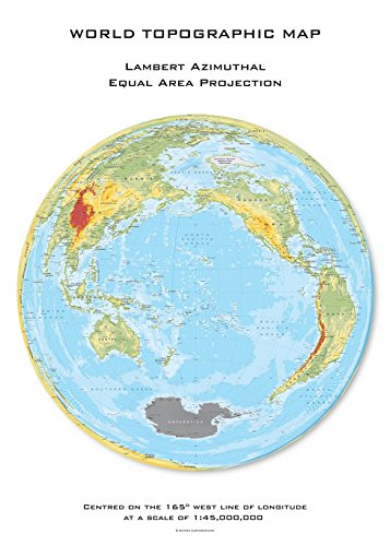
Lambert azimuthal equal-area projections preserve accurate distance relationships when centered on major aviation hubs like Atlanta or London. You can visualize flight connections radiating outward from your chosen center point while maintaining proportional areas for fuel consumption calculations. This projection works exceptionally well for displaying hub-and-spoke airline networks, where you need to compare route distances and coverage areas accurately. Position your center point at the primary hub to optimize the visualization’s effectiveness.
Stereographic Projection for Polar Routes
Stereographic projections provide the most accurate representation of polar flight routes connecting North America, Europe, and Asia. You’ll achieve minimal distortion when mapping transpolar aviation corridors that cross Arctic regions, where Mercator projections create significant distance errors. Airlines use these projections for route optimization software because they maintain accurate angular relationships around the pole. Center your projection on the North Pole to visualize the shortest great circle routes between continents effectively.
Great Circle Distance Calculations
Great circle calculations become visually intuitive when you apply azimuthal projections centered on departure points. You can display true shortest-path distances as straight lines radiating from your chosen origin, eliminating the curved appearance these routes show on cylindrical projections. This approach proves essential for logistics planning, where you need to compare multiple destination options from a single origin point. Maritime shipping companies rely on these centered azimuthal views for fuel-efficient route selection.
Utilizing Cylindrical Equal-Area Projections for Environmental Data
Cylindrical equal-area projections excel at maintaining accurate proportional relationships for environmental datasets where landmass size comparisons are critical. These projections eliminate the area distortions that can mislead conservation efforts and biodiversity assessments.
Gall-Peters Projection for Conservation Areas
Gall-Peters projection maintains accurate area relationships essential for conservation planning and protected area management. You’ll find this projection particularly effective when comparing conservation zone sizes across different continents or analyzing habitat coverage percentages. The projection’s equal-area properties ensure that tropical conservation areas in Africa and South America appear proportionally accurate relative to temperate zones, eliminating the size exaggerations common in Mercator-based environmental maps. Conservation organizations frequently use Gall-Peters for displaying global protected area networks and calculating accurate habitat percentages.
Behrmann Projection for Biodiversity Mapping
Behrmann projection offers reduced shape distortion while preserving area accuracy for biodiversity data visualization. You’ll achieve more visually appealing results compared to Gall-Peters when mapping species distribution ranges or ecosystem boundaries. This projection maintains accurate proportional relationships between biomes while minimizing the extreme horizontal stretching at polar regions. Field researchers prefer Behrmann for displaying migratory patterns and species richness data because it provides clearer continental outlines without sacrificing mathematical accuracy. The projection works exceptionally well for tropical biodiversity hotspots where precise area calculations are essential.
Forest Cover and Deforestation Tracking
Forest cover analysis requires projections that accurately represent woodland areas without size distortions affecting change calculations. You should implement Lambert cylindrical equal-area projection for deforestation monitoring because it maintains consistent area measurements across all latitudes. This projection enables accurate year-over-year forest loss comparisons between tropical and temperate regions. Satellite imagery processing benefits from equal-area projections since pixel calculations remain mathematically sound regardless of geographic location. Environmental monitoring agencies rely on these projections for calculating accurate deforestation rates and carbon storage estimates in global forest assessments.
Exploring Innovative Modern Projections for Digital Mapping
Modern digital mapping platforms increasingly support advanced projections that push beyond traditional cartographic limitations. These cutting-edge approaches offer unprecedented accuracy for specialized data visualization needs.
AuthaGraph for Balanced Global Representation
AuthaGraph projection divides Earth’s surface into 96 triangular sections, creating remarkably balanced continental proportions without significant distortion. You’ll find this projection particularly valuable for demographic datasets requiring proportional accuracy across all continents. The projection’s tetrahedral foundation maintains consistent scale relationships, making it ideal for global population density maps where Africa’s true size remains proportional to other landmasses. UNESCO adopted this projection for educational materials because it eliminates the northern hemisphere bias present in traditional world maps.
Achieve a flawless, even complexion with e.l.f. Flawless Satin Foundation. This lightweight, vegan formula provides medium coverage and a semi-matte finish for all-day wear, while hydrating your skin with glycerin.

Dymaxion Map for Minimizing Breaks
Experience the world's terrain with this Dymaxion map, featuring a stunning 3D shaded relief illusion. Printed in the USA on gallery-quality, acid-free fine art paper with archival inks for lasting detail and vibrant colors.

Dymaxion projection unfolds Earth onto an icosahedron, creating a map with minimal distortion and no visible breaks in continental landmasses. You can display this projection as a flat map or interactive 3D model, making it excellent for showing global connectivity patterns like internet infrastructure or migration routes. The projection’s unique geometry preserves both area and angular relationships better than most alternatives. Digital mapping software like QGIS and ArcGIS Pro now support Dymaxion transformations for specialized geographic analysis projects.
Interactive Digital Applications
Interactive digital platforms allow you to switch between multiple projections instantly, letting users explore data through different cartographic perspectives. Modern web mapping libraries like D3.js and Leaflet support custom projection plugins that enable seamless transitions between Mercator, Robinson, and equal-area alternatives. You can create dynamic visualizations where users toggle projections to understand how different perspectives affect data interpretation. Popular platforms like Observable and Mapbox provide built-in tools for implementing these projection-switching interfaces in professional data visualization projects.
Conclusion
Your choice of map projection directly impacts how effectively you communicate global data to your audience. By moving beyond Mercator’s limitations you’ll ensure your visualizations tell accurate stories that reflect true geographic relationships.
Each projection type serves specific analytical purposes. Whether you’re mapping population density climate patterns economic flows or environmental data selecting the right projection enhances data accuracy and viewer comprehension.
Modern digital platforms make these advanced projections more accessible than ever. You can now experiment with multiple projection types and create interactive visualizations that allow your audience to explore data from various cartographic perspectives.
The key is matching your projection choice to your data’s characteristics and your visualization goals. This thoughtful approach transforms basic maps into powerful analytical tools that reveal insights previously hidden by projection distortions.
Frequently Asked Questions
What are the main problems with the Mercator projection?
The Mercator projection significantly distorts landmasses, especially at high latitudes. Regions like Greenland and Alaska appear disproportionately large compared to equatorial areas. This distortion creates misleading size comparisons between countries and can skew understanding of demographic, economic, and climate data, particularly making Arctic regions seem overly significant while diminishing tropical zones.
Which map projections are best for displaying population data?
Equal-area projections are ideal for population data as they maintain proportional relationships between landmasses. The Mollweide projection effectively displays global demographic trends like urbanization and migration with minimal distortion in populated mid-latitude regions. The Albers equal-area conic projection works well for regional population analysis, particularly in North America.
How do orthographic projections help with climate data visualization?
Orthographic projections present Earth as it appears from space, providing a spherical perspective that enhances understanding of global atmospheric patterns and oceanic systems. They eliminate edge distortions, allow accurate assessment of storm systems and polar ice coverage, and effectively display seasonal climate shifts while maintaining accurate relationships within the hemisphere view.
What are interrupted projections and when should they be used?
Interrupted projections eliminate oceanic distortion by focusing on continental landmasses where most economic activity occurs. Goode’s homolosine projection maintains equal-area properties across continents, making it effective for mapping global trade routes. The Waterman butterfly projection uses a unique geometric approach for accurate visualization of mineral deposits and energy resources.
Which projections work best for transportation and logistics planning?
Azimuthal projections excel at displaying transportation networks by maintaining accurate directional relationships from a central point. The Lambert azimuthal equal-area projection preserves distance relationships for flight paths centered on aviation hubs, while the stereographic projection provides accurate polar flight routes, essential for optimizing aviation and maritime shipping routes.
How do cylindrical equal-area projections benefit environmental data visualization?
Cylindrical equal-area projections maintain accurate proportional relationships critical for conservation efforts and biodiversity assessments. The Gall-Peters projection ensures tropical conservation areas are accurately represented, while the Behrmann projection reduces shape distortion for biodiversity mapping. The Lambert cylindrical equal-area projection enables accurate deforestation monitoring and carbon storage estimates.
What are some modern digital mapping innovations?
Modern digital platforms support advanced projections like the AuthaGraph projection, which divides Earth into triangular sections for balanced representation, and the Dymaxion projection, which unfolds Earth onto an icosahedron. Interactive applications now allow users to switch between multiple projections, enabling dynamic exploration of data through various cartographic perspectives.