4 Best Data Visualization Traits for Impact
In the ever-expanding data universe, the art of distilling complex information into digestible visuals is nothing short of alchemy. Stellar data visualization can illuminate patterns and tell stories hidden within numbers, transforming the abstract into the concrete.
Are you lost in a forest of numbers? Data visualization is your compass. It transforms data into visual forms like maps or charts, revealing insights not easily noticed in text. Beyond aesthetics, it enhances understanding and aids decision-making. In today’s data-driven era, effective communication is key.
Data visualization acts as a bridge, translating raw data into a compelling story for everyone. It’s visual storytelling—each chart or graph unfolds a narrative. It navigates through complex information, expertly wielded, uncovering rich stories within the data tapestry. It’s not just about what you present but how you present it.
Disclosure: As an Amazon Associate, this site earns from qualifying purchases. Thank you!
P.S. check out Udemy’s GIS, Mapping & Remote Sensing courses on sale here…
1. Clarity in Design

Clarity is the cornerstone of effective data visualization. The goal is to make the viewer ‘get it’ at a glance—like a good billboard that catches your eye on the highway. If a chart is cluttered or confusing, the message gets lost in translation. It’s the equivalent of mumbling through a speech.
The design should guide the viewer’s eye to the most important parts of the data. It’s like using a highlighter in a textbook; you want to draw attention to the key information. This means prioritizing data over decoration—no unnecessary bells and whistles. The best visuals are often the simplest ones.
Remember, clarity doesn’t mean boring. It’s about striking a balance between aesthetics and functionality. A clear design is like a well-organized desk; it makes it easier to find what you’re looking for and understand what you see.
2. Accuracy Matters

Accuracy in data visualization is non-negotiable. Presenting data accurately is a matter of integrity—it builds trust with your audience. When you’re accurate, you’re telling the truth, and who doesn’t appreciate honesty? Fudging the numbers is like a chef sneaking a questionable ingredient into a dish—it can spoil the whole experience.
Accuracy extends to how data is scaled and contextualized. Misleading scales or cherry-picked data can distort the viewer’s perception, leading to incorrect conclusions. It’s like looking at a map with the wrong scale—it won’t get you where you need to go.
It’s not just about the numbers themselves; it’s about the story they tell. Accurate visualization ensures that the narrative is based on solid ground. It’s the difference between a well-researched article and a piece of gossip—reliability makes all the difference.
3. Accessibility

Accessibility in data visualization means designing with all potential users in mind. It’s about breaking down barriers, whether they’re physical, cognitive, or cultural. Imagine a world where everyone, regardless of ability, can understand the story your data tells—that’s the goal.
Good design accounts for color blindness, screen reader compatibility, and other factors that make visuals inclusive. It’s like building a ramp alongside stairs—everyone gets to enter through the same front door. You want your audience to focus on the data, not struggle with how it’s presented.
Get clear, full-page magnification with this 2-pack of 3X Fresnel lenses (7.5" x 10.5"), ideal for reading small print. Made from durable, optical-grade PVC, this set also includes 3 bonus bookmark magnifiers for on-the-go convenience.

Accessibility also extends to the language and symbols used in your visualizations. They should be clear and universally understood. Think of it as using plain language in a speech—it ensures the message resonates with the entire audience, not just a select few.
4. Engagement

Engagement is the secret sauce that makes data visualization memorable. It’s what turns a standard chart into a conversation piece. When viewers are engaged, they’re not just looking at the data; they’re interacting with it. It’s like the difference between a lecture and a dialogue—one is passive, the other active.
An engaging visualization often tells a story. It takes the viewer on a journey, highlighting twists and turns in the data. It’s like a good book that you can’t put down; you’re hooked from the first page to the last.
Interactive elements can also boost engagement. Allowing users to explore and manipulate data makes the experience more personal. It’s like giving someone a map and a compass instead of just a list of directions—they become part of the adventure.
Importance of Simplicity
Simplicity is the soul of efficiency. In data viz, this means stripping away the superfluous to focus on the essence. A simple visualization reduces cognitive load, making it easier for the audience to process and retain information. Think of it like a minimalist painting—it doesn’t need complexity to convey a powerful message.
A cluttered chart is like a crowded party where everyone’s talking at once—you can’t focus on a single conversation. By keeping designs simple, you allow the viewer to grasp the narrative you’re presenting quickly. It’s about making the complex accessible, not dumbing it down.
Simplicity isn’t just about what you include; it’s also about what you leave out. The art of subtraction can be more powerful than that of addition. It’s the difference between a scalpel and a sledgehammer—use precision to carve out your message.
Ensuring Data Integrity
 Magnifying glass and documents with analytics data lying on table , and digital virtual reality graph” class=”wp-image-214″/>
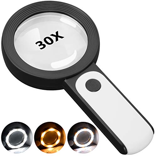
This 30X magnifying glass helps users with low vision easily read small text. Featuring a large 3.15" lens and 18 LEDs with adjustable cool, warm, and mixed light modes, it reduces eye strain and improves reading in any lighting.
Ensuring data integrity is like being a good fact-checker—you’re the last line of defense against misinformation. This means double-checking sources, verifying data, and using reliable methods to represent it visually. It’s a bit like a detective ensuring all the evidence lines up before presenting a case.
Data integrity also involves being transparent about your methods and sources. If you’re not upfront about where your data comes from or how it’s processed, you risk losing credibility. It’s like a magician revealing the secret behind a trick—it adds to the audience’s appreciation.
Finally, data integrity is about consistency. Consistency in your visual language helps viewers understand and compare different sets of data. It’s like using the same measuring cup for all your ingredients when baking—it ensures the result is what you intended.
Crafting a Narrative
Crafting a narrative in data visualization means connecting dots to tell a story. It’s not just about the individual points of data; it’s about how they fit together to form a bigger picture. Like a skilled storyteller, a good visualization weaves a tale that resonates with the audience.
A narrative approach helps make complex data relatable. By framing data within a story, you provide context and relevance. It’s like using real-world examples to explain abstract concepts—it makes the information stick.
Remember, every element of your visualization should contribute to the narrative. Unnecessary details are like filler scenes in a movie—they can distract from the main plot. Keep the focus on the story you want to tell.
Conclusion: Best Practices
In the realm of data visualization, best practices are your map to success. They guide you in creating visuals that are not just informative, but also engaging and accessible. It’s like having a trusted recipe when you’re cooking—you know the outcome will be good if you follow the steps.
Always strive for clarity, accuracy, accessibility, and engagement. These four traits are the pillars upon which effective visualizations are built. They’re the difference between a forgettable graph and one that makes an impact.
Remember, the goal is to turn data into knowledge, and knowledge into understanding. By adhering to these best practices, you can transform raw numbers into compelling visual stories that captivate and inform. It’s not just about showing data; it’s about enlightening your audience with it.
As we wrap up, remember that stellar data visualization isn’t just about pretty pictures—it’s about clear, accurate, accessible, and engaging communication. It’s your chance to turn numbers into narratives and insights into action.