5 Key Insights: Understanding Special Purpose Maps
Maps are like personal diaries of the world, telling stories beyond just locations and distances. Let’s dive into the fascinating realm of special purpose maps, where every fold and symbol uncovers a new tale just waiting to be explored.
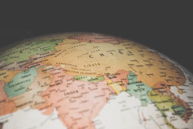
Special-purpose maps, akin to spotlights, zoom in on specific themes like climate patterns or population demographics rather than offering a broad geographical overview. Unlike general maps, these charts focus exclusively on conveying targeted messages, stripping away excess information.
Crafting a special-purpose map requires precision and focus, turning the mapmaker into a storyteller who selects and presents data on a world canvas, resembling the act of turning down the volume at a noisy party to highlight a favorite song.
Disclosure: As an Amazon Associate, this site earns from qualifying purchases. Thank you!
P.S. check out Udemy’s GIS, Mapping & Remote Sensing courses on sale here…
1. Identifying the Target Audience

The first insight in creating a special purpose map is knowing who it’s for. Are you guiding tourists through the winding streets of a historic city, or are you helping scientists track the migration of endangered species? The audience shapes the map’s design, language, and complexity.
For instance, a map intended for children might use bright colors and simple symbols, like a picture book that guides them through geography. On the other hand, a map for urban planners might be a dense tapestry of zoning codes and land use data, requiring a trained eye to decipher. It’s a bit like cooking for different guests—knowing their tastes and dietary preferences is key to a successful meal.
Understanding the audience also influences the map’s accessibility. A well-designed map for public transportation should be easy for anyone to understand, regardless of their familiarity with the area. It’s about making sure no one gets lost in the sauce—or this case, the streets.
2. Importance of Scale and Detail
Scale and detail are the Yin and Yang of mapmaking; they must be balanced for the map to achieve harmony. The scale of a map determines how much of the world you’re showing and influences the level of detail that can be effectively displayed. It’s like choosing the right zoom level on your camera—you want to capture the scene without losing focus on what’s important.
A large-scale map, which shows a smaller area in greater detail, might be perfect for a city utility map, highlighting every hydrant and manhole cover. Conversely, a small-scale map, showing a larger area with less detail, is akin to a wide-angle shot, suitable for understanding broader patterns like population distribution.
The trick is to include enough detail to inform but not so much that it confuses. Imagine trying to read a novel where every character’s backstory is told in full—it might be rich in detail, but you’d lose the plot. Maps, like stories, need the right balance of depth and breadth.
3. Symbolization and Color Usage
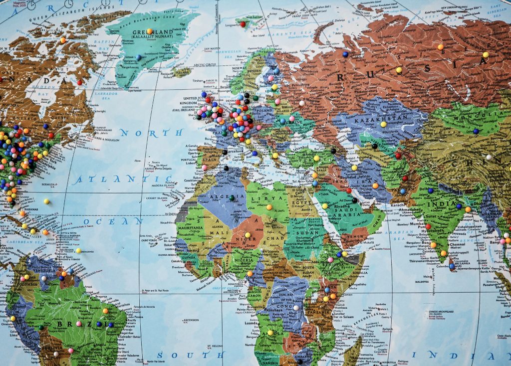 paper world map hanging on a wall dotted with colorful pins marking destinations” class=”wp-image-347″/>
Explore the world with this up-to-date 24" x 36" world map featuring stunning 3D shaded relief. Printed on durable 24lb paper, it's ideal for business, home, or educational use and folds to 8x10 inches for portability.
Symbols and colors are the language through which a map communicates. Choosing the right symbols and color palette can make the difference between clarity and chaos. Think of each symbol as a word and each color as a tone of voice—used wisely, they can convey complex ideas with simplicity and elegance.
The use of color should be intuitive; blue for water is a no-brainer, but what about using green for areas of high vegetation or red for areas of conflict? It’s about tapping into universal associations and making sure your map ‘speaks’ to the reader. And just like in writing, avoid clichés—be creative but clear with your visual language.
Symbols, too, must be carefully chosen. They should be distinct and scalable, capable of being understood at different sizes. A good symbol works like a logo, instantly recognizable and evocative of its meaning. It’s a delicate dance of form and function, where aesthetics meet utility.
4. Data Selection and Accuracy
Data is the backbone of any special-purpose map—it gives the map its substance. Selecting the right data is a bit like curating an art exhibition; you want to show the most relevant and impactful pieces without overwhelming the viewer. It involves a careful vetting process to ensure the data is current, reliable, and relevant to the map’s theme.
Accuracy is non-negotiable. A map with inaccurate data is like a compass that doesn’t point north—it’s not just useless; it’s potentially misleading. As a cartographer, I double-check sources and cross-reference data to ensure my maps are as accurate as possible. It’s the responsibility of the reader to present the truth as best as one can depict it.
The choice of data also reflects the map’s purpose. A map showing economic data will require different datasets than one showing environmental conditions. The key is to select data that tells a coherent story, aligning with the map’s overall theme and objectives.
5. Balancing Aesthetics and Functionality
The final insight is finding the sweet spot between beauty and practicality. A map should be pleasing to the eye, inviting the reader to explore its contents, but it should also be functional, allowing them to extract the information they need without strain. It’s a balancing act, akin to designing a car that’s both stunning to look at and a joy to drive.
Aesthetics can enhance a map’s readability, using visual hierarchies to guide the eye to the most important information. It’s like using bold fonts and bullet points in a document to draw attention. However, too much style over substance can confuse a map, like a novel with a beautiful cover but an unreadable font.
The functionality of a map is its usability. It must be intuitive, with a clear legend, a well-chosen scale, and an appropriate level of detail. The map should be as easy to navigate as a well-organized book, with chapters and headings that lead the reader through the story.
Historical Evolution of Thematic Cartography
Thematic cartography, the art and science behind special purpose maps, has a rich tapestry of history stretching back centuries. It’s the story of how we’ve visualized the invisible, making abstract data tangible. Early examples, like the cholera maps of the 19th century, not only informed but saved lives, showing us that maps could be powerful tools for understanding and action.
As the times have changed, so have our maps. The introduction of color lithography in the 19th century was like adding Technicolor to what was a black-and-white film. Suddenly, maps were not just informative; they were beautiful, capable of conveying complex information through a symphony of hues and shades. This evolution continued with the digital revolution, turning cartographers into data wizards, capable of manipulating vast datasets into interactive, multi-dimensional maps.
The journey of thematic cartography is a testament to human curiosity and our relentless pursuit of knowledge. Each era’s maps reflect not just the technology of the time, but the prevailing interests and concerns. From tracking diseases to understanding demographics, these maps are a mirror to our collective psyche, revealing what we care about and why.
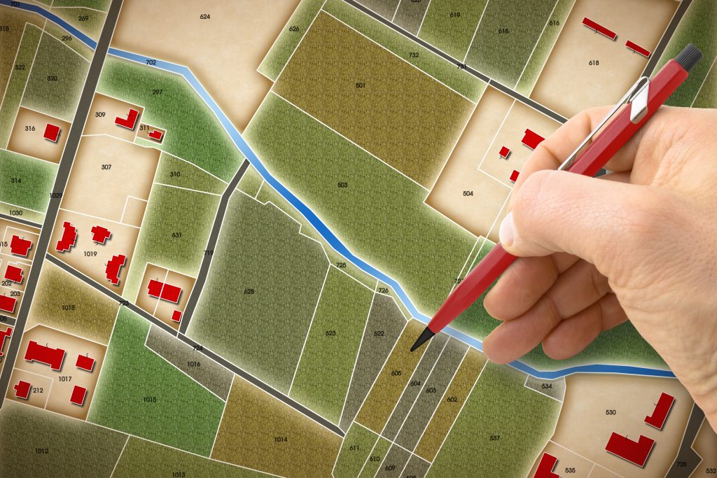
Essential Elements of Special Maps
Special purpose maps are like a chef’s signature dish—every ingredient must be chosen with care to achieve the desired flavor. The base of any special map is its thematic focus, the key ingredient that defines its purpose. Without a clear theme, the map is just an empty plate, waiting for direction.
The ingredients in our cartographic kitchen include a base map for context, a thematic overlay that adds flavor, and a legend that acts like a recipe card, guiding the reader through the symbols and colors used. Just as too much salt can ruin a dish, too many elements on a map can overwhelm the palate, or in this case, the reader.
An often overlooked but crucial element is the title. Just as you wouldn’t serve a dish without telling your guests what it is, a map without a title leaves users guessing. The title sets the stage, providing a first impression that can either invite the reader in or leave them confused about the map’s purpose.
Diverse Types of Special Purpose Maps
The world of special purpose maps is as varied as the cuisines of the world. There are climate maps, akin to a meteorologist’s crystal ball, revealing patterns of weather and temperature. Then, there are political maps, the chessboards of geopolitics, delineating borders and election results.
One of my personal favorites is the topographic map, a hiker’s best friend that turns a landscape into a tangible set of contours and elevations. It’s like having X-ray vision for the land, seeing its bones beneath the skin of trees and buildings. Another fascinating type is the economic map, which might show the pulsing arteries of trade routes or the beating hearts of financial centers.
Special maps can also be whimsical, like a map charting the fictional landscapes of novels or films. Whether you’re navigating the peaks and valleys of Middle Earth or the sprawling cityscape of Gotham, these maps transport you into other worlds, proving that maps can be both practical and magical.
In the video, MissA WorldGeo explains –
MissA WorldGeo
- Definition of Special-Purpose Maps: Special-purpose maps are used by geographers to study various aspects, including climate, precipitation, population, economic activities, elevation, topography, and history.
- Types of Maps Covered: The video mentions several types of special-purpose maps, such as physical maps, political maps, historical maps, thematic maps, population density maps, land use or resource maps, precipitation maps, climate maps, elevation profile maps, and contour maps.
- Physical Maps: Physical maps depict major landforms and bodies of water. An example shown is a physical map of the world highlighting desert areas.
- Political Maps: Political maps illustrate major boundaries between countries or states. The video provides a political representation of Europe as an example.
- Historical Maps: Historical maps display political boundaries from the past. An example presented in Europe before and after World War I, showcasing changes in countries and territories.
- Thematic Maps: Thematic maps focus on specific information related to a particular theme, such as religion or trade routes.
- Population Density Maps: Population density maps indicate where people live in a specific area, expressed as people per square mile.
- Land Use or Resource Maps: Land use or resource maps depict major natural resources, farms, and industrial products of an area. An example is shown highlighting oil and gas reserves in Texas.
- Precipitation Maps: Precipitation maps show the average amount of rain, snow, sleet, or hail a region receives each year. The video compares precipitation on the east and west coasts of Canada.
- Climate Maps: Climate maps use colors or patterns to represent various climate regions. The video mentions the varying climate zones in the continental US and prompts viewers to consider the reasons for such variations.
Future Trends in Special Purpose Mapping
The future of special purpose mapping is as open and uncharted as the ocean once was to ancient mariners. With advancements in technology, we’re seeing a shift towards interactive and dynamic maps that can be customized and updated in real time. It’s like having a living document, evolving with the world it represents.
Data visualization is becoming increasingly sophisticated, with the potential to integrate augmented reality (AR) and virtual reality (VR) into maps. Imagine donning a headset and walking through a historical battle map, experiencing the ebb and flow of combat as if you were there. These immersive experiences could redefine how we interact with geographic information.
Sustainability and accessibility are also becoming central themes in special-purpose mapping. As we become more conscious of our impact on the planet, maps highlighting environmental concerns or promoting sustainable practices will be in high demand. As we strive for inclusivity, maps that are accessible to all, regardless of ability or background, will become the new standard.
In the world of cartography, special purpose maps are the storytellers, each line and color a word in their narrative. As we’ve journeyed through these insights, remember that maps are more than just tools; they’re canvases where we paint our understanding of the world. Keep exploring, keep mapping, and who knows what stories you’ll uncover.