Key Cartographic Conventions Explained
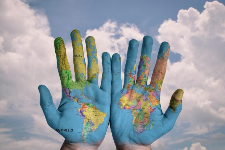
Ever unfolded a map and marveled at how a complex world is captured on a simple piece of paper? Cartography is the art and science of map-making, and it’s chock-full of conventions that help us navigate not just the physical world, but the map itself.
Cartography is not just about sketching coastlines and plotting points; it’s a sophisticated discipline that blends artistic elements with scientific principles. Think of it as a translator that turns the 3D world into a 2D depiction, understandable at a glance. For centuries, maps have been guiding explorers and travelers, and even in today’s GPS-dominated world, the basic principles of cartography remain crucial. They’re the bread and butter for understanding how to read and create accurate maps.
Disclosure: As an Amazon Associate, this site earns from qualifying purchases. Thank you!
The Importance of Scale
 Vintage Sundial With Zodiac Sign” class=”wp-image-504″/>
Track time in style with this 13" solid brass sundial. Featuring a beautiful aged patina finish and an original design, it fits all Rome sundial pedestals (sold separately).

Scale is the relationship between distance on a map and the corresponding distance on the ground. It’s what makes a map useful (or not). Without a proper scale, you might as well be looking at a pretty drawing. Imagine planning a trip and thinking your destination is a short walk away, only to find out it’s several miles—ouch! That’s why the scale is often the first thing cartographers decide on: it sets the stage for everything that follows.
P.S. check out Udemy’s GIS, Mapping & Remote Sensing courses on sale here…
Understanding Map Projections
Here’s where things get a bit mind-bending. The Earth is round (sorry, flat-Earthers), but maps are flat. Map projections are the methods used to flatten the globe’s surface onto a plane. Each projection has its quirks and distortions—there’s no perfect way to do it. For instance, the Mercator projection is great for navigation but makes Greenland look like it’s on steroids. Choosing the right projection is a balancing act between accuracy and functionality.
Symbolization Essentials
Symbols are the shorthand of cartography. They represent various features like cities, rivers, and roads. But here’s the kicker: there’s no universal symbol language. A cartographer’s choice of symbols must be intuitive—think dashed lines for paths or blue for water. It’s like a secret code that’s not so secret because everyone needs to crack it without a cipher.
The Role of Colors in Maps
Colors do more than just make a map pretty; they convey critical information. For example, blue often represents water, green for lower elevations, and brown for higher elevations. But it’s not all black and white—or should I say, green and brown? Colors can also be used to show data, like population density or climate zones. It’s a bit like painting, but instead of evoking feelings, you’re representing facts.
Text and Typography in Cartography
The font you choose for a map can make or break its readability. Too fancy, and you’re squinting; too bland, and you’re snoozing. Text size, style, and placement are all part of the cartographer’s toolkit to ensure that you can tell your Serif from your Sans Serif and your city from your lake. It’s like typography meets Where’s Waldo but for practical purposes.
Grids and Reference Systems
Grids and reference systems are the unsung heroes of navigation. They’re like the underlying skeleton of a map, giving it structure and allowing us to pinpoint exact locations. Latitude and longitude are the classic duo, but there are others, like UTM and MGRS. It’s not the most glamorous part of map-making, but boy, is it important.
The Use of Legends and Keys
Legends and keys are like the Rosetta Stone for maps. They unlock the meaning behind those squiggly lines and colored blobs. Without them, you might be left guessing whether that red dot represents a city or a volcano. A well-designed legend is both comprehensive and concise—it’s the cheat sheet you always wished you had during exams.
In the video, girl AtVenture explains-
girl AtVenture
- Introduction to Symbols: The video explains that symbols are pictures that represent something else, and it uses the example of a crosswalk sign as a symbol for pedestrians.
- Maps Have Symbols: The concept is introduced that maps also use symbols, with the example being a map of Lydia’s house. Symbols simplify the representation of objects and features in a larger area.
- Limited Space on Maps: The video highlights that maps have limited space, making it impractical to draw everything in great detail. Instead, symbols are employed to convey information more efficiently.
- Example of City Map: The video shows a map of a city where symbols are used to represent houses as squares, streets as black lines, a stop sign as a red dot, a park as a green triangle, and more. This demonstrates how symbols can replace detailed drawings on a map.
- Representation of Natural Features: Different natural features on the map are represented by specific symbols, such as mountains depicted as black triangles, rivers as blue lines, lakes as blue shapes, and roads as grey lines.
- Understanding Symbols: The importance of understanding symbols is emphasized. The video suggests that symbols are easy to read if you know what they mean.
- Introduction to Key or Legend: The video introduces the concept of a key or legend, which acts as a guide to interpreting the symbols on a map. It explains that a key unlocks the meaning of the symbols.
- Key on the Map: A specific example of a key on a map is shown, indicating that it provides information about each symbol used. The key helps readers understand the symbols and their corresponding meanings.
- Alternative Term for Key: The video mentions that a key is also called a legend, emphasizing that these terms are interchangeable in the context of maps and globes.
- Importance of a Key: The video concludes by highlighting that maps and globes using symbols always have a key or legend to assist readers in understanding the meaning of the symbols, facilitating navigation and interpretation.
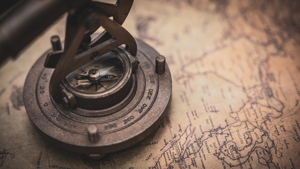
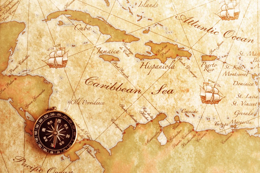
Orientation: North Arrow and Beyond
“North” is more than just a direction; it’s a foundational aspect of most maps. The North Arrow tells you which way is up, both literally and figuratively. But sometimes, maps are oriented differently, for example, toward Mecca for Islamic maps or downstream in river maps. It’s like having a compass built into the map—simple but essential.
Conclusion: Applying Conventions
Cartographic conventions are tools that enable us to interpret and create maps effectively. They’re the reason we can switch from a city subway map to a topographical trail guide without missing a beat. When applied with skill, these conventions turn a dizzying array of data into a clear, navigable path. So next time you unfold that map or zoom in on your screen, remember the craft and care that went into those lines and symbols—they’re your ticket to exploring the world.
Maps are more than just paper or pixels; they’re a canvas where science and art collide to guide us through the physical world. Cartographic conventions are the brushstrokes that make this possible, and understanding them is the first step to becoming a savvy navigator of both maps and the terrain they represent.