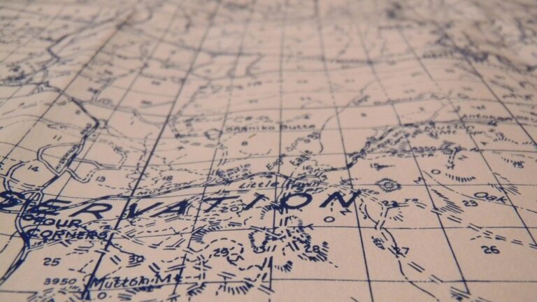
7 Best Map Design Styles
Why it matters: Map ornamentation transforms basic geographical data into visually stunning artwork that captures attention and tells compelling stories.
The big picture: Whether you’re designing for digital platforms or print media, the right decorative elements can elevate your maps from functional tools to memorable visual experiences that engage viewers and enhance understanding.
What’s next: These seven aesthetic approaches will help you create maps that balance artistic flair with practical functionality, ensuring your geographical presentations stand out in today’s crowded visual landscape.
Disclosure: As an Amazon Associate, this site earns from qualifying purchases. Thank you!
P.S. check out Udemy’s GIS, Mapping & Remote Sensing courses on sale here…
Vintage Cartographic Elegance With Classical Flourishes
Transform your modern maps into timeless masterpieces by incorporating traditional cartographic elements that evoke the golden age of exploration. This aesthetic approach draws from 16th through 19th-century mapping traditions to create sophisticated visual narratives.
Ornate Compass Roses and Wind Direction Indicators
Create intricate compass roses using multi-layered designs with detailed cardinal and intercardinal points. Position your compass rose in open ocean areas or corner spaces, incorporating decorative flourishes like fleur-de-lis markers for north orientation. Add wind head illustrations showing classical representations of the four winds – Boreas, Notus, Eurus, and Zephyrus – complete with flowing ribbons and personified faces that mirror historical cartographic conventions.
Decorative Cartouches and Title Frames
Design elaborate cartouches featuring scrollwork, heraldic elements, and architectural details that frame your map titles and legends. Use baroque-style ornamentation with flowing ribbons, cherub figures, and botanical motifs surrounding text blocks. Position these decorative frames strategically in map corners or along borders, ensuring they complement rather than compete with geographical features while providing elegant spaces for essential map information and attribution details.
Period-Appropriate Typography and Calligraphy
Select typefaces that reflect historical lettering styles, using serif fonts like Trajan Pro or custom calligraphic scripts for major labels. Implement hierarchical typography with hand-lettered appearance for place names, employing varying weights and flourishes. Incorporate Latin phrases and archaic spellings where appropriate, using techniques like letter spacing and decorative initial capitals to mirror the craftsmanship of historical manuscript maps and early printed atlases.
Nautical Maritime Theme With Oceanic Elements
Transform your maps into captivating maritime narratives by incorporating oceanic design elements that evoke the romance and adventure of seafaring exploration.
Ships, Anchors, and Naval Vessels
Incorporate detailed sailing ships as scale reference points and decorative anchors in map corners to establish maritime authenticity. Position galleons and brigantines near coastal areas using vector illustrations that match your map’s scale and color palette. Place nautical anchors with rope details at cardinal directions or use them to frame important port cities. Design ship silhouettes ranging from ancient Viking longships to modern naval vessels depending on your map’s historical context and geographic focus.
Sea Monsters and Mythical Creatures
Populate unexplored ocean areas with traditional sea monsters like krakens, sea serpents, and leviathans to fill empty maritime spaces creatively. Draw these creatures using flowing lines that complement your map’s artistic style while maintaining historical cartographic accuracy. Position mythical beings in deep ocean regions where they won’t interfere with navigation routes or coastal details. Create creatures that reflect regional maritime folklore, such as Scandinavian sea trolls or Mediterranean sirens.
Rope Borders and Maritime Symbols
Frame your entire map with twisted rope borders that create natural boundaries and reinforce the nautical theme throughout your design. Incorporate maritime symbols like ship wheels, lighthouses, and compass roses as decorative elements that serve both aesthetic and functional purposes. Use rope knots as corner decorations and sailing knots as dividers between different map sections. Add nautical flags and pennants along coastlines to indicate wind patterns or mark significant maritime locations.
Fantasy Medieval Style With Mythological Touches
Transform your maps into enchanted landscapes by blending medieval cartographic traditions with fantasy elements. This aesthetic creates immersive worlds that transport viewers to realms of adventure and legend.
Dragons, Castles, and Heraldic Crests
Position dragons as territorial markers across unexplored regions, using their placement to indicate dangerous or mysterious areas. Castle illustrations mark settlements and strongholds, while heraldic crests distinguish different kingdoms or noble houses throughout your mapped territory. Scale these elements proportionally—smaller dragons for minor threats, towering castles for major cities. Use traditional heraldic colors like azure, gules, and or to maintain authenticity. Consider incorporating family banners and coat-of-arms designs that reflect the political landscape of your fantasy realm.
Illuminated Manuscript-Inspired Borders
Design elaborate border frameworks featuring interlaced Celtic knots, vineyard scrollwork, and mythical creature motifs drawn from medieval manuscripts. Incorporate gold leaf effects using metallic colors or foil textures to replicate the luxury of illuminated texts. Add corner flourishes with griffins, phoenixes, or other legendary beasts that complement your map’s theme. Use rich jewel tones—deep purples, emerald greens, and royal blues—to create the opulent appearance of monastery scriptoriums. Frame important text areas with decorative initial capitals reminiscent of medieval manuscripts.
Add a touch of gold to your art and DIY projects with these 200 imitation gold leaf sheets. Each 5.5" x 5.5" sheet is layered between tissue paper for easy handling in various applications like crafting, decor, and gilding.

Gothic Lettering and Ancient Symbols
Implement blackletter typography for major place names and titles, maintaining readability while preserving medieval authenticity. Incorporate runic alphabets, alchemical symbols, and mystical sigils as decorative elements that suggest ancient knowledge and forgotten lore. Use drop capitals with intricate Celtic interlacing for region names and important landmarks. Balance ornate Gothic scripts with simpler fonts for detailed information to ensure your map remains functional. Add compass roses featuring traditional wind names like Tramontana and Levante, decorated with medieval astronomical symbols and zodiacal references.
Modern Minimalist Approach With Clean Geometric Designs
Minimalist cartographic design transforms complex geographical data into clean, digestible visual information. This aesthetic prioritizes functionality while maintaining sophisticated visual appeal through strategic use of negative space and precise geometric elements.
Simple Line Art and Abstract Shapes
Embrace vector-based line work that reduces visual clutter while maintaining essential geographic information. You’ll achieve maximum impact by using single-pixel lines for boundaries and consistent stroke weights throughout your design. Replace traditional ornamental elements with simple geometric shapes like circles, triangles, and hexagons to mark significant locations. Utilize abstract representations of natural features through simplified polygons rather than detailed illustrations, creating a contemporary feel that enhances map readability.
Contemporary Color Palettes
Select monochromatic color schemes using variations of single hues to create depth without overwhelming viewers. You’ll benefit from using neutral base colors like soft grays and whites paired with one or two accent colors for highlighting important features. Apply flat color fills instead of gradients to maintain the minimalist aesthetic while ensuring proper contrast ratios for accessibility. Implement strategic color coding using no more than five distinct colors to categorize different map elements effectively.
Streamlined Typography and Icons
Choose sans-serif fonts with clean letterforms that maintain readability across different scales and digital platforms. You’ll enhance visual consistency by using maximum two font weights throughout your entire map design. Design simplified iconography using basic geometric shapes that communicate meaning instantly without decorative flourishes. Apply consistent spacing between text elements and maintain uniform sizing hierarchies to create professional-looking results that support your map’s minimalist geometric design approach.
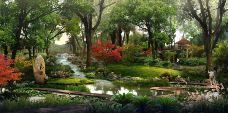
Nature-Inspired Botanical Ornamentation
Nature-inspired elements bring organic warmth to your cartographic designs while creating visual connections between the map’s content and the natural world it represents.
Flora and Fauna Illustrations
Botanical illustrations transform empty map spaces into rich ecosystems that reflect regional biodiversity. You’ll achieve authentic results by researching native plant species and incorporating detailed botanical drawings along coastlines and forest boundaries. Wildlife representations add narrative depth through strategically placed fauna illustrations – placing deer silhouettes in woodland areas or bird species near wetlands. Scale these elements proportionally to maintain map readability while creating visual interest in otherwise sparse regions.
Seasonal Elements and Weather Patterns
Seasonal motifs enhance temporal storytelling through carefully selected botanical elements that represent different times of year. You can incorporate autumn leaves in deciduous forest regions or spring blossoms near agricultural areas to convey seasonal characteristics. Weather pattern symbols provide both decorative and functional value by using stylized cloud formations, wind patterns, or precipitation indicators. Design these elements with subtle transparency effects to avoid overwhelming underlying geographical data while maintaining visual appeal.
Organic Borders and Natural Textures
Organic border designs replace rigid geometric frames with flowing botanical patterns that complement your map’s natural theme. You’ll create sophisticated results using intertwining vine motifs, leaf patterns, or root systems that grow organically around your map’s perimeter. Natural texture applications add tactile quality through subtle background treatments – incorporating wood grain effects in forested areas or stone textures in mountainous regions. Apply these textures at low opacity levels to maintain data legibility while enriching the overall aesthetic experience.
Cultural and Regional Artistic Motifs
Cultural and regional artistic motifs transform maps into authentic expressions of local identity and heritage. These design elements bridge the gap between geographical accuracy and cultural storytelling.
Indigenous Art Patterns and Symbols
Indigenous art patterns bring authentic cultural depth to your cartographic designs through traditional visual languages. You’ll find Southwestern Native American geometric patterns work exceptionally well for regional maps of Arizona and New Mexico, while Pacific Northwest totemic designs enhance coastal mapping projects. Incorporate Aboriginal dot painting techniques for Australian regional maps, using traditional color palettes like ochre, white, and charcoal. Celtic knotwork patterns complement maps of Ireland and Scotland, while Maori spiral motifs add cultural authenticity to New Zealand cartography.
Regional Architecture and Landmarks
Regional architecture and landmarks serve as powerful visual anchors that immediately communicate geographic context and cultural identity. You can incorporate distinctive building silhouettes like Gothic cathedrals for European maps, pagodas for Asian regions, or adobe structures for Southwestern American territories. Architectural elements work best as border decorations or corner vignettes, using simplified line drawings that don’t compete with geographic data. Consider featuring iconic structures like Big Ben for London maps, the Eiffel Tower for Paris, or the Sydney Opera House for Australian coastal charts.
Traditional Decorative Elements
Traditional decorative elements from specific cultures enhance your maps with authentic regional character and historical context. You’ll achieve striking results using Islamic geometric patterns for Middle Eastern maps, featuring intricate tessellations in traditional blue and gold color schemes. Japanese-inspired wave patterns and cherry blossom motifs work beautifully for East Asian cartography, while Mexican Talavera pottery designs add vibrant authenticity to Central American maps. Scandinavian rosemaling patterns complement Nordic regional maps, and African textile patterns bring cultural richness to continental African cartographic projects through bold geometric designs and earth-tone palettes.
Steampunk Industrial Aesthetic With Mechanical Elements
Transform your maps into intricate mechanical marvels by incorporating Victorian-era industrial design elements. This aesthetic combines the precision of clockwork mechanisms with the rugged beauty of brass-age machinery.
Gears, Clockwork, and Machinery Details
Integrate intricate gear systems and clockwork mechanisms as decorative border elements or compass rose designs. Position interlocking cogs around map corners and use mechanical pistons as directional indicators. Layer detailed steam pipes and pressure gauges along map edges to create authentic industrial framework. Incorporate riveted metal plates as background textures for legend boxes and scale indicators. Place mechanical components like escapement wheels and pendulum systems to fill empty cartographic spaces while maintaining functional map readability.
Victorian-Era Typography and Borders
Choose ornate serif fonts inspired by 19th-century industrial signage and brass nameplate lettering styles. Design elaborate borders featuring cast iron decorative patterns and wrought iron scrollwork reminiscent of Victorian-era machinery. Frame your map titles with detailed metalwork borders incorporating steam-powered emblems and mechanical flourishes. Apply embossed lettering effects that simulate engraved brass plates and industrial stencil typography. Create corner ornaments using Victorian patent drawing aesthetics with technical cross-sections and blueprint-style annotations.
Brass and Copper Color Schemes
Utilize warm metallic palettes dominated by burnished brass tones (#B87333) and oxidized copper hues (#B87333). Apply gradient effects that simulate aged metal patina and verdigris oxidation patterns on decorative elements. Incorporate deep bronze accents (#CD7F32) and antique gold highlights (#D4AF37) to create authentic industrial metal textures. Balance these warm metallics with muted background colors like charcoal gray (#36454F) and cream (#F5F5DC). Layer subtle rust effects and weathered metal textures to enhance the aged industrial machinery appearance.
Conclusion
Your map’s aesthetic choices ultimately determine whether viewers simply glance at your creation or stop to truly explore it. Each ornamental approach offers unique advantages – from vintage elegance that evokes historical authenticity to minimalist designs that prioritize clarity and function.
The key lies in matching your decorative style to your map’s purpose and audience. Whether you’re crafting fantasy worlds with medieval flair or presenting data through clean geometric elements your ornamental decisions should enhance rather than overwhelm the geographical information.
Remember that successful map ornamentation creates visual hierarchy guides the viewer’s eye and tells a story beyond mere geographical boundaries. By thoughtfully applying these aesthetic principles you’ll transform your maps from simple reference tools into compelling visual narratives that resonate with your audience.
Frequently Asked Questions
What is map ornamentation and why is it important?
Map ornamentation refers to decorative elements that transform basic geographical data into visually appealing artwork. It’s important because it elevates maps from mere functional tools to memorable visual experiences that engage viewers and convey compelling narratives. Ornamentation helps maps stand out in today’s visually saturated environment while maintaining practical functionality.
How can vintage cartographic elements enhance modern maps?
Vintage cartographic elements add elegance through ornate compass roses, decorative cartouches, and period-appropriate typography inspired by 16th-19th century mapping traditions. These elements include intricate wind direction indicators, baroque ornamentation for title frames, and classical lettering styles that reflect historical craftsmanship while enriching the visual narrative of contemporary maps.
What are the key components of nautical maritime map themes?
Nautical maritime themes incorporate oceanic design elements like detailed sailing ships, decorative anchors, and traditional sea monsters in unexplored areas. Key components include twisted rope borders, maritime symbols such as ship wheels and lighthouses, and mythical sea creatures that creatively fill empty ocean spaces while establishing authenticity and enhancing aesthetic appeal.
How do you create fantasy medieval style maps?
Fantasy medieval maps blend traditional cartographic elements with mythological touches. Use dragons as territorial markers, castles for settlements, and heraldic crests for kingdoms. Incorporate elaborate illuminated manuscript-inspired borders, Gothic lettering, and medieval astronomical symbols in compass roses. Maintain authenticity with traditional color palettes while balancing ornate typography with readability.
What defines a modern minimalist approach to map design?
Modern minimalist map design emphasizes clean geometric elements, strategic use of negative space, and simple line art. It features contemporary monochromatic color palettes, flat color fills, and streamlined sans-serif typography. This approach transforms complex geographical data into digestible visual information while maintaining functionality and visual appeal across different scales and platforms.
How can botanical elements enhance map ornamentation?
Botanical ornamentation brings organic warmth through regional flora and fauna illustrations that fill empty spaces and enhance narrative depth. Incorporate seasonal motifs for temporal storytelling, weather pattern symbols for functional decoration, and organic border designs with natural textures. These elements enrich the aesthetic experience while maintaining data legibility and complementing the map’s theme.
What role do cultural motifs play in map design?
Cultural motifs transform maps into authentic expressions of local identity and heritage. They include indigenous art patterns like Native American geometric designs, regional architecture such as Gothic cathedrals or pagodas, and traditional decorative elements like Islamic geometric patterns or Japanese wave motifs. These elements add cultural depth and historical context while creating visual anchors.
How can steampunk elements be incorporated into map design?
Steampunk map design incorporates Victorian-era industrial elements like intricate gear systems, clockwork mechanisms, riveted metal plates, and steam pipes. Use ornate serif fonts inspired by 19th-century industrial signage and warm metallic color schemes dominated by brass and copper tones. These elements create an authentic industrial aesthetic while maintaining map readability and functionality.