8 Ways Cartography Shapes US Politics
In the intricate dance of democracy, cartography twirls with a grace that shapes the very foundations of American politics. Let’s explore how maps are more than just tools for navigation; they are instruments of power that can sway the tides of political fortunes.
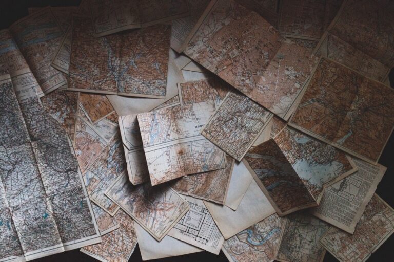
Cartography, the art and science of map-making, has guided explorers and conveyed stories since ancient times. Beyond static representations, maps are dynamic storytellers, laden with meaning and sometimes bias. In U.S. politics, cartography extends beyond geography to influence strategy, power distribution, and decision-making.
Maps shape perceptions, from local zoning laws to national policy, exerting a quiet but impactful influence. Well-crafted maps can change minds and garner support for causes, making them battlegrounds for political wars, be it redistricting or resource allocation. Even in the digital age, cartography’s enduring power remains evident.
Disclosure: As an Amazon Associate, this site earns from qualifying purchases. Thank you!
P.S. check out Udemy’s GIS, Mapping & Remote Sensing courses on sale here…
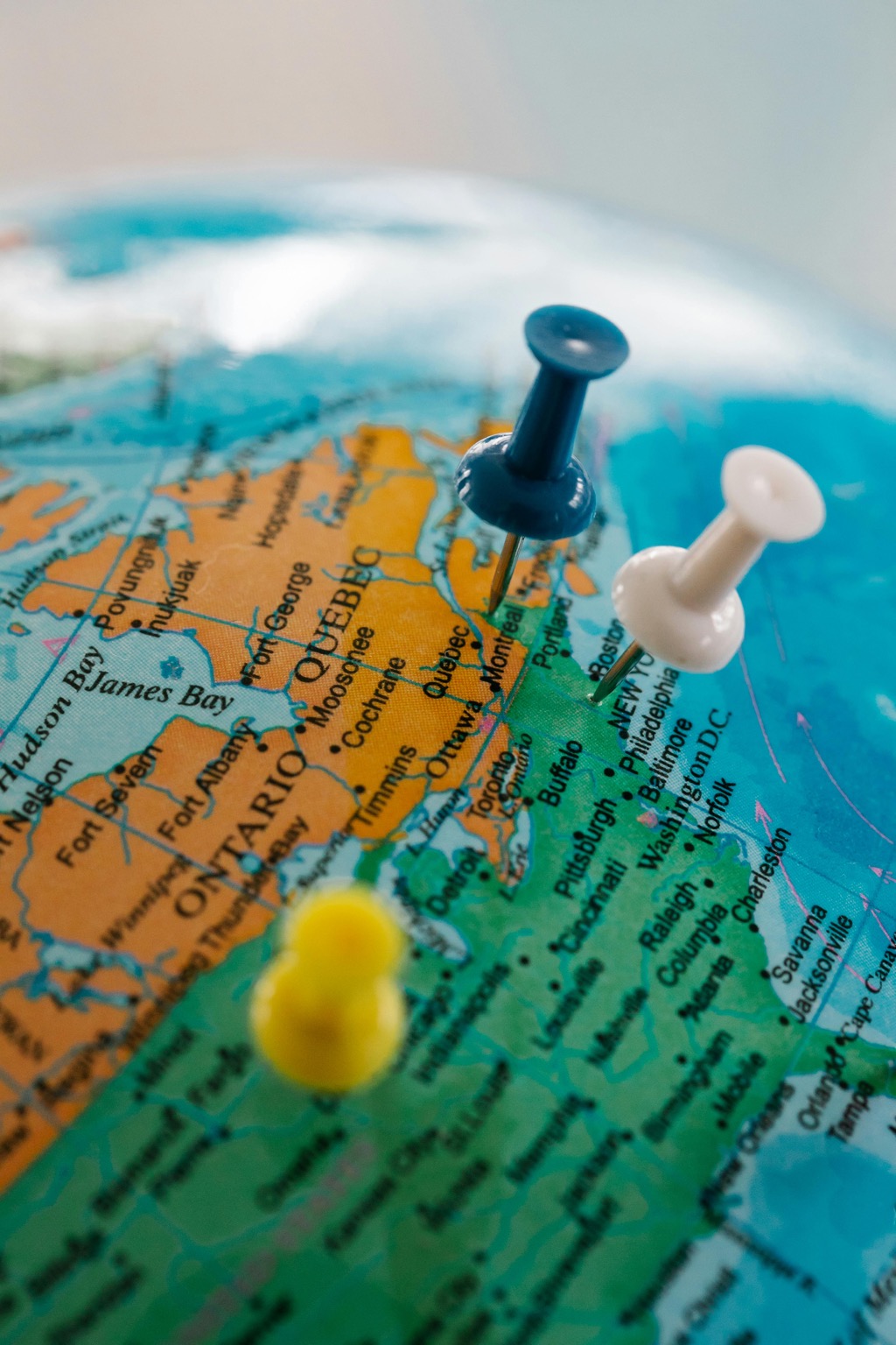
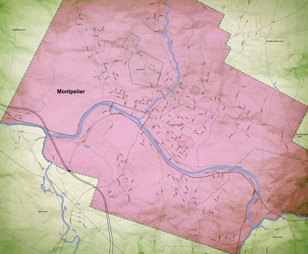
1. Electoral District Mapping
Electoral district mapping is where the rubber meets the road in political cartography. These maps dictate the boundaries of constituencies and can have a profound impact on election outcomes. Every ten years, following the census, district lines are redrawn, and it’s like a giant game of Tetris where the stakes are control of Congress.
This process can be a hotbed for controversy, as small tweaks to district borders can significantly alter the demographic makeup of a voting bloc. I remember poring over these maps during redistricting years, marveling at how a seemingly innocuous line could tip the scales from one party to another. It’s a powerful reminder that in politics, geography is destiny.
The complexity of electoral district mapping is not just in the drawing of lines but in the interpretation of communities and their interests. It’s a delicate balance between equal representation and strategic advantage, and the mapmakers’ decisions can resonate for a decade or more. The maps they create don’t just reflect political realities—they help create them.
In the video, Elections and Democracy explains-
- Inquiry Question: The central question of the lesson is “What makes an electoral district fair?” This question guides students in exploring the concept of fairness in electoral district boundaries.
- Lesson Structure: The lesson follows a three-part structure: Minds-On, Activity, and Exit Card. The Minds-On phase connects students’ experiences to the lesson, the Activity phase involves hands-on mapping, and the Exit Card encourages reflection on learning.
- Concrete Example: The Minds-On activity uses a relatable scenario of dividing a cake among family members to help students understand the difference between equality and equity, setting the stage for exploring fair electoral districts.
- Real Factors Considered: When deciding electoral boundaries in Canada, several factors are considered, including the size of the population, geographic features, and social factors like culture and language.
- Hands-On Activity: The Activity phase involves small group work where students use maps and info sheets to apply the concept of fairness in mapping electoral boundaries for an imaginary country.
- Challenge in Activity: Students face challenges in the activity, such as dealing with an island district with historical electoral boundaries and low population, prompting them to make decisions that reflect their geographic thinking.
- No Right or Wrong Answers: Emphasis is placed on the complexity of the task, and there are no right or wrong answers. Each group’s map will be unique, requiring strong collaboration and communication skills.
- Assessment Rubric: An assessment rubric is provided to help evaluate collaboration and communication skills, providing an opportunity for students to improve these skills.
- Extension Opportunities: Wild Cards are provided as extension challenges, bringing in more real-life geographic challenges for groups that finish early.
- Application of Learning: After completing the map activity, students watch an interview with an Elections Canada geographer, connecting the lesson to real-world applications and showcasing the impact of geography on the mapping of federal electoral boundaries.
2. Gerrymandering Explained
Gerrymandering is the dark art of drawing electoral maps to favor one party over another, and it’s as old as the republic itself. The term comes from a salamander-shaped district created by Massachusetts Governor Elbridge Gerry in 1812, and it’s been a thorn in the side of fair representation ever since. It’s like a chess game where one player gets to move the pieces before the match begins.
By manipulating district boundaries, politicians can “pack” or “crack” voters, concentrating or dispersing them to dilute their influence. I’ve seen maps that look like abstract art, with districts snaking across the landscape in bizarre patterns. It’s a clear case of politicians choosing their voters, rather than the other way around, and it’s a serious challenge to democratic principles.
Yet, gerrymandering persists because it’s a tool of immense power. It’s a way for the ruling party to entrench its position and for the opposition to cry foul. (And sometimes, those roles reverse with the next redistricting cycle.) The fight against gerrymandering is a fight for fair maps, and it’s a battle that’s waged both in the court of public opinion and in the courts of law.
3. Campaign Strategy Design
Maps are crucial tools for campaign strategy design, offering a visual representation of where to allocate resources and how to tailor messages. Campaign managers dissect maps like generals over battlefield plans, pinpointing key demographics and geographic areas where the vote could swing. It’s a high-stakes puzzle that requires both intuition and data.
As a casual observer, you might not notice the surgical precision with which campaigns target voters, but believe me, there’s a map for that. From identifying potential door-knocking neighborhoods to planning the route of a candidate’s bus tour, cartography is at the heart of campaign logistics. It’s a blend of geography and psychology, and when done right, it can be a game-changer.
Even the placement of campaign offices is a decision driven by maps. Strategists look for central locations within key areas to maximize reach and efficiency. It’s a fascinating process that turns the abstract lines of a map into a tangible path to victory (or defeat). The better the map, the better the chances of a champagne celebration on election night.
4. Data Visualization Impact
In the era of big data, cartography has become a critical tool for visualizing complex political information in an accessible way. A well-designed map can reveal trends and patterns that might be missed in spreadsheets or reports. It’s like turning a symphony into a pop song—it makes the data dance in a way that’s easy to understand and hard to ignore.
Political analysts use maps to layer various data points, from voting histories to socioeconomic factors, creating a rich tapestry that tells a story at a glance. For someone like me, who loves both politics and design, it’s a match made in heaven. The impact of these visualizations can’t be overstated; they shape narratives and influence decision-making at the highest levels.
What’s more, these maps are increasingly interactive, allowing users to explore data with the click of a mouse. It’s a powerful way to engage the public and demystify the complexities of political science. And let’s be honest, who doesn’t love playing with an interactive map? It’s like the grown-up version of a pop-up book.
5. Public Opinion Influences
Cartography can also shape public opinion by framing the way issues are presented. Think of it as the mapmaker’s “spin” on the story. For example, a map highlighting the disparate impacts of a policy can rally support for change or maintain the status quo, depending on the narrative it supports. It’s visual persuasion, and it’s incredibly effective.
When I look at thematic maps showing things like income inequality or voter turnout, I’m not just seeing data—I’m seeing a call to action (or complacency). Maps have this uncanny ability to bypass our rational defenses and speak directly to our emotions. They can inspire outrage, empathy, or pride with just a few shades of color.
Visualize your data effectively with "Thematic Mapping: 101 Inspiring Ways." This guide offers practical techniques for creating compelling thematic maps.

Moreover, maps that go viral on social media can become icons of political movements. They’re shared, debated, and can even become symbols of identity. It’s a testament to the power of cartography that a simple image can become a rallying cry for millions. Maps don’t just reflect public opinion; they have the power to mold it.
6. Cartography in Legislation
Cartography plays a significant role in legislation, often serving as the backbone for policy decisions. Lawmakers rely on maps for everything from assessing the environmental impact of a proposed law to understanding the demographics of the populations they serve. It’s a foundation upon which the House of Law is built.
In my experience, a map can be the difference between a bill that’s dead on arrival and one that gains traction. When legislators see how a policy will affect their constituents, visually and geographically, it becomes more than an abstract concept—it’s a tangible reality. Maps bring the distant and impersonal into the realm of the immediate and personal.
Furthermore, maps are used to allocate federal and state funds, ensuring resources are directed where they’re most needed. It’s a complex jigsaw puzzle that requires careful consideration of multiple factors. The cartographer’s pen can guide billions of dollars in spending, highlighting the profound influence of this often-overlooked craft on the legislative process.
7. Policy Planning Support
When it comes to policy planning, cartography provides a spatial understanding that is crucial for effective decision-making. Whether it’s urban planning, transportation, or disaster response, maps offer a bird’s-eye view of the challenges and opportunities. They help policymakers see the forest for the trees (sometimes literally).
I’ve watched urban planners use maps to visualize city growth and plan for future infrastructure. These maps are more than just lines and labels—they represent lives and livelihoods. They help ensure that as cities expand, they do so in a way that’s sustainable and equitable. It’s an unsung role of cartography, but its impact on everyday life is immeasurable.
In environmental policy, cartography is indispensable for identifying areas at risk of issues like climate change or deforestation. By overlaying data on topography, land use, and demographic trends, maps can predict outcomes and guide interventions. It’s proactive problem-solving, with cartography as the guiding light.
8. Cartographic Tech Advances
The field of cartography has been revolutionized by technological advances. Geographic Information Systems (GIS) and satellite imagery have transformed map-making from an art into a science. These tools allow for real-time data analysis and the creation of stunningly detailed maps that would have been impossible a few decades ago.
As a tech enthusiast, I’m amazed at how these advancements have democratized cartography. Nowadays, anyone with an internet connection can access powerful mapping tools. It’s a brave new world where crowdsourced maps can challenge the accuracy and authority of official ones. The implications for political activism and grassroots organizing are profound.
Moreover, the rise of machine learning and artificial intelligence is enabling predictive cartography—maps that can forecast trends and model scenarios. It’s like having a crystal ball but with algorithms instead of magic. These predictive maps are becoming invaluable for everything from election forecasting to anticipating the spread of diseases.
Conclusion: Maps & Democracy
In conclusion, cartography and democracy are intertwined in a delicate dance of representation and power. Maps do more than just chart the physical landscape; they shape the political one, influencing everything from public opinion to policy planning. They’re powerful tools that, when wielded wisely, can support the very foundations of a fair and functioning democracy.
Maps are amazing, and as we’ve seen, their impact on U.S. politics is profound and multifaceted. Whether it’s through redistricting, campaign strategy, or legislative planning, cartography holds a unique and often underappreciated influence on the political process. As we continue to navigate the complexities of our democratic system, let’s not forget the role that these seemingly simple diagrams play in guiding our collective journey.
As we fold up this map of political cartography, remember that every line drawn is a story told, and every map created is a future shaped. Keep exploring, keep questioning, and above all, keep charting the course toward a more informed and engaged democracy.