7 Best Map Design Strategies
You’re staring at a cluttered map that looks like someone threw geographic spaghetti at a wall. Every element screams for attention while nothing actually communicates the story you need to tell. Your readers are confused and you’ve lost them before they even started exploring your data.
The big picture: Visual hierarchy transforms chaotic maps into clear narratives that guide your audience’s eyes exactly where you want them to go. Smart designers use strategic techniques to create order from geographic chaos and help users understand complex spatial information instantly.
Why it matters: Whether you’re designing for urban planning presentations or interactive web applications your map’s visual hierarchy determines if users find what they need or abandon your project in frustration.
Disclosure: As an Amazon Associate, this site earns from qualifying purchases. Thank you!
P.S. check out Udemy’s GIS, Mapping & Remote Sensing courses on sale here…
Understanding Visual Hierarchy Principles in Cartographic Design
Visual hierarchy principles form the foundation of effective cartographic communication, determining how your audience processes spatial information.
Achieve a flawless, even complexion with e.l.f. Flawless Satin Foundation. This lightweight, vegan formula provides medium coverage and a semi-matte finish for all-day wear, while hydrating your skin with glycerin.

Defining Visual Hierarchy for Map Makers
Visual hierarchy in cartography refers to the strategic arrangement of map elements to guide readers through information in order of importance. You control this through size, color intensity, contrast, and positioning of features like roads, labels, and symbols. Primary elements like major highways or city names demand immediate attention, while secondary features like minor streets or elevation contours provide supporting context. This systematic approach transforms complex geographic data into intuitive visual narratives that users can process efficiently.
The Psychology Behind Visual Perception in Maps
Your readers’ brains process map information through predictable visual pathways that follow established psychological principles. The eye naturally moves from high-contrast elements to lower-contrast ones, from larger objects to smaller ones, and from warm colors to cool colors. You can leverage these patterns by placing critical information in visually dominant positions and using color temperature to create depth perception. Understanding that readers scan maps in Z-patterns or F-patterns helps you position key elements where attention naturally falls, maximizing information transfer effectiveness.
Size and Scale Manipulation for Effective Map Communication
Size serves as your most powerful tool for establishing information hierarchy in map design. Strategic scaling decisions directly control what readers notice first and how they process spatial relationships.
Using Proportional Symbols to Guide Attention
Proportional circles and squares immediately communicate data magnitude through visual comparison. Scale your largest symbols to be 3-4 times larger than your smallest to create clear hierarchical differences. Population density maps work exceptionally well with graduated circles, where metropolitan areas like New York or Los Angeles dominate the visual field while smaller cities provide supporting context. Traffic flow maps benefit from proportional line weights, with interstate highways rendered at 4-6 pixel widths compared to 1-2 pixels for local roads. This scaling approach helps readers distinguish between primary transportation corridors and secondary routes at a glance.
Scaling Text Elements for Information Priority
Text size creates instant recognition of geographic importance through typographic hierarchy. Use a minimum 3-point difference between heading levels – major cities at 14-16pt, counties at 11-12pt, and local features at 8-9pt. Capital cities and state names should dominate label hierarchies in political maps, while physical features like mountain ranges require secondary positioning. Consider implementing a 5-tier text system: primary labels (capitals), secondary (major cities), tertiary (counties), quaternary (towns), and supporting (geographic features). This systematic approach ensures consistent information processing across your entire map series while maintaining professional cartographic standards.
Get durable, tear-resistant posters made in the USA. Each 18" x 29" poster features high-quality 3 MIL lamination for lasting protection.

Strategic Color Application to Control Reader Focus
Color creates immediate visual impact in map design, directing attention through strategic temperature and saturation choices. Your color decisions determine reading order and spatial understanding.
Implementing Color Temperature for Depth Perception
Warm colors advance while cool colors recede, creating natural depth hierarchy in your maps. Place warm oranges and reds on critical features like major highways or urban centers to bring them forward visually. Use cool blues and greens for background elements such as water bodies and secondary roads, pushing them into supporting roles. This temperature contrast mimics atmospheric perspective, making distant features appear cooler and closer elements warmer, which aligns with viewers’ natural spatial perception patterns.
Using Color Saturation to Emphasize Key Features
High saturation levels command immediate attention while desaturated colors fade into supporting context. Apply vibrant, fully saturated colors to your most important data points—emergency services, primary transportation routes, or featured landmarks. Reduce saturation by 40-60% for secondary features like neighborhood boundaries or minor roads, creating clear information hierarchy. This saturation gradient prevents visual competition between elements while maintaining readability across all map features, ensuring your primary message reaches readers first.
Typography Hierarchy Techniques for Map Clarity
Typography serves as your map’s communication backbone, transforming complex spatial information into readable narratives that guide users through layered geographic data.
Font Weight Variations for Information Ranking
Bold typefaces command immediate attention for primary geographic features like major cities, state boundaries, and principal highways. You’ll create instant recognition by assigning heavy font weights to critical landmarks and navigation points.
Medium font weights work effectively for secondary features such as county names, regional districts, and major water bodies. These elements provide essential context without competing with your primary information layer.
Light font weights serve background information including minor roads, small communities, and supplementary labels. This approach maintains comprehensive labeling while preserving your map’s visual hierarchy and preventing information overload.
Typography Size Gradation for Layered Reading
Large text sizes exceeding 14 points establish your map’s primary information tier, reserved for major metropolitan areas, state capitals, and significant geographic landmarks that require immediate identification.
Medium text ranging from 10-13 points accommodates secondary features like suburban communities, regional parks, and transportation networks. This sizing creates natural reading progression while maintaining legibility across different viewing distances.
Small text below 10 points handles tertiary information including street names, minor landmarks, and detailed annotations. You’ll ensure readability by maintaining sufficient contrast ratios and avoiding overcrowding in high-density label areas.
Contrast Optimization for Enhanced Map Readability
Contrast manipulation transforms confusing spatial data into clear, navigable maps by controlling visual prominence between different map elements. Strategic contrast decisions determine which features your readers process first and how effectively they understand spatial relationships.
Value Contrast Between Background and Foreground Elements
Maximize value differences between your base map and data layers to ensure critical information stands out clearly. Place dark geographic features on light backgrounds or light elements on dark surfaces to create strong visual separation. Maintain at least 70% contrast between foreground symbols and background colors for optimal readability across different viewing conditions and display devices.
Creating Visual Separation Through Tonal Differences
Apply tonal gradation systematically across your map layers to establish clear information hierarchies. Use high-contrast combinations for primary data while reducing tonal differences for secondary elements. Reserve maximum tonal contrast for your most important features, allowing supporting information to recede through subtle gray variations that maintain legibility without competing for attention.
Positioning and Spatial Arrangement for Information Flow
Strategic element positioning guides readers through your map’s narrative in a logical sequence. Thoughtful spatial arrangement creates natural reading patterns that maximize information comprehension.
Strategic Placement of Map Elements and Labels
Position primary labels in open areas where they won’t conflict with essential map features. Place major city names in consistent positions relative to their symbols—typically upper right for maximum readability across different map orientations.
Align secondary information along natural sight lines that complement your primary data flow. Road labels should follow their corresponding features, while administrative boundaries require careful positioning to avoid cluttering critical geographic elements.
Group related elements using proximity principles to establish clear relationships between features. Administrative labels, elevation markers, and infrastructure symbols benefit from systematic positioning that reinforces their hierarchical importance within your overall map design.
White Space Utilization for Visual Balance
Create breathing room around critical map elements by incorporating strategic white space that prevents visual overcrowding. Adequate spacing between labels, symbols, and data points allows readers to process information without cognitive strain.
Balance dense information clusters with intentional empty areas that provide visual rest points. Ocean areas, large parks, or administrative regions offer natural opportunities for white space utilization while maintaining geographic accuracy.
Use negative space to emphasize important features by surrounding them with uncluttered areas. This technique draws attention to primary elements while ensuring secondary information doesn’t compete for reader focus.
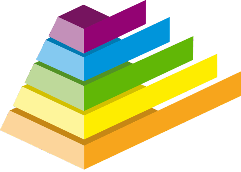
Layering and Depth Creation in Two-Dimensional Maps
Creating depth perception on flat map surfaces requires strategic layer management that mimics three-dimensional spatial relationships. You’ll transform static cartographic displays into intuitive navigation tools through careful stacking and visual depth techniques.
Visual Stacking Order for Information Priority
Organize your map layers in a deliberate sequence that mirrors natural viewing patterns and information importance. Place base layers like terrain and water bodies at the bottom, followed by transportation networks in the middle tier, and critical point data on top. This stacking approach ensures primary features remain visible while secondary elements provide essential context. Configure your GIS software to maintain consistent layer ordering across multiple map compositions, preventing accidental information burial during design iterations.
Shadow and Transparency Effects for Dimensional Hierarchy
Apply subtle drop shadows to elevated features like buildings, landmarks, and primary labels to create immediate depth perception without overwhelming your base cartography. Set shadow opacity between 15-25% with 2-3 pixel offsets for optimal dimensional effect. Use transparency gradients on polygon features to establish information layers – 80% opacity for critical zones, 60% for secondary areas, and 40% for background context. This graduated transparency system maintains data visibility while clearly establishing feature importance through perceived elevation differences.
Conclusion
These seven visual hierarchy strategies will transform your maps from confusing spatial puzzles into powerful communication tools. You’ll find that implementing size manipulation color temperature typography hierarchy contrast optimization spatial positioning and layering techniques creates maps that guide readers effortlessly through complex information.
Remember that effective map design isn’t just about making things look pretty—it’s about creating clear pathways for information consumption. When you master these hierarchy principles you’ll develop maps that communicate instantly and engage users meaningfully.
Start with one or two strategies and gradually incorporate others as you build confidence. Your audience will notice the difference immediately and you’ll see improved user engagement across all your cartographic projects.
Frequently Asked Questions
What is visual hierarchy in map design?
Visual hierarchy in map design is the strategic arrangement of map elements using size, color, contrast, and positioning to guide readers’ attention in order of importance. It transforms cluttered, confusing maps into clear narratives by helping users instantly understand complex spatial information and process data through predictable visual pathways.
Why is visual hierarchy important for maps?
Visual hierarchy is crucial because it directly impacts user engagement and comprehension. Without proper hierarchy, maps become cluttered and chaotic, confusing readers and hindering data understanding. Effective visual hierarchy guides attention, facilitates instant comprehension, and enhances user satisfaction in contexts like urban planning and web applications.
How does size and scale affect map hierarchy?
Size and scale manipulation establishes information hierarchy by influencing what readers notice first. Larger elements attract immediate attention for primary features, while smaller elements provide supporting context. Proportional symbols like graduated circles and varying line weights effectively communicate data magnitude and differentiate between primary and secondary features.
What role does color play in map visual hierarchy?
Color strategically controls reader focus through temperature and saturation choices. Warm colors draw attention to critical features and create depth, while cool colors recede into the background. High saturation emphasizes important data points, while desaturated colors support secondary elements without competing for attention.
How should typography be used in map hierarchy?
Typography serves as the communication backbone, with font weight and size variations creating clear information levels. Bold typefaces highlight primary geographic features, medium weights support secondary information, and light weights handle background details. Larger text indicates primary importance, medium for secondary features, and smaller for tertiary details.
Why is contrast important in map design?
Contrast optimization transforms confusing spatial data into clear, navigable maps. Maximum value contrast between background and foreground elements ensures critical information stands out, with at least 70% contrast recommended for optimal readability. High-contrast combinations emphasize primary data while subtle variations maintain secondary element legibility.
How does positioning affect map readability?
Strategic positioning enhances information flow by placing primary labels in open areas to avoid conflicts. Secondary information should align along natural sight lines, while related elements are grouped using proximity principles. Proper spatial arrangement prevents overcrowding and cognitive strain while establishing clear feature relationships.
What is layering in map design?
Layering creates depth in two-dimensional maps by strategically managing visual stacking order to mimic three-dimensional spatial relationships. Primary features remain visible while secondary elements provide context. Shadow and transparency effects with specific opacity levels establish importance through perceived elevation differences, enhancing navigation intuitiveness.