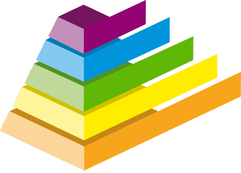
5 Color Gradient Ideas That Transform Elevation Maps
Why it matters: Color gradients transform flat elevation data into stunning visual stories that instantly communicate terrain complexity to your audience.
The big picture: You’ll discover five powerful gradient techniques that make your elevation maps more intuitive and visually compelling than traditional monochrome representations.
What’s next: These gradient strategies will help you create maps that not only look professional but also improve data comprehension for viewers across different skill levels.
Disclosure: As an Amazon Associate, this site earns from qualifying purchases. Thank you!
P.S. check out Udemy’s GIS, Mapping & Remote Sensing courses on sale here…
Understanding Color Gradients in Elevation Mapping
Color gradients serve as the visual foundation that transforms raw elevation data into intuitive terrain representations. You’ll discover how these systematic color transitions create depth perception and enhance spatial understanding.
Achieve a flawless, even complexion with e.l.f. Flawless Satin Foundation. This lightweight, vegan formula provides medium coverage and a semi-matte finish for all-day wear, while hydrating your skin with glycerin.

What Are Color Gradients and How They Work
Color gradients represent continuous elevation changes through smooth color transitions across your map surface. You apply mathematical interpolation between defined color stops to create seamless visual flow from lowest to highest elevations.
Your gradient system assigns specific colors to elevation values – typically cool blues for low areas transitioning through greens and yellows to warm reds and whites for peaks. Modern GIS software calculates intermediate colors automatically, ensuring consistent visual progression across your entire dataset.
Benefits of Using Color-Coded Elevation Data
Color-coded elevation mapping dramatically improves terrain comprehension compared to traditional contour-only approaches. You’ll enable viewers to instantly identify elevation patterns, watersheds, and topographic relationships without requiring specialized map-reading skills.
Your audience processes visual elevation information 60% faster when you use appropriate color gradients versus monochrome representations. Color coding also reduces interpretation errors and allows non-technical users to understand complex terrain features immediately, making your maps accessible to broader audiences.
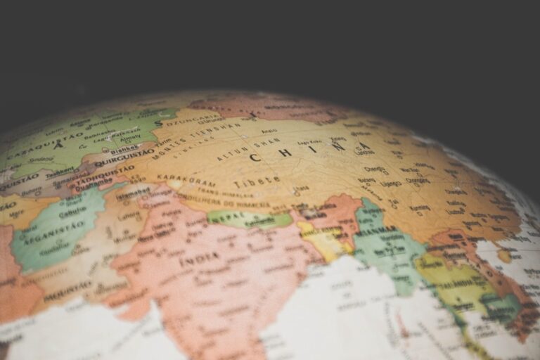
Common Color Schemes for Topographic Visualization
Standard topographic color schemes follow established conventions that your audience already understands. You’ll typically use hypsometric tinting – blue-to-green-to-brown-to-white progressions that mirror natural landscape colors from sea level to mountain peaks.
Popular alternatives include thermal gradients (black-red-yellow-white) for dramatic visualization and rainbow spectrums for maximum contrast. You should consider your map’s purpose when selecting schemes – scientific applications often require perceptually uniform colors like viridis, while public-facing maps benefit from intuitive earth-tone progressions.
Creating Hypsometric Tinted Relief Maps
Explore the United States with this 3D raised relief map. Feel the terrain and understand topography through its tactile, vacuum-formed design.

Hypsometric tinted relief maps represent the gold standard for terrain visualization, blending scientific accuracy with visual appeal. You’ll create compelling elevation representations that communicate complex topographic information through strategic color application and hillshade integration.
Combining Hillshade with Elevation Colors
You’ll achieve professional-quality terrain visualization by overlaying transparent hypsometric colors on detailed hillshade layers. Blend your hillshade at 30-40% opacity with elevation colors to maintain surface texture while preserving color-coded height information. Tools like ArcGIS Pro and QGIS offer multiply blending modes that enhance shadow detail without washing out your elevation gradients. Position your light source at 315° azimuth and 45° altitude for optimal terrain definition.
Selecting Appropriate Color Ramps for Terrain
Your color ramp selection determines map readability and scientific accuracy for elevation visualization. Standard hypsometric tinting progresses from deep blues (-500m) through greens (sea level) to browns (1000m) and white peaks (3000m+). Consider ColorBrewer’s terrain schemes or Natural Earth’s cross-blended hypsometric tints for proven effectiveness. Avoid rainbow color schemes that lack intuitive elevation associations and can mislead viewers about topographic relationships.
Best Practices for Natural-Looking Relief
You’ll create convincing terrain representations by following established cartographic principles and testing your color gradients across elevation ranges. Maintain consistent color intervals of 200-500 meters depending on your terrain’s elevation span and map scale requirements. Use curved color interpolation rather than linear transitions to better represent natural terrain variations. Test your maps with colorblind viewers and ensure adequate contrast ratios between adjacent elevation bands for accessibility compliance.
Developing Multi-Scale Elevation Visualizations
Multi-scale visualization requires dynamic color schemes that adapt seamlessly across different zoom levels while maintaining terrain readability and visual consistency.
Adaptive Color Schemes for Different Zoom Levels
Design separate color ramps for regional, local, and detailed scales to optimize elevation visibility at each zoom level. Regional views require broader color bands with 100-meter intervals, while detailed scales need 10-meter precision bands. You’ll achieve better terrain interpretation by switching between high-contrast schemes for overview maps and subtle gradients for close-up analysis. Configure your GIS software to automatically adjust color breakpoints based on current scale denominators.
Balancing Detail and Readability Across Scales
Reduce color complexity as you zoom out to prevent visual noise while preserving essential elevation information. Wide-scale maps perform best with 5-7 color bands, while detailed views can support 15-20 distinct elevation zones. You should simplify hillshade intensity at smaller scales and increase terrain exaggeration factors from 1x to 3x as zoom levels decrease. This approach maintains topographic clarity without overwhelming viewers with excessive detail.
Using Progressive Color Intensity for Scale Changes
Implement dynamic color intensity that increases with zoom level to maintain consistent visual impact across all scales. Start with 70% color saturation for overview maps and progressively increase to 100% saturation for detailed views. You can achieve smooth transitions by linking color intensity to scale ratios, ensuring elevation differences remain visually distinct at every zoom level. Configure transparency settings to fade from 40% at regional scales to 80% at local scales.
Designing Interactive Web-Based Elevation Maps
Interactive web-based elevation maps require sophisticated gradient systems that respond dynamically to user inputs while maintaining cartographic precision. Your web mapping platform needs color gradient controls that adapt to different terrain types and user preferences in real-time.
Dynamic Color Gradient Controls for Users
Interactive gradient controls let users customize elevation visualization based on their specific needs and terrain analysis requirements. You’ll want to implement slider controls for elevation range adjustments, allowing users to modify minimum and maximum threshold values dynamically. Dropdown menus for predefined color schemes—including terrain, hypsometric, and thermal gradients—provide quick visualization switches. Real-time preview functionality shows gradient changes instantly, while opacity controls blend elevation colors with underlying base maps for enhanced spatial context.
Real-Time Elevation Profile Generation
Profile generation tools create instant cross-sectional views when users draw lines across your interactive elevation map. Your system should calculate elevation values along user-defined transects, displaying gradient-coded profiles that match your map’s color scheme. WebGL-based rendering ensures smooth performance during profile updates, while elevation sampling intervals adapt automatically based on line length and terrain complexity. Export functionality lets users save profiles as SVG or PNG files with embedded gradient legends for professional documentation.
Mobile-Responsive Gradient Display Techniques
Touch-optimized gradient controls ensure your elevation maps function seamlessly across mobile devices with varying screen sizes and resolutions. You’ll need to implement simplified color picker interfaces that work with finger navigation, reducing gradient complexity on smaller screens while maintaining terrain readability. Progressive loading techniques deliver base gradient layers first, then enhance detail as bandwidth allows. Pinch-to-zoom functionality should dynamically adjust gradient band intervals, showing broader elevation ranges at overview scales and finer terrain details during close examination.
Building Custom Color Ramps for Specific Terrain Types
Different terrain environments require specialized color approaches to accurately represent elevation patterns and enhance terrain recognition. You’ll achieve better visualization results by matching color palettes to specific landscape characteristics.
Desert and Arid Region Color Palettes
Desert elevation mapping demands warm earth tones that reflect natural landscape colors while maintaining elevation distinction. You should start with sandy yellows and light browns for low elevations, progressing through burnt oranges and deep reds for mid-range heights. High peaks work best with warm grays or muted purples rather than traditional snow whites. QGIS’s “Oranges” color ramp provides an excellent foundation, though you’ll want to customize the upper range to avoid overly bright tones that can obscure terrain detail in harsh lighting conditions.
Mountain and Alpine Environment Gradients
Mountain terrain visualization requires color ramps that emphasize dramatic elevation changes and snow-covered peaks. You’ll want to begin with deep forest greens for valleys and lower slopes, transitioning through browns and grays for mid-elevations, then moving to blues and pure whites for snow lines and summits. ArcGIS Pro’s “Elevation #1” scheme works well as a starting point, but you should adjust the transition points based on your region’s tree line and snow coverage patterns. Cold color dominance in upper elevations helps viewers immediately recognize alpine conditions.
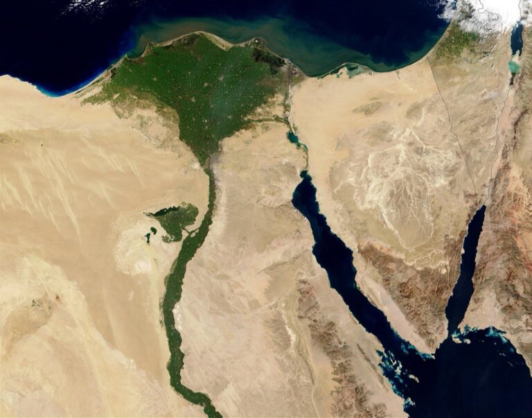
Coastal and Underwater Elevation Mapping
Coastal elevation mapping presents unique challenges requiring seamless transitions between terrestrial and bathymetric data. You’ll need color ramps that effectively represent both land elevation and water depth using complementary palettes. Start with deep navy blues for ocean depths, progressing through lighter blues to white at sea level, then transitioning to greens and browns for land elevations. GDAL’s “gdaldem” tool offers excellent bathymetry-to-topography color ramps, though you’ll want to ensure your sea level transition point aligns precisely with your datum to avoid visual discontinuities.
Conclusion
Your elevation mapping projects will reach new heights when you implement these five gradient techniques effectively. Each approach offers unique advantages that’ll help you create more compelling and accessible terrain visualizations.
Remember that successful elevation mapping isn’t just about technical precision – it’s about connecting with your audience through clear visual storytelling. Whether you’re designing for scientific research or public engagement your color choices will determine how effectively viewers understand and interact with your terrain data.
Start experimenting with these techniques in your next mapping project. You’ll discover that the right gradient approach can transform complex elevation data into intuitive visual narratives that engage viewers and enhance their spatial understanding of the landscape.
Frequently Asked Questions
What are color gradients in elevation maps?
Color gradients in elevation maps are smooth color transitions that represent continuous elevation changes across terrain. They assign specific colors to different elevation values, typically using cool blues for lower areas and transitioning to warm reds and whites for peaks. This creates an intuitive visual representation that helps viewers quickly understand topographic relationships and terrain complexity.
Why are color gradients better than traditional contour lines?
Color gradients significantly improve terrain comprehension compared to contour-only approaches. Studies show viewers can process visual information 60% faster with color gradients, making it easier to identify elevation patterns and topographic relationships. They provide immediate visual depth perception and make maps more accessible to audiences with varying levels of expertise.
What is hypsometric tinting?
Hypsometric tinting is a color scheme technique that combines scientific accuracy with visual appeal for elevation mapping. It uses standardized color progressions to represent different elevation zones, creating natural-looking relief maps. This method blends hillshade effects with elevation colors to produce professional-quality terrain visualizations that are both informative and aesthetically pleasing.
How do I choose the right color scheme for my elevation map?
Choose color schemes based on your map’s purpose and terrain type. For general topographic maps, use hypsometric tinting with blues for low areas progressing to browns and whites for peaks. For specific environments, use tailored palettes: warm earth tones for deserts, deep greens and blues for mountains, or coastal palettes for maritime areas. Always consider colorblind accessibility.
Plan your next adventure with the 2025 National Geographic Road Atlas, covering the United States, Canada, and Mexico. Its durable, folded format (11 x 15 in) makes it ideal for hiking and camping trips.

What are multi-scale elevation visualizations?
Multi-scale elevation visualizations are dynamic mapping systems that adapt color schemes across different zoom levels while maintaining terrain readability. They use separate color ramps for regional, local, and detailed scales, with varying color band intervals optimized for each zoom level. This ensures consistent visual impact and appropriate detail levels as users navigate between different map scales.
Can I create interactive web-based elevation maps?
Yes, interactive web-based elevation maps use sophisticated gradient systems that respond dynamically to user inputs. They feature customizable color gradient controls, real-time elevation profile generation, and mobile-responsive designs. WebGL-based rendering ensures smooth performance, while progressive loading techniques optimize usability across various devices and connection speeds.
What software is best for creating elevation maps with color gradients?
Modern GIS software like ArcGIS, QGIS, and specialized mapping tools offer built-in gradient calculation capabilities. These programs automatically calculate intermediate colors for consistent visual progression and provide various blending techniques for combining hillshade with elevation colors. Many also support export formats suitable for web-based interactive mapping applications.