7 Best Climate Change Maps for Awareness
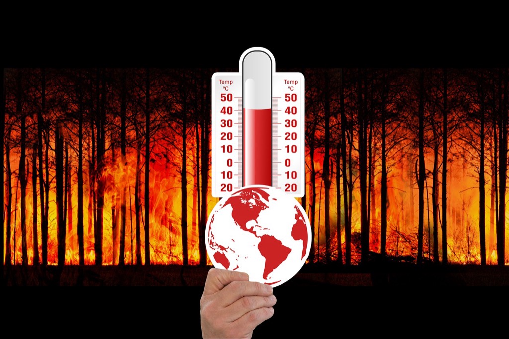
Why it matters: You’re living through one of the most documented environmental crises in human history yet many people still struggle to grasp climate change’s real-world impact on their daily lives.
The big picture: Maps transform abstract climate data into visual stories that make rising sea levels flooding frequency and temperature shifts instantly understandable for your community.
What’s next: Visual mapping tools are revolutionizing how you can engage with climate science and take meaningful action in your own backyard.
Disclosure: As an Amazon Associate, this site earns from qualifying purchases. Thank you!
P.S. check out Udemy’s GIS, Mapping & Remote Sensing courses on sale here…
Interactive Climate Data Visualization Makes Complex Information Accessible
Interactive mapping platforms transform overwhelming climate datasets into digestible visual formats that help you grasp environmental changes affecting your region. These tools bridge the gap between scientific research and public understanding by presenting data through intuitive interfaces.
Real-Time Temperature and Weather Pattern Displays
Temperature mapping platforms like NOAA’s Climate Explorer display current and historical temperature data through color-coded heat maps that update continuously. You’ll see temperature anomalies, seasonal variations, and long-term warming trends across different geographic scales. These visualizations help you identify local temperature shifts that might otherwise go unnoticed in daily weather reports. Interactive sliders let you compare decades of data, revealing patterns like urban heat islands and regional warming rates that directly impact your community’s energy consumption and agricultural cycles.
Carbon Emission Hotspot Identification
Emission tracking maps from sources like the Global Carbon Atlas pinpoint major carbon sources in your area through detailed emissions data visualization. You can explore industrial facilities, transportation corridors, and urban centers that contribute most significantly to local carbon footprints. These maps often include sector-specific data showing whether emissions come from manufacturing, transportation, or residential sources. Interactive features let you filter by emission types, compare regional contributions, and track changes over time to understand how local policies and industrial changes affect your area’s environmental impact.
Sea Level Rise Projections and Coastal Impact Zones
Coastal vulnerability maps from NOAA’s Sea Level Rise Viewer show projected flooding scenarios for different sea level rise amounts in your coastal area. You’ll see which neighborhoods, infrastructure, and ecosystems face the highest risk under various climate scenarios. These interactive tools let you adjust sea level projections from one to ten feet, revealing how rising waters would affect your community’s roads, buildings, and natural areas. The maps often include frequency data showing how often flooding events might occur, helping you understand both gradual changes and extreme weather impacts.
Historical Climate Change Tracking Shows Long-Term Environmental Shifts
Historical climate mapping reveals environmental changes that span decades and centuries. You’ll discover patterns invisible in short-term data when examining long-term climate records through cartographic analysis.
Decade-by-Decade Temperature Change Comparisons
Temperature comparison maps show dramatic regional warming patterns since the 1880s. You can analyze NOAA’s temperature anomaly datasets to create decade-by-decade visualizations revealing accelerated warming in Arctic regions and urban heat islands. Modern GIS platforms like ArcGIS Pro enable you to process historical weather station data and create animated temperature change sequences. These comparative maps demonstrate how global average temperatures have risen 1.1°C since pre-industrial times, with some regions experiencing increases exceeding 3°C.
Get real-time weather data with the Ambient Weather WS-2902. This WiFi-enabled station measures wind, temperature, humidity, rainfall, UV, and solar radiation, plus it connects to smart home devices and the Ambient Weather Network.

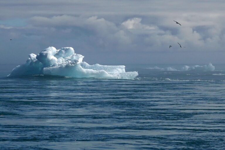
Glacier Retreat Documentation Through Satellite Imagery
Satellite imagery provides powerful documentation of glacier retreat across multiple decades. You’ll find Landsat archives dating to 1972 offer consistent temporal coverage for tracking ice loss in regions like Alaska’s Muir Glacier and Switzerland’s Aletsch Glacier. USGS Earth Explorer and Google Earth Engine contain processed glacier boundary datasets that simplify retreat analysis. Time-series mapping reveals that Arctic glaciers have lost approximately 280 billion tons of ice annually since 2002, with retreat rates accelerating significantly after 1990.
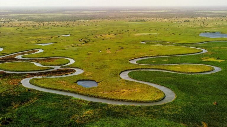
Deforestation and Land Use Change Over Time
Land use change maps document forest loss and urban expansion patterns spanning several decades. You can access Global Forest Watch datasets to track deforestation in the Amazon Basin, Southeast Asia, and Central Africa since 1990. Hansen Global Forest Change data provides annual forest loss statistics at 30-meter resolution through Google Earth Engine. These historical maps show that global forest cover has declined by 420 million hectares since 1990, with agricultural expansion and urban development as primary drivers of change.
Local Impact Mapping Connects Global Issues to Personal Communities
You’ll discover how localized climate mapping transforms abstract global warming data into tangible neighborhood realities that demand immediate attention.
Neighborhood-Level Air Quality Monitoring
Air quality sensors create hyperlocal pollution maps that reveal how emissions affect your specific streets and schools. PurpleAir networks display real-time PM2.5 readings across residential areas, while EPA monitoring stations track ozone and nitrogen dioxide concentrations. You can identify pollution hotspots near highways, industrial facilities, and construction zones that directly impact your family’s respiratory health and outdoor activities.
Understand your indoor air quality with the Amazon Smart Air Quality Monitor. It tracks five key factors and provides an easy-to-understand air quality score in the Alexa app, plus notifications when air is poor.

Regional Flood Risk and Extreme Weather Predictions
Flood prediction models pinpoint vulnerable areas within your county using elevation data and storm surge projections. NOAA’s flood mapping tools show 100-year and 500-year floodplains alongside historical flooding events in your region. You’ll see how climate change intensifies hurricane storm surges, increases rainfall intensity, and creates flash flood risks that threaten local infrastructure, schools, and emergency evacuation routes.
Local Renewable Energy Potential Assessment
Solar and wind resource maps reveal your area’s clean energy capacity through detailed meteorological analysis and geographic modeling. NREL’s renewable energy atlases display average wind speeds, solar irradiance levels, and rooftop solar potential for individual properties. You can evaluate community-scale renewable projects, identify optimal locations for solar installations, and calculate potential energy savings that reduce both carbon emissions and utility costs.
Species Migration and Habitat Loss Documentation Reveals Biodiversity Threats
Wildlife mapping platforms now reveal how climate change forces species to relocate and adapt, creating powerful visualizations that connect habitat loss to global warming impacts.
Animal Migration Pattern Changes Due to Climate Shifts
Migration route tracking shows dramatic shifts in animal movement patterns across the globe. The National Audubon Society’s climate maps reveal that 588 North American bird species face extinction risk, with species like the American Robin shifting their ranges northward by 200+ miles. You can explore real-time migration data through eBird’s abundance maps, which display seasonal movement changes for over 10,000 species. Arctic animals demonstrate the most dramatic shifts, with caribou herds altering traditional migration routes by up to 400 miles due to changing ice patterns and vegetation zones.
Endangered Species Habitat Reduction Mapping
Critical habitat mapping demonstrates how rising temperatures shrink suitable living spaces for vulnerable species worldwide. The IUCN Red List spatial data shows polar bear habitat declining by 30% since 1979, with interactive maps revealing projected habitat loss through 2050. You’ll find that mountain species face particularly severe threats, with pikas losing 50% of their habitat range in the Sierra Nevada mountains. Conservation organizations use GIS platforms to track habitat fragmentation, showing how human development and climate change create isolated population pockets that threaten species survival.
Coral Reef Bleaching and Ocean Ecosystem Changes
Ocean temperature mapping reveals devastating coral bleaching events that coincide with marine heatwaves and rising sea temperatures. NOAA’s Coral Reef Watch provides real-time satellite monitoring of ocean thermal stress, showing that 50% of shallow-water corals died during the 2014-2017 global bleaching event. You can track bleaching severity through color-coded heat stress maps that predict future bleaching risks. The Great Barrier Reef Marine Park Authority’s mapping data shows three mass bleaching events since 2016, with northern reef sections experiencing the most severe damage from consecutive thermal stress events.
Carbon Footprint Mapping Enables Individual and Corporate Accountability
Carbon footprint mapping transforms abstract emissions data into actionable visual insights that drive environmental responsibility. These specialized maps connect your daily activities and business operations to their precise environmental impact.
Transportation Route Optimization for Reduced Emissions
Route optimization maps calculate emissions reductions through intelligent transportation planning. Fleet management platforms like Route4Me and GPS tracking systems analyze vehicle paths to identify fuel-efficient alternatives that reduce carbon output by 15-30%.
Track vehicles and assets with the LandAirSea 54 GPS Tracker. Get real-time location alerts and historical playback using the SilverCloud app, with a long-lasting battery and discreet magnetic mount.

Commercial delivery services use real-time traffic and emissions mapping to minimize environmental impact. You’ll discover shorter routes that avoid high-congestion zones while reducing fuel consumption and greenhouse gas emissions across your transportation network.
Supply Chain Carbon Impact Visualization
Supply chain mapping platforms reveal hidden emissions throughout your product lifecycle from raw materials to final delivery. Tools like IBM Environmental Intelligence Suite and Emmi track carbon footprints across multiple vendor relationships and shipping routes.
Interactive visualization dashboards display emissions hotspots within your supply network. You can identify high-carbon suppliers and transportation methods that contribute disproportionately to your company’s environmental footprint while discovering sustainable alternatives.
Personal Carbon Footprint Tracking by Location
Location-based carbon calculators connect your geographic activities to precise emissions measurements. Apps like Klima and Capture track transportation choices, energy consumption patterns, and lifestyle decisions based on your specific neighborhood and daily movements.
Personal mapping tools integrate GPS data with local emissions factors to calculate your environmental impact. You’ll receive detailed breakdowns showing how different locations and activities contribute to your carbon footprint throughout each day.
Renewable Energy Resource Mapping Promotes Sustainable Solutions
Renewable energy mapping transforms complex atmospheric and geographic data into actionable deployment strategies that accelerate the transition to clean power sources.
Solar and Wind Energy Potential Identification
Solar irradiance maps reveal optimal photovoltaic installation sites by analyzing average daily sunlight hours and seasonal weather patterns across regions. Wind resource atlases identify consistent high-velocity zones at various elevations, helping developers select turbine locations with sustained 15+ mph wind speeds. The National Renewable Energy Laboratory’s mapping tools show that southwestern U.S. states receive 6-7 kWh per square meter daily, while Great Plains regions consistently generate wind speeds exceeding commercial viability thresholds.
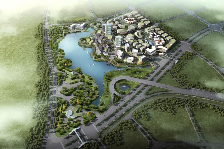
Green Infrastructure Development Opportunities
Green infrastructure maps identify strategic locations for urban forest expansion, permeable pavement installation, and stormwater management systems that reduce environmental impact. These mapping tools analyze soil composition, drainage patterns, and existing vegetation coverage to determine optimal placement for rain gardens, bioswales, and green rooftops. Cities like Portland and Philadelphia use comprehensive green infrastructure mapping to prioritize investments in natural climate solutions, targeting areas where vegetation can maximize carbon sequestration and urban heat reduction.
Electric Vehicle Charging Network Expansion Plans
EV charging infrastructure maps analyze traffic patterns, population density, and electrical grid capacity to identify strategic charging station locations that support widespread electric vehicle adoption. Transportation planning software combines demographic data with travel corridor analysis to predict charging demand hotspots along major highways and urban centers. The Alternative Fuels Data Center provides interactive mapping tools showing current charging station gaps, helping municipalities and private companies plan installations that serve both daily commuters and long-distance travelers effectively.
Climate Action Success Stories Inspire Community Engagement
Interactive maps showcase environmental victories that motivate citizens to join climate action movements. These visual success stories demonstrate how collective efforts create measurable environmental improvements.
Reforestation Project Progress Tracking
Reforestation maps track tree planting initiatives with satellite imagery and GPS coordinates to show expanding forest coverage over time. You’ll see projects like Ethiopia’s Green Legacy Initiative, which planted 4 billion trees in 2019, documented through before-and-after aerial mapping. These platforms track seedling survival rates, carbon sequestration progress, and biodiversity recovery in real-time, creating compelling visual narratives of environmental restoration success.
Urban Green Space Development Initiatives
Green infrastructure maps highlight cities transforming concrete landscapes into thriving ecological hubs through strategic urban planning. You’ll discover projects like Singapore’s City in a Garden initiative, which increased green coverage from 36% to 47% between 1986 and 2020. Interactive maps showcase rooftop gardens, vertical forests, and converted parking lots, demonstrating how urban communities reduce heat islands while improving air quality through coordinated green space development.
Community-Led Climate Mitigation Efforts
Grassroots climate maps document neighborhood-scale environmental projects that inspire broader community participation through visual storytelling. You’ll explore initiatives like Transition Towns movements, where local groups reduce carbon footprints through shared gardens, tool libraries, and renewable energy cooperatives. These maps track measurable outcomes including energy savings, waste reduction, and local food production, proving that small-scale climate action creates significant cumulative environmental benefits.
Conclusion
Maps have revolutionized how you understand and respond to climate change by transforming complex data into visual stories that resonate with your daily experiences. These powerful tools bridge the gap between abstract scientific concepts and tangible local realities that directly impact your community.
Whether you’re tracking emissions in your neighborhood visualizing renewable energy potential or monitoring biodiversity changes these mapping platforms empower you to make informed decisions about your environmental footprint. You can now see exactly how climate change affects your specific location and take targeted action based on real data.
The future of climate awareness depends on your ability to connect global challenges with local solutions. Through interactive maps you’re not just observing climate change—you’re equipped to become an active participant in creating positive environmental change within your own community.
Frequently Asked Questions
What are climate mapping tools and why are they important?
Climate mapping tools are interactive platforms that transform complex climate data into visual stories that are easy to understand. They help bridge the gap between scientific research and public understanding by making abstract concepts like rising sea levels and temperature changes more relatable to everyday life, empowering communities to take meaningful local action.
How do temperature tracking maps work?
Temperature tracking maps display real-time weather patterns and long-term warming trends using historical data dating back to the 1880s. Modern GIS platforms create animated visualizations showing decade-by-decade temperature changes, revealing dramatic regional warming patterns and helping users visualize local temperature shifts in their communities.
What can carbon emission tracking maps tell us?
Carbon emission tracking maps identify major local sources of emissions and calculate their contributions to carbon footprints. They help users understand transportation impacts, supply chain emissions, and personal carbon footprints by connecting geographic activities to precise emissions measurements, promoting environmental responsibility and accountability.
How do coastal vulnerability maps help communities?
Coastal vulnerability maps project flooding scenarios due to sea level rise, helping communities understand risks to infrastructure and ecosystems. These tools identify vulnerable areas and show potential impacts of climate change on local infrastructure, enabling better preparation and planning for coastal communities.
What role do wildlife mapping platforms play in climate awareness?
Wildlife mapping platforms illustrate how species are forced to relocate due to habitat loss caused by climate change. They document shifts in animal migration patterns, with examples like Arctic caribou altering routes by up to 400 miles, and show how rising temperatures are shrinking suitable habitats for vulnerable species.
How can renewable energy resource maps help communities?
Renewable energy resource maps identify optimal locations for solar panels and wind turbines by analyzing solar irradiance and wind patterns. They also help plan EV charging networks and green infrastructure projects, providing actionable strategies for communities to transition to clean energy sources effectively.
This 200W solar panel kit efficiently powers RVs, campers, and off-grid systems. It includes high-efficiency monocrystalline panels and a 30A PWM charge controller for reliable performance and easy installation.

What are some successful climate action projects shown through mapping?
Interactive maps showcase environmental victories like Ethiopia’s Green Legacy Initiative (4 billion trees planted in 2019), Singapore’s City in a Garden project, and grassroots Transition Towns movement. These visual narratives demonstrate how satellite imagery and community mapping can track and inspire local environmental projects.
How do neighborhood-level air quality maps work?
Neighborhood-level air quality maps use hyperlocal pollution monitoring networks like PurpleAir and EPA stations to show how emissions affect specific streets and schools. These tools reveal pollution patterns at the community level, helping residents understand air quality impacts in their immediate environment.
Protect your health with this smart indoor air quality monitor. It continuously tracks radon, PM2.5, CO2, VOCs, humidity, temperature, and air pressure, providing real-time data and notifications via the free Airthings app.