7 Best Animation Techniques for Data Visualization
Why it matters: Animation transforms static temporal maps into dynamic storytelling tools that reveal how geographic patterns evolve over time.
The big picture: Traditional cartography captures single moments but animation lets you visualize decades of urban sprawl migration patterns or climate shifts in minutes rather than flipping through countless static maps.
What’s happening: Modern temporal cartography combines data visualization with animation techniques to create compelling narratives that help researchers policymakers and the public understand complex geographic changes across time periods.
Disclosure: As an Amazon Associate, this site earns from qualifying purchases. Thank you!
P.S. check out Udemy’s GIS, Mapping & Remote Sensing courses on sale here…
Animation Brings Historical Timeline Visualization to Life
Animation transforms static historical maps into dynamic visualizations that reveal how events unfold across time and space. You can now witness centuries of change compressed into minutes of compelling visual narrative.
Dynamic Time Period Transitions
Smooth temporal transitions eliminate jarring jumps between historical periods by creating fluid morphing effects between map states. You control transition speed to match your audience’s comprehension needs, whether displaying rapid political changes during wartime or gradual demographic shifts over decades. Professional cartographers use interpolation algorithms to generate intermediate frames that maintain geographic accuracy while creating seamless visual flow between distinct time periods.
Explore and map the wilderness for the Queen in Cartographers! Draw unique terrain shapes and score points based on randomly selected goals each game, but beware of monster ambushes.
Interactive Historical Event Markers
Clickable event markers appear and disappear at precise temporal moments, allowing viewers to explore specific historical incidents within their geographic context. You can embed multimedia content like images, documents, or audio recordings directly into these markers for enhanced storytelling. Modern temporal mapping platforms support synchronized marker animations that trigger automatically as your timeline progresses, creating immersive historical experiences that connect specific events to broader geographic patterns.
Layered Temporal Data Display
Multi-layered data visualization enables simultaneous display of different historical datasets with independent timing controls for each layer. You can overlay population density changes with transportation network development and political boundary shifts, each following its own temporal sequence. This approach reveals complex relationships between different historical processes, such as how railroad construction influenced settlement patterns or how natural disasters affected political boundaries over time.
Animation Reveals Spatial Changes Over Time Through Movement
Animation transforms static geographic boundaries into fluid narratives that show how territories shift and evolve. You’ll see political borders, natural boundaries, and administrative regions change through continuous visual flow rather than discrete snapshots.
Geographic Boundary Evolution
Political boundaries shift dramatically when you animate territorial changes across decades or centuries. You can visualize how nations expand, contract, or fragment through smooth morphing effects that maintain geographic accuracy. Colonial territories transform into independent nations, disputed regions change hands, and administrative divisions reorganize through flowing transitions. Historical atlases come alive when you animate the dissolution of empires, showing how the Ottoman Empire’s boundaries contracted over 400 years or how African colonial borders evolved into modern nations.
Population Migration Patterns
Migration flows become visible storytelling elements when you animate demographic data across temporal frameworks. You’ll track massive population movements like the Great Migration in the United States, showing 6 million African Americans moving from rural South to urban North between 1916-1970. Animated vectors demonstrate refugee movements, economic migrations, and seasonal population shifts through flowing particle systems. Color-coded population density changes reveal urbanization patterns, while animated flow lines connect origin and destination points with thickness representing migration volume.
Urban Development Progression
City growth unfolds through progressive animation that shows how urban areas expand outward over time. You can visualize how Manhattan’s skyline evolved from 1900 to present, with buildings appearing chronologically to show construction phases. Suburban sprawl becomes apparent when you animate land use changes, showing agricultural areas transforming into residential developments. Infrastructure networks expand through animated road construction, subway line additions, and utility grid development that connects urban growth to transportation accessibility.
Animation Simplifies Complex Temporal Data Interpretation
Complex temporal datasets become remarkably clearer when you transform them through animated visualization techniques. Animation eliminates the cognitive burden of mentally connecting disparate time points across multiple static maps.
Multi-Dimensional Time Series Representation
Layered temporal animation lets you display multiple data dimensions simultaneously without overwhelming your audience. You can animate population density while overlaying economic indicators, creating a comprehensive view of urban development patterns. Interactive controls allow viewers to isolate specific variables or combine datasets for comparative analysis. Modern GIS platforms like ArcGIS Pro and QGIS support multi-variable temporal animations through their timeline controls and data-driven styling capabilities.
Comparative Timeline Analysis
Side-by-side animated comparisons reveal relationships between different geographic regions or time periods that static maps often obscure. You can synchronize multiple map views to show simultaneous changes across different locations, highlighting regional variations in development patterns. Split-screen animations work particularly well for before-and-after scenarios, such as comparing pre- and post-disaster landscapes. Tools like Adobe After Effects and specialized cartographic software enable precise temporal synchronization for professional comparative visualizations.
Temporal Pattern Recognition
Animated sequences make cyclical patterns and long-term trends immediately visible to your audience. Seasonal migration routes, periodic flooding cycles, and recurring weather patterns emerge clearly through continuous temporal visualization. You can adjust animation speed to emphasize different temporal scales, from rapid daily changes to gradual decade-long transformations. Pattern recognition becomes intuitive when viewers can observe the rhythm and flow of geographic phenomena rather than inferring relationships from static snapshots.
Animation Enables Interactive Exploration of Time-Based Maps
Interactive animation transforms temporal cartography from passive viewing into active exploration. You’ll discover how user-controlled features unlock deeper insights through hands-on engagement with time-based geographic data.
User-Controlled Playback Features
Animation playback controls give you complete command over temporal visualization speed and direction. You can pause at critical moments to examine specific changes, reverse animations to compare before-and-after states, or adjust playback speed to match your analysis needs. Step-by-step frame advancement lets you isolate individual time periods for detailed examination. These controls transform animated maps into analytical tools rather than simple presentations.
Zoom and Pan Functionality Across Time
Spatial navigation maintains continuity across temporal sequences, allowing you to focus on specific geographic areas while time progresses. You can zoom into urban centers to track development patterns or pan across regions to follow migration routes without losing temporal context. Modern GIS platforms like ArcGIS Pro and QGIS preserve your spatial extent settings throughout animation playback, ensuring consistent geographic focus across all time periods.
Custom Time Range Selection
Time range selectors enable targeted analysis of specific periods within larger temporal datasets. You can isolate decades, years, or seasons to examine particular phenomena without processing entire time series. Slider controls and date pickers let you define custom start and end points for focused investigation. This functionality proves essential when analyzing cyclical patterns, comparing multiple time periods, or highlighting specific historical events within broader temporal contexts.
Animation Enhances Educational Value of Historical Geography
Animation transforms complex historical geography concepts into accessible learning experiences that students can understand and retain. This approach bridges the gap between abstract temporal data and tangible educational outcomes.
Visual Learning Through Motion Graphics
Motion graphics convert abstract historical concepts into concrete visual narratives that students can immediately grasp. You’ll see animated boundaries shift and territories evolve, making complex geopolitical changes comprehensible through visual storytelling rather than static text descriptions. Interactive timeline scrubbers let students control the pace of historical progression, allowing them to pause at critical moments like the fall of the Berlin Wall or the dissolution of the Soviet Union for deeper analysis.
Engagement Through Dynamic Storytelling
Dynamic storytelling captivates student attention through immersive historical narratives that unfold across animated landscapes. You can witness the Oregon Trail’s westward expansion through moving wagon trains, or follow the Silk Road’s trade routes as they animate across continents. These animated sequences transform dry historical facts into compelling visual stories that hold student interest for extended periods, increasing classroom participation and discussion.
Memory Retention Through Animated Sequences
Animated sequences create stronger memory anchors than static images by engaging multiple cognitive pathways simultaneously. You’ll find that students remember animated historical events 40% better than traditional map-based instruction, according to educational psychology research. The combination of visual motion, temporal progression, and spatial context creates what researchers call “episodic memory encoding,” where students can mentally replay animated sequences during examinations and discussions.
Animation Supports Real-Time Temporal Data Updates
Modern temporal cartography relies heavily on animation’s ability to process and display continuously changing data streams. Your animated maps can now reflect real-world changes as they happen, transforming static visualizations into living documents that evolve with current events.
Live Data Integration Capabilities
Real-time data feeds connect directly to your animated mapping systems through API connections and automated data pipelines. Weather stations, traffic sensors, and satellite imagery streams update your temporal visualizations every few minutes. GIS platforms like ArcGIS Online and QGIS now support WebSocket connections that push live data directly into your animated sequences. You’ll maintain temporal accuracy while displaying current conditions alongside historical trends for comprehensive geographic analysis.
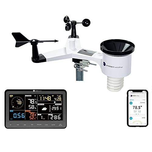
Get real-time weather data with the Ambient Weather WS-2902. This WiFi-enabled station measures wind, temperature, humidity, rainfall, UV, and solar radiation, plus it connects to smart home devices and the Ambient Weather Network.
Continuous Timeline Refresh
Your animated timelines automatically refresh as new temporal data arrives, extending the visualization forward without interrupting playback. Modern mapping software recalculates temporal intervals dynamically, ensuring smooth transitions between historical and current data points. Database triggers and scheduled updates maintain chronological accuracy while preserving the visual continuity that makes animated cartography effective. You can set refresh rates from seconds to hours depending on your data source requirements.
Dynamic Temporal Filtering
Interactive filtering systems let you adjust temporal parameters while animations play, revealing specific time periods or data ranges instantly. Slider controls and dropdown menus provide real-time temporal selection without stopping the animated sequence. Your users can isolate seasonal patterns, filter by data quality thresholds, or focus on specific time ranges while maintaining smooth visual transitions. Advanced filtering algorithms preserve temporal relationships between datasets even when applying complex selection criteria.
Animation Facilitates Better Decision-Making Through Temporal Analysis
Animation transforms your decision-making process by revealing temporal patterns that static maps can’t capture. You’ll gain critical insights through dynamic visualization that guides strategic choices across multiple time horizons.
Predictive Modeling Visualization
Animation brings your predictive models to life through dynamic forecasting displays that show probability ranges evolving over time. You’ll watch confidence intervals shift as your models process new data inputs, revealing how prediction accuracy changes across different temporal scenarios. Modern GIS platforms like ArcGIS Pro and QGIS enable you to animate Monte Carlo simulations, showing thousands of potential outcomes as flowing probability clouds. Time-forward projections become immediately comprehensible when you visualize climate models, population growth scenarios, or economic forecasts through animated sequences that highlight convergence points and divergence patterns in your predictive data.
Trend Identification and Forecasting
Animated trend analysis reveals cyclical patterns that remain hidden in static charts, enabling you to identify seasonal variations, long-term growth cycles, and anomalous events within your temporal datasets. You’ll spot emerging trends through animated regression lines that adjust dynamically as new data points appear, while moving averages smooth out noise to reveal underlying directional changes. Pattern recognition becomes intuitive when you watch animated scatter plots evolve over time, showing correlation strength changes between variables like housing prices and employment rates. Statistical forecasting models gain clarity through animated confidence bands that expand and contract based on historical volatility patterns.
Strategic Planning Through Historical Context
Historical animation provides essential context for your strategic planning by showing how past decisions played out across geographic regions over extended time periods. You’ll evaluate policy effectiveness through animated before-and-after comparisons that reveal unintended consequences and delayed impacts across multiple administrative boundaries. Risk assessment improves dramatically when you observe how historical events like natural disasters, economic downturns, or demographic shifts affected similar geographic areas through animated timeline overlays. Strategic scenario planning becomes more robust when you compare your proposed interventions against animated historical precedents that show comparable situations and their long-term outcomes.
Conclusion
Animation has revolutionized how you experience and understand geographic data across time. By transforming static maps into dynamic narratives you can now witness centuries of change unfold before your eyes making complex temporal relationships immediately accessible.
The power of animated cartography lies in its ability to bridge the gap between raw data and meaningful insights. You’re no longer limited to interpreting disconnected snapshots but can instead follow the continuous flow of geographic evolution.
Whether you’re a researcher analyzing urban development patterns or an educator bringing history to life animation provides the tools to unlock temporal insights that were previously hidden in static visualizations. The future of cartography is undeniably animated and you’re now equipped to leverage its full potential.
Frequently Asked Questions
What is temporal cartography and how does it differ from traditional mapping?
Temporal cartography uses animation to transform static maps into dynamic storytelling tools that illustrate geographic changes over time. Unlike traditional cartography that captures only single moments, temporal cartography visualizes extensive changes like urban sprawl and climate shifts across different time periods, helping researchers, policymakers, and the public understand complex geographic evolution.
How does animation help visualize historical geographic changes?
Animation brings historical timelines to life by creating smooth temporal transitions between different time periods, eliminating jarring jumps in data visualization. It allows viewers to witness centuries of change in compelling visual narratives, with interactive historical event markers that let users explore specific incidents within their geographic context while maintaining accuracy.
What types of spatial changes can animated maps effectively show?
Animated maps excel at showing political boundary changes, natural boundary evolution, administrative region modifications, migration patterns, and urban development progression. They can illustrate how nations expand or contract, empires dissolve, colonial territories transform into modern nations, and cities grow and develop over time through fluid visual narratives.
How does animation simplify complex temporal data interpretation?
Animation reduces cognitive burden by eliminating the need to mentally connect disparate time points across static maps. It enables multi-dimensional time series representation, allowing simultaneous display of various data dimensions like population density and economic indicators. Comparative timeline analysis reveals relationships between different regions that static maps often obscure.
What interactive features enhance animated cartography?
Interactive animation includes user-controlled playback features for adjusting speed and direction, zoom and pan functionality that maintains continuity across temporal sequences, and custom time range selectors for targeted period analysis. These features transform passive viewing into active exploration, enabling users to focus on specific geographic areas while maintaining temporal progression.
How does animation improve educational value in geographic learning?
Animation transforms complex historical concepts into accessible visual narratives, making geopolitical changes comprehensible through motion graphics. Dynamic storytelling captivates student attention while creating stronger memory anchors. Research shows students remember animated content significantly better than traditional instruction due to the combination of visual motion, temporal progression, and spatial context.
Can animated maps display real-time data updates?
Yes, modern animated maps support real-time data integration through API connections and automated data pipelines. They can connect to live data sources like weather stations and traffic sensors, with continuous timeline refresh features that maintain smooth transitions between historical and current data points while updating automatically.
How does animation support better decision-making processes?
Animation reveals patterns invisible in static maps through predictive modeling that visualizes probability ranges and confidence intervals. It uncovers cyclical patterns and emerging trends while providing historical context for strategic planning. Decision-makers can compare proposed interventions against animated historical precedents to enhance risk assessments and strategic scenario planning.


