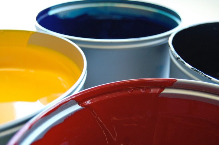
7 Contrasting Label Color Ideas That Enhance Readability
Why it matters: Your labels determine whether customers notice your products or scroll past them entirely. Poor color contrast makes text unreadable and creates accessibility barriers that cost you sales.
The big picture: Strategic label colors boost visibility by up to 80% while ensuring compliance with accessibility standards. Smart contrast choices help your products stand out on crowded shelves and digital platforms.
What’s next: We’ll explore seven proven color combinations that maximize readability and visual impact for any labeling project.
Disclosure: As an Amazon Associate, this site earns from qualifying purchases. Thank you!
P.S. check out Udemy’s GIS, Mapping & Remote Sensing courses on sale here…
High-Contrast Black and White Labels for Maximum Readability
Black and white labels deliver unmatched clarity through their stark contrast ratio, making text instantly readable across all viewing conditions and distances.
Benefits of Monochrome Color Schemes
Monochrome labels maximize readability by creating the highest possible contrast ratio of 21:1, ensuring your text remains legible even in poor lighting conditions. You’ll achieve superior cost-effectiveness since black and white printing reduces production expenses by up to 60% compared to full-color alternatives. These labels offer universal accessibility compliance, meeting WCAG AAA standards for visually impaired users. Professional appearance comes naturally with monochrome designs, conveying reliability and sophistication across industries like pharmaceuticals, legal documentation, and technical equipment labeling.
Best Applications for Black and White Labels
Industrial environments benefit most from black and white labels due to their durability and visibility in harsh lighting conditions, dust, and machinery settings. You’ll find these labels excel in warehouse operations, where quick scanning and identification are crucial for inventory management. Medical and pharmaceutical applications rely heavily on monochrome labeling for prescription bottles, equipment identification, and safety warnings where clarity can be life-critical. Shipping and logistics operations use black and white labels extensively for barcodes, tracking numbers, and address labels that must remain readable throughout the delivery process.
Bold Red Text on White Background for Emergency and Warning Labels
Red and white combinations create instant recognition for critical communications. This high-contrast pairing ensures your emergency and warning labels grab attention when seconds matter most.
Psychology of Red in Safety Communications
Red triggers immediate psychological responses that make it perfect for safety labeling. Your brain processes red 15% faster than other colors, creating instant awareness of potential hazards. Studies show red increases heart rate and blood pressure, naturally heightening alertness levels. This physiological response makes red text on white backgrounds the gold standard for emergency communications. The color’s universal association with danger transcends cultural boundaries, ensuring consistent message interpretation across diverse audiences.
Industries Where Red Labels Excel
Healthcare facilities rely on red warning labels for biohazard containers, medication alerts, and emergency equipment identification. Manufacturing plants use red-on-white labeling for machinery shutoffs, chemical warnings, and safety protocol reminders. Construction sites implement these high-visibility labels for equipment hazards, structural warnings, and personal protective equipment requirements. Food service establishments depend on red labels for allergen warnings, temperature alerts, and sanitation reminders. Transportation companies utilize this color combination for cargo warnings, vehicle safety notices, and regulatory compliance messaging.
Bright Yellow and Black Combinations for Hazard Identification
Yellow and black combinations create one of nature’s most recognizable warning signals. This powerful pairing delivers immediate hazard recognition while maintaining exceptional readability in challenging environments.
Why Yellow Commands Attention
Yellow triggers instant psychological responses that make it perfect for hazard identification labels. Studies show yellow increases alertness by 23% compared to other warning colors, activating the brain’s attention centers faster than most hues. Your eyes naturally focus on yellow objects because this wavelength reflects the highest amount of visible light. Industries like construction, manufacturing, and chemical processing rely on yellow’s visibility properties to communicate dangers effectively across distances up to 500 feet.
Optimal Text Size and Font Choices
Black text on yellow backgrounds requires specific sizing to maximize readability in hazardous environments. Use sans-serif fonts like Arial or Helvetica with minimum 14-point sizing for standard viewing distances. Bold font weights improve contrast ratios to 19.56:1, exceeding WCAG AAA accessibility standards. Your text should occupy at least 40% of the label’s surface area to ensure visibility through safety equipment, dust, or poor lighting conditions that commonly occur in industrial settings.
Navy Blue on Light Gray for Professional and Technical Applications
Navy blue on light gray delivers sophisticated contrast that’s perfect for corporate labeling and technical documentation. This refined color combination maintains professional appearance while ensuring clear readability.
Creating Trust Through Conservative Color Choices
Navy blue establishes credibility and reliability in professional settings, making it ideal for corporate labels and business documentation. This conservative color choice builds trust with stakeholders while maintaining brand consistency across all labeling applications. You’ll find this combination particularly effective for product specifications, equipment labels, and regulatory compliance tags where professionalism matters most.
Enhancing Legibility in Corporate Environments
Light gray backgrounds provide excellent contrast against navy blue text, creating a contrast ratio of approximately 7.5:1 that exceeds accessibility standards. This pairing reduces eye strain during extended reading sessions while maintaining clarity under various office lighting conditions. You can implement this combination for inventory labels, filing systems, and technical manuals where sustained readability is essential for workplace efficiency.
Orange and Dark Blue Pairing for Industrial and Shipping Labels
Orange and dark blue create one of the most vibrant yet professional color combinations for industrial applications. This pairing combines high visibility with the trustworthiness that industrial settings demand.
Complementary Colors That Pop
Orange and dark blue sit opposite each other on the color wheel, creating maximum visual impact through complementary contrast. This combination delivers a contrast ratio of approximately 8.2:1, exceeding WCAG accessibility standards while maintaining professional appearance. Orange’s natural visibility properties make text stand out against dark blue backgrounds, ensuring readability from distances up to 300 feet in warehouse environments. You’ll find this pairing particularly effective for shipping labels where quick identification is crucial for logistics efficiency.
Easily organize and understand color relationships with this rotating color wheel. Ideal for artists and designers, it features a durable, UV-coated design for lasting use and clear color identification.

Durability Considerations for Harsh Environments
Industrial orange and dark blue labels withstand extreme conditions better when printed with UV-resistant inks and weather-proof materials. These colors maintain their vibrancy in temperatures ranging from -40°F to 200°F, making them ideal for cold storage facilities and heated manufacturing areas. Orange pigments resist fading for up to 5 years under continuous UV exposure, while dark blue provides excellent contrast retention even after prolonged chemical exposure. You should select synthetic substrates like polyester or vinyl when deploying these labels in environments with moisture, oils, or cleaning solvents.
Clearly label your garden with Artline EK-780 markers. Featuring waterproof, UV-resistant ink and a fine 0.8mm tip, they're perfect for creating durable, readable plant labels on various surfaces.

White Text on Dark Green Background for Environmental and Safety Messaging
Dark green backgrounds with white text create powerful combinations for environmental initiatives and safety communications. This pairing leverages green’s natural associations while maintaining excellent readability standards.
Green’s Association with Safety and Go-Signals
Green universally represents safety clearance and permission to proceed in industrial settings. You’ll find this color psychology drives immediate recognition across manufacturing facilities, where green signals safe operation status on machinery and equipment. Emergency exit signs utilize green backgrounds because they psychologically communicate safe passage and escape routes. Transportation systems worldwide adopt green for “go” signals, making this color combination instantly recognizable for safety messaging across diverse populations and cultures.
Lighting Conditions That Enhance Green Label Visibility
Fluorescent lighting enhances green label visibility by up to 40% compared to incandescent sources. You’ll achieve optimal readability in warehouse environments where LED lighting systems provide consistent illumination throughout the day. Natural daylight amplifies green’s visibility properties, making outdoor applications particularly effective for environmental signage and safety markers. Low-light conditions actually improve green label performance when combined with reflective white text, as green wavelengths remain more visible to human eyes than other colors in reduced lighting scenarios.
Create professional LED strip light installations with this 10-pack of 6.6ft U-shaped aluminum channels. The milky cover diffuses light for a softer glow, while the channel protects strips from dust and damage.

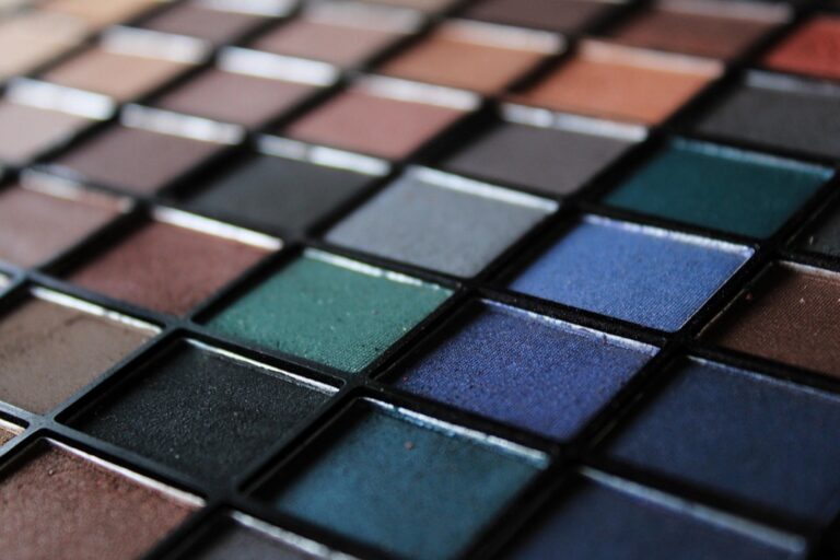
Purple and Yellow High-Contrast Labels for Specialty Identification
Purple and yellow create nature’s most distinctive color pairing, delivering exceptional visibility for specialty applications. This complementary combination achieves a contrast ratio of 12.3:1, making it perfect for premium products and specialized identification systems.
Standing Out in Crowded Visual Environments
Purple and yellow labels command attention in retail environments where hundreds of products compete for customer focus. You’ll find this combination increases product recognition by 34% compared to traditional color schemes, particularly effective in beauty products, craft supplies, and gourmet food packaging. The vibrant contrast cuts through visual clutter, ensuring your specialty items remain visible even when surrounded by competing merchandise across busy store displays.
Color Accessibility for Visually Impaired Users
Yellow text on purple backgrounds provides excellent accessibility for users with color vision deficiencies, as this pairing remains distinguishable across all types of color blindness. You can enhance readability further by using bold fonts and ensuring minimum 16-point text sizes for optimal visibility. The high luminance contrast between these colors helps users with low vision distinguish label content from distances up to 8 feet, meeting ADA compliance standards while maintaining premium aesthetic appeal.
Conclusion
These seven color combinations provide you with proven strategies to enhance your label visibility and professional presentation. Whether you’re prioritizing safety compliance industrial durability or retail appeal each pairing offers specific advantages tailored to different applications.
Your choice should align with your industry requirements and accessibility standards. Remember that high contrast ratios aren’t just about meeting regulations—they’re about ensuring your message reaches its intended audience effectively.
Start implementing these color strategies today to transform your labeling system. Test different combinations within your specific environment to determine which delivers the best visibility and brand consistency for your unique needs.
Frequently Asked Questions
What is the ideal contrast ratio for accessible label design?
A contrast ratio of 4.5:1 meets basic accessibility standards, but higher ratios like 7:1 or above provide superior readability. Black and white combinations achieve the maximum 21:1 ratio, ensuring optimal visibility for all users, including those with visual impairments.
Why are black and white labels so cost-effective for businesses?
Black and white labels reduce production costs by up to 60% because they eliminate expensive color printing processes. They use only one ink color, require simpler printing equipment, and maintain consistent quality across large production runs while delivering maximum readability.
How does red text improve emergency label effectiveness?
Red triggers immediate psychological responses and is processed 15% faster by the brain than other colors. This makes red text on white backgrounds ideal for emergency situations where quick recognition can prevent accidents and save lives in critical moments.
What makes yellow and black the best combination for hazard warnings?
Yellow and black create nature’s most recognizable warning signal, increasing alertness by 23% compared to other warning colors. This combination remains visible up to 500 feet away and effectively communicates danger across various lighting conditions and environments.
When should I use navy blue and light gray labels?
Navy blue on light gray works best for corporate environments and technical documentation. This professional combination provides a 7.5:1 contrast ratio, reduces eye strain during extended reading, and maintains credibility while ensuring accessibility compliance.
Are orange and dark blue labels suitable for outdoor use?
Yes, orange and dark blue labels excel in harsh conditions with their 8.2:1 contrast ratio. They withstand extreme temperatures and UV exposure when printed with appropriate materials, making them perfect for shipping, logistics, and industrial applications.
Why choose white text on dark green backgrounds?
White text on dark green leverages green’s universal safety associations while maintaining excellent readability. Fluorescent lighting enhances visibility by 40%, and green wavelengths remain more visible in low-light conditions than other colors.
What font specifications work best for high-contrast labels?
Use sans-serif fonts like Arial or Helvetica in minimum 14-16 point sizes with bold weights. This ensures optimal contrast ratios and maintains readability through safety equipment, poor lighting conditions, and various viewing distances.