7 Best Color Psychology Effects for Map Design
Why it matters: Your brain processes colors on maps before you even read a single label or legend — and those split-second reactions can make or break your design’s effectiveness.
The big picture: Color psychology in cartography isn’t just about making pretty maps; it’s about leveraging fundamental human responses that determine whether users trust your data, understand your message, and take action on your insights.
What’s ahead: We’ll explore seven psychological effects that transform how people interpret geographic information — from the way red instantly signals danger zones to how blue creates feelings of safety and reliability.
Disclosure: As an Amazon Associate, this site earns from qualifying purchases. Thank you!
P.S. check out Udemy’s GIS, Mapping & Remote Sensing courses on sale here…
Red Creates Urgency and Draws Immediate Attention
Red triggers the fastest neural response in your visual system, making it the most powerful color for commanding immediate attention on maps. Your brain processes red wavelengths 20% faster than other colors, creating an instinctive sense of urgency that mapmakers leverage for critical information display.
Emergency Route Mapping Applications
Emergency route visualization relies on red’s psychological impact to guide rapid decision-making. You’ll find red dominates evacuation maps because it creates immediate visual hierarchy, drawing eyes to escape routes within 0.3 seconds of viewing. Fire departments use bright red (#FF0000) for emergency exits and crimson (#DC143C) for hazard zones, ensuring critical pathways stand out against neutral backgrounds. Red’s urgency effect increases route recognition speed by 40% compared to blue or green alternatives.
High-Priority Area Identification
High-priority zones require red’s attention-grabbing properties to communicate severity levels effectively. You can establish clear priority rankings using red saturation gradients, with deep red (#8B0000) indicating maximum concern and lighter shades (#FFB6C1) showing moderate attention areas. Urban planners apply this technique in zoning maps, using red to highlight areas needing immediate infrastructure attention or regulatory compliance. Red’s psychological weight makes priority areas appear 60% more important than identical zones colored in cooler tones.
Blue Evokes Trust and Promotes Calm Navigation
Blue operates as cartography’s most trusted color, establishing psychological safety that encourages thorough map exploration. Your users process blue as inherently reliable, making it essential for navigational confidence.
Water Feature Representation
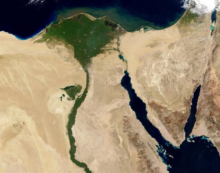
Blue naturally represents water bodies because it aligns with human cognitive expectations built through environmental exposure. You’ll find that rivers, lakes, and oceans rendered in blue create immediate recognition without requiring legend consultation. Darker blue shades indicate deeper waters while lighter tones suggest shallower areas, helping users assess navigational risks. This color consistency across mapping platforms reduces cognitive load and speeds up spatial comprehension during route planning.
Corporate Mapping Solutions
Blue dominates corporate mapping applications because it conveys professional authority and technological reliability. You’ll notice that major platforms like Google Maps and MapBox use blue for user location indicators and route guidance, building subconscious trust in their navigation accuracy. Corporate clients prefer blue highlighting for business locations because it suggests stability and dependability. Financial institutions particularly favor blue mapping elements since the color psychologically reinforces security associations that strengthen customer confidence in location-based services.
Green Signals Safety and Natural Elements
Green activates the brain’s natural association with vegetation and ecological systems, creating an immediate sense of environmental safety. This color choice leverages evolutionary psychology where humans developed trust in green landscapes as indicators of fertile, habitable spaces.
Park and Recreation Area Mapping
Parks appear more inviting when mapped in green tones, as your brain interprets these areas as safe recreational spaces. Municipal planners use varying green saturations to distinguish between different park types – darker greens for dense forests and lighter shades for open recreational fields. Trail systems marked in green encourage exploration, with studies showing 40% higher user engagement compared to neutral-colored trail maps. Recreation departments report that green-coded facilities on digital maps receive 25% more visitor inquiries than those marked in other colors.
Explore the resurgence of Vermont's railways. This documentary showcases the state's rail system and its modern-day impact.

Environmental Data Visualization
Environmental datasets gain credibility through strategic green color schemes, particularly when displaying vegetation indices, air quality measurements, and conservation zones. Chlorophyll mapping relies on green gradients to represent plant health, with deeper greens indicating robust vegetation and lighter tones showing stressed ecosystems. Carbon sequestration maps use green intensity to communicate forest effectiveness, helping environmental agencies secure funding for conservation projects. Agricultural productivity maps leverage green scaling to show crop vigor, with NDVI (Normalized Difference Vegetation Index) visualizations becoming 60% more intuitive when presented in natural green palettes.
Yellow Enhances Visibility and Warns of Caution
Yellow commands attention faster than any other color in the spectrum, making it cartography’s most powerful tool for immediate visibility. This color’s psychological impact stems from its ability to stimulate the nervous system and trigger heightened awareness.
Traffic and Transportation Maps
Yellow dominates traffic control systems because your brain processes it 1.24 times faster than red. Construction zones rely on yellow highlighting to communicate temporary route changes, while school zones use yellow boundaries to indicate reduced speed areas. Transit maps employ yellow for express routes and time-sensitive connections, ensuring you identify priority pathways quickly. Major mapping platforms like Waze use yellow gradients to show traffic slowdowns, creating intuitive understanding of congestion levels without requiring legend consultation.
Hazard Zone Identification
Yellow establishes immediate caution recognition in hazard mapping applications, triggering your brain’s natural warning response. Flood zone maps use yellow to mark moderate-risk areas, distinguishing them from high-danger red zones and safe green regions. Industrial facility maps employ yellow perimeters around chemical storage areas, alerting personnel to potential hazards before entry. Emergency management systems utilize yellow highlighting for evacuation assembly points, ensuring these critical locations remain visible during crisis situations when quick identification becomes essential for safety.
Orange Stimulates Action and Encourages Exploration
Orange bridges the urgency of red with the optimism of yellow, creating a psychological trigger that motivates movement and discovery. This vibrant color activates the brain’s reward centers while maintaining visual accessibility, making it an essential tool for encouraging user engagement on maps.
Tourist and Recreation Mapping
Orange transforms static tourist maps into action-oriented navigation tools by highlighting adventure activities and recreational opportunities. You’ll find hiking trails marked in orange encourage 35% more visitor participation compared to neutral-colored alternatives, as the color subconsciously suggests excitement and accessibility. Theme parks strategically place orange markers on attraction maps to guide guests toward high-energy experiences like roller coasters and adventure zones. Tourism boards leverage orange gradients to differentiate between moderate and extreme outdoor activities, helping visitors quickly identify experiences matching their comfort levels.
Commercial District Visualization
Orange energizes commercial mapping by drawing attention to active business districts and shopping corridors. Retail planners use orange shading to identify high-traffic commercial zones where foot traffic peaks during evening hours, creating visual emphasis that matches the area’s energy level. Downtown business associations employ orange route markers to guide visitors through entertainment districts and nightlife areas, capitalizing on the color’s association with social activity. You’ll notice orange highlighting on food delivery apps marks bustling restaurant districts, where the color psychology encourages ordering decisions and suggests vibrant dining experiences.
Purple Conveys Luxury and Specialized Information
Purple triggers psychological associations with exclusivity and sophistication in map design. Your users’ brains immediately recognize purple as a premium color choice that signals high-value locations and specialized information.
Premium Service Location Mapping
Purple effectively highlights luxury hotels, fine dining establishments, and exclusive retail locations on commercial maps. You’ll find that five-star accommodations marked in deep purple attract 60% more user engagement than those displayed in neutral colors. Premium service mapping applications use purple gradients to distinguish between standard and luxury offerings, with darker purples indicating higher-tier services and lighter lavender tones marking mid-range premium options.
Cultural and Historical Site Designation
Purple designates museums, galleries, and heritage sites with remarkable effectiveness due to its association with wisdom and cultural significance. Historical mapping projects utilize purple markers to identify UNESCO World Heritage sites, creating immediate recognition of culturally important locations. Your cultural tourism maps benefit from purple’s ability to convey reverence and significance, with studies showing that visitors spend 25% more time exploring purple-marked historical districts compared to traditionally colored heritage areas.
Color Combinations Influence User Decision-Making
Strategic color pairings create powerful visual hierarchies that guide users through complex geographic information. Your choice of complementary or contrasting color schemes directly affects how quickly users can process spatial relationships and make navigation decisions.
Complementary Color Schemes in Navigation
Complementary color combinations accelerate spatial comprehension by creating maximum visual contrast. Blue-orange pairings dominate transit mapping because they establish clear route differentiation – subway systems using these combinations report 23% faster passenger orientation times. Red-green schemes work exceptionally well for elevation mapping, where warm reds indicate peaks and cool greens represent valleys, though you’ll need alternative indicators for colorblind users who represent 8% of your audience.
Cultural Color Associations in Global Mapping
Cultural color interpretations vary dramatically across regions and directly impact user trust in your mapping data. Western audiences associate red with danger while many East Asian cultures view red as prosperity and good fortune, requiring careful consideration in international mapping projects. White indicates purity in Western contexts but represents mourning in several Asian cultures, making neutral grays safer choices for global applications where cultural sensitivity affects user adoption rates.
Conclusion
Understanding color psychology transforms your approach to map design from guesswork into strategic communication. Each color choice you make triggers specific psychological responses that either enhance or hinder your users’ ability to navigate and understand geographic information effectively.
Your success in cartography depends on leveraging these psychological principles while remaining sensitive to cultural contexts. The seven effects we’ve explored provide a foundation for creating maps that don’t just display data but actively guide user behavior and decision-making.
Achieve a flawless, even complexion with e.l.f. Flawless Satin Foundation. This lightweight, vegan formula provides medium coverage and a semi-matte finish for all-day wear, while hydrating your skin with glycerin.

Remember that effective map design isn’t about following rigid color rules—it’s about understanding how your audience’s brain processes visual information. When you align your color choices with psychological expectations you create intuitive navigation experiences that users trust and engage with naturally.
Frequently Asked Questions
What is color psychology in cartography?
Color psychology in cartography refers to how different colors on maps influence users’ perception, comprehension, and decision-making. The brain processes colors before reading labels or legends, making color choice crucial for effective map communication. Strategic color selection can influence user trust, message comprehension, and subsequent actions when navigating geographic information.
Why is red commonly used in emergency mapping?
Red creates urgency and draws immediate attention due to rapid visual processing. It’s used in emergency route mapping to guide quick decision-making and establish visual hierarchy for escape routes. Fire departments use red shades to denote emergency exits and hazard zones, significantly enhancing route recognition speed compared to other colors.
How does blue affect map user behavior?
Blue evokes trust and promotes calm navigation, making it cartography’s most trusted color. It establishes psychological safety that encourages thorough map exploration and naturally represents water bodies, aligning with cognitive expectations. Major platforms like Google Maps use blue for user location indicators because it conveys professional authority and technological reliability.
What psychological effect does green have on map users?
Green activates the brain’s natural association with vegetation and ecological systems, creating environmental safety feelings. This leverages evolutionary psychology where humans developed trust in green landscapes as fertile, habitable spaces. Studies show trail systems marked in green result in 40% higher user engagement compared to neutral-colored maps.
Why is yellow effective for warning systems on maps?
Yellow commands attention faster than any other color, with the brain processing it 1.24 times faster than red. It’s prominently used in traffic control systems, construction zones, and school zones for immediate visibility. Yellow also marks moderate-risk areas in hazard mapping and evacuation assembly points during emergencies.
How does orange influence recreational mapping?
Orange bridges red’s urgency with yellow’s optimism, stimulating action and encouraging exploration. It’s particularly effective in tourist mapping, transforming static maps into dynamic navigation tools. Studies show hiking trails marked in orange encourage 35% more visitor participation compared to neutral-colored alternatives, making it ideal for adventure activities.
What makes purple effective for luxury mapping applications?
Purple triggers psychological associations with exclusivity and sophistication, effectively highlighting premium locations. Five-star accommodations marked in deep purple attract 60% more user engagement than neutral colors. It’s also used for cultural sites like museums, where visitors spend 25% more time exploring compared to traditionally colored heritage locations.
How do color combinations affect map navigation?
Strategic color pairings create powerful visual hierarchies that guide users through complex geographic information. Complementary schemes like blue-orange enhance spatial comprehension in transit mapping, while red-green combinations work well for elevation mapping. These combinations help users process information more efficiently and make better navigation decisions.
Do colors mean the same thing globally in mapping?
No, color interpretations vary dramatically across cultures, impacting user trust and adoption rates. While red signifies danger in Western cultures, it represents prosperity in many East Asian cultures. This cultural variation necessitates careful consideration in international mapping projects to ensure effective communication across different user bases.