7 Best Scalable Symbol Designs for Visual Impact
Why it matters: Your symbols need to work flawlessly whether they’re displayed on a massive billboard or squeezed onto a smartphone screen – and that’s where scalable design becomes your secret weapon.
Experience vivid content on the Galaxy A16 5G's 6.7" display and capture stunning photos with its triple-lens camera. Enjoy peace of mind with a durable design, six years of updates, and Super Fast Charging.

The challenge: Most designers create symbols that look perfect at one size but fall apart when scaled up or down, leading to cluttered interfaces and frustrated users who can’t recognize your brand elements.
What’s ahead: These seven proven techniques will transform how you approach symbol design, ensuring your icons remain crisp, recognizable and functional across every platform and device your audience uses.
Disclosure: As an Amazon Associate, this site earns from qualifying purchases. Thank you!
P.S. check out Udemy’s GIS, Mapping & Remote Sensing courses on sale here…
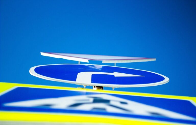
Start With Simple Geometric Shapes
Simple geometric forms create the foundation for effective scalable symbol design. They provide visual consistency and ensure your icons remain recognizable across all display sizes.
Achieve a flawless, even complexion with e.l.f. Flawless Satin Foundation. This lightweight, vegan formula provides medium coverage and a semi-matte finish for all-day wear, while hydrating your skin with glycerin.

Focus on Basic Forms Like Circles, Squares, and Triangles
Circles offer perfect symmetry and work exceptionally well for user profile icons, buttons, and status indicators. Squares provide stability and structure making them ideal for app icons, folders, and document symbols. Triangles create directional emphasis perfect for play buttons, arrows, and navigation elements. These fundamental shapes maintain their proportions naturally when scaled up or down. Your brain recognizes these forms instantly even at tiny 16-pixel sizes.
Avoid Complex Details That Disappear at Small Sizes
Intricate patterns become muddy blobs when reduced to mobile icon dimensions. Fine lines disappear completely at small scales leaving users confused about your symbol’s meaning. Detailed textures turn into visual noise rather than helpful design elements. Stick to bold strokes with minimum 2-pixel widths for mobile displays. Test your symbols at 16×16 pixels during the design phase to identify problematic details early.
Maintain Consistent Stroke Weights
Consistent stroke weights create visual harmony and ensure your symbols remain readable at any scale. This technique prevents certain elements from overpowering others and maintains professional appearance across all applications.
Use Uniform Line Thickness Throughout the Design
Select one stroke weight and apply it consistently across all elements within your symbol. Whether you choose 2px, 4px, or 8px strokes, maintain this thickness for borders, internal lines, and decorative elements. Mixing different stroke weights creates visual confusion and makes symbols appear unprofessional when scaled down. Test your chosen weight at the smallest intended size to ensure it remains visible and doesn’t create pixelation issues.
Ensure Strokes Scale Proportionally Across Different Sizes
Design your stroke weights using relative units rather than fixed pixel values to maintain proportional scaling. When your symbol scales from 256px to 16px, the stroke should automatically adjust from 8px to 0.5px accordingly. Use vector-based design tools like Adobe Illustrator or Figma that preserve these proportional relationships during export. Avoid manually adjusting stroke weights for different sizes, as this creates inconsistencies across your symbol family.
Learn Adobe Illustrator with the 2025 release of this comprehensive guide. Master essential skills through hands-on lessons.

Optimize for Multiple Sizes From the Beginning
Start your symbol design process by establishing clear size requirements and target applications. This approach ensures your symbols maintain effectiveness across all intended uses.
Design at Various Scale Points Simultaneously
Create your symbol using multiple artboards at different dimensions like 16px, 32px, 64px, and 128px. Work on each size version concurrently rather than designing one master version and scaling it down. Adjust line weights, spacing, and details for each specific size to maintain visual clarity. Use design software like Figma or Sketch that allows simultaneous editing across multiple frames for efficient workflow management.
Test Symbol Clarity at Both Large and Small Dimensions
Export your symbols at their smallest intended size and evaluate them on actual devices or screens. Check if key details remain visible and recognizable when displayed at 16×16 pixels or smaller dimensions. Test your symbols in real-world contexts like mobile interfaces, desktop applications, and print materials. Use grayscale versions to verify that your symbols rely on shape rather than color for recognition and functionality.
Embrace Negative Space as a Design Element
Negative space isn’t just empty area—it’s a powerful design tool that creates breathing room and enhances symbol clarity. Strategic use of white space improves visual hierarchy and ensures your symbols remain readable across all sizes.
Use White Space to Enhance Symbol Recognition
White space creates visual separation that helps users quickly identify symbol elements. You’ll improve recognition by allowing key shapes to breathe instead of cramming details together. Strategic spacing between elements prevents visual confusion at smaller sizes like 16×16 pixels. Icons like the Twitter bird or Apple’s symbols demonstrate how generous white space creates instant recognition. Consider adding padding around your symbol’s core elements to maintain clarity when scaled down for mobile interfaces or favicon applications.
Balance Positive and Negative Areas for Visual Impact
Balanced positive and negative areas create visual stability that works across all sizes. You’ll achieve better contrast by ensuring neither element overwhelms the design. Test your symbol by squinting at it—well-balanced designs remain clear even when details blur. The FedEx logo exemplifies this principle with its hidden arrow created through negative space. Maintain roughly equal visual weight between filled areas and empty spaces to prevent your symbol from appearing too heavy or too light at different scales.
Create Strong Contrast and Color Relationships
Strong contrast and thoughtful color relationships ensure your symbols remain visible and functional across all viewing conditions and technical limitations.
Design for Both Color and Monochrome Applications
Design your symbols to work effectively without relying on color alone. Create versions that maintain their meaning and clarity when converted to grayscale or single-color applications like stamps, engravings, or high-contrast displays. Use shape differentiation, line weights, and patterns to convey information rather than depending solely on color coding. Test your symbols by converting them to black and white early in the design process to identify any recognition issues.
Ensure Adequate Contrast Ratios for Accessibility
Maintain contrast ratios of at least 3:1 for large symbols and 4.5:1 for smaller icons to meet WCAG accessibility standards. Use tools like WebAIM’s contrast checker to verify your color combinations provide sufficient visibility for users with visual impairments. Choose background and foreground colors that create clear separation, avoiding low-contrast combinations like light gray on white or dark blue on black. Consider how your symbols will appear on various backgrounds and ensure they remain legible across different display technologies and lighting conditions.
Establish a Modular Grid System
Grid systems create the mathematical foundation that ensures your symbols maintain visual consistency and scalability across all applications. You’ll transform chaotic design decisions into systematic precision by establishing clear measurement relationships.
Build Symbols on Consistent Baseline Measurements
Define a standard unit system using multiples of 8 or 16 pixels as your base measurement for all symbol elements. This creates predictable relationships between stroke weights, spacing, and overall dimensions that scale proportionally across different sizes.
Use your baseline unit to determine element sizing—if your base is 8px, design elements at 8px, 16px, 24px, or 32px increments. This mathematical consistency ensures symbols maintain their visual weight and spacing relationships when resized for different applications.
Align Elements to Predictable Grid Points
Position all symbol components at intersection points within your established grid system rather than placing elements arbitrarily. This alignment creates visual harmony and prevents awkward spacing that becomes problematic during scaling operations.
Snap curves, corners, and stroke endpoints to grid intersections to maintain consistent spacing between elements. Your symbols will appear more professional and cohesive when every component follows the same positional logic, eliminating visual inconsistencies that plague freehand designs.
Test Across Different Media and Contexts
Testing your scalable symbols across diverse applications reveals critical performance issues before they reach end users. This validation process ensures your designs maintain their effectiveness regardless of where they appear.
Validate Symbol Performance in Digital and Print Applications
Digital screens and printed materials demand different symbol requirements due to resolution and display technology differences. Test your symbols at 72 DPI for web applications and 300 DPI for print materials to identify scaling issues early. Export symbols in multiple formats including SVG for web scalability and high-resolution PNG files for print applications. Check how stroke weights render on both glossy paper and matte finishes, as ink bleeding can affect fine details. Verify that symbols remain legible when printed at business card size (approximately 0.5 inches) and maintain clarity on low-resolution displays like older monitors or budget smartphones.
Create vibrant prints with Koala Glossy Inkjet Paper. This 8.5x11", 115gsm paper delivers a smooth, glossy finish ideal for photos, flyers, and custom projects using dye ink.
Check Readability on Various Background Colors and Textures
Background variations dramatically impact symbol visibility and recognition across different contexts. Test your symbols against light, medium, and dark backgrounds to ensure consistent readability. Place symbols over textured backgrounds like fabric patterns, wood grain, or concrete surfaces to simulate real-world applications. Verify performance on gradients and photographic backgrounds where symbols might appear as overlays. Check visibility against brand colors from your target companies or industries, ensuring symbols don’t disappear when placed on similar hues. Test symbols on both glossy and matte surfaces under different lighting conditions to identify potential reflection issues that could compromise readability.
Conclusion
Mastering these seven techniques transforms your symbol design process from guesswork into strategic precision. When you combine geometric foundations with consistent stroke weights and thoughtful negative space you’re building symbols that perform flawlessly across every platform.
Your testing phase becomes the final validation that separates professional-grade symbols from amateur attempts. By establishing clear grid systems and maintaining strong contrast relationships you’re ensuring your designs communicate effectively whether they’re displayed on smartwatch screens or highway billboards.
Remember that scalable symbol design isn’t just about technical execution—it’s about creating lasting connections with your users. When your symbols remain clear and recognizable at any size you’re building trust and enhancing the overall user experience across every touchpoint.
Frequently Asked Questions
What makes a symbol design scalable?
A scalable symbol design maintains clarity and functionality across all sizes, from large billboards to small smartphone icons. It relies on simple geometric shapes, consistent stroke weights, and strategic use of negative space. The key is avoiding complex details that become indistinct when scaled down to smaller sizes.
Why should I start with simple geometric shapes?
Simple geometric shapes like circles, squares, and triangles provide visual consistency and remain recognizable at any size. They create strong foundations for symbols because they’re universally understood and maintain their form when scaled. Complex details often become cluttered and unreadable at smaller dimensions.
How do I maintain consistent stroke weights in my symbols?
Use uniform line thickness throughout all elements within a symbol to create visual harmony. Design stroke weights using relative units in vector-based tools like Adobe Illustrator or Figma. This ensures proportional scaling and prevents inconsistencies or pixelation when symbols are resized across different applications.
What size should I test my symbols at?
Test symbols at 16×16 pixels or smaller to identify problematic details early in the design process. This smallest common size reveals whether your symbol maintains clarity and recognizability. Also test at your symbol’s largest intended size to ensure it works across the full range of applications.
How does negative space improve symbol design?
Negative space (white space) creates breathing room around key elements, preventing visual confusion at smaller sizes. It enhances visual hierarchy and aids recognition by allowing important shapes to stand out. Proper balance between positive and negative areas creates visual stability and instant recognition.
Why should my symbols work in grayscale?
Symbols must function without color to ensure accessibility and versatility across different contexts. Testing in grayscale early identifies recognition issues and ensures your design relies on shape differentiation rather than color alone. This approach guarantees functionality in monochrome applications and various viewing conditions.
What is a modular grid system for symbols?
A modular grid system uses baseline measurements (typically multiples of 8 or 16 pixels) to create predictable relationships between stroke weights, spacing, and dimensions. This mathematical foundation ensures visual consistency and prevents awkward spacing, making symbols more professional and scalable across applications.
How should I test my scalable symbols?
Test symbols across diverse applications including digital (72 DPI) and print (300 DPI) contexts. Check readability against various background colors and textures, and validate performance on actual devices. This comprehensive testing identifies critical issues before symbols reach end users, ensuring optimal functionality.