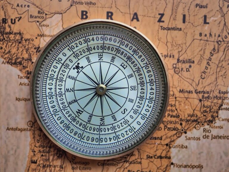
7 Best Digital Map Animation Styles
Why it matters: Animation transforms static maps into powerful storytelling tools that capture attention and communicate complex geographic data more effectively than traditional cartography methods.
The big picture: Modern mapmakers are experimenting with contrasting animation styles to create visual tension and guide viewer focus through layered geographic information.
What’s next: These seven innovative approaches will help you design animated maps that stand out in today’s crowded digital landscape while delivering clear spatial narratives.
Disclosure: As an Amazon Associate, this site earns from qualifying purchases. Thank you!
P.S. check out Udemy’s GIS, Mapping & Remote Sensing courses on sale here…
Hand-Drawn Sketchy Animation Meets Digital Precision Mapping
You’ll create compelling visual tension by combining organic sketchy animation with precise digital cartography. This contrast draws viewers into your map while maintaining spatial accuracy.
Traditional Pencil-Style Line Work
Sketch-style animations simulate hand-drawn cartography through variable line weights and intentional imperfections. You can apply this technique to boundary lines, contours, and network features using tools like Adobe After Effects or QGIS TimeManager. The organic appearance contrasts beautifully with clean basemap elements, creating visual hierarchy that guides attention to animated features while preserving the professional accuracy your audience expects.
Organic Movement and Flow Patterns
Natural movement patterns enhance sketchy animations by mimicking how cartographers actually draw maps by hand. You’ll achieve this through subtle tremor effects, variable speed transitions, and hand-drawn path animations that follow geographic features. Rivers, transportation networks, and territorial boundaries benefit most from this approach, as the organic flow mirrors real-world geographic processes while maintaining your data’s spatial integrity.
Contrast With Clean Vector Graphics
Sharp vector elements amplify sketchy animation impact by providing visual anchor points throughout your animated sequence. You can maintain precise coordinate systems, accurate scale bars, and clean typography while allowing sketchy elements to animate organically around them. This dual approach satisfies both aesthetic appeal and cartographic standards, ensuring your audience appreciates the artistic elements without questioning your technical credibility or spatial accuracy.
Stop-Motion Clay Animation Combined With Satellite Imagery
You’ll discover that combining physical clay animation with high-resolution satellite imagery creates compelling geographic narratives. This technique transforms static mapping data into dynamic, memorable presentations that engage audiences through tangible visual storytelling.
Tactile Physical Elements Over Digital Maps
Clay topography literally brings elevation data to life by sculpting terrain features from modeling clay positioned over satellite base maps. You’ll shape mountain ranges, valleys, and coastlines using GPS coordinates to ensure spatial accuracy while maintaining organic visual appeal. This technique works particularly well for geological processes, urban development visualization, and climate change impacts where physical transformation becomes the central narrative element.
Create unique clay projects with this 5lb bucket of Crayola Air Dry Clay. This natural, nontoxic clay is easy to sculpt and paint, perfect for classrooms and kids ages 3+.

Frame-by-Frame Movement Techniques
Stop-motion animation requires capturing individual frames while incrementally adjusting clay elements to demonstrate geographic changes over time. You’ll position your camera perpendicular to the map surface, maintaining consistent lighting and using grid references to track movement precision. Each frame represents specific time intervals – whether showing glacier retreat over decades or urban sprawl across years – requiring careful planning to maintain temporal accuracy.
Blending Real-World Textures With Geographic Data
Physical textures enhance satellite imagery by incorporating actual materials like sand for deserts, moss for forests, or crushed stone for urban areas. You’ll apply these elements selectively over digital base maps, creating depth and visual interest while preserving underlying geographic accuracy. This approach works exceptionally well for environmental storytelling, allowing viewers to connect emotionally with abstract spatial data through familiar tactile elements.
Minimalist Flat Design Animation Paired With 3D Topographic Relief
This technique creates compelling visual tension by combining clean geometric elements with dimensional terrain visualization. You’ll achieve maximum impact when flat design elements contrast against realistic elevation data.
Simple Geometric Shapes and Icons
Use basic circles, squares, and triangles to represent geographic features while maintaining design consistency across your animated map. Your icons should follow a unified color palette of 3-4 colors maximum to prevent visual clutter. Animate these geometric elements with simple scaling or rotation movements that don’t exceed 1.5 seconds duration. Consider using outline-style icons rather than filled shapes when overlaying dense topographic areas, as they maintain visibility without competing with elevation details.
Smooth Transition Effects
Apply linear easing functions for consistent movement patterns that complement your flat design aesthetic rather than distract from geographic accuracy. Your transition timing should range between 0.8-2.0 seconds to allow viewers to process spatial relationships effectively. Use fade-in effects for data layers appearing over 3D terrain, ensuring opacity levels don’t exceed 85% to preserve topographic detail visibility. Avoid bounce or elastic transitions that conflict with professional cartographic standards and undermine spatial credibility.
Dimensional Elevation Contrasts
Emphasize elevation differences through strategic lighting and shadow placement that enhances your flat design elements without overwhelming them. Your 3D relief should use subtle vertical exaggeration ratios between 2:1 and 5:1 depending on terrain variation and map scale. Position flat design annotations at consistent heights above the terrain surface, typically 10-15% of your maximum elevation value. Use ambient lighting with 60-degree angles to create sufficient contrast while maintaining readability of both design elements and topographic features.
Watercolor Paint Animation Overlaying Technical Grid Systems
Create vibrant watercolor art with this portable set. It includes 40 colors (metallic & fluorescent), a brush pen, watercolor paper, and more, all in a stylish tin box.

Watercolor animation creates dramatic visual contrast when layered over precise coordinate grids, transforming sterile technical data into emotionally engaging geographic narratives. This technique allows you to maintain cartographic accuracy while introducing organic movement that captures viewer attention.
Fluid Paint Bleeding Effects
Bleeding watercolor animations simulate natural paint flow across your map boundaries, creating soft transitions between geographic regions. You’ll achieve the most effective results by animating color saturation changes over 2-3 second intervals, allowing pigment to appear as if it’s naturally spreading through paper fibers. Use CSS keyframe animations with ease-out timing functions to replicate authentic watercolor bleeding patterns. Control the bleeding radius to prevent obscuring critical geographic features like political boundaries or transportation networks.
Structured Coordinate Systems
Technical grid overlays provide essential spatial reference while watercolor elements flow organically around them. Position UTM or latitude-longitude grids as static vector layers beneath your animated watercolor components, ensuring coordinate labels remain clearly readable throughout the animation sequence. Maintain grid line opacity between 40-60% to preserve technical accuracy without competing with your watercolor storytelling elements. Use monospace fonts like Courier New for coordinate labels to reinforce the technical precision contrasting with artistic movement.
Color Gradients Versus Sharp Lines
Strategic color transitions create powerful visual hierarchy when contrasting soft watercolor gradients against sharp coordinate grid lines. Animate watercolor transparency from 80% to 40% opacity to emphasize the relationship between artistic interpretation and technical precision. Use complementary color schemes—warm watercolors with cool grid lines—to enhance the visual separation between organic and geometric elements. Time your gradient animations to complete before grid line animations begin, establishing clear visual priorities for your map readers.
Retro Pixel Art Animation Integrated With Modern Vector Maps
Pixel art animation creates striking visual contrast when layered over contemporary vector cartography. This technique transforms standard digital maps into nostalgic interactive experiences while maintaining spatial accuracy.
8-Bit Style Character Movement
Character movement in 8-bit style follows predictable grid-based patterns that align perfectly with coordinate systems. You’ll create animated sprites using 16×16 or 32×32 pixel dimensions to maintain crisp edges at various zoom levels. Frame rates of 8-12 fps deliver smooth movement while preserving the characteristic stuttered motion of classic arcade games. Position characters along vector pathways using snap-to-grid functionality to ensure they follow roads railways and boundaries with geographic precision.
Contemporary Mapping Standards
Modern vector maps provide the technical foundation for pixel art overlays through standardized projection systems and coordinate references. You’ll maintain cartographic accuracy by using Web Mercator (EPSG:3857) or appropriate UTM zones as your base coordinate system. Layer management becomes critical when combining low-resolution pixel elements with high-resolution vector data. Export settings should preserve both the crisp pixel boundaries and smooth vector lines through careful anti-aliasing controls and format selection.
Achieve a flawless, even complexion with e.l.f. Flawless Satin Foundation. This lightweight, vegan formula provides medium coverage and a semi-matte finish for all-day wear, while hydrating your skin with glycerin.

Nostalgic Gaming Aesthetics
Gaming aesthetics from the 1980s and 1990s create emotional connections through familiar visual language and color palettes. You’ll implement 16-color or 256-color restrictions to achieve authentic retro appearance while ensuring map readability isn’t compromised. Tile-based backgrounds work exceptionally well for representing urban grids agricultural patterns and natural features. Sound design elements like 8-bit chimes or beeps can reinforce the nostalgic experience during map interactions and feature reveals.
Realistic Photographic Animation Contrasted With Abstract Symbol Mapping
This technique creates powerful visual tension by combining actual footage or high-resolution photography with simplified cartographic symbols. You’ll achieve maximum impact when documentary-style elements interact with clean geometric representations.
Live-Action Geographic Elements
Live-action footage transforms static maps into dynamic storytelling platforms that connect viewers emotionally with geographic spaces. You can integrate drone flyovers, time-lapse sequences, or street-level photography directly into your animated cartographic framework. Consider using Google Earth Studio or DJI Terra for seamless integration with your mapping software. The key lies in matching your photographic elements to the same coordinate system as your base map, ensuring spatial accuracy while the realistic footage provides immediate visual context that abstract symbols can’t achieve.
Simplified Icon Representations
Simplified icons create visual anchors that complement photographic complexity without competing for attention. You’ll want to develop a consistent symbol library using tools like Adobe Illustrator or Figma, focusing on geometric shapes that maintain readability at multiple zoom levels. Keep your icon palette limited to 3-4 colors maximum, ensuring sufficient contrast against photographic backgrounds. Scale your symbols proportionally to geographic importance rather than actual size, and maintain consistent visual weight throughout your animation sequence to preserve cartographic hierarchy and spatial relationships.
Learn Adobe Illustrator with the 2025 release of this comprehensive guide. Master essential skills through hands-on lessons.

Documentary Style Versus Conceptual Design
Documentary-style animation requires precise temporal accuracy while conceptual symbols allow for creative interpretation of geographic relationships. You can blend news footage, historical photographs, or real-time satellite imagery with abstract representations like flow arrows, heat maps, or network diagrams. This contrast works particularly well for urban planning presentations or environmental change documentation. Balance your approach by using photographic elements for emotional connection and symbolic representations for data clarity, ensuring neither element overwhelms the cartographic message you’re communicating.
Hand-Lettered Typography Animation Mixed With Automated Data Visualization
This technique creates compelling visual tension by combining artisanal lettering with precision data charts. You’ll establish emotional connections through handwritten elements while maintaining statistical accuracy through algorithmic visualization.
Custom Calligraphy and Script Fonts
Custom lettering brings personality to sterile geographic data by introducing human imperfections that contrast sharply with automated precision. You can animate brush strokes appearing sequentially across place names using Adobe After Effects’ write-on effects or similar tools. Variable letter spacing and baseline shifts create organic movement that mimics actual handwriting processes. Consider using pressure-sensitive stylus inputs to capture authentic stroke variations. Time your calligraphy animations to reveal location names as data visualizations populate, creating narrative flow that guides viewer attention across your cartographic composition.
Algorithm-Generated Chart Elements
Automated chart generation provides consistent data accuracy while your handwritten elements add emotional resonance to geographic narratives. Use D3.js or Observable Plot to create real-time population graphs, climate data visualizations, or economic indicators that update automatically as your hand-lettered labels appear. Program smooth transitions between data states using cubic-bezier easing functions. Configure your algorithms to maintain consistent color palettes and scaling ratios that complement your calligraphy styling. Consider using Python libraries like Matplotlib or Plotly for complex statistical visualizations that require precise mathematical calculations.
Personal Touch Versus Machine Precision
Balancing human artistry with algorithmic accuracy requires strategic timing and spatial arrangement to prevent visual conflicts between contrasting elements. Position your hand-lettered typography in negative spaces where automated charts won’t interfere with readability. Use opacity masks and blend modes to integrate organic lettering with geometric data visualizations seamlessly. Test your animations at different playback speeds to ensure both calligraphy strokes and data transitions remain comprehensible. Consider using grid systems to align handwritten elements with chart boundaries, maintaining professional cartographic standards while preserving artistic expression.
Conclusion
These contrasting animation techniques give you the power to transform ordinary maps into captivating visual stories. By mixing traditional and digital approaches you’ll create unique cartographic experiences that stand out in today’s crowded digital landscape.
The key lies in balancing artistic expression with geographic accuracy. Whether you’re combining hand-drawn elements with satellite imagery or blending nostalgic pixel art with modern vectors you need to maintain spatial precision while engaging your audience emotionally.
Start experimenting with one technique that resonates with your project goals. Each approach offers distinct advantages for different storytelling objectives and you’ll discover which combinations work best for your specific mapping needs through hands-on practice.
Frequently Asked Questions
What makes animated maps more effective than static maps?
Animated maps transform complex geographic data into engaging storytelling tools that capture viewer attention in competitive digital environments. They create visual tension and direct focus to layered information, making spatial narratives more memorable and accessible than traditional static cartography.
How do you combine hand-drawn animation with digital mapping accuracy?
Combine sketchy, hand-drawn animation styles with precise digital cartography to create compelling visual tension while maintaining spatial accuracy. Use variable line weights and organic movement patterns that mimic natural drawing processes, then contrast these with clean vector graphics for technical credibility.
What is stop-motion clay animation in mapping?
Stop-motion clay animation involves sculpting terrain features from modeling clay over satellite base maps, then capturing frame-by-frame movements to show geographic changes over time. This technique brings elevation data to life while maintaining spatial accuracy and creating memorable geographic narratives.
How does minimalist flat design work with 3D topographic data?
Minimalist flat design creates visual tension by contrasting clean geometric shapes and simple icons with realistic 3D elevation data. Use consistent color palettes, smooth transition effects, and strategic lighting to emphasize elevation differences while keeping flat design annotations readable against terrain.
What are the benefits of watercolor animation in mapping?
Watercolor animation transforms sterile technical data into emotionally engaging narratives through fluid paint bleeding effects that simulate natural transitions between geographic regions. This technique maintains cartographic accuracy by layering artistic elements over structured coordinate systems and technical grid frameworks.
How do you integrate retro pixel art with modern vector maps?
Combine 8-bit style character movement following grid-based patterns with contemporary mapping standards like Web Mercator projections. Use limited color palettes, tile-based backgrounds, and nostalgic gaming aesthetics from the 1980s-90s to create emotional connections while maintaining spatial accuracy.
What’s the advantage of mixing photographic animation with abstract symbols?
This technique creates powerful visual tension by integrating live-action footage like drone flyovers with simplified icon representations. It enhances emotional connections to geographic spaces while maintaining map readability, balancing documentary-style precision with creative conceptual design for effective cartographic storytelling.
How do you combine hand-lettered typography with automated data visualization?
Balance artisanal custom calligraphy with algorithm-generated chart elements to add personality while ensuring statistical accuracy. Use strategic timing, spatial arrangement, opacity masks, and grid systems to seamlessly integrate handwritten elements with automated visualizations while maintaining professional cartographic standards.