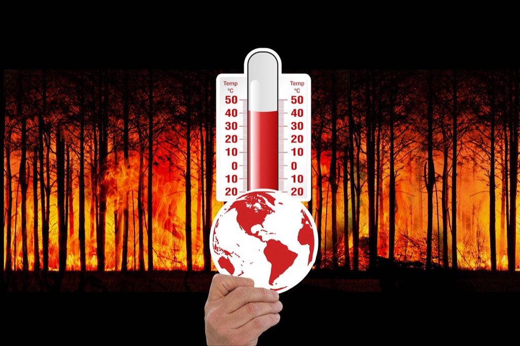
5 Best Climate Change Awareness Tools
Climate change feels abstract until you see it mapped out. You’ve likely heard statistics about rising sea levels and extreme weather but struggle to grasp the real-world impact on your community. Visual mapping transforms complex climate data into clear actionable insights that make the crisis tangible.
Traditional climate reports bury crucial information in dense text and overwhelming charts. Modern mapping technology cuts through this confusion by showing exactly where and how climate change affects real places and people. Whether you’re tracking local temperature changes or visualizing future flood zones these tools make environmental data accessible to everyone.
The right mapping approach doesn’t just inform—it motivates action. When you can see your neighborhood’s vulnerability to extreme heat or your region’s changing precipitation patterns the urgency becomes personal and immediate.
Disclosure: As an Amazon Associate, this site earns from qualifying purchases. Thank you!
P.S. check out Udemy’s GIS, Mapping & Remote Sensing courses on sale here…
Visualizing Temperature Changes Through Interactive Heat Maps
Interactive heat maps transform complex temperature datasets into intuitive visual experiences that reveal climate patterns at a glance. You’ll discover how these dynamic tools make temperature variations across time and geography immediately comprehensible to any audience.
Real-Time Global Temperature Tracking
Real-time temperature tracking displays current global conditions through color-coded overlays that update hourly. You can monitor temperature anomalies as they develop using platforms like NOAA’s Climate Explorer or NASA’s GISS Temperature Analysis. These systems pull data from thousands of weather stations worldwide, creating seamless visualizations that highlight unusual warming or cooling events. The continuous data streams enable you to identify emerging temperature patterns before they become major climate stories.
Get real-time weather data with the Ambient Weather WS-2902. This WiFi-enabled station measures wind, temperature, humidity, rainfall, UV, and solar radiation, plus it connects to smart home devices and the Ambient Weather Network.

Historical Climate Data Comparison
Historical climate comparisons reveal long-term temperature trends through side-by-side heat map visualizations spanning decades. You’ll access comprehensive datasets from sources like Berkeley Earth or ECMWF ERA5 that show temperature changes from 1880 to present. These comparative maps use standardized color scales to highlight warming trends, with deep reds indicating areas experiencing the most dramatic increases. The temporal slider functionality lets you animate temperature changes year by year, making decades of climate data instantly digestible.
Regional Hotspot Identification
Regional Hotspot Identification pinpoints areas experiencing rapid temperature increases through high-resolution heat mapping at local scales. You can zoom into specific watersheds, urban areas, or ecosystems using tools like Climate Central’s Surging Seas or USGS Climate Science Centers data. These detailed visualizations often reveal surprising patterns, such as urban heat islands or elevation-dependent warming in mountain regions. The granular approach helps you identify climate vulnerabilities that broader global maps might obscure.
Tracking Sea Level Rise With Coastal Mapping Technology
Coastal mapping technology provides critical data for documenting rising sea levels and their immediate impacts on vulnerable shoreline communities. These advanced mapping systems capture measurable changes that illustrate climate change’s tangible effects on coastal regions.
Satellite Imagery Analysis
Satellite Imagery Analysis delivers precise measurements of sea level changes through radar altimetry and optical sensors. NASA’s Jason-3 satellite provides millimeter-accurate readings of global sea surface heights, tracking annual increases of 3.3 millimeters worldwide. ESA’s Sentinel-1 radar satellites capture coastal flooding events in real-time, enabling you to monitor storm surge impacts and tidal variations. These satellite datasets create comprehensive time-series visualizations showing accelerating sea level trends over decades, making abstract climate data immediately understandable through before-and-after coastal comparisons.
Flood Risk Visualization
Flood Risk Visualization transforms complex hydrological models into interactive maps showing potential inundation zones under various sea level scenarios. NOAA’s Sea Level Rise Viewer displays community-specific flooding projections for 1-10 foot increases, highlighting vulnerable infrastructure like schools and hospitals. Municipal planners use these visualization tools to identify at-risk neighborhoods and prioritize adaptation investments. Dynamic flood mapping combines historical tide data with topographic models, creating animated sequences that demonstrate how rising seas will gradually affect residential areas, commercial districts, and critical transportation networks.
Coastal Erosion Documentation
Coastal Erosion Documentation uses high-resolution aerial photography and LiDAR surveys to measure shoreline retreat rates with centimeter precision. Repeat aerial surveys reveal dramatic changes along eroding coastlines, with some areas losing 10-30 feet annually due to intensified wave action and higher sea levels. Digital elevation models capture beach profile changes and dune migration patterns, documenting how protective coastal features diminish over time. These erosion maps provide compelling visual evidence of climate impacts, showing property owners and policymakers exactly how rising seas threaten coastal communities and infrastructure.
Monitoring Deforestation Patterns Using Satellite Mapping
Satellite mapping transforms forest monitoring by delivering real-time deforestation data that reveals the true scale of global forest loss. You’ll discover how advanced remote sensing technology exposes critical patterns in forest destruction that ground-based surveys simply can’t capture.
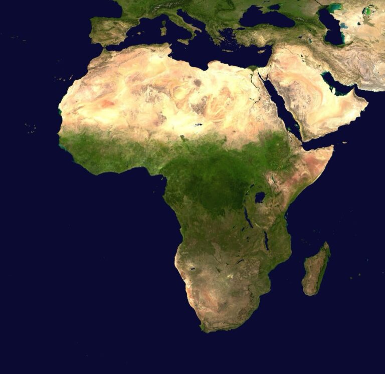
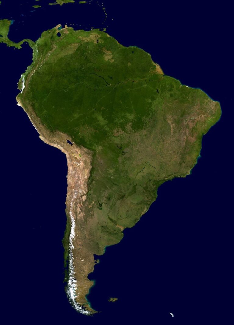
Amazon Rainforest Loss Tracking
Amazon deforestation monitoring utilizes high-resolution Landsat and Sentinel-2 satellite imagery to track forest cover changes across Brazil’s 2.1 million square miles of rainforest. You can access NASA’s Global Forest Watch platform to visualize annual forest loss data, which revealed 4,466 square miles of Amazon deforestation in 2022 alone. These satellite systems detect clearing activities within days, enabling rapid response from conservation organizations and government agencies monitoring illegal logging operations.
Urban Expansion Impact Assessment
Urban sprawl mapping employs multispectral satellite analysis to document how city growth destroys surrounding forests and natural habitats. You’ll find that cities like Jakarta and São Paulo show dramatic expansion patterns when comparing 1990 versus 2020 satellite imagery. Google Earth Engine processes these massive datasets to quantify exact acreage lost to development, revealing that urban areas have tripled globally since 1970, consuming forests at unprecedented rates.
Carbon Storage Capacity Analysis
Forest carbon mapping combines LiDAR satellite data with biomass algorithms to calculate precise carbon storage values for different forest types and ages. You can measure how deforestation directly impacts global carbon sequestration by analyzing forest density maps alongside carbon storage databases. Recent satellite analysis shows that tropical deforestation releases 1.5 billion tons of carbon dioxide annually, equivalent to removing 400 million acres of mature forest from Earth’s carbon absorption capacity.
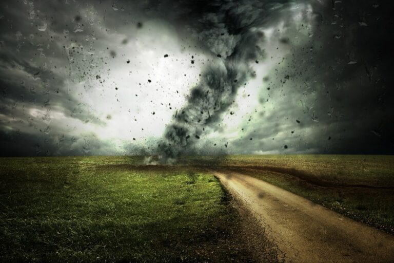
Mapping Extreme Weather Events and Their Frequency
Extreme weather mapping transforms scattered meteorological data into compelling visual narratives that reveal the increasing frequency and intensity of climate-related disasters. These visualizations make the abstract concept of changing weather patterns tangible for communities facing growing climate risks.
Hurricane Path Visualization
Hurricane tracking maps display storm trajectories using GPS coordinates and atmospheric pressure data from weather buoys and reconnaissance aircraft. You can create dynamic visualizations showing wind speed intensification using color gradients, with category 5 hurricanes appearing in deep red zones. NOAA’s Historical Hurricane Database provides decades of storm data, enabling you to overlay multiple seasons and reveal shifting storm patterns toward populated coastal areas.
Drought Pattern Recognition
Drought mapping utilizes satellite-derived vegetation indices and precipitation data to identify moisture stress patterns across agricultural regions. You’ll find the Palmer Drought Severity Index particularly useful for creating standardized drought maps that compare conditions across different climate zones. The U.S. Drought Monitor’s weekly updates provide real-time data showing how drought conditions persist and intensify, with some southwestern regions experiencing exceptional drought conditions for consecutive years.
Wildfire Spread Documentation
Wildfire perimeter mapping combines thermal infrared satellite imagery with ground-based GPS data to track fire progression in real-time. You can visualize burn severity using normalized burn ratio calculations that highlight vegetation loss intensity through color-coded classifications. NASA’s FIRMS platform provides active fire detection data within hours of satellite passes, enabling you to document how fires spread across landscapes and threaten infrastructure networks.
Creating Community-Based Environmental Action Maps
You can transform your community’s environmental awareness by developing action maps that identify local challenges and guide targeted solutions. These grassroots mapping initiatives enable residents to document environmental issues while building collective knowledge for meaningful change.
Local Pollution Source Identification
Mapping pollution sources requires you to use air quality sensors and smartphone apps to document contamination patterns throughout your neighborhood. You’ll position low-cost PM2.5 monitors near industrial facilities, major roadways, and waste sites while recording GPS coordinates for each measurement location. Apps like AirVisual and PurpleAir allow you to upload real-time data that creates community-wide pollution heat maps, revealing hotspots that regulatory agencies might overlook.
Understand your indoor air quality with the Amazon Smart Air Quality Monitor. It tracks five key factors and provides an easy-to-understand air quality score in the Alexa app, plus notifications when air is poor.

Green Initiative Location Planning
Strategic green space planning helps you identify optimal locations for community gardens, tree planting projects, and renewable energy installations through demographic and environmental data analysis. You’ll overlay census information with soil quality maps, sunlight exposure data, and foot traffic patterns to pinpoint high-impact locations. Tools like QGIS and ArcGIS Online enable you to analyze vacant lots, assess accessibility for elderly residents, and prioritize areas with limited green infrastructure access.
Citizen Science Data Collection
Crowdsourced environmental monitoring empowers you to coordinate neighborhood volunteers in collecting standardized data using mobile apps and simple measurement tools. You’ll distribute water quality test kits, phenology observation forms, and noise level meters while training participants to upload consistent, geotagged measurements. Platforms like iNaturalist, eBird, and CoCoRaHS aggregate your community’s contributions into regional datasets that inform local environmental policies and conservation efforts.
Ensure your drinking water is safe with the Varify 17-in-1 test kit. Easily test for lead, bacteria, chlorine, and more using our simple, color-coded strips and included bacteria tests.

Conclusion
These mapping tools represent more than just technological advances—they’re powerful catalysts for environmental awareness and action. When you can see your neighborhood’s flood risk or track local air quality in real-time you’re more likely to engage with climate solutions that directly impact your daily life.
The shift from abstract data to visual storytelling makes climate science accessible to everyone regardless of technical background. You don’t need to interpret complex charts when interactive maps clearly show how rising temperatures or sea levels affect your community.
Most importantly these visualization tools bridge the gap between global climate challenges and local action. By revealing specific environmental threats and opportunities in your area they transform climate awareness from a distant concern into an immediate call to participate in meaningful change.
Frequently Asked Questions
What is visual climate mapping and why is it important?
Visual climate mapping transforms complex climate data into easy-to-understand visual formats like interactive maps and heat maps. It makes abstract climate concepts tangible by showing real-world impacts on specific communities. This approach helps people better understand local climate risks, making scientific data more accessible and motivating individuals to take action against climate change.
How do interactive heat maps help visualize temperature data?
Interactive heat maps convert complex temperature datasets into intuitive visual experiences that show temperature variations across time and geography at a glance. Users can easily identify warming trends, temperature anomalies, and regional differences without needing to interpret dense scientific reports or complicated charts.
What tools are available for tracking real-time climate data?
Several platforms provide real-time climate monitoring, including global temperature tracking systems that offer hourly updates on temperature anomalies. Tools like NASA’s Global Forest Watch monitor deforestation, while NOAA’s Sea Level Rise Viewer visualizes coastal flooding risks. These platforms enable users to monitor emerging climate patterns as they develop.
How does coastal mapping technology document sea level rise?
Coastal mapping uses satellite imagery analysis to provide precise measurements of sea level changes and monitor coastal flooding events in real-time. High-resolution aerial photography and LiDAR surveys measure shoreline retreat rates, while tools like NOAA’s Sea Level Rise Viewer transform complex hydrological models into interactive maps showing potential flood zones.
What role does satellite mapping play in monitoring deforestation?
Satellite mapping delivers real-time data on global forest loss using high-resolution imagery from Landsat and Sentinel-2 satellites. Platforms like NASA’s Global Forest Watch visualize significant annual forest loss, track Amazon rainforest deforestation, and assess urban expansion impacts on surrounding forests, providing crucial data for conservation efforts.
How do extreme weather event maps improve disaster preparedness?
Extreme weather maps transform meteorological data into visual narratives showing the increasing frequency and intensity of climate disasters. They include hurricane path visualizations, drought mapping for agricultural regions, and real-time wildfire tracking. These tools help communities understand growing climate risks and prepare for potential disasters.
What are community-based environmental action maps?
Community-based environmental action maps empower residents to identify local environmental challenges and guide targeted solutions. They help locate pollution sources through air quality monitoring, optimize placement of green initiatives like community gardens, and engage volunteers in citizen science data collection to inform local policies and conservation efforts.
How does forest carbon mapping work?
Forest carbon mapping combines LiDAR data with biomass algorithms to analyze deforestation’s impact on global carbon storage. This technology reveals that tropical deforestation releases substantial amounts of carbon dioxide annually, providing visual evidence of how forest loss contributes to climate change and helping prioritize conservation efforts.