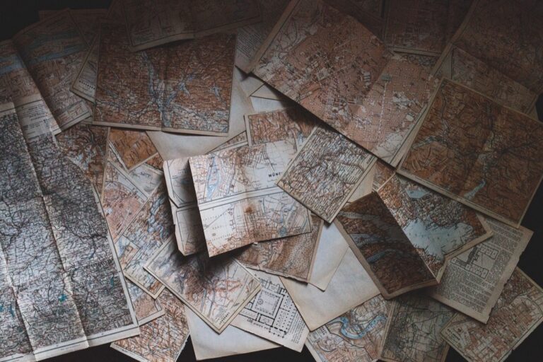
7 Best Artistic Map Color Techniques
You’ve probably seen countless maps that stick to the same predictable color schemes – blue for water, green for land, and brown for mountains. Why it matters: Breaking free from traditional cartographic colors can transform your artistic maps into stunning visual narratives that capture attention and tell stories in completely new ways. Whether you’re designing fantasy worlds, reimagining real places, or creating abstract geographical art, unconventional color choices can make your maps unforgettable.
Disclosure: As an Amazon Associate, this site earns from qualifying purchases. Thank you!
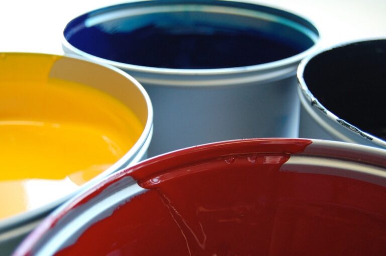
Monochromatic Gradients: Creating Depth With Single Color Families
Monochromatic gradients transform flat geographic representations into dimensional landscapes using variations within a single color family. This technique creates sophisticated depth perception while maintaining visual cohesion across your entire map composition.
Exploring Temperature Variations in Blues and Greens
You’ll achieve remarkable depth by manipulating the temperature within blue and green families rather than switching between completely different hues. Cool blues like ultramarine and prussian blue work perfectly for deep ocean trenches, while warmer cerulean and sky blues represent shallow coastal waters. Similarly, you can use forest green for dense vegetation and sage green for grasslands. This temperature-based approach creates natural visual hierarchy while maintaining color harmony throughout your cartographic design.
P.S. check out Udemy’s GIS, Mapping & Remote Sensing courses on sale here…
Get vibrant dark blue pigment with this 25g Prussian Blue powder (99+% purity). Its insoluble formula makes it ideal for various applications, including survival kits.

Using Warm Tones to Represent Elevation Changes
Warm monochromatic gradients excel at depicting topographic relief through strategic value and saturation shifts. You can employ deep burgundy for valley floors, progressing through medium reds for foothills, and finishing with pale salmon for mountain peaks. This technique works equally well with orange families – burnt orange for lowlands transitioning to peach for highlands. The key lies in maintaining consistent hue while dramatically shifting lightness values to create convincing elevation perception.
Inverted Color Schemes: Flipping Traditional Cartographic Conventions
Inverted color schemes challenge your audience’s visual expectations by reversing the standard cartographic color palette. This technique creates immediate visual tension and forces viewers to engage more actively with your map design.
Making Water Appear in Warm Colors
Replace traditional blue water with coral reds, burnt oranges, and golden yellows to create striking oceanic representations. You’ll find that warm-toned water bodies evoke desert landscapes or alien worlds, making your maps feel otherworldly. Use deeper reds for ocean depths and lighter coral tones for shallow coastal areas. This approach works particularly well for fantasy maps, science fiction illustrations, or abstract interpretations of real coastlines where you want to emphasize heat or drought conditions.
Representing Land Masses in Cool Ocean Blues
Transform continents and islands using deep navy blues, turquoise, and cool cyan tones to reverse traditional land representation. You’ll discover that blue landmasses suggest ice worlds, underwater civilizations, or mystical realms. Apply darker blues for mountainous regions and lighter aqua shades for plains and valleys. This technique proves especially effective for depicting frozen planets, mythical underwater kingdoms, or creating surreal interpretations of familiar geography that challenge viewers’ spatial understanding.
Emotional Color Mapping: Connecting Feelings to Geographic Features
Emotional color mapping transforms geographic features into visual narratives that reflect the psychological and cultural associations of places. You’ll create deeper connections between viewers and locations by deliberately choosing colors that evoke specific feelings rather than literal representations.
Assigning Colors Based on Historical Significance
Historical events dictate your color choices to create powerful visual storytelling. You’ll use deep crimson for battlefields and conflict zones, golden yellows for areas of prosperity or discovery, and muted grays for regions marked by tragedy or loss. Revolutionary sites work well with bold purples, while colonial territories benefit from sepia tones that suggest age and complexity. This approach transforms your map into an emotional timeline where colors carry the weight of human experience.
Using Personal Memory Colors for Familiar Locations
Personal experiences guide your color selection for places that hold individual meaning. You’ll assign warm oranges to childhood neighborhoods, soft blues to peaceful retreats, or vibrant greens to locations of personal achievement. College campuses might receive school colors, while vacation destinations get the hues of memorable sunsets or ocean views. This technique creates intimate connections between your map and its intended audience, making geographic features resonate with personal significance.
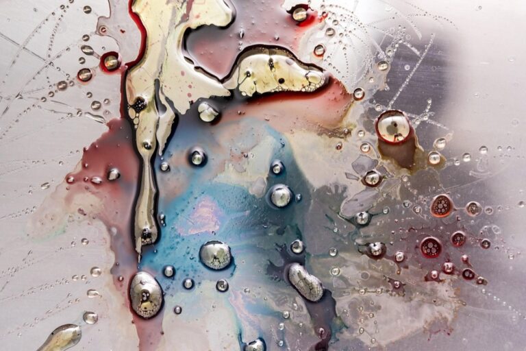
Complementary Color Contrasts: Maximizing Visual Impact Through Opposition
Complementary colors create the strongest visual contrast in cartographic design, generating immediate viewer attention through their natural opposition on the color wheel.
Pairing Orange and Blue for Dynamic Coastlines
Orange coastlines against deep blue oceans create striking maritime boundaries that enhance visual drama. You’ll achieve maximum contrast by using saturated burnt orange for sandy beaches and coral formations while applying navy or ultramarine for deep waters. This combination works particularly well for tropical and Mediterranean coastlines, where the warm orange suggests sun-baked shores. Consider using graduated orange tones from pale peach at the waterline to deep copper inland to create natural depth transitions.
Creating Drama With Red and Green Boundaries
Red and green boundaries generate intense visual tension that draws viewers into territorial divisions and political borders. You can use crimson red for contested regions or conflict zones paired with forest green for peaceful territories, creating immediate emotional responses. This pairing works effectively for historical maps showing wartime boundaries or contemporary political divisions. Apply darker burgundy reds against sage greens for more sophisticated contrast, or use bright cherry red with emerald green for maximum impact in fantasy cartography.
Explore history's most significant maps with *Great Maps*. This book delves into cartographic masterpieces and their historical context.

Metallic and Iridescent Accents: Adding Luxury to Geographic Art
Metallic elements transform ordinary maps into sophisticated artistic statements that capture light and create visual hierarchy through reflective surfaces.
Incorporating Gold Leaf for Important Landmarks
Gold leaf application highlights significant landmarks and creates focal points that demand attention from viewers. You’ll achieve maximum impact by applying genuine gold leaf to capital cities, major monuments, and historically significant locations using specialized adhesive sizing. This technique works particularly well for commemorative maps and limited-edition prints where the metallic sheen catches ambient light and creates dynamic visual interest as viewing angles change.
Achieve beautiful gilding with Mona Lisa Metal Leaf Adhesive. This water-based glue, made in the USA, dries in just 30 minutes and cleans up easily with soap and water.

Using Copper Tones for Industrial Regions
Copper coloring effectively represents manufacturing districts and mining areas while adding warmth to industrial geography. You can apply copper leaf or metallic paints to factory complexes, steel mills, and mining operations to create authentic industrial atmosphere. The natural patina effect of copper tones suggests age and established industry, making this approach ideal for historical industrial maps or contemporary urban planning visualizations where you want to emphasize manufacturing heritage.
Add a touch of luxury to your crafts with these 100 genuine copper leaf sheets. The rose gold color is perfect for art projects, furniture gilding, and more; sheets are individually separated for easy use.

Seasonal Color Interpretations: Representing Time Through Hue
You can capture the essence of temporal change by applying seasonal color palettes to geographic features, creating maps that tell stories across different times of year.
Spring Pastels for Agricultural Areas
Spring pastels transform farmland visualization into vibrant representations of agricultural renewal. You’ll find soft mint greens work exceptionally well for newly planted fields, while pale lavender effectively depicts fallow ground preparing for cultivation. Cream and butter yellows represent emerging crops like wheat and corn during their early growth stages. These gentle hues create visual harmony while maintaining the technical accuracy needed for agricultural mapping, particularly when overlaying crop rotation data or soil composition information.
Autumn Warmth for Deciduous Forest Regions
Autumn warmth brings deciduous forests alive through strategic color temperature application. You should apply burnt sienna and deep amber tones to represent mature hardwood stands, while russet reds effectively highlight oak and maple concentrations. Golden ochre works perfectly for mixed deciduous areas during peak foliage season. This approach proves particularly valuable when creating forestry management maps or recreational trail guides, as the warm palette immediately communicates seasonal timing and forest health status to both professional and general audiences.
Experience rich, transparent color with DANIEL SMITH Burnt Sienna Watercolor. This 15ml tube offers excellent lightfastness and granulation, perfect for landscapes and glazing techniques.

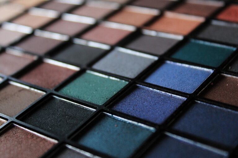
Abstract Color Coding: Breaking Away From Natural Representations
Abstract color coding transforms geographic data into pure visual communication, where colors serve meaning rather than mimicking nature. You’ll discover how unconventional hues can reveal patterns invisible in traditional cartographic representations.
Using Neon Colors for Urban Density
Neon colors create striking visualizations of population density that immediately capture viewer attention. You can apply electric pink for high-density residential areas, creating visual hierarchy that distinguishes crowded neighborhoods from sparse suburbs. Bright cyan works effectively for commercial districts, while electric yellow highlights mixed-use zones. These saturated hues cut through visual noise and make demographic patterns instantly recognizable, particularly effective for urban planning presentations where you need stakeholders to grasp density distribution quickly.
Applying Jewel Tones to Population Centers
Jewel tones add sophistication while maintaining strong visual distinction between population centers. You’ll find emerald green perfect for representing major metropolitan areas, while sapphire blue effectively depicts mid-sized cities. Ruby red creates compelling focal points for smaller urban centers, and amethyst purple works beautifully for specialized economic zones like tech hubs. These rich, saturated colors provide elegant alternatives to standard population mapping while ensuring clear hierarchical relationships between different settlement sizes and economic functions.
Conclusion
Your artistic maps don’t have to follow the same tired color conventions that have dominated cartography for centuries. By embracing unconventional palettes you’ll transform your geographic visualizations into compelling artistic statements that capture attention and tell stories in ways traditional maps simply can’t.
The seven color strategies we’ve explored offer you endless possibilities for creative expression. Whether you’re designing fantasy worlds or reimagining real locations these techniques will help your maps stand out in a crowded visual landscape.
Remember that color is your most powerful tool for guiding viewer emotion and creating memorable experiences. Don’t be afraid to experiment with bold choices that challenge expectations and push the boundaries of what maps can be.
Frequently Asked Questions
What are the main limitations of traditional map color schemes?
Traditional map color schemes rely on predictable combinations like blue for water, green for land, and brown for mountains. These conventional palettes create flat, unengaging maps that fail to tell unique stories or capture viewers’ attention. By breaking away from these standard colors, map creators can produce more artistic and memorable geographical representations.
How do monochromatic gradients improve map design?
Monochromatic gradients use variations within a single color family to create depth and dimension in maps. This technique transforms flat geographic representations into layered landscapes while maintaining visual cohesion. Temperature variations within colors, like cool blues for deep waters and warmer tones for shallow areas, effectively communicate elevation and depth changes.
What are inverted color schemes in cartography?
Inverted color schemes challenge traditional mapping conventions by reversing standard color palettes. This approach uses warm colors like coral reds for water bodies and cool blues for land masses, creating visual tension and engaging viewers more actively. It’s particularly effective for fantasy maps and science fiction geographical art.
How does emotional color mapping work?
Emotional color mapping connects geographic features to psychological and cultural associations, creating deeper viewer connections. Colors are assigned based on historical significance or personal memories, such as deep crimson for battlefields or golden yellows for prosperous areas. This transforms maps into emotional narratives that resonate with personal and historical context.
What are complementary color contrasts in map making?
Complementary color contrasts use opposing colors to maximize visual impact, such as pairing orange and blue for dynamic coastlines or red and green for territorial boundaries. These combinations create visual drama and can evoke strong emotional responses, making them ideal for historical maps or areas requiring emphasis.
How can metallic accents enhance geographic art?
Metallic accents like gold leaf and copper tones elevate ordinary maps into sophisticated artistic statements. Gold highlights can emphasize significant landmarks and create focal points, while copper tones authentically represent industrial regions. These elements add luxury and visual interest while maintaining geographical accuracy.
What is seasonal color interpretation in mapping?
Seasonal color interpretation uses different hues to represent temporal changes in geographic features. Spring pastels can depict agricultural areas with soft mint greens for new crops, while autumn warmth shows deciduous forests with burnt sienna and amber tones. This approach enhances storytelling and makes maps more relatable.
How does abstract color coding work in cartography?
Abstract color coding transforms geographic data into pure visual communication, where colors convey meaning rather than mimic nature. Neon colors can represent urban density patterns, while jewel tones indicate population centers. This method creates striking visualizations that make demographic and geographic data instantly recognizable and engaging.