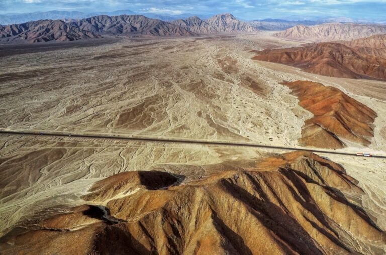
5 Best GPS Data Visualization Techniques
GPS accuracy isn’t just about getting from point A to point B—it’s about understanding where your data might be leading you astray. When you’re working with location-based data whether for fleet management logistics or outdoor recreation identifying and visualizing discrepancies can make the difference between reliable insights and costly mistakes.
Visualizing GPS data discrepancies transforms raw coordinates into actionable intelligence you can actually use. Instead of drowning in spreadsheets of latitude and longitude numbers you’ll spot patterns outliers and systematic errors that could be throwing off your entire operation.
The key lies in turning those invisible data inconsistencies into clear visual representations that reveal what’s really happening with your GPS tracking. You’ll discover five proven visualization techniques that help you identify problem areas improve data quality and ultimately make better decisions based on more accurate location information.
Track vehicles and assets with the LandAirSea 54 GPS Tracker. Get real-time location alerts and historical playback using the SilverCloud app, with a long-lasting battery and discreet magnetic mount.

Disclosure: As an Amazon Associate, this site earns from qualifying purchases. Thank you!
P.S. check out Udemy’s GIS, Mapping & Remote Sensing courses on sale here…
Identify Signal Interference Patterns Through Visual Heat Maps
Heat maps transform complex GPS interference data into clear visual patterns that reveal where and why your positioning accuracy degrades. You’ll immediately spot problematic zones that traditional error logs might miss completely.
Recognizing Urban Canyon Effects on GPS Accuracy
Urban canyons create distinctive interference patterns where tall buildings block satellite signals from multiple directions. You’ll notice elongated error zones running parallel to major streets in your heat map visualizations. These patterns typically show red or orange clusters indicating poor accuracy along narrow corridors between skyscrapers. Downtown areas consistently display the most severe canyon effects, with accuracy degrading by 5-15 meters compared to open areas.
Detecting Multipath Signal Reflections in Dense Areas
Multipath errors appear as irregular hotspots scattered throughout areas with reflective surfaces like glass buildings or metal structures. You can identify these zones by their characteristic jagged error patterns that don’t follow predictable geometric shapes. Industrial complexes and modern commercial districts generate the most multipath interference, creating accuracy variations of 3-8 meters within short distances. Your heat map will show these as isolated red patches surrounded by more accurate green zones.
Mapping Weather-Related Signal Degradation Zones
Weather interference creates broad, sweeping patterns across your coverage area that change seasonally and daily. You’ll observe accuracy degradation during heavy precipitation, with heat maps showing widespread yellow-to-red zones during storm events. Atmospheric conditions affect signal propagation differently at various elevations, creating gradient patterns from good accuracy at ground level to poor performance at higher altitudes. Temperature inversions and humidity levels produce temporary but significant accuracy drops of 2-6 meters across entire regions.
Detect Satellite Constellation Gaps Using Timeline Visualizations
Timeline visualizations reveal critical gaps in satellite availability that directly impact your GPS positioning accuracy. You’ll discover how constellation geometry changes throughout the day affect data quality.
Analyzing GPS Satellite Availability Windows
Availability windows show you when satellite coverage drops below optimal thresholds. You can plot satellite count against time to identify periods with fewer than four visible satellites. Timeline charts reveal coverage gaps lasting 15-45 minutes in mountainous terrain or urban canyons. These visualization patterns help you plan data collection during optimal satellite windows. You’ll spot recurring daily gaps that occur at consistent times due to orbital mechanics.
Identifying PDOP (Position Dilution of Precision) Variations
PDOP timeline graphs expose positioning accuracy fluctuations throughout your data collection periods. Values above 6.0 indicate poor satellite geometry that degrades accuracy by 2-5 meters. You can visualize PDOP spikes correlating with specific time windows when satellites cluster in narrow sky sectors. Timeline patterns show predictable daily PDOP cycles lasting 2-4 hours. These visualizations help you filter out low-quality position fixes during high-PDOP periods.
Tracking Satellite Geometry Changes Over Time
Geometry tracking reveals how satellite positioning affects your data accuracy across time intervals. You’ll observe constellation spread patterns that create accuracy variations of 1-10 meters during different hours. Timeline visualizations show satellite azimuth and elevation changes that impact signal reception quality. Poor geometry periods appear as compressed satellite arrangements in specific sky quadrants. These patterns help you identify optimal data collection windows with well-distributed satellite coverage.
Analyze Coordinate Drift Patterns With Scatter Plot Analysis
Scatter plots transform GPS coordinate discrepancies into visual patterns that reveal accuracy trends across your positioning data. You’ll identify systematic errors and drift patterns that timeline analysis can’t capture effectively.
Visualizing Position Accuracy Degradation Over Distance
Distance-based scatter plots expose how positioning accuracy deteriorates as you move farther from reference points. Plot your measured coordinates against known survey points to reveal error magnification patterns. Urban environments typically show 2-4 meter accuracy degradation per kilometer of distance from cellular towers. Dense foliage areas demonstrate exponential error growth, with accuracy dropping from 3 meters to 15+ meters over 500-meter intervals.
Identifying Systematic Bias in GPS Measurements
Systematic bias appears as consistent coordinate offsets when you plot multiple position fixes against true locations. Create X-Y scatter plots comparing your GPS readings to surveyed control points across different times and conditions. Receiver-specific bias typically manifests as 1-3 meter directional shifts that remain constant across measurement sessions. Atmospheric interference creates temporal bias patterns showing 0.5-2 meter seasonal variations in the same geographic locations.
Comparing Static vs. Dynamic Positioning Errors
Static positioning scatter plots cluster tightly around true coordinates while dynamic measurements show elongated error distributions. Plot stationary GPS fixes to establish baseline accuracy before analyzing mobile data patterns. Static measurements typically achieve 1-2 meter circular error probable (CEP) while dynamic positioning shows 3-8 meter error ellipses. Vehicle speed directly correlates with positioning scatter, with errors increasing 15-25% for every 10 mph above walking pace.
Monitor Real-Time Data Quality Through Dashboard Displays
Real-time dashboard monitoring transforms GPS data quality assessment from reactive troubleshooting to proactive accuracy management. You’ll maintain continuous oversight of positioning performance while identifying emerging accuracy issues before they compromise your mapping operations.
Creating Alerts for Accuracy Threshold Breaches
Configure automatic notifications when GPS accuracy drops below your specified thresholds. Set primary alerts at 5-meter accuracy degradation for general mapping work and secondary alerts at 10-meter thresholds for less critical applications. Most GIS platforms support email and SMS notifications that trigger within 30 seconds of threshold breaches. Customize alert sensitivity based on your project requirements—surveying operations need 1-meter alerts while general navigation can tolerate 15-meter thresholds.
Tracking Signal Strength Variations in Live Feeds
Monitor carrier-to-noise ratio (C/N0) values across satellite channels to identify signal degradation patterns. Healthy GPS signals maintain C/N0 values above 35 dB-Hz while problematic signals drop below 25 dB-Hz. Live feed displays reveal signal strength fluctuations that correlate with positioning errors—urban environments show 10-15 dB-Hz variations while open areas maintain stable readings. Track signal strength across multiple satellite constellations to identify which systems perform best in your operating environment.
Implementing Color-Coded Quality Indicators
Deploy visual quality indicators using green-yellow-red color schemes to instantly assess GPS accuracy status. Green indicators represent sub-3-meter accuracy suitable for precise mapping while yellow signals 3-8-meter accuracy requiring validation. Red indicators mark accuracy degradation exceeding 8 meters and trigger immediate data quality reviews. Implement additional color gradients for PDOP values—blue for excellent geometry (PDOP < 2) and orange for marginal conditions (PDOP > 5).
Compare Multi-GNSS Performance Using Overlay Maps
Multi-GNSS overlay maps reveal performance differences between satellite systems that single-constellation analysis can’t detect. You’ll visualize accuracy variations across GPS, GLONASS, and Galileo to optimize your positioning strategy.
Evaluating GPS vs. GLONASS vs. Galileo Accuracy
Different satellite systems deliver varying accuracy levels across geographic regions. GPS typically provides 3-5 meter accuracy in open areas while GLONASS performs better at high latitudes with 4-6 meter precision. Galileo achieves 1-3 meter accuracy in Europe but shows reduced performance in other regions. Create side-by-side accuracy maps comparing each system’s error distribution patterns across your survey area.
Identifying Optimal Satellite System Combinations
Combining multiple GNSS constellations reduces positioning errors by 30-50% compared to single systems. GPS+Galileo combinations excel in urban environments with 2-3 meter accuracy improvements while GPS+GLONASS works best in polar regions. Use overlay visualizations to identify which dual-constellation pairings minimize error ellipses in your specific operating zones. Color-code combination performance to reveal optimal system selections for different terrain types.
Visualizing Coverage Improvements With Multiple Systems
Multi-GNSS coverage maps demonstrate satellite availability gains that directly improve positioning reliability. Single GPS coverage drops to 4-6 satellites in urban canyons while combined systems maintain 8-12 satellites. Overlay coverage heat maps show how GLONASS fills GPS gaps in northern latitudes and Galileo enhances signal availability in European mountainous terrain. These visualizations help you predict positioning quality before field deployment.
Conclusion
These visualization techniques transform your GPS data from confusing numbers into clear actionable insights. You’ll spot accuracy problems faster and make better decisions about when and where to collect location data.
The combination of heat maps scatter plots timeline analysis real-time monitoring and multi-GNSS overlays gives you complete visibility into your positioning quality. You’re no longer guessing about data reliability.
Start implementing these visualization methods today and you’ll see immediate improvements in your location-based operations. Your GPS accuracy will become a competitive advantage rather than a source of uncertainty.
Frequently Asked Questions
What is GPS accuracy visualization and why is it important?
GPS accuracy visualization transforms raw coordinate data into visual patterns that reveal positioning errors and quality issues. It’s crucial for fleet management, outdoor activities, and location-based applications because it helps identify costly mistakes before they impact operations. By visualizing GPS discrepancies, users can make better decisions based on more reliable location data.
How do heat maps help identify GPS signal interference?
Heat maps reveal areas where GPS positioning accuracy degrades by showing interference patterns as color-coded zones. Urban canyons create elongated error zones where accuracy drops 5-15 meters, while multipath reflections appear as irregular hotspots with 3-8 meter variations. Weather conditions also create broad accuracy loss patterns during heavy precipitation.
What are timeline visualizations used for in GPS analysis?
Timeline visualizations detect satellite constellation gaps and track Position Dilution of Precision (PDOP) variations over time. They reveal periods when satellite coverage drops below optimal thresholds, particularly in mountainous terrain, with gaps lasting 15-45 minutes. This helps identify optimal data collection windows when satellite geometry provides the best positioning accuracy.
How do scatter plots analyze GPS coordinate drift patterns?
Scatter plots transform GPS discrepancies into visual trends showing accuracy degradation patterns. Distance-based plots reveal 2-4 meter accuracy loss per kilometer from reference points in urban areas. They also identify systematic bias through consistent coordinate offsets and compare static versus dynamic positioning errors based on movement speed.
What are the benefits of real-time GPS dashboard monitoring?
Real-time dashboards provide proactive GPS data quality management by identifying accuracy issues before they affect operations. They feature automatic alerts for threshold breaches, signal strength tracking, and color-coded quality indicators. This enables immediate assessment of GPS accuracy status and ensures more reliable mapping and operational decisions.
How do multi-GNSS overlay maps improve positioning accuracy?
Multi-GNSS overlay maps compare GPS, GLONASS, and Galileo performance across different regions, revealing accuracy variations that single-constellation analysis misses. Combining systems like GPS+Galileo or GPS+GLONASS can reduce positioning errors by 30-50%. These maps show optimal satellite combinations for specific environments, improving reliability in challenging areas like urban canyons.