5 Best Map Visualization Methods for Data Analysis
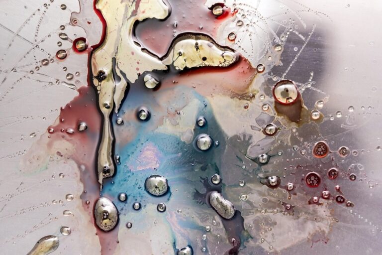
Why it matters: Your data tells a story but static charts and tables often fail to capture the full picture especially when location plays a crucial role in your analysis.
The big picture: Dynamic map visualizations transform complex datasets into interactive experiences that reveal geographic patterns trends and relationships you’d never spot in traditional spreadsheets.
What’s ahead: We’ll explore five powerful mapping techniques that’ll help you uncover hidden insights and present your findings in ways that captivate stakeholders and drive better decision-making.
Disclosure: As an Amazon Associate, this site earns from qualifying purchases. Thank you!
P.S. check out Udemy’s GIS, Mapping & Remote Sensing courses on sale here…
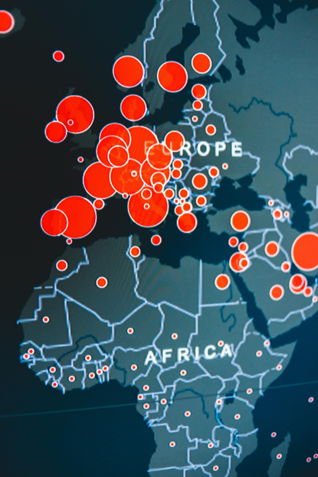
Heat Maps: Revealing Data Density and Distribution Patterns
Heat maps transform raw geographic data into powerful visual stories that reveal concentration patterns across your study area. You’ll discover population clusters, crime hotspots, or sales territories through color-coded intensity gradients that make data density immediately apparent.
Understanding Heat Map Color Gradients and Intensity Scales
Color selection directly impacts your map’s readability and analytical value. Sequential color schemes work best for heat maps, progressing from light colors representing low values to dark colors showing high concentrations. You should use single-hue progressions like blue-to-red or yellow-to-red for clear intensity communication. Avoid rainbow color schemes that create false hierarchies and confuse data interpretation. Set your intensity scales using natural breaks or quantile classifications to ensure even distribution across color categories.
Best Practices for Heat Map Data Categorization
Data normalization prevents misleading visualizations in your heat map analysis. You must adjust raw counts by area size or population to create meaningful comparisons between different geographic zones. Use standardized metrics like density per square mile or rates per thousand residents rather than absolute values. Group your data into 5-7 categories maximum to maintain visual clarity and prevent color oversaturation. Consider your audience’s familiarity with the subject matter when determining category boundaries and labeling conventions.
Tools and Software for Creating Interactive Heat Maps
Professional heat map creation requires specialized software with robust spatial analysis capabilities. QGIS offers excellent free heat map functionality through its Heatmap plugin and kernel density estimation tools. ArcGIS Pro provides advanced heat mapping with customizable search radii and multiple interpolation methods. For web-based solutions, you can use Leaflet.js with heat map plugins or Mapbox GL JS for interactive online presentations. Python users benefit from libraries like Folium and Plotly for programmatic heat map generation with extensive customization options.
Choropleth Maps: Displaying Statistical Data Across Geographic Regions
Choropleth maps excel at revealing spatial patterns in statistical data by encoding values through color variations across defined geographic boundaries. Unlike heat maps that show point-based intensity, these boundary-based visualizations help you understand how phenomena distribute across administrative regions like counties, states, or census tracts.
Choosing Appropriate Color Schemes for Choropleth Visualization
Sequential color schemes work best for choropleth maps displaying continuous data like population density or income levels. You’ll want to use single-hue progressions from light to dark, such as light blue to navy blue, which naturally communicate increasing values. Avoid diverging schemes unless your data has a meaningful midpoint, and never use rainbow gradients that create false hierarchies. Tools like ColorBrewer 2.0 provide scientifically-tested palettes optimized for geographic visualization and colorblind accessibility.
Handling Data Normalization and Classification Methods
Raw counts rarely tell the complete story in choropleth mapping—you must normalize data by area, population, or relevant denominators to create meaningful comparisons. Use natural breaks (Jenks) classification for most datasets, as it minimizes variance within classes while maximizing differences between them. Equal interval classification works well for uniformly distributed data, while quantile methods ensure balanced visual distribution. Consider your audience when choosing class numbers; five to seven classes typically provide optimal visual distinction without overwhelming viewers with complexity.
Common Pitfalls in Choropleth Map Design and How to Avoid Them
The modifiable areal unit problem creates misleading patterns when you aggregate data at inappropriate geographic scales—always match your boundary units to your research question. Avoid the visual bias created by large geographic areas that dominate the map despite having low statistical significance. Include “no data” categories with distinct styling rather than leaving areas blank, and provide clear legends that specify units and classification methods. Test your color choices across different devices and consider printing limitations if hard copies are needed.
Flow Maps: Tracking Movement and Migration Patterns
Flow maps excel at visualizing directional movement between geographic locations, revealing migration patterns and connectivity that traditional mapping methods can’t capture effectively.
Visualizing Origin-Destination Data with Arrow Thickness
You’ll encode flow volume through arrow thickness variations, creating immediate visual hierarchy in your movement data. Thicker arrows represent higher volumes while thinner lines show smaller flows. Scale your arrow widths proportionally using square root transformation to prevent dominant flows from overwhelming smaller movements. Tools like D3.js and Mapbox GL JS offer precise control over line thickness, while QGIS provides built-in flow mapping capabilities for desktop analysis.
Animating Temporal Flow Data for Enhanced Storytelling
You can animate flow sequences to reveal temporal patterns in migration and movement data over time. Create frame-by-frame animations showing seasonal migration routes or daily commuter flows using tools like Observable notebooks or custom JavaScript libraries. Set appropriate frame rates between 0.5-2 seconds per frame to maintain readability while preserving narrative flow. Consider adding play controls and timeline scrubbers to let users explore specific time periods independently.
Applications in Transportation, Trade, and Population Studies
You’ll find flow maps particularly effective for visualizing commuter patterns between cities, international trade routes between countries, and population migration flows during demographic shifts. Transportation planners use flow maps to identify high-traffic corridors and optimize route planning. Trade analysts leverage these visualizations to understand supply chain dependencies and economic relationships. Population researchers apply flow mapping to track displacement patterns and urbanization trends across different time periods.
Dot Density Maps: Representing Population and Quantity Distributions
Dot density maps transform quantitative data into individual points scattered across geographic areas, where each dot represents a specific number of units like people, livestock, or housing units. This technique excels at showing raw distribution patterns without the boundary constraints that limit choropleth visualizations.
Calculating Optimal Dot Values and Placement Strategies
Determine your dot value by dividing total population by desired dot count, typically aiming for 200-500 dots per map to maintain readability. Calculate dot density using the formula: total units ÷ (area × dot value) to ensure consistent spacing. Place dots randomly within census boundaries using GIS software like ArcGIS Pro’s “Create Random Points” tool, avoiding water bodies and uninhabitable areas through mask layers for accurate representation.
Combining Dot Density with Other Visualization Techniques
Layer dot density maps over choropleth backgrounds to show both raw counts and normalized rates simultaneously, using semi-transparent dots (50-70% opacity) over lightly colored polygons. Combine with flow arrows to illustrate population movement patterns, or overlay heat map gradients to highlight concentration zones. Tools like QGIS and Mapbox GL JS support multiple layer rendering for these hybrid visualizations.
Addressing Visual Clutter in High-Density Areas
Implement dynamic dot sizing based on zoom levels to prevent overcrowding in metropolitan areas, using smaller dots at regional scales and larger ones for detailed views. Apply transparency gradients where dot density exceeds readability thresholds, or switch to hexagonal binning for extreme concentrations. Consider inset maps for dense urban cores, maintaining the same dot value while providing enlarged detail windows.
3D Terrain and Elevation Maps: Adding Dimensional Depth to Geographic Data
Three-dimensional terrain maps transform flat geographic data into immersive visual experiences that reveal elevation patterns and topographic relationships invisible in traditional two-dimensional visualizations.
Integrating Topographic Data with Statistical Information
Overlaying statistical data onto elevation models creates powerful multi-dimensional visualizations. You’ll combine Digital Elevation Models (DEMs) with census data, environmental measurements, or economic indicators to reveal correlations between terrain and phenomena. USGS provides 1-meter resolution DEMs through The National Map, while SRTM offers global 30-meter coverage. Layer population density onto mountainous regions to understand settlement patterns, or combine temperature data with elevation to visualize climate gradients. Tools like ArcGIS Pro and QGIS support direct DEM integration with statistical datasets through raster overlays and 3D symbology.
Creating Interactive 3D Visualizations for Web Applications
Web-based 3D terrain visualization requires specialized JavaScript libraries and optimized data formats. Cesium.js and Three.js provide robust frameworks for browser-based 3D mapping with terrain support. Convert your elevation data to tiled formats like quantized mesh or heightmaps for efficient streaming. Mapbox GL JS offers native 3D terrain rendering with custom styling options. You’ll need to balance visual quality with performance by implementing level-of-detail systems and progressive loading. Consider WebGL limitations and provide fallback options for older browsers while maintaining smooth navigation controls.
Balancing Aesthetic Appeal with Data Accuracy
Vertical exaggeration enhances visual impact but can distort spatial relationships and mislead interpretation. Apply 2-3x vertical exaggeration for subtle terrain features while maintaining geographic accuracy. Use consistent color ramps that follow elevation conventions – blues for water, greens for lowlands, browns for highlands. Implement proper lighting models with hillshading to enhance depth perception without obscuring data values. Label key elevation points and include scale references to help users interpret heights correctly. Test your visualizations with different viewing angles to ensure critical data patterns remain visible from multiple perspectives.
Conclusion
These five dynamic mapping techniques offer powerful ways to transform your geographic data into compelling visual narratives. Each method serves distinct analytical purposes – from heat maps revealing concentration patterns to 3D terrain visualizations uncovering elevation-based correlations.
Your choice of visualization should align with your specific research questions and audience needs. Consider combining multiple techniques when appropriate to create comprehensive analytical dashboards that tell complete geographic stories.
Remember that effective map visualization requires careful attention to color schemes data normalization and interactive elements. The tools and best practices outlined here will help you avoid common pitfalls while maximizing the impact of your geographic analysis.
Start experimenting with these methods using your existing datasets. You’ll discover geographic patterns and relationships that traditional charts simply can’t reveal driving more informed decision-making across your organization.
Frequently Asked Questions
What are dynamic map visualizations and why are they important?
Dynamic map visualizations are interactive maps that reveal geographic patterns and relationships in data that traditional static charts often miss. They transform complex datasets into engaging visual stories, helping stakeholders identify spatial trends, make better decisions, and uncover insights that might be hidden in standard spreadsheets or tables.
What are heat maps and when should I use them?
Heat maps use color-coded intensity gradients to show concentration patterns in geographic data, such as population clusters or crime hotspots. They’re ideal for visualizing density, frequency, or intensity of phenomena across geographic areas. Use sequential color schemes and normalize your data for meaningful comparisons between different regions.
How do choropleth maps differ from heat maps?
Choropleth maps encode statistical values through color variations across defined geographic boundaries like counties or states, while heat maps show continuous intensity patterns. Choropleth maps are perfect for comparing data between administrative regions, but require careful attention to boundary selection and data classification to avoid misleading interpretations.
What are flow maps best used for?
Flow maps visualize directional movement between geographic locations using arrows or lines of varying thickness. They excel at showing migration patterns, trade routes, commuter flows, and transportation networks. Arrow thickness represents flow volume, and they can be animated to show temporal changes in movement patterns.
When should I choose dot density maps over other mapping techniques?
Use dot density maps when you want to show raw distribution patterns without boundary constraints. Each dot represents a specific number of units (people, houses, etc.), making them ideal for visualizing population distribution, resource locations, or facility placement. They work well combined with other techniques like choropleth backgrounds.
What tools can I use to create interactive maps?
Popular tools include QGIS and ArcGIS Pro for desktop mapping, web-based solutions like Leaflet.js and Mapbox GL JS for interactive web maps, and Python libraries for programmatic generation. For 3D visualizations, consider Cesium.js and Three.js. Choose based on your technical skills and specific visualization needs.
How do I avoid common mistakes in map design?
Key best practices include: using appropriate color schemes (avoid rainbow gradients), normalizing data for fair comparisons, choosing proper classification methods, matching boundary units to your research questions, providing clear legends, and addressing the modifiable areal unit problem by selecting appropriate geographic scales for your analysis.
Can I combine different mapping techniques in one visualization?
Yes, combining techniques often creates more powerful visualizations. You can layer dot density over choropleth backgrounds, add flow arrows to show movement patterns, or overlay statistical data on 3D terrain maps. The key is ensuring each layer adds value without creating visual clutter or confusion.