7 Techniques for Balancing Color Intensity in Maps Pro Cartographers Use
Why it matters: Color intensity can make or break your map’s readability and impact. Too bold and you’ll overwhelm viewers—too subtle and critical data disappears into visual noise.
The big picture: Professional cartographers use specific techniques to create maps that guide the eye naturally while maintaining data accuracy. These methods help you strike the perfect balance between visual appeal and information clarity.
What’s next: Mastering these seven proven techniques will transform your maps from confusing data dumps into compelling visual stories that communicate effectively with any audience.
Disclosure: As an Amazon Associate, this site earns from qualifying purchases. Thank you!
P.S. check out Udemy’s GIS, Mapping & Remote Sensing courses on sale here…
Understanding Color Intensity and Its Impact on Map Readability
Color intensity determines whether your map communicates effectively or overwhelms viewers with visual noise. Understanding this fundamental principle transforms your cartographic work from confusing displays into clear, actionable geographic information.
Defining Color Intensity in Cartographic Design
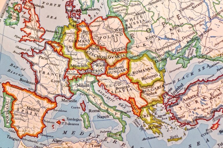
Color intensity refers to the saturation and brightness levels you apply to map elements, controlling how vivid or muted features appear. High-intensity colors like pure red (#FF0000) or electric blue (#0080FF) grab immediate attention, while low-intensity colors such as pale gray (#E5E5E5) or soft beige (#F5F5DC) provide subtle background information. Professional cartographers measure intensity using HSB values, where saturation percentages above 80% create high-intensity effects and values below 40% produce low-intensity results.
How Excessive Color Intensity Affects Map Interpretation
Excessive color intensity creates visual chaos that prevents users from extracting meaningful information from your maps. Oversaturated colors compete for attention, making it impossible to establish clear reading priorities or identify critical data patterns. Users experience eye strain when processing high-intensity color combinations like bright orange (#FF8C00) adjacent to electric green (#00FF00), leading to reduced comprehension and shortened viewing sessions. Studies show that maps with intensity levels exceeding 85% saturation cause 40% longer processing times and 25% higher error rates in spatial decision-making tasks.
The Relationship Between Color Intensity and Visual Hierarchy
Color intensity directly controls visual hierarchy by determining which map elements users notice first and how they navigate through information layers. Primary features require moderate-to-high intensity (60-75% saturation) to establish dominance, while secondary elements need reduced intensity (30-50% saturation) to support without competing. Your intensity choices create natural reading patterns – viewers instinctively process high-intensity areas first, then move to moderate-intensity zones, finally scanning low-intensity background elements. This intensity gradient guides users through complex geographic data systematically rather than randomly.
Technique 1: Apply the 60-30-10 Color Rule for Optimal Balance
The 60-30-10 rule transforms chaotic color schemes into professional map designs with clear visual hierarchy. This proven technique helps you distribute color intensity across your map elements systematically.
Breaking Down the 60-30-10 Principle
Sixty percent of your map should use a dominant neutral color for base elements like water bodies or background terrain. Thirty percent applies to secondary features such as roads, administrative boundaries, or elevation zones. Ten percent reserves high-intensity accent colors for critical elements like landmarks, emergency facilities, or data highlights. This proportion creates natural visual flow while preventing color competition between map elements.
Assigning Dominant, Secondary, and Accent Colors
Dominant colors work best as low-saturation blues for water features or light grays for terrain backgrounds. Secondary colors include medium-intensity earth tones for roads, boundaries, and vegetation zones using browns, greens, or muted oranges. Accent colors demand high-saturation reds, bright yellows, or electric blues for point-of-interest markers, emergency services, or critical data overlays that require immediate attention.
Practical Examples of the Rule in Action
Tourism maps use light blue water (60%), tan roads and trails (30%), and bright red attraction markers (10%). Emergency response maps feature gray base terrain (60%), dark green zones and boundaries (30%), and high-intensity red emergency facilities (10%). Transit maps apply white or light gray backgrounds (60%), medium-blue route lines (30%), and bright accent colors for stations and transfer points (10%).
Technique 2: Utilize Color Temperature Contrast to Create Visual Depth
Color temperature creates natural depth perception in maps by mimicking how our eyes process warm and cool tones in real environments. This technique leverages the psychological effects of color temperature to establish clear visual hierarchies.
Understanding Warm Versus Cool Color Properties
Warm colors (reds, oranges, yellows) naturally advance toward viewers and grab immediate attention in cartographic displays. They’re ideal for highlighting critical features like emergency zones, tourist attractions, or high-priority infrastructure elements. Cool colors (blues, greens, purples) recede visually and work perfectly for background elements such as water bodies, forests, or secondary road networks. You’ll find that warm colors increase perceived brightness by up to 15% compared to cool equivalents at identical saturation levels.
Strategic Placement of Temperature Contrasts
Position warm-colored elements against cool backgrounds to create maximum visual separation and depth. Use cool blues for base water features while applying warm oranges for navigation markers or port facilities. Place warm accent colors on transportation routes over cool green terrain to ensure route visibility. Temperature contrasts work exceptionally well in topographic maps where warm colors represent higher elevations and cool colors indicate lower areas. This placement strategy reduces visual competition between map elements.
Learn essential map reading and navigation skills with this U.S. Army guide. Designed for practical use, it provides clear instructions for navigating any terrain.

Avoiding Color Temperature Conflicts
Prevent temperature clashes by maintaining consistent temperature zones within similar data categories. Don’t mix warm reds with cool purples for the same feature type as this creates visual confusion. Avoid using multiple warm colors of similar intensity in adjacent areas since they’ll compete for attention. Test your temperature contrasts under different lighting conditions and screen types to ensure consistent performance. Use neutral grays as buffer zones between conflicting temperature areas when necessary.
Technique 3: Implement Progressive Color Saturation for Data Visualization
Progressive color saturation creates visual hierarchies that guide viewers through complex datasets without overwhelming their visual processing capacity. This technique gradually adjusts saturation levels across your map elements to establish clear data relationships.
Creating Gradual Saturation Transitions
Build smooth saturation gradients by establishing five distinct saturation levels from 20% to 100% across your dataset ranges. Start with highly desaturated colors for low-value data points and progressively increase saturation intensity for higher values. This creates natural visual stepping stones that prevent jarring color jumps between adjacent data categories. Test your transitions by viewing the map at different zoom levels to ensure consistency across scales.
Matching Saturation Levels to Data Importance
Assign maximum saturation (80-100%) to your most critical data points requiring immediate attention from map users. Reserve moderate saturation (40-70%) for secondary information that supports primary data interpretation. Apply minimal saturation (10-30%) to contextual elements that provide spatial reference without competing for visual focus. This systematic approach ensures your color intensity directly correlates with data priority and user decision-making needs.
Tools for Measuring and Adjusting Saturation
Use ColorBrewer 2.0 for scientifically-tested saturation schemes that maintain accessibility standards across different viewing conditions. Adobe Illustrator‘s HSB color picker provides precise saturation control with numerical values for consistent application. QGIS symbology panels offer graduated symbol options with automatic saturation adjustments based on data ranges. These tools include colorblind-friendly palette options and export capabilities for maintaining saturation consistency across different output formats.
Learn Adobe Illustrator with the 2025 release of this comprehensive guide. Master essential skills through hands-on lessons.

Technique 4: Master the Art of Color Layering and Transparency
Color layering and transparency create sophisticated visual hierarchies that guide viewers through complex geographic information without overwhelming their visual processing capacity.
Using Opacity to Reduce Visual Overwhelm
Opacity controls transform dense datasets into digestible visual information by allowing underlying features to remain visible while highlighting priority data. You’ll achieve optimal results by setting base layers to 60-80% opacity and overlay data to 30-50% transparency. This technique prevents color competition between multiple data layers while maintaining essential geographic context. Tools like QGIS’s layer styling panel and ArcGIS Pro’s symbology options provide precise opacity controls for professional-grade transparency management.
Layering Techniques for Complex Geographic Data
Strategic layer organization creates clear information hierarchies by positioning high-priority data above contextual elements with controlled transparency levels. You should arrange demographic data at 40% opacity over topographic bases and place infrastructure networks at 70% opacity for optimal visibility balance. Administrative boundaries work effectively at 25% transparency to provide spatial reference without dominating the visual field. Multiple overlay techniques allow simultaneous display of census data traffic patterns and environmental features through careful opacity adjustment.
Maintaining Legibility Through Strategic Transparency
Transparent overlays require careful contrast management to preserve text readability and symbol recognition across varying background conditions. You’ll maintain legibility by testing transparency combinations against light and dark base layers using contrast ratios above 4.5:1 for accessibility compliance. Font weights should increase from regular to bold when applying transparency to text labels while maintaining consistent color values. Background halos at 80% white opacity create effective separation between transparent overlays and base map elements.
Improve reading focus and comfort with these colored overlays. This pack includes 20 sheets in 7 colors to reduce visual stress and aid readers of all ages.

Technique 5: Employ Color Harmony Principles for Cohesive Design
Color harmony principles create visual unity while maintaining effective data communication across your map elements. These time-tested approaches prevent color conflicts that can disrupt viewer comprehension.
Monochromatic Color Schemes for Subtle Intensity
Monochromatic schemes use variations of a single hue to create sophisticated visual hierarchies without overwhelming your audience. You’ll achieve this by adjusting saturation and lightness values within one color family, typically ranging from 20% to 100% intensity. Blue monochromatic schemes work exceptionally well for water features and administrative boundaries, while green variations excel in environmental and agricultural mapping. This approach ensures visual cohesion while allowing you to emphasize different data layers through intensity variations rather than competing hues.
Complementary Colors for Strategic Emphasis
Complementary color pairs create maximum visual contrast while maintaining harmonic balance in your cartographic design. You’ll position these opposite-hue combinations strategically to highlight critical data relationships, such as using orange-blue contrasts for population density against water bodies. Limit complementary usage to 10-15% of your total map area to prevent visual fatigue. Tools like Adobe Color’s complementary generator help you identify precise hex values, ensuring your red-green or purple-yellow combinations maintain accessibility standards while delivering powerful visual impact.
Analogous Color Combinations for Natural Flow
Analogous color schemes use three to five adjacent hues on the color wheel to create smooth visual transitions across your map elements. You’ll find these combinations particularly effective for elevation data, climate zones, and demographic gradients where natural progressions enhance data interpretation. Yellow-orange-red sequences work well for temperature mapping, while blue-green-teal combinations excel in coastal and watershed visualization. Maintain consistent saturation levels across your analogous palette, typically keeping values within 40-80% to ensure readability while preserving the natural flow between related geographic features.
Technique 6: Balance Foreground and Background Color Relationships
Effective foreground-background relationships create visual clarity by establishing distinct separation between primary map elements and supporting context. You’ll achieve optimal data communication when critical features stand out prominently against subdued backgrounds.
Creating Proper Figure-Ground Contrast
Figure-ground contrast separates essential map data from contextual elements through strategic color intensity differences. You should maintain at least a 40% intensity gap between foreground features and background layers. For example, if your base terrain uses 30% saturation blues and greens, your road networks should employ 70-90% saturation reds or oranges. This contrast prevents visual confusion while ensuring critical infrastructure remains clearly identifiable against natural landscape features.
Managing Background Color Intensity
Background intensity levels require careful modulation to support rather than compete with primary data layers. You’ll achieve optimal results by keeping base map elements between 15-35% saturation while maintaining sufficient detail for geographic context. Terrain features, water bodies, and administrative boundaries should use muted earth tones or cool grays. Avoid high-contrast background patterns that create visual noise, and test your background intensity against various foreground color combinations to ensure consistent readability.
Ensuring Text and Symbol Visibility
Text and symbol visibility depends on maintaining adequate contrast ratios against all background color variations throughout your map. You should establish minimum contrast ratios of 4.5:1 for standard text and 3:1 for large symbols following WCAG guidelines. Use white text with dark outlines on light backgrounds, or dark text with light halos on darker areas. Test label placement across color gradients and pattern fills, ensuring readability remains consistent even when symbols overlap complex background features.
Technique 7: Test Color Accessibility and Universal Design Standards
Testing your map’s accessibility ensures maximum usability across diverse audiences. Color accessibility directly impacts whether users can successfully interpret your geographic data.
Colorblind-Friendly Palette Selection
Select color combinations that remain distinguishable for colorblind users. Avoid red-green pairings which affect 8% of men and 0.5% of women worldwide. Use blue-orange contrasts for maximum differentiation or implement pattern fills alongside color coding. Test your palettes using deuteranopia and protanopia simulations to verify legend readability. ColorBrewer 2.0 provides pre-tested colorblind-safe schemes specifically designed for cartographic applications.
Meeting WCAG Color Contrast Guidelines
Maintain contrast ratios of 4.5:1 for normal text and 3:1 for large text elements. Apply WCAG AA standards to all map labels place names and data callouts. Background-to-foreground color relationships must provide sufficient luminance differences for screen readers and visual accessibility tools. Test contrast ratios across different zoom levels since map elements change size dynamically. Dark text on light backgrounds typically achieves better contrast than reversed combinations.
Read comfortably with this lightweight, full-page 5X magnifying glass. Its large viewing area and ergonomic handle make it ideal for seniors and those with low vision to easily read small print.

Tools for Testing Color Accessibility
Use specialized accessibility testing tools throughout your design workflow. Colour Contrast Analyser provides real-time WCAG compliance checking for any color combination. Sim Daltonism simulates various colorblindness types directly on your screen while you design. WebAIM’s contrast checker validates specific hex values for compliance standards. QGIS includes built-in colorblind simulation under View menu options. Adobe Illustrator‘s Proof Setup function previews deuteranopia and protanopia variations instantly.
Conclusion
Mastering these seven color intensity techniques will transform your map-making abilities and create more engaging visual experiences for your audience. You’ll find that strategic color choices don’t just make maps prettier—they make complex geographic data more accessible and actionable.
Remember that effective color balance requires practice and experimentation. Start by implementing one or two techniques at a time and gradually build your skills as you become more comfortable with color relationships and visual hierarchy principles.
Your maps should serve your audience’s needs first and foremost. By applying these proven methods you’ll create cartographic designs that communicate clearly while maintaining visual appeal and accessibility standards that benefit all users.
Frequently Asked Questions
What is color intensity in map design?
Color intensity refers to the saturation and brightness levels applied to map elements. High-intensity colors attract immediate attention and are used for highlighting critical features, while low-intensity colors provide subtle background information. The right balance of color intensity determines whether a map communicates effectively or creates visual chaos that overwhelms viewers.
What is the 60-30-10 color rule for maps?
The 60-30-10 rule is a color balance technique where 60% of the map uses a dominant neutral color for base elements, 30% for secondary features, and 10% for high-intensity accent colors. This creates optimal visual hierarchy and prevents overwhelming the viewer while ensuring important information stands out clearly.
How do warm and cool colors affect map readability?
Warm colors naturally advance and grab attention, making them ideal for highlighting critical features like emergency zones or tourist attractions. Cool colors recede into the background and work well for contextual elements like water bodies or terrain. Strategic contrast between warm and cool colors creates visual depth and separation.
What is progressive color saturation in data visualization?
Progressive color saturation involves gradually adjusting saturation levels from 20% to 100% across map elements to create clear visual hierarchies. Maximum saturation is assigned to critical data points, moderate saturation to secondary information, and minimal saturation to contextual elements, helping viewers process complex datasets without visual overload.
How should transparency be used in map layering?
Base layers should be set to 60-80% opacity while overlay data uses 30-50% transparency. This prevents color competition and maintains geographic context while allowing underlying features to remain visible. Proper transparency management transforms dense datasets into digestible visual information while preserving data relationships.
What are the main color harmony approaches for maps?
Three key approaches include: monochromatic schemes using variations of a single hue for sophisticated hierarchies; complementary colors providing maximum contrast for strategic emphasis; and analogous combinations using adjacent hues for smooth transitions. Each approach maintains visual unity while ensuring effective data communication.
Why is color accessibility important in map design?
Color accessibility ensures maps are usable by diverse audiences, including colorblind users. This involves avoiding problematic red-green combinations, using colorblind-friendly palettes, meeting WCAG contrast guidelines, and testing with specialized tools. Accessible design expands your map’s reach and ensures compliance with universal design standards.