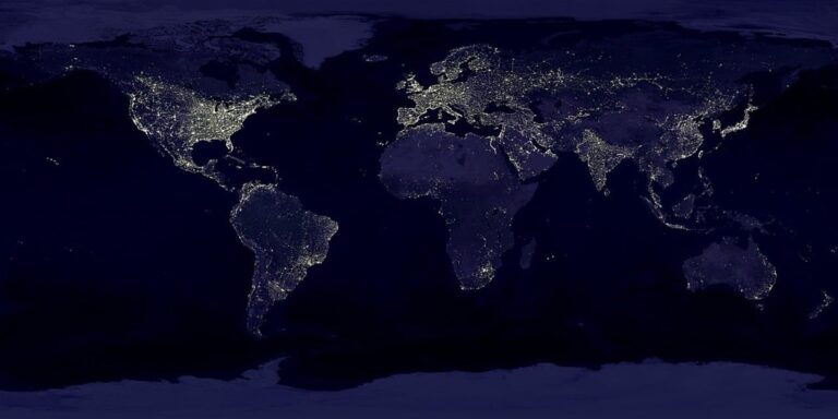
7 Thematic Map Types That Unlock Spatial Data Secrets
Why it matters: Data visualization can make or break your message — and thematic maps are your secret weapon for turning complex information into compelling stories that actually stick with your audience.
The big picture: Whether you’re presenting quarterly sales figures to executives or explaining demographic trends to stakeholders you need the right map type to match your data and goals.
What’s ahead: We’ll break down seven essential thematic mapping techniques that’ll transform how you communicate spatial data — from simple choropleth maps that show patterns at a glance to advanced cartograms that reshape geography itself.
Disclosure: As an Amazon Associate, this site earns from qualifying purchases. Thank you!
P.S. check out Udemy’s GIS, Mapping & Remote Sensing courses on sale here…
Choropleth Maps: Visualizing Data Density and Distribution
Choropleth maps represent one of cartography’s most powerful tools for displaying statistical data across geographic regions. You’ll find these color-coded visualizations essential for communicating patterns in population density, economic indicators, and social phenomena where boundaries matter more than precise locations.
Understanding Color-Coded Regional Data
Color-coded regional mapping transforms raw statistics into immediate visual understanding through systematic shading patterns. You assign different colors or shades to administrative boundaries like counties, states, or census tracts based on data values. This technique works best when your data represents rates, percentages, or normalized values rather than raw counts. For example, population density per square mile provides more meaningful comparisons than total population when comparing regions of different sizes.
Best Practices for Color Selection and Classification
Sequential color schemes work best for continuous data like income levels, using light-to-dark progressions within a single hue family. You should avoid rainbow color schemes that create false hierarchies in your data visualization. Choose 5-7 classification breaks using methods like natural breaks (Jenks) or quantiles depending on your data distribution. Test your color choices for colorblind accessibility using tools like ColorBrewer, and ensure sufficient contrast between adjacent classes for clear visual separation.
Common Applications in Demographics and Economics
Demographic choropleth mapping excels at displaying census data like age distribution, educational attainment, and household income across geographic units. You’ll commonly see these maps in economic analysis showing unemployment rates, median home values, or business density by zip code. Election mapping represents another frequent application, visualizing voting patterns and political preferences across precincts or districts. Public health organizations use choropleth techniques to map disease prevalence, vaccination rates, and health outcomes by administrative regions.
Dot Density Maps: Representing Point Data Across Geographic Areas
Dot density maps provide a powerful alternative to choropleth maps when you need to show the actual distribution of phenomena rather than administrative averages. Each dot represents a specific quantity of your data, creating an intuitive visual that reveals spatial clustering and dispersion patterns across geographic areas.
Creating Accurate Population and Resource Visualizations
Calculate dot values based on your data density and map scale to ensure readable visualization. You’ll typically assign each dot a value between 100-10,000 units depending on your dataset size. Population mapping works well with dots representing 1,000 people, while agricultural data might use dots for 500 head of livestock. Place dots randomly within geographic boundaries to avoid artificial clustering, using GIS software like ArcGIS or QGIS for automated dot placement algorithms.
Balancing Dot Size and Spacing for Clarity
Design dot specifications that prevent visual overcrowding while maintaining data accuracy. Keep individual dots between 1-3 points in size for optimal readability across different viewing scales. Maintain consistent dot sizing throughout your map to preserve proportional relationships. You’ll need to adjust dot values rather than sizes when dealing with varying data densities. Test your dot spacing at intended publication sizes to ensure dots don’t merge visually in high-density areas.
Effective Use Cases for Statistical Representation
Apply dot density mapping for phenomena that occur at specific locations rather than uniform distributions. Population demographics, crime incidents, and business locations work exceptionally well with this technique. You’ll find dot density maps particularly effective for showing urban-rural contrasts, resource extraction sites, and wildlife observation points. Avoid using dot density for continuous phenomena like temperature or elevation, where choropleth or isopleth maps provide better representation of gradual transitions across space.
Proportional Symbol Maps: Scaling Symbols to Show Quantitative Relationships
Proportional symbol maps excel at visualizing quantitative data through scaled geometric shapes where symbol size directly correlates to data values. This mapping technique transforms numerical data into immediate visual comparisons across geographic locations.
Designing Circles, Squares, and Custom Symbols
Circles provide the most accurate proportional representation because readers intuitively compare areas rather than diameters. Calculate circle areas using the square root of your data values to maintain proportional accuracy. Squares work well for urban data like building counts or property values, while custom symbols enhance thematic relevance—use factory icons for industrial data or demographic symbols for population statistics. Maintain consistent symbol orientation and avoid overlapping by adjusting placement or using transparency effects.
Maintaining Visual Hierarchy and Readability
Establish clear size ranges by setting minimum and maximum symbol sizes that remain readable at your target scale. Use a 1:10 ratio between smallest and largest symbols to prevent visual confusion. Apply consistent color schemes with darker tones for larger values and lighter shades for smaller quantities. Position symbols strategically to avoid overlap while maintaining geographic accuracy. Include size legends with actual data values rather than relative comparisons to ensure proper interpretation.
Industries That Benefit from Proportional Symbol Mapping
Business analysts use proportional symbols to visualize sales performance, market penetration, and customer distribution across territories. Public health professionals map disease outbreaks, hospital capacity, and vaccination rates using scaled symbols for immediate impact assessment. Urban planners employ this technique for population density, traffic volume, and infrastructure capacity visualization. Energy companies map production facilities, consumption patterns, and resource distribution using proportional symbols that convey operational scale and geographic relationships effectively.
Isopleth Maps: Connecting Points of Equal Value
Isopleth maps use contour lines to connect points with identical values, creating smooth visual representations of continuous phenomena across geographic space. You’ll find these maps essential for displaying gradual changes in elevation, temperature, precipitation, and other measurable variables.
Understanding Contour Lines and Gradient Zones
Contour lines represent areas of equal value, similar to elevation lines on topographic maps. You create these by interpolating between known data points to establish continuous surfaces. The spacing between lines indicates gradient steepness—closer lines show rapid change while wider spacing reveals gradual transitions. Your color fills between contours enhance pattern recognition and highlight distinct zones of similar values.
Learn essential map reading and navigation skills with this U.S. Army guide. Designed for practical use, it provides clear instructions for navigating any terrain.

Applications in Weather, Elevation, and Environmental Data
Weather mapping relies heavily on isopleth techniques for temperature isotherms, precipitation isobars, and pressure systems. You’ll use elevation contours for terrain analysis, watershed delineation, and visibility studies. Environmental applications include pollution concentration mapping, soil pH distributions, and groundwater level monitoring. These maps excel when you need to show continuous phenomena that vary smoothly across landscapes rather than discrete boundary changes.
Creating Smooth Transitions Between Data Points
Interpolation algorithms generate the continuous surfaces between your measured data points. You’ll typically use kriging, inverse distance weighting, or spline methods depending on data density and spatial correlation. Consider your contour interval carefully—too many lines create visual clutter while too few obscure important variations. Test different classification methods and color ramps to ensure your gradient zones communicate the intended data relationships effectively.
Flow Maps: Illustrating Movement and Directional Patterns
Flow maps reveal the dynamic relationships between locations through directional visualization of movement patterns. You’ll create compelling narratives about connectivity and spatial relationships using arrows, lines, and graduated symbols to represent flows of people, goods, or information across geographic space.
Visualizing Migration, Trade, and Transportation Routes
Migration patterns become immediately apparent when you map population movements with flow lines connecting origin and destination points. Trade route visualization shows economic relationships between regions through weighted connections that reflect transaction volumes. Transportation networks display passenger flows, cargo movements, and service frequencies across airline routes, shipping lanes, and highway corridors, helping you identify critical infrastructure bottlenecks.
Arrow Design and Line Weight Considerations
Line thickness should correspond directly to flow volume, with your heaviest lines representing maximum values and maintaining consistent proportional scaling throughout. Arrow heads need sufficient size to remain visible at your intended viewing scale while avoiding visual clutter through overlapping symbols. Color coding enhances directional clarity—warm colors for outbound flows and cool colors for inbound movements create intuitive visual separation.
Combining Flow Data with Geographic Context
Topographic features influence flow patterns, so you’ll overlay movement data onto terrain maps to reveal how mountains, rivers, and urban areas channel or redirect flows. Base map selection determines readability—simplified coastlines and minimal labeling prevent visual competition with your flow symbols. Interactive elements like hover tooltips provide detailed flow statistics without cluttering the primary visualization, letting users explore specific connections while maintaining overall pattern recognition.
Heat Maps: Highlighting Intensity and Concentration Areas
Heat maps transform dense numerical data into intuitive visual representations that immediately reveal spatial patterns and concentration areas. You’ll create compelling visualizations that communicate data intensity through strategic color application and geographic context.
Using Color Gradients to Show Data Hotspots
Sequential color schemes from light to dark effectively communicate increasing data values across your mapped area. You’ll achieve optimal results using single-hue progressions like white-to-red or yellow-to-blue that maintain perceptual uniformity. Diverging palettes work best when displaying data with meaningful central values, such as temperature variations or population change rates. Apply consistent classification methods like natural breaks or quantiles to ensure accurate representation, and test your gradient choices against colorblind accessibility standards for maximum audience reach.
Digital Mapping Tools and Software Options
QGIS provides robust heat mapping capabilities through its heatmap renderer and kernel density estimation tools, offering professional-grade analysis at no cost. ArcGIS Pro delivers advanced spatial interpolation methods including kriging and inverse distance weighting for precise heat map generation. Google Earth Engine excels at processing large environmental datasets for climate and satellite-based heat mapping applications. Leaflet.js and Mapbox enable interactive web-based heat maps with real-time data integration, while specialized tools like Heatmapper streamline the creation process for users requiring quick visualization solutions.
Real-World Applications in Business and Urban Planning
Retail location analysis uses customer density heat maps to identify optimal store placement and service area coverage, maximizing market penetration strategies. Urban planners apply heat mapping to visualize traffic congestion patterns, emergency service response times, and population density distributions for infrastructure development decisions. Public health officials leverage disease outbreak mapping and healthcare facility accessibility analysis to improve community health outcomes. Marketing teams create customer engagement heat maps combining demographic data with purchasing behavior to optimize advertising placement and campaign targeting across geographic markets.
Cartogram Maps: Distorting Geography to Emphasize Data Values
Cartogram maps deliberately reshape geographic boundaries to reflect data values rather than actual geographic area. You’ll find these powerful visualizations transform familiar geographic shapes into data-driven representations that prioritize statistical significance over spatial accuracy.
Types of Cartograms and Their Visual Impact
Area cartograms resize geographic regions proportionally to data values, creating dramatically distorted but recognizable shapes. You can implement continuous cartograms that maintain topological relationships between regions, or use non-contiguous versions that separate boundaries for clarity. Linear cartograms work best for route-based data like subway systems, where you’ll stretch or compress distances to reflect travel time or frequency. Distance cartograms excel at showing accessibility patterns, transforming maps based on travel time rather than physical distance, making remote areas appear larger when they’re harder to reach.
When to Choose Cartograms Over Traditional Maps
Choose cartograms when geographic area misleads your audience about data importance. You’ll find them essential for election results where small urban areas hold more voting power than large rural regions. Population-based cartograms work perfectly for demographic data, economic indicators, or public health statistics where per-capita values matter more than land area. Avoid cartograms for location-dependent data like natural disasters, weather patterns, or transportation networks where spatial accuracy remains critical. They’re also inappropriate when your audience needs to identify specific geographic locations or when distortion would confuse rather than clarify your message.
Balancing Accuracy with Communication Goals
Maintain recognizability while emphasizing data patterns by preserving distinctive geographic features your audience expects to see. You’ll achieve better results using gradual distortion algorithms that minimize visual shock while maximizing data communication. Test your cartograms with target audiences to ensure they understand the distortion concept and can still identify key regions. Consider hybrid approaches that combine traditional base maps with cartogram overlays, allowing viewers to toggle between geographic accuracy and data emphasis. Always include clear legends explaining the distortion method and provide reference points to help viewers interpret the transformed geography correctly.
Conclusion
Mastering these seven thematic mapping techniques will transform how you present spatial data to your audience. Each map type serves a unique purpose and choosing the right one depends on your data characteristics and communication objectives.
You’ll find that combining different techniques often yields the most compelling results. Don’t hesitate to experiment with various approaches until you discover what resonates best with your specific audience and dataset.
Remember that effective map design goes beyond just selecting the right type. Your color choices accessibility considerations and legend clarity will ultimately determine whether your message reaches its intended impact. Start implementing these techniques today and watch your data storytelling capabilities reach new heights.
Frequently Asked Questions
What are thematic maps and why are they important?
Thematic maps are specialized visualizations that display specific data themes across geographic regions, such as population density, economic indicators, or environmental conditions. They transform complex statistical information into easily understandable visual patterns, making it possible to identify trends, relationships, and spatial distributions that would be difficult to recognize in raw data tables.
How do choropleth maps work?
Choropleth maps display statistical data by using different colors or shades to represent values across geographic boundaries like states, counties, or districts. Each region is colored according to predetermined data ranges, creating an immediate visual understanding of how values vary across space. They’re particularly effective for showing demographic trends, election results, and economic indicators.
What’s the difference between dot density maps and choropleth maps?
While choropleth maps show averages across administrative boundaries, dot density maps reveal the actual distribution of phenomena using individual dots. Each dot represents a specific quantity of data, showing where concentrations actually occur rather than regional averages. This makes dot density maps better for displaying population distributions, crime incidents, or business locations.
When should I use proportional symbol maps?
Proportional symbol maps are ideal when you need to show quantitative data at specific locations where the exact value matters more than regional patterns. They work best for displaying business revenues, population sizes of cities, or facility capacities. The symbol size directly corresponds to the data value, making comparisons between locations immediately apparent.
What are isopleth maps best used for?
Isopleth maps excel at displaying continuous phenomena that change gradually across space, such as temperature, elevation, rainfall, or pollution levels. They use contour lines to connect points of equal value, creating smooth transitions that show how variables increase or decrease across landscapes. They’re essential for weather mapping and environmental analysis.
How do flow maps help visualize movement patterns?
Flow maps use arrows and lines of varying thickness to show movement between locations, such as migration patterns, trade routes, or transportation flows. Line thickness corresponds to volume, while colors can represent different types of flows. They’re particularly valuable for understanding supply chains, commuter patterns, and communication networks.
What makes heat maps effective for data visualization?
Heat maps use color intensity to show data concentration and patterns across geographic areas. They excel at revealing hotspots and clusters in dense datasets, making them perfect for analyzing customer locations, crime patterns, or website traffic by region. The intuitive color progression from cool to warm colors makes patterns immediately recognizable.
When should I consider using cartogram maps?
Cartogram maps are useful when you want to emphasize data values over geographic accuracy by distorting area sizes to reflect the data being displayed. They’re effective for showing economic data, population statistics, or any situation where the actual values are more important than maintaining true geographic proportions for better visual impact.