7 Best Digital Map Design Tips
The big picture: Your online maps can make or break user engagement — whether you’re showcasing business locations or visualizing complex data sets.
Why it matters: Poorly designed digital maps confuse visitors and drive them away from your site while well-crafted maps boost user experience and keep people exploring your content longer.
What’s ahead: We’ll walk you through seven proven strategies that transform cluttered confusing maps into clean intuitive navigation tools that users actually want to interact with.
Disclosure: As an Amazon Associate, this site earns from qualifying purchases. Thank you!
P.S. check out Udemy’s GIS, Mapping & Remote Sensing courses on sale here…
Choose the Right Color Palette for Maximum Visual Impact
Strategic color selection transforms your digital map from a confusing data dump into an intuitive navigation tool. Professional cartographers rely on systematic color theory to ensure data clarity and user comprehension across all devices and viewing conditions.
Explore and map the wilderness for the Queen in Cartographers! Draw unique terrain shapes and score points based on randomly selected goals each game, but beware of monster ambushes.

Use Contrasting Colors for Data Differentiation
High contrast ratios separate overlapping datasets without visual confusion. Choose colors with at least 3:1 contrast ratios between adjacent map elements – blues against oranges or reds against greens work exceptionally well. Avoid similar hues like light blue and teal which blend together on mobile screens. Test your color combinations using WebAIM’s contrast checker to verify readability standards before publishing your interactive map design.
Apply Color Psychology to Guide User Interpretation
Warm colors like reds and oranges naturally draw attention to high-priority locations or urgent data points. Cool blues and greens suggest calm areas or lower values in heat maps. Green universally represents positive metrics while red indicates warnings or negative data. Leverage these psychological associations – users instinctively understand red zones as problematic areas and blue regions as water bodies without consulting your legend.
Ensure Accessibility with Colorblind-Friendly Schemes
ColorBrewer palettes provide scientifically-tested color combinations that work for all vision types. Approximately 8% of men experience color vision deficiency, making deuteranopia-safe palettes essential for professional mapping. Use patterns, textures, or symbols alongside color coding to convey critical information. Tools like Coblis simulator let you preview your map through different colorblind perspectives before final deployment.
Simplify Your Legend and Labeling System
Cluttered legends and inconsistent labeling destroy map readability faster than any other design element. Your symbol definitions and text hierarchy must work together to guide users through complex spatial information without overwhelming them.
Create Clear and Concise Symbol Definitions
Design symbols that communicate meaning instantly without requiring detailed explanations. Use universally recognized icons like triangles for mountains or squares for buildings rather than abstract shapes that confuse users. Keep symbol descriptions to three words maximum and group similar elements together. Test your legend with fresh eyes – if someone can’t understand a symbol within two seconds, redesign it for better clarity.
Position Legends for Easy Reference
Place your legend in the lower-right corner where users naturally expect to find reference information. Avoid positioning legends over important map features or in areas where they’ll obstruct critical data visualization. Keep legends close enough to the map content for quick reference but separate enough to maintain visual hierarchy. Consider floating legends for interactive maps that move with user navigation to ensure constant accessibility.
Use Hierarchical Text Sizing for Information Priority
Structure your text labels using three distinct font sizes to establish clear information hierarchy. Use your largest font (14-16pt) for primary features like city names or major landmarks. Apply medium sizing (10-12pt) for secondary information such as street names or regional boundaries. Reserve the smallest text (8-9pt) for supplementary details like elevation markers or coordinate references. This systematic approach guides user attention naturally through your map’s most important information first.
Optimize Interactive Elements for User Engagement
Smooth interactive features transform static maps into dynamic exploration tools that keep users engaged with your geographic data.
Implement Smooth Zoom and Pan Functionality
Smooth zoom transitions create professional-grade map experiences that encourage deeper exploration. You’ll want to implement progressive zoom levels with consistent scaling ratios, typically using powers of two (2x, 4x, 8x) for optimal performance. Modern JavaScript libraries like Leaflet and Mapbox GL JS provide built-in smooth transitions that prevent jarring jumps between zoom levels. Test your zoom functionality across different devices to ensure consistent 60fps performance, as choppy animations immediately signal poor map quality to users.
Add Hover Effects for Additional Data Layers
Hover interactions reveal supplementary information without cluttering your base map design. You should implement subtle visual feedback like color changes or border highlights when users mouse over interactive elements. Consider displaying tooltips with key data points, coordinates, or feature names that appear within 200-300 milliseconds of hover activation. Keep hover content concise—limit text to 2-3 lines maximum and use consistent positioning to avoid screen edge conflicts. This approach maintains clean map aesthetics while providing on-demand detail access.
Include Click-Through Actions for Detailed Information
Click interactions should provide comprehensive data access through modal windows, side panels, or dedicated detail pages. You’ll achieve better user engagement by implementing multi-level information architecture—basic details on first click, expanded data on secondary actions. Consider adding external link capabilities to connect map features with related databases, websites, or documentation. Ensure click targets meet accessibility standards with minimum 44px touch areas for mobile users, and provide clear visual confirmation of successful interactions through highlighting or animation effects.
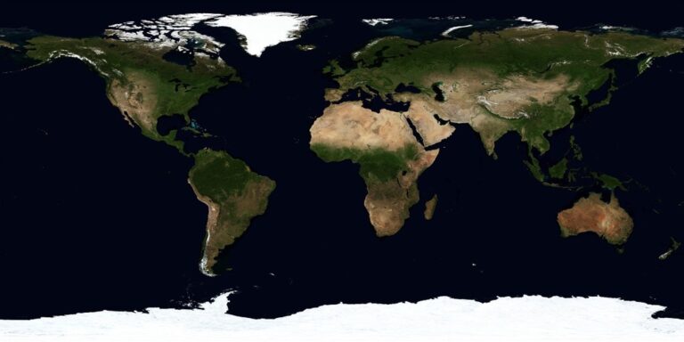
Select Appropriate Map Projections for Your Data
Map projection selection determines how accurately your geographic data translates to screen displays. The wrong projection can distort spatial relationships and mislead users about actual distances, areas, or directions.
Match Projection Type to Geographic Scope
Global datasets require different projections than regional studies. Web Mercator (EPSG:3857) works well for worldwide interactive maps but severely distorts polar regions. Use Robinson or Natural Earth projections for global static maps that need balanced distortion across all continents.
Regional mapping benefits from localized coordinate systems. UTM zones provide excellent accuracy for areas spanning less than 6 degrees longitude. State Plane coordinates offer precise measurements for US state-level projects. Always check your data’s native projection before reprojecting to avoid unnecessary coordinate transformations.
Consider Distortion Effects on Data Accuracy
Area measurements become unreliable when using conformal projections like Mercator for choropleth maps. Greenland appears larger than Africa in Web Mercator, despite being 14 times smaller. Switch to equal-area projections like Albers or Lambert Azimuthal for accurate area comparisons.
Distance calculations require careful projection selection based on your analysis needs. Equidistant projections preserve distances from one or two points but distort elsewhere. Use appropriate local projections for buffer analysis or nearest-neighbor calculations to maintain measurement accuracy.
Balance Visual Appeal with Technical Precision
Aesthetic considerations shouldn’t override data integrity, but visual harmony improves user comprehension. Natural Earth projection offers a pleasing curved appearance for world maps while maintaining reasonable distortion levels. Avoid overly artistic projections that sacrifice spatial accuracy for visual novelty.
Get durable, tear-resistant posters made in the USA. Each 18" x 29" poster features high-quality 3 MIL lamination for lasting protection.

User familiarity influences map effectiveness. Web Mercator’s widespread use in Google Maps and similar platforms makes it instantly recognizable to users. However, include projection information in technical maps and consider alternative views for specialized applications requiring precise measurements.
Incorporate Responsive Design for Multi-Device Access
Modern mapping applications must seamlessly adapt to different screen sizes and device capabilities to maintain user engagement across all platforms.
Adapt Layout for Mobile and Tablet Viewing
Prioritize essential map elements by implementing a mobile-first design approach that scales up for larger screens. Use flexible grid systems that automatically reposition legends and control panels based on available screen real estate. Stack navigation elements vertically on mobile devices while maintaining horizontal layouts on desktop displays. Test your map layouts on actual devices rather than browser emulators to identify touch target sizing issues and viewport-specific rendering problems.
Ensure Touch-Friendly Interactive Controls
Design interactive elements with minimum 44-pixel touch targets to accommodate finger-based navigation on mobile devices. Implement gesture-based controls like pinch-to-zoom and two-finger pan for intuitive mobile map exploration. Replace hover-dependent features with tap-based interactions that work consistently across touch and non-touch devices. Position control buttons with adequate spacing between elements to prevent accidental activation during map manipulation activities.
Optimize Loading Times Across Different Platforms
Implement progressive tile loading to display base map layers first while detailed overlays load in the background. Use WebP image formats for modern browsers and PNG fallbacks for older systems to balance image quality with file size. Compress vector data using simplification algorithms that maintain geographic accuracy while reducing bandwidth requirements. Cache frequently accessed map tiles locally to minimize server requests and improve performance on slower mobile network connections.
Layer Information Strategically for Clear Communication
Effective layer management transforms complex geographic data into comprehensible visual narratives. Strategic information layering prevents cognitive overload while maintaining data integrity across your digital mapping interface.
Prioritize Essential Data in Primary Layers
Display your most critical geographic features in the base layer to establish spatial context immediately. Place primary roads, major landmarks, and administrative boundaries in this foundational layer since users need these reference points for orientation. Secondary data like demographic statistics or environmental measurements should occupy separate layers that you can toggle independently. This hierarchy ensures users grasp essential spatial relationships before diving into specialized datasets.
Achieve a flawless, even complexion with e.l.f. Flawless Satin Foundation. This lightweight, vegan formula provides medium coverage and a semi-matte finish for all-day wear, while hydrating your skin with glycerin.

Use Progressive Disclosure for Complex Datasets
Implement zoom-dependent layer visibility to reveal information gradually as users explore deeper detail levels. Configure your mapping platform to show county-level data at state views, then display census tract information when users zoom to city scales. Tools like ArcGIS Online and QGIS Cloud support scale-dependent rendering that automatically adjusts layer visibility based on zoom thresholds. This progressive approach prevents information overload while maintaining access to comprehensive datasets.
Balance Information Density with Visual Clarity
Limit simultaneous visible layers to three or four maximum to maintain visual comprehension and processing speed. Use transparency settings between 60-80% for overlapping layers to preserve underlying geographic context while highlighting new information. Apply consistent symbol sizing across datasets—keep point symbols between 4-8 pixels for optimal visibility without overwhelming base map features. Test your layer combinations on different devices to ensure readability remains consistent across desktop and mobile platforms.
Test and Iterate Based on User Feedback
User feedback transforms theoretical map design into practical navigation tools. Your mapping project’s success depends on real-world testing and continuous refinement based on actual user experiences.
Conduct Usability Testing with Target Audiences
Run formal usability sessions with 8-12 participants from your target demographic. Set up controlled testing environments where users complete specific map-based tasks like finding locations or interpreting data layers. Record session videos using tools like UserTesting or Maze to capture navigation patterns, confusion points, and completion times. Test different user groups separately—business professionals need different map functionality than outdoor enthusiasts or emergency responders.
Analyze User Interaction Patterns and Behavior
Track user behavior through heat mapping tools like Hotjar or Crazy Egg to identify which map areas receive the most attention. Monitor click-through rates on interactive elements, zoom level preferences, and time spent exploring different map layers. Analyze bounce rates from specific map sections and identify common exit points that indicate user frustration. Export interaction data monthly to identify trends in user engagement patterns across different devices and geographic regions.
Implement Continuous Improvements Based on Data
Deploy iterative updates every 4-6 weeks based on collected user feedback and behavioral analytics. Prioritize changes that address the most common user pain points, such as improving legend clarity or adjusting zoom thresholds. A/B test major design modifications with 50% user splits to measure improvement effectiveness before full deployment. Document all changes in a version control system and maintain feedback loops with your user community through surveys and beta testing programs.
Conclusion
Effective online map design isn’t just about visual appeal—it’s about creating functional tools that serve your users’ needs. By implementing these seven strategies you’ll transform cluttered confusing maps into intuitive navigation experiences that keep visitors engaged.
Remember that great map design is an ongoing process. Your users’ feedback will guide you toward improvements that make real differences in how people interact with your geographic data.
Start with one or two of these techniques and build from there. Whether you’re focusing on color optimization or responsive design each improvement brings you closer to maps that truly work for your audience. Your commitment to user-centered design will set your mapping projects apart in today’s competitive digital landscape.
Frequently Asked Questions
What makes an online map user-friendly?
User-friendly maps feature intuitive navigation, strategic color choices, simplified legends, clear labeling, and smooth interactive elements. They prioritize essential information, use contrasting colors for better comprehension, and implement responsive design for all devices. Well-designed maps guide users naturally through the data without overwhelming them with cluttered visuals.
How do I choose the right color palette for my map?
Select contrasting colors to differentiate data effectively and apply color psychology principles to guide user interpretation. Ensure accessibility by using colorblind-friendly schemes and test your color combinations with specialized tools. Strategic color selection clarifies data presentation and improves overall user comprehension of geographic information.
Where should I position the legend on my map?
Position legends in the lower-right corner for easy reference without obstructing important map features. Use clear, concise symbol definitions with universally recognized icons that users can understand instantly. Keep legends simple and uncluttered to maintain map readability and enhance user experience.
What interactive elements improve map engagement?
Implement smooth zoom and pan functionality using modern JavaScript libraries like Leaflet or Mapbox GL JS. Add hover effects with concise tooltips to reveal additional data layers, and create click-through actions for detailed information. These elements transform static maps into dynamic exploration tools that keep users engaged.
How do I optimize maps for mobile devices?
Adopt a mobile-first approach by prioritizing essential map elements and adapting layouts for different screen sizes. Ensure touch-friendly interactive controls with adequate sizing for finger navigation. Optimize loading times through progressive tile loading, efficient image formats, and local caching for better performance on mobile networks.
What is layer management in digital mapping?
Layer management involves strategic organization of map information to prevent cognitive overload. Prioritize essential data in primary layers while using secondary layers for additional details. Implement zoom-dependent layer visibility and limit visible layers using transparency settings to maintain visual clarity and user comprehension.
How do I test and improve my map design?
Conduct usability testing with target audiences to gather insights on navigation patterns and user experiences. Analyze user interaction patterns through heat mapping tools to identify areas of interest and frustration points. Implement continuous improvements based on collected data to address common user pain points.
Which map projection should I use?
Choose projections based on your geographic scope and purpose. Use Web Mercator for worldwide interactive maps, Robinson or Natural Earth projections for static global maps, equal-area projections for accurate area comparisons, and local projections for precise distance calculations. Balance visual appeal with technical precision requirements.