7 Best Map Infographic Ideas for Visual Storytelling
Maps tell stories better than almost any other visual medium. You can transform complex data into compelling narratives that grab attention and stick in memory when you combine geographic context with smart infographic design.
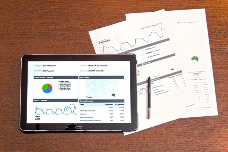
Custom map infographics aren’t just pretty picturesâthey’re powerful tools that help you communicate everything from business expansion plans to environmental changes. Whether you’re tracking election results or showing customer demographics, the right map visualization can turn boring statistics into engaging stories that your audience actually wants to explore.
The key lies in choosing the right approach for your specific message and data set.
Disclosure: As an Amazon Associate, this site earns from qualifying purchases. Thank you!
P.S. check out Udemy’s GIS, Mapping & Remote Sensing courses on sale here…
Interactive Population Density Maps That Reveal Hidden Demographic Patterns
You’ll discover powerful visualization techniques that transform census data into compelling narratives about human settlement patterns. These interactive density maps expose demographic trends that static visualizations often miss entirely.
Dynamic Color Coding for Population Clusters
Configure your color schemes to highlight density variations across metropolitan areas effectively. Use sequential color palettes ranging from light yellows for sparse populations to deep reds for high-density zones. Tools like QGIS and ArcGIS Pro offer built-in Jenks natural breaks classification that automatically identifies optimal break points in your population data. You’ll want to test different color ramps including ColorBrewer’s sequential schemes to ensure accessibility for colorblind users while maintaining visual impact.
Animated Time-Lapse Population Growth Visualization
Create temporal animations that showcase demographic shifts over decades using census data from 1970 to present. Export your maps as sequential PNG files at 2-second intervals to build smooth transitions between census years. Mapbox Studio and D3.js provide excellent frameworks for web-based animations that allow viewers to control playback speed. You’ll need to normalize your data across different census methodologies to maintain consistent visual scaling throughout your time-lapse sequence.
Layered Data Integration with Census Information
Combine multiple demographic datasets including age distribution income levels and educational attainment within single interactive displays. Use PostGIS to join American Community Survey tables with TIGER/Line boundary files for precise geographic alignment. Your layer controls should allow users to toggle between population density household income and employment data seamlessly. Implement opacity sliders for each layer so viewers can blend datasets to identify correlations between demographic variables across different geographic scales.
Journey Maps That Chronicle Historical Migration Routes
Historical migration stories become compelling when you trace the actual paths people traveled across continents and centuries. Journey maps transform abstract demographic data into human narratives that audiences can follow geographically.
Storytelling Through Pathway Visualization
Pathway visualization transforms migration data into compelling visual narratives by mapping specific routes taken by different groups throughout history. You’ll create the strongest impact by using vector paths with varying line weights to represent migration volume – thicker lines for major movements like the Great Migration or Irish diaspora, thinner ones for smaller group movements. Design curved pathways rather than straight lines to reflect actual travel routes around geographic barriers. Color-code different migration waves chronologically, using warmer colors for earlier periods and cooler tones for recent movements.
Timeline Integration with Major Historical Events
Timeline integration connects migration patterns directly to the historical forces that triggered population movements across your mapped regions. You’ll achieve maximum storytelling impact by synchronizing migration flow animations with historical event markers – displaying push factors like famines, wars, or persecution alongside corresponding population movements. Create timeline scrubbers that allow users to explore specific decades, watching how events like the Irish Potato Famine or California Gold Rush immediately influenced migration patterns. Position event callouts strategically along migration corridors to show cause-and-effect relationships between historical moments and population displacement.
Cultural Impact Markers Along Migration Corridors
Cultural impact markers reveal how migrating populations transformed the communities they encountered throughout their journeys and destinations. You’ll create deeper engagement by placing interactive icons along migration routes that showcase cultural exchanges – highlighting where Irish immigrants established communities in Boston, or how Chinese railway workers influenced Western towns. Design pop-up information panels showing before-and-after demographic changes, architectural influences, and cultural traditions that migrants brought to new regions. Use symbol libraries representing different cultural elements like cuisine, architecture, or religious practices to show lasting impacts these migration waves created.
Climate Change Impact Maps That Show Environmental Transformation
Climate change visualization maps transform complex environmental data into compelling visual narratives that reveal planetary transformation patterns. These maps communicate urgency through geographic context while making scientific projections accessible to diverse audiences.
Before and After Comparison Visualizations
Before and after visualizations showcase environmental transformation through split-screen map layouts that highlight specific change areas. You’ll capture dramatic landscape shifts by selecting identical geographic extents and matching projection parameters between time periods. Use satellite imagery basemaps for glacier retreat documentation, forest loss tracking, and urban heat island development. Position comparison points strategically to emphasize the most significant changes, incorporating swipe tools for interactive exploration that lets viewers control the temporal transition.
Temperature Change Heat Maps Over Time
Temperature change heat maps reveal warming patterns through graduated color schemes that display anomaly data across geographic regions. You’ll implement sequential color palettes ranging from cool blues for temperature decreases to warm reds for increases, ensuring colorblind accessibility through proper contrast ratios. Animate temperature progression using annual or decadal intervals, incorporating data smoothing techniques to reduce noise while preserving significant trends. Layer temperature contours over topographic basemaps to show elevation correlations with warming patterns.
Sea Level Rise Projections with Coastal Impact Data
Sea level rise projections combine elevation models with inundation scenarios to visualize future coastal vulnerability across different warming scenarios. You’ll integrate LiDAR-derived digital elevation models with IPCC projection data, creating layered visualizations that show 1-meter, 2-meter, and 3-meter rise scenarios. Use transparency effects to overlay flood zones onto current infrastructure, highlighting affected populations, transportation networks, and economic centers. Include uncertainty bands around projections to communicate scientific confidence levels while maintaining visual clarity.
Economic Data Maps That Transform Complex Statistics Into Visual Stories
Economic data maps convert abstract financial statistics into compelling geographic narratives that reveal patterns invisible in traditional charts. These visualizations help audiences understand complex economic relationships through spatial context.
GDP Growth Visualization by Geographic Region
GDP growth maps effectively display economic performance variations across territories using graduated color schemes and proportional symbols. You’ll want to employ choropleth mapping techniques with sequential color palettes ranging from light to dark hues to represent growth percentages. Consider using diverging color schemes when displaying both positive and negative growth rates, with neutral tones at zero growth. Animated time series maps reveal economic cycles and regional development patterns over multiple years, while bivariate mapping combines GDP data with population density for deeper insights.
Trade Route Mapping with Volume Indicators
Trade route visualizations transform shipping data into dynamic flow maps using proportional line weights and directional arrows. You can represent trade volumes through varying line thickness, with major shipping lanes appearing as bold corridors and smaller routes as thin connections. Color-coding different commodity types creates layered narratives about global commerce patterns. Sankey diagrams integrated with geographic routes show trade relationships between specific countries, while animated flows demonstrate seasonal trading patterns and economic disruptions affecting global supply chains.
Industry Concentration Heat Maps
Industry concentration maps reveal economic clusters through density-based visualization techniques that highlight manufacturing hubs and service centers. You’ll achieve optimal results using kernel density estimation to smooth point data into continuous surfaces representing employment concentrations. Multi-layer mapping allows comparison between different industries on the same geographic area, using transparency effects to show overlapping economic activities. Symbol scaling based on employment numbers or revenue data creates proportional representations, while temporal comparisons track industrial shifts and economic diversification trends across regions.
Travel and Adventure Maps That Inspire Wanderlust
You’ll find that travel-focused infographics create emotional connections that transform geographic data into compelling personal narratives. These custom map visualizations turn wanderlust into actionable travel inspiration through strategic storytelling techniques.
Personal Journey Documentation with Photo Integration
You can transform your travel experiences into compelling visual narratives by overlaying geotagged photographs onto custom route maps. Link GPS coordinates from your photo metadata to create interactive journey timelines that showcase destinations chronologically. Combine elevation profiles with photo markers to illustrate terrain challenges alongside memorable moments. Use photo clustering techniques to highlight extended stays and significant locations throughout your documented adventures.
Bucket List Destination Mapping
You’ll create aspirational travel content by mapping dream destinations with ranked priority systems and feasibility indicators. Color-code locations based on travel seasons, budget requirements, and accessibility levels to provide practical planning context. Integrate distance calculations and travel time estimates between clustered destinations to optimize multi-stop itineraries. Add visual markers for unique experiences like aurora viewing zones, wildlife migration patterns, or cultural festivals tied to specific geographic locations.
Adventure Activity Hotspot Visualization
You can map adventure activities using density-based clustering to reveal geographic concentrations of specific sports and outdoor pursuits. Layer topographic data with activity markers to show terrain relationships for hiking, climbing, and water sports locations. Create seasonal activity overlays that indicate optimal timing for different adventures based on weather patterns and natural conditions. Use graduated symbols to represent difficulty levels and skill requirements across various adventure hotspots.
Real Estate Market Maps That Decode Property Trends
Property market data becomes compelling when you transform spreadsheets into geographic narratives that reveal hidden patterns across neighborhoods and time periods.
Price Appreciation Visualization Over Time
Create animated choropleth maps showing property value changes across multiple years using sequential color palettes. You’ll want to normalize your data by percentage change rather than absolute values to avoid skewing results toward expensive neighborhoods. Use quarterly intervals for smoother transitions and overlay median home price annotations at the census tract level. This approach reveals gentrification patterns and market cycles that traditional bar charts can’t capture effectively.
Neighborhood Desirability Scoring Systems
Develop composite scoring visualizations that weight multiple factors like school ratings, crime statistics, and walkability scores into single neighborhood rankings. You can use graduated symbols or heat map overlays to display these weighted scores across zip codes or census blocks. Include interactive filtering capabilities that let users adjust scoring weights based on their priorities. This technique transforms complex multi-variable analysis into intuitive geographic comparisons for home buyers.
Investment Opportunity Heat Maps
Generate density-based visualizations showing rental yield potential and appreciation forecasts using clustering algorithms on your property data. You’ll achieve best results by combining cash flow projections with neighborhood growth indicators like new business permits and infrastructure investments. Use diverging color schemes to highlight both high-opportunity and high-risk areas simultaneously. Layer zoning data and future development plans to provide context for long-term investment strategies.
Cultural Heritage Maps That Preserve Historical Narratives
Cultural heritage mapping transforms archaeological findings and ethnographic research into compelling visual narratives that preserve humanity’s collective memory. These specialized infographics bridge the gap between academic research and public understanding by making historical data geographically accessible.
Archaeological Site Documentation and Timeline
Archaeological mapping requires precise coordinate integration with temporal data layers to show site development across centuries. You’ll create chronological visualizations using stratified color schemes that represent different historical periods while maintaining spatial accuracy through GPS-verified site boundaries. Modern GIS platforms like ArcGIS Pro enable you to overlay excavation grids with artifact distribution patterns, creating interactive timelines that reveal how ancient settlements evolved. Documentation standards require metadata recording for each artifact’s provenance coordinates, ensuring your heritage maps meet archaeological field recording protocols.
Traditional Culture Distribution Mapping
Traditional culture mapping visualizes the geographic extent of indigenous practices, ceremonies, and knowledge systems across landscapes. You’ll use ethnographic boundaries defined through community consultation rather than political borders, creating culturally sensitive visualizations that respect tribal sovereignty and intellectual property rights. Density mapping techniques help illustrate practice intensity variations, while symbolic representation systems convey sacred site locations without compromising cultural protocols. Your mapping workflow should incorporate community feedback loops and follow established guidelines for indigenous data governance throughout the cartographic process.
Language and Dialect Geographic Boundaries
Linguistic boundary mapping requires sociolinguistic survey data integration with geographic information systems to visualize language distribution patterns accurately. You’ll create isogloss visualizations that show dialect transition zones using gradient color schemes rather than hard boundaries, reflecting the natural fluidity of language variation across regions. Survey methodology should incorporate speaker density data and linguistic competency levels to avoid oversimplifying complex multilingual landscapes. Your dialect maps need regular updates as language boundaries shift due to urbanization, migration patterns, and intergenerational transmission changes.
Conclusion
Custom map infographics offer you endless possibilities for transforming data into compelling visual stories. Whether you’re tracking population changes or documenting cultural heritage sites you’ll find that geographic context makes your information more engaging and memorable.
Your choice of mapping technique should align with your specific storytelling goals. Interactive elements and thoughtful color schemes will help your audience connect emotionally with the data while ensuring accessibility across different user groups.
Start experimenting with these seven approaches to discover which resonates best with your content objectives. Remember that effective map storytelling combines accurate data with intuitive design creating narratives that inform inspire and drive action.
Frequently Asked Questions
What makes maps an effective storytelling medium?
Maps transform complex data into engaging narratives by providing geographic context and combining visual design elements. They make abstract statistics more appealing and accessible to audiences, helping communicate everything from business expansion to environmental changes through compelling visual stories that people can easily understand and follow.
How do interactive population density maps reveal demographic patterns?
Interactive population density maps use dynamic color coding and sequential color palettes to highlight density variations across regions. They transform census data into compelling narratives about human settlement patterns, making demographic information more accessible while ensuring colorblind-friendly visualization through proper color selection.
What are the key features of effective journey maps for migration routes?
Effective migration maps use pathway visualization with varying line weights to represent migration volume and color-coding to show different time periods. They integrate timelines with historical events and include cultural impact markers with interactive icons to showcase how migrating populations transformed communities along their routes.
How do climate change impact maps communicate environmental data?
Climate change maps use before-and-after comparison visualizations, temperature change heat maps with graduated color schemes, and sea level rise projections combining elevation models. These techniques make scientific projections more accessible by providing geographic context that effectively communicates environmental urgency to diverse audiences.
What mapping techniques work best for economic data visualization?
Economic data maps use choropleth mapping with sequential color palettes for GDP growth, dynamic flow maps for trade routes, and density-based visualization for industry concentration heat maps. These techniques convert abstract financial statistics into geographic narratives that reveal patterns traditional charts might obscure.
How can travel maps create emotional connections with audiences?
Travel maps integrate geotagged photographs onto custom route maps, create interactive timelines of travel experiences, and use bucket list destination mapping with color-coded indicators. They transform geographic data into personal narratives that inspire wanderlust and help users document their adventures effectively.
What makes real estate market maps effective for property analysis?
Real estate maps use animated choropleth visualizations to show property value changes over time, develop composite scoring systems for neighborhood desirability, and create investment opportunity heat maps. They transform spreadsheet data into geographic narratives that reveal hidden market patterns across neighborhoods.
How do cultural heritage maps preserve historical narratives?
Cultural heritage maps integrate archaeological findings with precise coordinates and temporal data, document traditional culture distribution patterns, and map language boundaries using sociolinguistic data. They require community consultation to ensure culturally sensitive visualizations that accurately represent indigenous practices and historical contexts.