5 Best Data Visualization Tools for Environmental Awareness
You scroll through your phone daily but rarely consider how the maps you use could reshape your understanding of the planet’s environmental challenges. Modern mapping technology transforms abstract climate data into visual stories that make environmental issues impossible to ignore.
From tracking deforestation in real-time to visualizing rising sea levels in your own neighborhood these digital tools are revolutionizing how you connect with environmental realities. Interactive maps don’t just show you where problems exist — they help you understand the scale urgency and personal relevance of environmental threats.
The power of visual environmental data lies in its ability to turn overwhelming global statistics into compelling local narratives that drive meaningful action.
Disclosure: As an Amazon Associate, this site earns from qualifying purchases. Thank you!
P.S. check out Udemy’s GIS, Mapping & Remote Sensing courses on sale here…
Visualizing Climate Change Patterns Through Interactive Mapping
Interactive mapping platforms now transform complex climate datasets into compelling visual narratives that reveal environmental changes occurring across different timescales and geographic regions.
Real-Time Temperature and Weather Data Visualization
Temperature mapping tools display current thermal conditions across continents using color-coded overlays that shift from deep blues to intense reds. You’ll find platforms like Climate.gov and NOAA’s weather maps updating every few hours with satellite-derived temperature readings. Heat dome visualization becomes particularly powerful when you layer historical averages with current readings, revealing anomalies that indicate shifting climate patterns. Weather stations contribute ground-truth data that validates satellite observations, creating comprehensive thermal landscapes you can explore at multiple zoom levels.
Get real-time weather data with the Ambient Weather WS-2902. This WiFi-enabled station measures wind, temperature, humidity, rainfall, UV, and solar radiation, plus it connects to smart home devices and the Ambient Weather Network.

Sea Level Rise and Coastal Impact Mapping
Coastal vulnerability maps combine tide gauge measurements with topographic elevation data to project future shoreline positions under various sea level scenarios. You can access NOAA’s Sea Level Rise Viewer to examine potential flooding impacts for specific coastal communities through 2100. Tidal flooding frequency appears as animated sequences showing how “sunny day” flooding events increase from rare occurrences to weekly realities. Storm surge modeling adds another layer, displaying how hurricane-driven water levels compound with baseline sea level rise to threaten coastal infrastructure.
Deforestation and Land Use Change Tracking
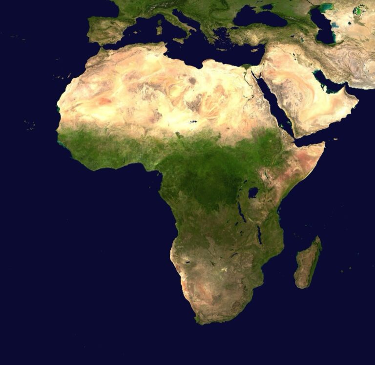
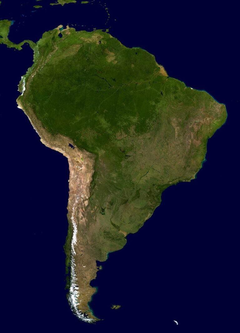
Forest cover analysis utilizes Landsat satellite imagery spanning decades to document clearing patterns across tropical and temperate regions. You’ll discover that Global Forest Watch provides annual tree cover loss data with 30-meter resolution, allowing you to zoom from continental overviews to individual logging operations. Agricultural expansion mapping reveals how crop boundaries shift into previously forested areas, while urban development patterns show infrastructure growth consuming natural habitats. Time-lapse animations compress years of gradual change into seconds, making long-term environmental transformation immediately apparent to viewers.
Tracking Pollution Sources and Environmental Hazards
Environmental hazard mapping extends beyond climate visualization to identify specific contamination sources and their geographic distribution. These specialized maps transform complex pollution data into actionable intelligence for communities and decision-makers.
Air Quality Monitoring and Pollution Hotspot Identification
Real-time air quality maps pinpoint pollution concentrations using data from EPA monitoring stations and satellite sensors. You’ll find platforms like AirNow displaying PM2.5 and ozone levels through color-coded overlays that update hourly. Industrial corridor mapping reveals pollution clusters around manufacturing zones, while traffic density overlays correlate vehicle emissions with respiratory health statistics in nearby neighborhoods.
Water Contamination Mapping and Source Tracking
Watershed contamination maps trace pollution pathways from source to downstream impact zones using hydrological modeling. You can access USGS water quality databases that track chemical concentrations, bacterial levels, and pH measurements across thousands of monitoring points. Agricultural runoff visualization connects fertilizer application timing with algae bloom locations, while industrial discharge permits overlay with water quality violations to reveal contamination patterns.
Industrial Waste and Toxic Site Location Awareness
Superfund site mapping displays EPA’s National Priorities List locations alongside demographic data to reveal environmental justice patterns. You’ll discover that proximity analysis tools measure distances between toxic facilities and schools, hospitals, or residential areas. Chemical release inventory maps combine TRI data with wind pattern modeling to show potential exposure zones, while historical contamination layers document legacy pollution sites and their cleanup progress over time.
Monitoring Wildlife Migration and Biodiversity Loss
Wildlife tracking maps reveal critical patterns in animal movements and ecosystem health that traditional observation methods can’t capture. These specialized mapping tools combine satellite telemetry, GPS collar data, and field observations to document species behavior across vast geographic areas.
Keep your dog safe with the Halo Collar 4, a GPS wireless fence and tracker. It uses dual-frequency GPS for accurate location and features customizable boundaries, activity tracking, and extended battery life.

Animal Movement Pattern Visualization
Satellite tracking systems map individual animal journeys using GPS collar data transmitted to orbiting satellites. You can visualize migration corridors through platforms like Movebank, which displays real-time movements of tagged elephants, whales, and migratory birds. These movement maps reveal seasonal patterns, breeding site locations, and corridor bottlenecks that impact species survival rates across continents.
Explore global navigation, inertial navigation, and their integration. This resource provides comprehensive insights into these complex systems.
Habitat Destruction and Fragmentation Mapping
Land-use change maps document habitat loss through comparative satellite imagery analysis spanning multiple decades. You’ll find fragmentation patterns using tools like Hansen Global Forest Change, which displays annual forest cover loss at 30-meter resolution. These maps reveal corridor breaks, edge effects, and isolated habitat patches that disrupt wildlife movement patterns and reduce population connectivity.
Endangered Species Population Tracking
Population density maps combine field survey data with habitat modeling to estimate species distributions and abundance levels. You can access endangered species tracking through platforms like eBird and iNaturalist, which crowdsource observation data from researchers and citizen scientists. These maps highlight population decline trends, breeding success rates, and critical habitat areas requiring immediate conservation intervention.
Identifying Renewable Energy Opportunities and Resources
Maps reveal where renewable energy sources concentrate naturally across landscapes. You’ll discover untapped potential through specialized energy mapping platforms that combine meteorological data with geographic analysis.
Solar and Wind Energy Potential Mapping
Solar irradiance maps display photovoltaic potential using satellite measurements and weather station data across regions. You can access the National Renewable Energy Laboratory’s (NREL) solar resource database to identify peak solar zones with annual irradiance values exceeding 5.5 kWh/m²/day. Wind resource maps combine topographic modeling with anemometer readings to pinpoint locations where average wind speeds reach 7+ meters per second at turbine height, making commercial wind development viable.
Geothermal Resource Identification
Geothermal gradient maps reveal subsurface temperature patterns through heat flow measurements and geological surveys. You’ll find the U.S. Geological Survey’s geothermal database maps temperatures at various depths, highlighting areas where geothermal gradients exceed 25°C per kilometer. Enhanced geothermal system (EGS) potential maps combine rock permeability data with heat source proximity, identifying locations where artificial fracturing could access deep thermal resources for power generation.
Hydroelectric Power Site Assessment
Hydroelectric potential maps analyze stream flow data and elevation changes to identify viable dam locations. You can examine USGS stream gauge networks that measure annual flow rates, precipitation patterns, and seasonal variations across watersheds. Micro-hydro opportunity maps highlight smaller waterways where run-of-river systems could generate 5-100 kilowatts without major infrastructure, using digital elevation models to calculate head pressure and flow combinations.
Promoting Sustainable Transportation and Urban Planning
Maps empower transportation planners and individuals to make environmentally conscious mobility decisions. These platforms visualize carbon emissions data alongside route options to optimize sustainable travel patterns.
Carbon Footprint Visualization for Travel Routes
Carbon mapping platforms display emission calculations for different transportation modes across your planned routes. Tools like Google Maps’ eco-friendly routing feature calculate fuel consumption and CO2 output based on vehicle type and traffic conditions. Route optimization algorithms identify the most efficient paths while factoring in elevation changes and real-time congestion data. Transit comparison overlays show emission differences between driving single-occupancy vehicles versus public transportation options for identical destinations.
Green Infrastructure and Sustainable Development Mapping
Urban sustainability maps reveal existing green infrastructure networks and identify expansion opportunities throughout metropolitan areas. City planning platforms visualize tree canopy coverage using LiDAR data to pinpoint heat island reduction zones and air quality improvement areas. Stormwater management maps display permeable surface distributions and rain garden locations to optimize natural drainage systems. Green building certification overlays highlight LEED-certified structures and energy-efficient development patterns within neighborhoods.
Public Transportation Accessibility and Environmental Impact
Transit accessibility maps combine ridership data with environmental impact calculations to demonstrate public transportation’s carbon reduction potential. Service frequency visualizations show bus and rail intervals alongside corresponding emission savings compared to private vehicle usage. Coverage area analysis identifies transit deserts where improved service could reduce neighborhood carbon footprints. Multimodal connection points display bike-share stations and park-and-ride facilities that extend public transit reach while minimizing environmental impact.
Conclusion
Maps have revolutionized how you understand and respond to environmental challenges. They’ve transformed complex data into visual narratives that make climate issues personal and immediate.
Through these powerful tools you can now see the direct connections between global environmental patterns and your local community. Whether you’re tracking air quality in your neighborhood or identifying renewable energy opportunities near your home these maps provide the clarity needed for informed decision-making.
The technology continues evolving and your ability to visualize environmental data will only improve. As these mapping platforms become more sophisticated you’ll have even greater power to contribute to environmental solutions and sustainable practices in your daily life.
Frequently Asked Questions
How do interactive maps help people understand climate change better?
Interactive maps transform complex climate data into visual stories that make environmental issues more relatable and urgent. By converting global statistics into local narratives, these digital tools help individuals see how climate change directly affects their communities, encouraging meaningful action toward addressing environmental threats.
What types of environmental data can be visualized through mapping technology?
Modern mapping platforms can visualize temperature patterns, sea level changes, deforestation rates, air quality levels, pollution sources, wildlife migration routes, habitat loss, renewable energy potential, and carbon emissions. These tools use satellite imagery, sensor data, and real-time monitoring to create comprehensive environmental visualizations.
How do real-time air quality maps work?
Real-time air quality maps use data from EPA monitoring stations and satellite sensors to display pollution concentrations across different regions. Platforms like AirNow show PM2.5 and ozone levels using color-coded overlays, helping users understand current air quality conditions and potential health risks in their area.
Can mapping tools track wildlife migration patterns?
Yes, specialized mapping tools use satellite tracking systems to visualize individual animal journeys, revealing migration corridors and seasonal patterns for species like elephants and whales. Platforms like eBird and iNaturalist help track endangered species populations and identify areas needing conservation intervention.
How do renewable energy maps identify suitable locations for clean energy projects?
Renewable energy maps combine meteorological data with geographic analysis to identify optimal locations. Solar irradiance maps show photovoltaic potential, wind resource maps pinpoint suitable areas for wind development, and geothermal gradient maps reveal subsurface temperature patterns for geothermal energy projects.
What role do transportation maps play in reducing carbon emissions?
Transportation maps help users make environmentally conscious mobility decisions by visualizing carbon emissions data alongside route options. They calculate emissions for different transportation modes, show public transit accessibility, and highlight opportunities to reduce environmental impact through sustainable transportation choices.
How do coastal vulnerability maps predict future flooding risks?
Coastal vulnerability maps project future shoreline positions using tide gauge measurements and topographic data. These interactive tools allow users to assess potential flooding impacts through 2100, helping communities prepare for rising sea levels and plan adaptation strategies.
Can mapping technology help identify environmental justice issues?
Yes, environmental mapping reveals environmental justice patterns by showing the proximity of toxic facilities to schools and residential areas. Superfund site mapping and pollution source visualization help communities understand how environmental hazards disproportionately affect certain neighborhoods and populations.