7 Best Color Theory Strategies for Global Map Design
Why it matters: You’re designing maps for global audiences and color choices can make or break user comprehension across different languages and cultures.
The big picture: Color theory becomes exponentially more complex when your maps need to communicate effectively with speakers of multiple languages who may interpret visual cues differently based on their cultural backgrounds.
What’s next: Smart color strategies can bridge language barriers and create intuitive navigation experiences that work seamlessly regardless of whether your users speak English Mandarin or Arabic.
Disclosure: As an Amazon Associate, this site earns from qualifying purchases. Thank you!
P.S. check out Udemy’s GIS, Mapping & Remote Sensing courses on sale here…
Understanding Color Psychology Across Different Languages and Cultures
Color perception shapes how users interpret geographic information, making cultural awareness essential for effective multilingual cartography. Your color choices must account for diverse psychological associations that vary significantly across linguistic and cultural boundaries.
Cultural Color Associations in Western vs Eastern Cartography
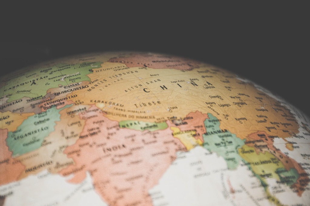
Western cartographic traditions typically associate red with danger or high values, while green indicates safety or low risk levels. Eastern mapping conventions often reverse these associations, with red symbolizing prosperity and good fortune in Chinese cartography. You’ll need to research your target audience’s cultural background before selecting color schemes, as misinterpretation can lead to navigation errors or confusion about data significance.
Language-Specific Color Terminology and Map Interpretation
Color vocabulary differs dramatically between languages, affecting how users process visual information on maps. Russian speakers distinguish between light blue (goluboy) and dark blue (siniy) as separate colors, while Japanese has specific terms for blue-green (ao) that don’t translate directly. Your multilingual maps should account for these linguistic differences by using color combinations that remain distinct across various language groups’ color categorization systems.
Religious and Historical Color Symbolism in Geographic Representation
Sacred colors carry powerful meanings that influence map interpretation across different religious traditions. Islamic cartography traditionally uses green for holy sites, while Hindu mapping may incorporate saffron for spiritual significance. You must consider historical contexts where certain colors represent political movements or cultural identity, ensuring your geographic representations respect these associations while maintaining cartographic clarity for diverse religious and cultural audiences.
Creating Harmonious Color Palettes for Multiple Language Scripts
Harmonious color palettes for multilingual maps require careful consideration of how different scripts interact with color choices across various cultural contexts.
Balancing Contrast for Latin, Cyrillic, and Asian Character Sets
You’ll need to adjust contrast ratios based on the stroke complexity of different writing systems. Latin scripts typically require a 4.5:1 contrast ratio for readability, while Cyrillic characters with their varied stroke weights need 5:1 ratios. Asian character sets demand the highest contrast at 7:1 due to intricate strokes and radicals. Consider using darker backgrounds with lighter text for dense Chinese or Japanese labels, while maintaining standard contrast for simpler Latin place names on the same map.
Font Weight and Color Combinations for Optimal Readability
You should match font weights to color intensity for consistent visual hierarchy across scripts. Bold Latin fonts pair well with medium-saturation colors (60-70% saturation), while regular-weight Cyrillic text requires high-saturation colors (80-90%) for equivalent visual prominence. Asian scripts benefit from semi-bold weights combined with low-saturation, high-contrast colors. Use color temperature consistently – warm colors (reds, oranges) for primary labels and cool colors (blues, greens) for secondary information across all character sets.
Background Color Selection for Diverse Typography Styles
You’ll achieve optimal legibility by selecting neutral background colors that complement all script styles simultaneously. Light gray backgrounds (RGB: 245, 245, 245) provide excellent contrast for dark text in any language, while cream tones (RGB: 255, 253, 240) reduce eye strain during extended map reading. Avoid pure white backgrounds when displaying multiple scripts together, as they create harsh contrast that affects readability differently across character sets. Test your color combinations with native speakers to ensure cultural appropriateness alongside technical readability standards.
Implementing Accessibility Standards for Global Map Audiences
Accessibility standards ensure your multilingual maps reach every user effectively, regardless of their visual abilities or assistive technology needs. You’ll need to adapt these standards for diverse global audiences while maintaining consistent usability across different cultural contexts.
Color-Blind Friendly Palettes for International Users
You must design palettes that work for the 8% of men and 0.5% of women who experience color vision deficiency worldwide. Deuteranopia affects green perception most commonly, so you’ll want to avoid red-green combinations entirely. Instead, use blue-yellow contrasts with purple accents for categorical data. Test your palettes with tools like Coblis or Color Universal Design filters to verify accessibility across protanopia, deuteranopia, and tritanopia conditions.
Quickly attach these 40 universal flash color gels to your shoe-mount flash using the innovative tabbed design. The kit includes 20 color effects, 5 color correction, and 1 diffusion filter to enhance your photography, video, and stage lighting.

High Contrast Requirements Across Different Writing Systems
You need minimum contrast ratios that exceed standard WCAG guidelines when working with complex scripts. Arabic and Chinese characters require 7:1 ratios due to intricate stroke patterns, while Latin text performs adequately at 4.5:1. Cyrillic scripts need 5:1 ratios for optimal legibility. Apply darker backgrounds with lighter text for dense Asian character sets, and use medium-contrast approaches for alphabetic systems to prevent eye strain during extended map reading sessions.
Screen Reader Compatibility and Color Coding Alternatives
Read comfortably with this lightweight, full-page 5X magnifying glass. Its large viewing area and ergonomic handle make it ideal for seniors and those with low vision to easily read small print.

You should provide alternative identification methods beyond color alone for screen reader users and visually impaired audiences. Implement pattern fills, texture variations, or shape coding alongside your color schemes. Add alt-text descriptions for each map element and use ARIA labels for interactive features. Include data tables with numerical values corresponding to your color-coded regions, ensuring screen readers can communicate the same information your visual elements convey to sighted users.
Utilizing Semantic Color Systems for Universal Geographic Features
You’ll achieve optimal multilingual map communication by implementing standardized color systems that transcend cultural and linguistic boundaries. These universal color conventions leverage human cognitive associations with natural elements to create intuitive geographic representations.
Water Bodies and Terrain Color Standardization
You should apply consistent blue values (#0077BE to #4A90E2) for water features across all language versions, as blue represents water universally in most cultures. Mountain terrain works best with brown gradients (#8B4513 to #D2B48C), while forests maintain recognition through green tones (#228B22 to #90EE90). These standardized terrain colors eliminate confusion when users switch between different language interfaces on the same geographic region.
Political Boundaries and Administrative Division Colors
You can establish clear administrative hierarchies using consistent boundary colors that avoid culturally sensitive combinations. International borders require bold black lines (#000000) with 2-pixel width, while provincial boundaries use medium gray (#696969) at 1.5-pixel thickness. Municipal divisions work effectively with light gray (#C0C0C0) dotted lines, ensuring these administrative levels remain distinguishable regardless of the displayed language or cultural context.
Transportation Networks and Infrastructure Color Coding
You’ll maximize wayfinding effectiveness by using standardized transportation colors that align with international conventions. Highways maintain recognition through red tones (#DC143C), while railways use black (#000000) or dark gray (#2F2F2F) for universal identification. Airport symbols require blue (#0000FF) backgrounds, and ports utilize navy blue (#000080) to distinguish maritime facilities from aviation infrastructure across all multilingual map versions.
Establishing Visual Hierarchy Through Strategic Color Application
Creating effective visual hierarchy in multilingual maps requires strategic color layering that guides readers through information naturally. You’ll need to prioritize critical geographic elements while maintaining cultural sensitivity across diverse audiences.
Primary Information Layer Color Priorities
Prioritize the most critical map elements using your brightest and highest-contrast colors. You should assign your strongest values to water bodies first—ocean blues at 100% saturation work universally across cultures. Political boundaries demand your next highest priority, using bold black (#000000) for international borders and medium gray (#666666) for regional divisions. Transportation networks require consistent red tones for highways and railways in dark charcoal (#333333) to ensure immediate recognition.
Secondary Data Overlay Color Management
Manage secondary information layers using mid-range saturation values between 40-60% to maintain visibility without competing with primary elements. You’ll want to apply muted earth tones for demographic data overlays—light browns and tans work effectively across cultural contexts. Population density requires graduated purple scales that avoid religious color conflicts, while economic indicators benefit from neutral blue-gray gradients. Administrative boundaries should use dashed lines in medium opacity to distinguish from primary political features.
Label and Annotation Color Differentiation Techniques
Differentiate text elements using strategic color relationships that enhance multilingual readability. You should apply high-contrast black text (#000000) on light backgrounds for primary city names and white text on dark overlays for secondary annotations. Country labels require bold typography in dark blue (#003366) to establish geographic hierarchy, while regional names work best in medium gray (#555555). Multilingual annotations benefit from consistent color coding—English labels in black, secondary languages in dark brown (#663300) to maintain visual organization.
Adapting Brand Colors for Cross-Cultural Map Design
Your brand colors need strategic modification when creating multilingual maps that serve diverse global audiences. Cultural color perceptions can dramatically alter how users interpret your branded geographic content.
Corporate Identity Integration in International Mapping
Corporate colors require careful adaptation when integrating into multilingual map interfaces across different cultural contexts. You’ll need to adjust your primary brand palette’s saturation levels by 15-20% for Asian markets where bold colors carry different symbolic weight. Consider creating secondary color variants that maintain brand recognition while respecting local color traditions – for example, modifying red corporate colors to burgundy tones in cultures where bright red signifies mourning. Test your adapted brand colors against each target language’s typography requirements to ensure consistent legibility across Latin, Cyrillic, and Asian character sets.
Cultural Sensitivity in Brand Color Translation
Brand color translation demands thorough research into cultural color associations before implementing your corporate palette in international maps. Your blue corporate colors might work universally for trust-building, but green brand elements need adjustment in Middle Eastern markets where green carries religious significance. Avoid using your brand’s white elements as primary colors in East Asian map versions, as white symbolizes mourning in many cultures. Create culture-specific brand color guidelines that maintain your visual identity while respecting local traditions – this might mean developing region-specific color variations that preserve brand essence without causing cultural offense.
Maintaining Brand Recognition Across Language Versions
Brand recognition consistency requires establishing core color anchors that remain unchanged while allowing secondary elements to adapt culturally. You should maintain your primary brand color in logo elements and key interface components across all language versions, using it as the constant visual thread. Develop a flexible brand color system where 60% of your palette remains consistent globally while 40% adapts to local preferences and cultural requirements. Document specific color codes (HEX, RGB, CMYK) for each regional variation to ensure consistent implementation across different mapping platforms and maintain brand integrity while respecting cultural sensitivities.
Testing and Validating Color Choices Across Language Markets
Testing your multilingual map color choices through systematic validation ensures your cartographic decisions translate effectively across diverse language markets and cultural contexts.
User Testing Methods for Multilingual Map Interfaces
Conduct comparative usability sessions with native speakers from each target language market to evaluate color comprehension and navigation efficiency. Task-based testing reveals how users interpret color-coded elements within their cultural context, measuring completion times for wayfinding scenarios. Focus groups with 8-12 participants per language group provide qualitative insights into color associations and preferences. Eye-tracking studies identify visual attention patterns across different script systems, showing whether Arabic readers follow different color hierarchy paths than Latin script users.
A/B Testing Color Schemes with Different Language Groups
Split-test alternative color palettes across geographic regions to measure user engagement and task completion rates for each language market. Version A might use Western-optimized colors while Version B incorporates culturally-adapted alternatives for Asian markets. Monitor metrics including time-on-map, zoom interactions, and feature identification accuracy across language groups. Heat mapping tools reveal whether Chinese users engage differently with green forestry colors compared to German users, providing quantitative data for color optimization decisions.
Feedback Collection and Iterative Color Refinement
Implement systematic feedback loops through surveys, user interviews, and analytics data to continuously refine your multilingual color strategies. Survey tools like Typeform or SurveyMonkey capture color preference data from native speakers, while Google Analytics reveals behavioral patterns across language versions. Create feedback forms in each target language to capture nuanced cultural responses to color choices. Document iterative changes through version control systems, tracking which color modifications improve user satisfaction scores and reduce navigation errors across different language markets.
Conclusion
Your multilingual map’s success hinges on thoughtful color decisions that transcend cultural boundaries. By implementing these seven strategic approaches you’ll create cartographic experiences that communicate effectively across diverse global audiences.
Remember that color isn’t just decorative—it’s a universal language that requires cultural fluency. Each hue you select carries the power to enhance or hinder user understanding depending on your audience’s linguistic and cultural background.
The investment in culturally-aware color theory pays dividends through improved user engagement and reduced navigation confusion. Your maps become more accessible when you prioritize both visual accessibility standards and cross-cultural color psychology.
Start applying these principles today and watch your multilingual maps transform into powerful communication tools that speak every user’s visual language.
Frequently Asked Questions
What makes color choices important for multilingual map design?
Color choices are crucial for multilingual maps because different cultures interpret colors differently. While Western cultures associate red with danger, Eastern traditions link it to prosperity. Effective color selection ensures clear communication across diverse audiences, overcoming language barriers and enhancing navigation experiences for users speaking English, Mandarin, Arabic, and other languages worldwide.
How do cultural differences affect color interpretation in maps?
Cultural backgrounds significantly influence how people perceive colors in maps. Religious traditions, historical contexts, and regional associations create varying interpretations of the same color. For example, white symbolizes purity in Western cultures but mourning in some Eastern traditions. Understanding these differences is essential for creating globally effective cartographic designs.
What contrast ratios are recommended for different writing systems?
Different scripts require specific contrast ratios for optimal readability. Latin scripts need a minimum 4.5:1 contrast ratio, Cyrillic characters require 5:1, and Asian character sets demand the highest ratio at 7:1. These varying requirements ensure text remains legible across different writing systems and cultural contexts in multilingual map applications.
How can maps be designed to accommodate color-blind users globally?
Color-blind friendly maps should avoid red-green combinations and use blue-yellow contrasts with purple accents instead. Additionally, provide alternative identification methods beyond color, such as pattern fills, symbols, and detailed alt-text descriptions. This approach ensures accessibility for users with color vision deficiencies across all cultural backgrounds and languages.
What are the standard color conventions for universal geographic features?
Universal geographic features should follow consistent color coding: blue values for water bodies, brown gradients for mountains, and green tones for forests. Political boundaries use bold black for international borders, medium gray for provinces, and light gray dotted lines for municipalities. Transportation networks utilize red for highways and black for railways.
How should brand colors be adapted for cross-cultural map design?
Brand colors require strategic modifications for different cultural markets while maintaining core identity. Adjust color saturation based on regional preferences, particularly in Asian markets. Develop culture-specific guidelines that respect local traditions while preserving brand recognition. Create flexible color systems that balance global consistency with local cultural adaptation for effective communication.
What methods are recommended for testing color choices across different markets?
Effective color testing involves comparative usability sessions with native speakers, A/B testing of different color schemes, and collecting feedback through surveys and analytics. These methods help evaluate user comprehension and navigation efficiency across cultural contexts. Iterative refinement based on user testing ensures color choices resonate appropriately within different language markets.