6 Ways Visualizing Cultural Changes Through Maps Reveal Hidden Patterns
Why it matters: Maps aren’t just about geography anymore â they’re powerful tools that reveal how cultures shift and evolve across time and space.
The big picture: From tracking language patterns to monitoring social movements, cartographic visualization transforms complex cultural data into clear, actionable insights that help you understand societal changes at a glance.
What’s ahead: We’ll explore six proven methods that researchers, businesses, and policymakers use to map cultural transformations, giving you the tools to spot trends and make informed decisions in our rapidly changing world.
Disclosure: As an Amazon Associate, this site earns from qualifying purchases. Thank you!
P.S. check out Udemy’s GIS, Mapping & Remote Sensing courses on sale here…
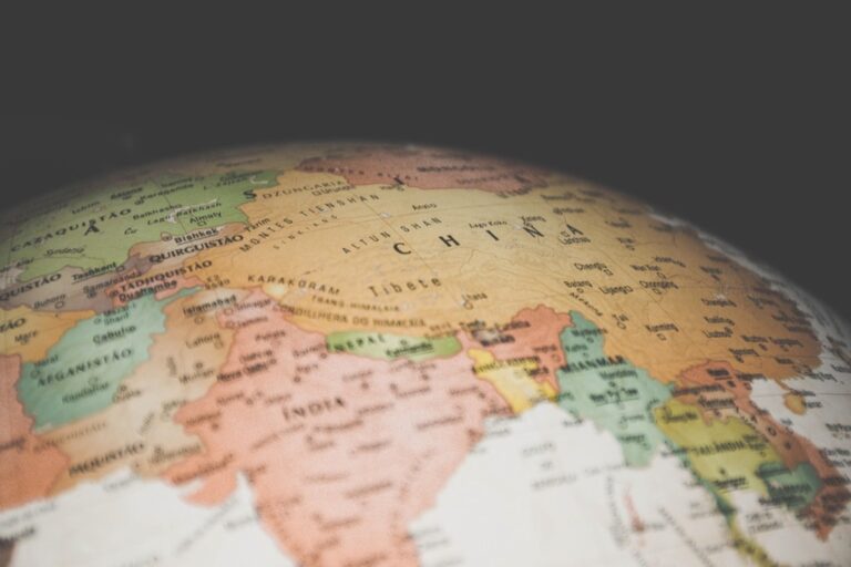
Understanding the Power of Cultural Mapping in Modern Analysis
Cultural mapping transforms abstract social phenomena into tangible visual narratives that reveal patterns invisible to traditional research methods. You’ll find this approach particularly valuable when analyzing demographic shifts, migration patterns, and social movements across different time periods.
Modern GIS platforms like ArcGIS Pro and QGIS enable you to layer multiple cultural datasets simultaneously, creating comprehensive visualizations that show relationships between language distribution, religious practices, and economic activities. These tools process census data, social media analytics, and survey responses to generate heat maps and choropleth visualizations.
Temporal mapping capabilities allow you to animate cultural changes over decades or centuries, revealing how cultural boundaries shift in response to political events, economic pressures, and technological advances. You can track language extinction rates, urbanization patterns, and cultural assimilation processes through sequential map displays.
Statistical clustering algorithms identify cultural regions that traditional political boundaries often miss, helping you understand how cultural groups naturally organize across geographic space. These methods combine demographic variables, linguistic data, and behavioral indicators to define culturally coherent territories.
Tracking Population Migration Patterns Through Interactive Map Technologies
Interactive mapping platforms now enable real-time visualization of human movement patterns that reveal profound cultural transformations across geographic regions.
Demographic Shift Visualization Tools
Population density heat maps transform census data into dynamic visualizations showing how communities evolve over decades. Tools like Tableau Public and ArcGIS Online process migration statistics from the U.S. Census Bureau’s American Community Survey to create animated choropleth maps. You’ll see color gradients shifting from blue (population loss) to red (population gain) across counties and metropolitan areas. These platforms integrate demographic variables including age, income, and education levels to reveal which population segments drive migration trends in specific regions.
Immigration and Emigration Flow Charts
Flow line maps visualize human movement between origin and destination points using curved arrows proportional to migration volume. QGIS and D3.js create these dynamic visualizations from International Organization for Migration datasets and national immigration records. You can adjust line thickness to represent migration intensity while color-coding flows by time period or demographic characteristics. Interactive features let users filter by specific countries, years, or migration types to explore patterns like climate-induced displacement or economic opportunity migration across international corridors.
Urban to Rural Movement Tracking
Dot density mapping reveals micro-level population shifts between metropolitan and rural areas using individual data points representing household relocations. ArcGIS Pro processes American Community Survey microdata to plot movement patterns during events like the COVID-19 pandemic’s remote work migration. You’ll identify emerging settlement patterns as urban professionals relocate to smaller communities while maintaining city-based employment. Time-series animations show seasonal migration flows and permanent relocations that reshape rural demographics and cultural composition across previously isolated regions.
Monitoring Language Evolution and Distribution Across Geographic Regions
Linguistic mapping reveals how languages adapt and spread across territories, providing crucial insights into cultural transformation patterns. You’ll discover how cartographic analysis tracks language boundaries, dialect variations, and endangered speech communities with unprecedented precision.
Linguistic Boundary Changes Over Time
Temporal language mapping captures how linguistic territories shift across decades through layered GIS datasets. You can visualize language retreat patterns by combining historical census data with contemporary linguistic surveys in ArcGIS Pro. Time-series animations reveal how urban expansion affects minority language boundaries, while isogloss mapping tracks specific linguistic features as they migrate between communities. These boundary shifts often correlate with economic development, educational policies, and population movements that reshape cultural landscapes.
Dialect Spread and Regional Variations
Dialect distribution mapping identifies regional speech patterns through acoustic clustering and geographic interpolation techniques. You’ll create choropleth maps showing lexical variation intensity across administrative boundaries using R’s spatial analysis packages. Kriging interpolation methods help predict dialect features in unmapped areas, while network analysis reveals how transportation corridors facilitate linguistic diffusion. Modern dialect mapping combines traditional fieldwork data with social media geolocation analysis to track emerging speech patterns in real-time.
Endangered Language Documentation
Endangered language cartography maps speaker populations and vitality levels across threatened linguistic communities. You can create density maps showing speaker concentrations using UNESCO’s Atlas of the World’s Languages in Danger as baseline data. Heat mapping techniques visualize language endangerment severity, while buffer analysis identifies geographic isolation factors contributing to language loss. These maps inform preservation efforts by highlighting critical intervention zones where cultural revitalization programs can maximize impact on linguistic survival.
Examining Religious and Belief System Transformations Through Spatial Data
Religious transformation mapping reveals how spiritual communities evolve across landscapes through sophisticated spatial analysis techniques. These methodologies track belief system boundaries, sacred space distribution, and interfaith interaction patterns that shape cultural territories.
Faith Community Growth and Decline Patterns
Denominational density mapping tracks religious population shifts through census data layering and congregation location analysis. You’ll visualize growth corridors using temporal heat maps that reveal evangelical expansion patterns, Catholic parish consolidation trends, and emerging spiritual movement territories. Statistical clustering algorithms identify religious demographic transitions, while proximity analysis maps measure interfaith community interactions and conversion zone boundaries across metropolitan areas.
Sacred Site Mapping and Cultural Preservation
Sacred landscape documentation preserves religious heritage through GPS coordinate systems and cultural significance databases. You’ll map pilgrimage routes, ceremonial grounds, and historic religious structures using drone surveys and archaeological data integration. Point-of-interest mapping catalogs threatened sacred sites, while buffer zone analysis protects cultural corridors from development pressures. Digital preservation techniques create immersive documentation supporting indigenous land rights and heritage tourism initiatives.
Interfaith Community Development Trends
Interfaith proximity analysis reveals collaborative religious community patterns through spatial relationship modeling. You’ll track shared facility usage, community service partnerships, and joint cultural events using network analysis tools. Demographic overlap mapping identifies areas with high religious diversity, while accessibility analysis measures interfaith dialogue opportunities. Time-series visualization captures ecumenical movement growth and religious cooperation trends across urban planning districts.
Analyzing Economic Cultural Shifts Using Geographic Information Systems
GIS technology transforms abstract economic data into compelling visual narratives that reveal how financial forces reshape cultural landscapes. You’ll discover how modern cartographic tools capture the intricate relationship between economic development and cultural identity formation.
Industry Evolution and Regional Economic Identity
Manufacturing decline visualization captures how deindustrialization transforms regional cultural identity through employment density mapping and facility closure tracking. You can layer historical industrial data with current economic indicators to reveal cultural adaptation patterns. Service sector expansion mapping illustrates how communities transition from blue-collar manufacturing identities to knowledge-based economies. Tech corridor development shows emerging cultural hubs through startup density analysis and venture capital flow visualization, revealing how innovation clusters create new regional identities.
Trade Route Changes and Cultural Exchange
Port activity analysis reveals how shipping volume fluctuations influence local cultural diversity through cargo manifest data and immigration pattern correlation. You’ll track how transportation infrastructure changes reshape cultural exchange networks using freight flow analysis and connectivity indices. Border commerce mapping captures cross-cultural economic relationships through trade value visualization and bilateral exchange tracking. Supply chain disruption visualization shows how economic shocks alter traditional cultural trade relationships, particularly evident during global events that redirect commercial pathways.
Economic Disparity Mapping and Social Impact
Income inequality heat maps reveal how economic stratification creates distinct cultural enclaves within metropolitan areas through census tract analysis and wealth distribution modeling. You can visualize gentrification patterns using property value changes and demographic displacement data to track cultural community fragmentation. Employment accessibility mapping shows how job market geography influences cultural preservation and transformation. Investment flow analysis captures how capital distribution affects cultural institutions and community development, revealing economic drivers behind cultural change patterns.
Documenting Arts, Music, and Creative Expression Through Location-Based Mapping
Creative expression mapping transforms abstract cultural phenomena into spatial datasets that reveal artistic communities and cultural innovation patterns. You’ll discover how location-based visualization techniques capture the geographic distribution of creative activities.
Cultural Festival and Event Distribution
Festival clustering algorithms identify seasonal cultural hotspots through temporal GIS analysis of event calendars and attendance data. You can map recurring festivals like Edinburgh Fringe or SXSW to visualize cultural density patterns across metropolitan areas. Heat mapping reveals emerging festival corridors where creative communities concentrate annually. Proximity analysis tools help identify underserved regions lacking cultural programming. Network analysis connects festival circuits to track how artistic movements spread between cities through shared performers and organizers.
Music Genre Origins and Geographic Spread
Musical genre mapping utilizes streaming data and venue location datasets to trace how sounds emerge from specific neighborhoods and spread globally. You’ll track hip-hop’s Bronx origins or grunge’s Seattle emergence through radio station playlists and concert venue data. Diffusion modeling reveals how genres spread along transportation corridors and urban networks. Acoustic analysis combined with GPS coordinates maps regional sound variations within genres. Social media geotags provide real-time data on where new musical styles gain popularity first.
Public Art Installation Tracking
Public art databases combine GPS coordinates with artwork metadata to create comprehensive cultural asset inventories for cities and regions. You can map mural districts, sculpture trails, and street art concentrations to identify creative neighborhoods. Temporal mapping tracks how public art installations influence gentrification patterns and property values. Commission tracking reveals funding sources and artist networks across municipalities. Condition monitoring through mobile GIS applications helps arts organizations maintain cultural heritage sites and plan restoration projects.
Visualizing Social Movement Progression and Cultural Activism Through Digital Maps
Digital maps transform social movement data into powerful visual narratives that reveal activism patterns and cultural resistance across geographic spaces. Modern GIS platforms enable cartographers to track protest evolution and community organizing efforts through sophisticated spatial analysis techniques.
Protest Movement Geographic Expansion
Movement spread visualization captures how protests diffuse across urban networks through spatio-temporal clustering algorithms. You’ll layer event data from social media APIs and news sources to create heat maps showing activation zones and expansion corridors. Temporal animation reveals how movements jump between cities, following transportation networks and demographic similarities. Geographic expansion patterns often correlate with university locations, income inequality zones, and historical activism centers, creating predictable diffusion pathways.
Social Change Initiative Mapping
Initiative density mapping transforms advocacy campaign data into spatial datasets that identify cultural transformation hotspots. You’ll utilize proximity analysis tools to cluster related movements within metropolitan areas, revealing collaborative opportunities and resource concentration patterns. Choropleth visualization displays policy change success rates across legislative districts, while dot density mapping tracks grassroots organizing intensity. These techniques help identify underserved regions requiring additional activism resources and community engagement strategies.
Community Organizing Network Visualization
Network analysis mapping converts organizer connections into spatial relationship models that reveal coalition-building patterns. You’ll apply graph theory algorithms to community partnership data, creating node-link diagrams overlaid on geographic boundaries. Flow line visualization traces resource sharing between organizations, while buffer analysis identifies service gaps in community coverage areas. These network maps expose influential organizing hubs and highlight opportunities for strategic alliance formation across geographic boundaries.
Conclusion
You now possess powerful techniques to visualize cultural transformations that shape our world. These six mapping approaches unlock insights hiding within demographic shifts linguistic evolution religious transformations economic changes creative expressions and social movements.
Your ability to transform abstract cultural data into compelling visual narratives will revolutionize how you understand community dynamics. Whether you’re a researcher tracking language preservation efforts or a policymaker analyzing migration patterns these tools provide the clarity needed for informed decision-making.
The intersection of geography and culture continues evolving as communities adapt to global changes. By mastering these visualization methods you’re equipped to identify emerging trends predict cultural shifts and contribute meaningful insights to the ongoing conversation about our interconnected world.
Frequently Asked Questions
What is cultural mapping and why is it important?
Cultural mapping is the process of visualizing abstract social phenomena like language patterns, religious practices, and social movements on geographic maps. It transforms complex cultural data into understandable visual narratives, helping researchers, businesses, and policymakers identify trends and make informed decisions about cultural transformations in our dynamic world.
What tools are commonly used for cultural mapping?
Modern cultural mapping relies on Geographic Information Systems (GIS) platforms like ArcGIS Pro and QGIS. These tools allow researchers to layer multiple cultural datasets, create comprehensive visualizations, and use statistical clustering algorithms to identify cultural regions beyond traditional political boundaries while tracking changes over time.
How can maps track population migration patterns?
Interactive mapping technologies use census data, flow line maps, and dot density mapping to visualize immigration, emigration, and urban-to-rural movement patterns. Time-series animations capture both seasonal migration flows and permanent relocations, revealing how events like COVID-19 reshaped demographics and cultural composition across different regions.
What is linguistic mapping and how does it work?
Linguistic mapping reveals how languages adapt and spread across territories using temporal GIS datasets and acoustic clustering techniques. It tracks dialect distribution, documents endangered languages by mapping speaker populations, and identifies critical intervention zones for cultural preservation efforts while showing correlations with economic and demographic factors.
How do maps visualize religious transformations?
Religious transformation mapping uses denominational density mapping, sacred site GPS databases, and network analysis tools to track spiritual community evolution. It visualizes growth corridors, preserves religious heritage through cultural significance mapping, and analyzes interfaith community development patterns to identify collaboration opportunities and demographic transitions.
Can maps show economic cultural shifts?
Yes, economic cultural mapping uses GIS to visualize how communities transition from blue-collar to knowledge-based economies. It tracks manufacturing decline, service sector expansion, trade route changes, and economic disparity patterns, revealing the relationship between economic development and cultural identity formation across different geographic areas.
How do maps track creative expression and artistic communities?
Creative expression mapping transforms artistic phenomena into spatial datasets using clustering algorithms to identify cultural hotspots. It tracks music genre origins through streaming data, maps public art installations with GPS coordinates, visualizes cultural festival distribution, and analyzes how creative assets influence gentrification patterns and property values.
What role do maps play in tracking social movements?
Maps visualize social movement progression through protest evolution tracking, community organizing network analysis, and cultural activism mapping. GIS platforms capture how protests spread across urban networks, identify transformation hotspots through initiative density mapping, and reveal coalition-building patterns that highlight strategic alliance opportunities across geographic boundaries.